


HooDoo House Case Study
It is always a joy to share work by Bartosz Domiczek, winner of the CABINS Challenge, and HooDoo House is no different. Join Bartosz in this case study about the making of this amazing piece.
I am glad to have the opportunity to share a few details from one of my recent projects – Hoodoo House.
It is not supposed to be the complete tutorial, but I hope that I can provide a few intriguing glimpses.
HooDoo House Project Background
I am an architect myself, and I have always been reluctant to perceive arch-viz as a mere service of previewing architecture. Indeed, it is the core of our industry, and there can be much of a creative approach in it, but the whole concept of the virtual architecture looms up as something potentially much more significant.
One of its aspects is creating spaces that are never supposed to be built. They could serve merely as a backdrop for some other subjects or constitute the goal by themselves. I see the overall concept of architecture and its implementation evolving, the brand new ways of funding are emerging, and I am continually being asked about producing various sorts of “instant architecture.” Its reason is more often to be a directed sensation than a well-rounded but a compromised design.


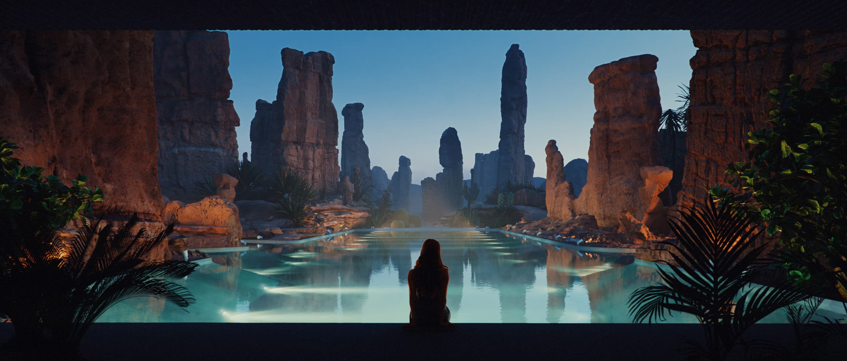
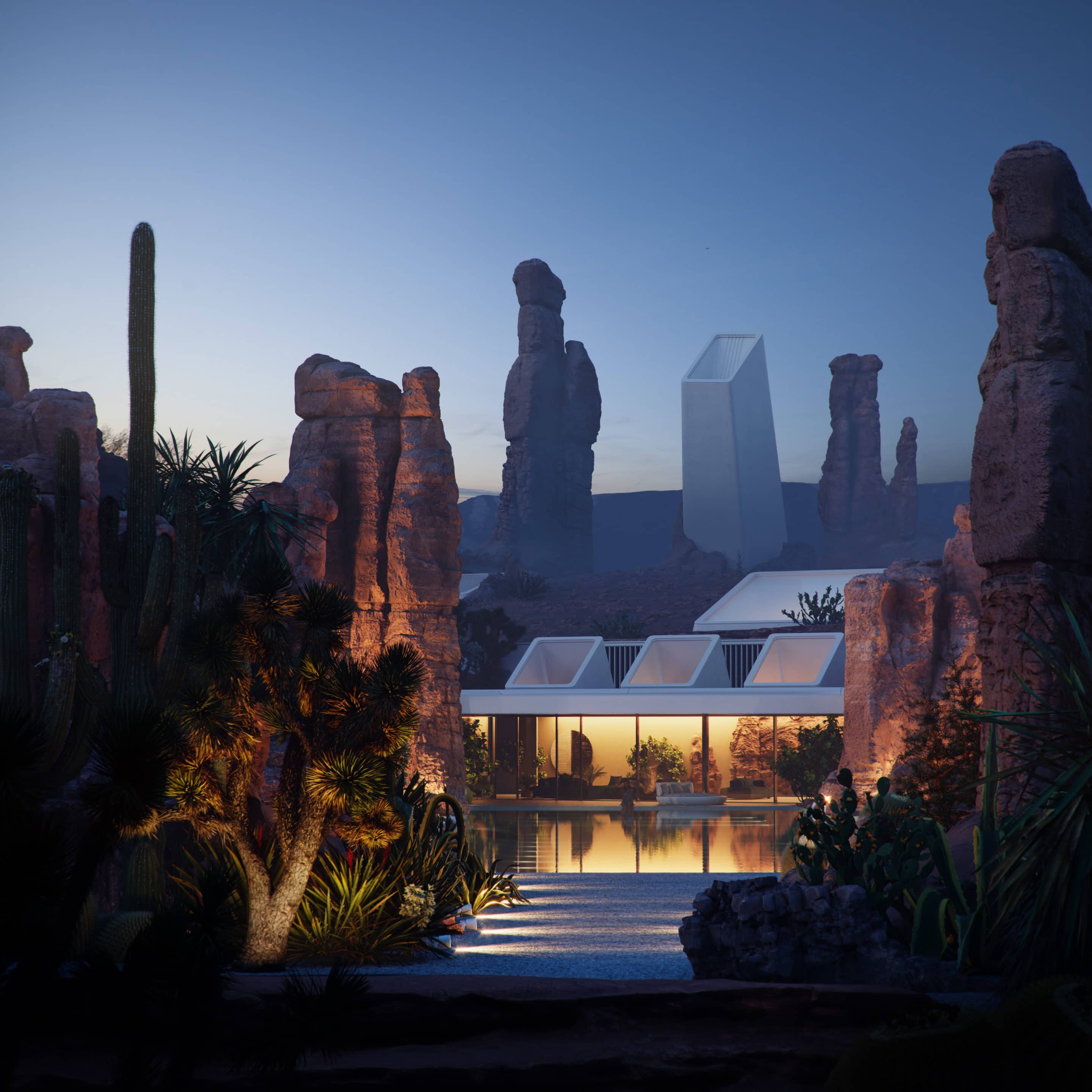
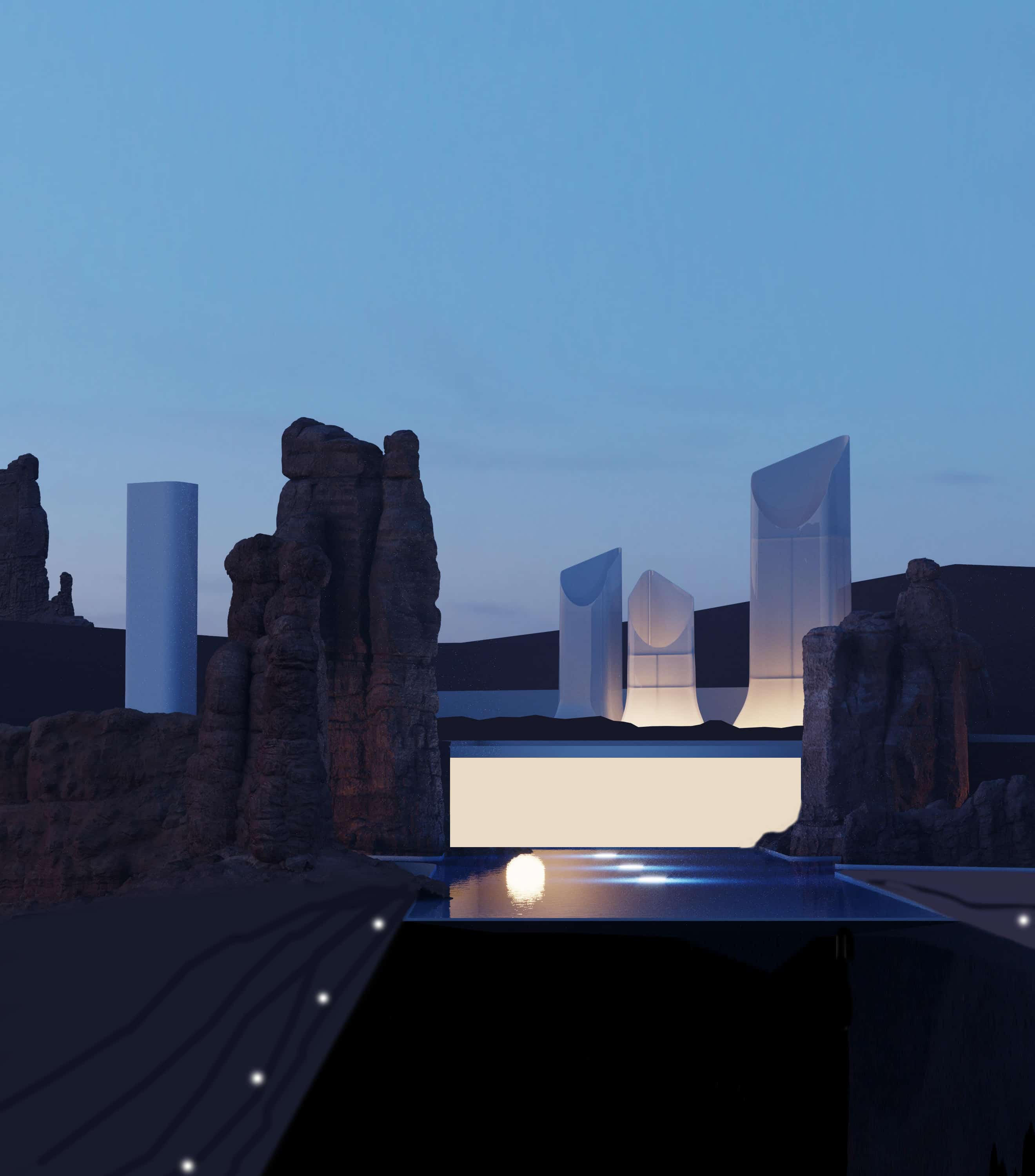
This project might be an example of that approach. It could never be built because of its location. Hoodoos – the tent rocks – are tall spires that protrude from the bottom of an arid drainage basin or badland. They typically consist of relatively soft rock topped by a harder stone that protects each column from the erosion. They are often associated with specific areas in Utah but are present pretty much all over the world.
Nonetheless, they constitute a pretty fragile and protected environment. That’s not a suitable place for any construction efforts, and CGI is the only way to create this striking, unseen juxtaposition. The one that might communicate to people’s dream of living in an utterly unique location.
The images were created in 3ds Max and rendered in Corona Renderer. Additionally, I used Photoshop, ArchiCAD, After Effect, Forest Pack, and Quixel Megascans Mixer, but I won’t cover all these software extensively here.
HooDoo Scene 3d Modeling
I started the project with the sketching process. During that phase, I execute a lot of pencil drawings and some very rough 3d blocking. It is a pretty messy stage, and I cannot show many iterations here as I am not used to collecting them.
As you can see in the single attached example, I merged some signature rocks and set up the lighting scenario similar to the final one. I knew at this point that I wanted to introduce some white vents which could allude to the rocks themselves and support the natural circulation of the cooled air from the shaded water basin area as well as bring the diffused daylight into the rooms underneath.
However, too much freedom is one’s creative enemy. When dealing with the architectural (not virtual) design, all the external constraints tend to channel and direct the ultimate look. Here, everything needed to be defined from scratch, and I decidedly didn’t want to iterate in this phase too much as it could undermine the entire pacing of the project (and it was supposed to be rather a quick one).
On the other hand, the rushed design could later ruin the entire endeavor. To prevent it as much as possible, I tried out many various shapes, materials, and arrangements, following the rule: when in doubt, build the typology first. I wasn’t entirely happy with the result, but it was time to move on, and CGI misadventures bear little consequences (as opposed to the real-life architecture).
After I sketched the initial concept, I started preparing floorplans. These were by no means supposed to constrain my later work in 3d. Plans were mostly used to set the overall pattern of the pool and its relation to the building. They don’t match in 100% with the visuals, but that has never been the case in this project.
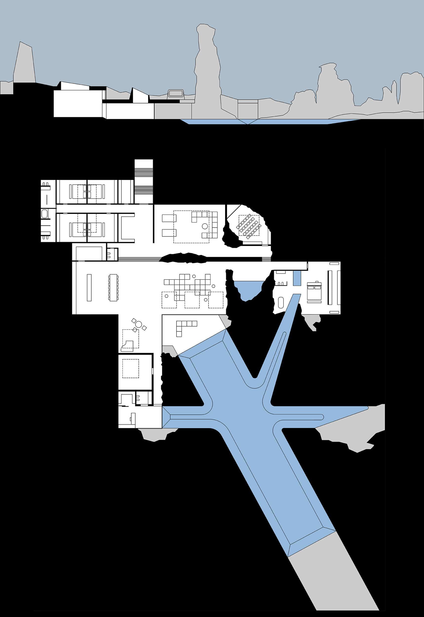
The scene features the multiscale terrain, spanning from the huge mesa in the background to the small scanned assets in the screes. Because of the crucial role of the definite geometric shape of the pool, it was vital for me to show the place from above.
It is a considerably ungrateful situation in 3d graphics since all imperfections tend to become vivid. Suddenly the textures reveal tiled details, the scattering of debris turns out to be implausible, and the performed erosion simulation appears to follow some previously unnoticed orthogonal grids.
It is also an awkward situation due to artistic reasons. The composition might appear bland as it usually lacks any sharp foreground and fades away linearly. Fortunately, I had these extremely vertical forms at my disposal, and I used them to create the depth of the images as well as introduce some rhythm into them.
Furthermore, I tried to keep the camera as low as possible while still having the overlook of the site.
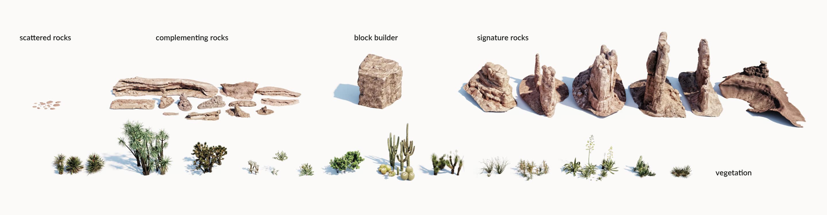
There are a few technical details regarding the assets themselves. I used Megascans, Terrain Domain, Maxtree, and some separately purchased elements.
Apart from them, I used my objects, which I didn’t make specifically for this project. Indeed, I had to unify the hue and glossiness of assets to create a feeling of continuity.
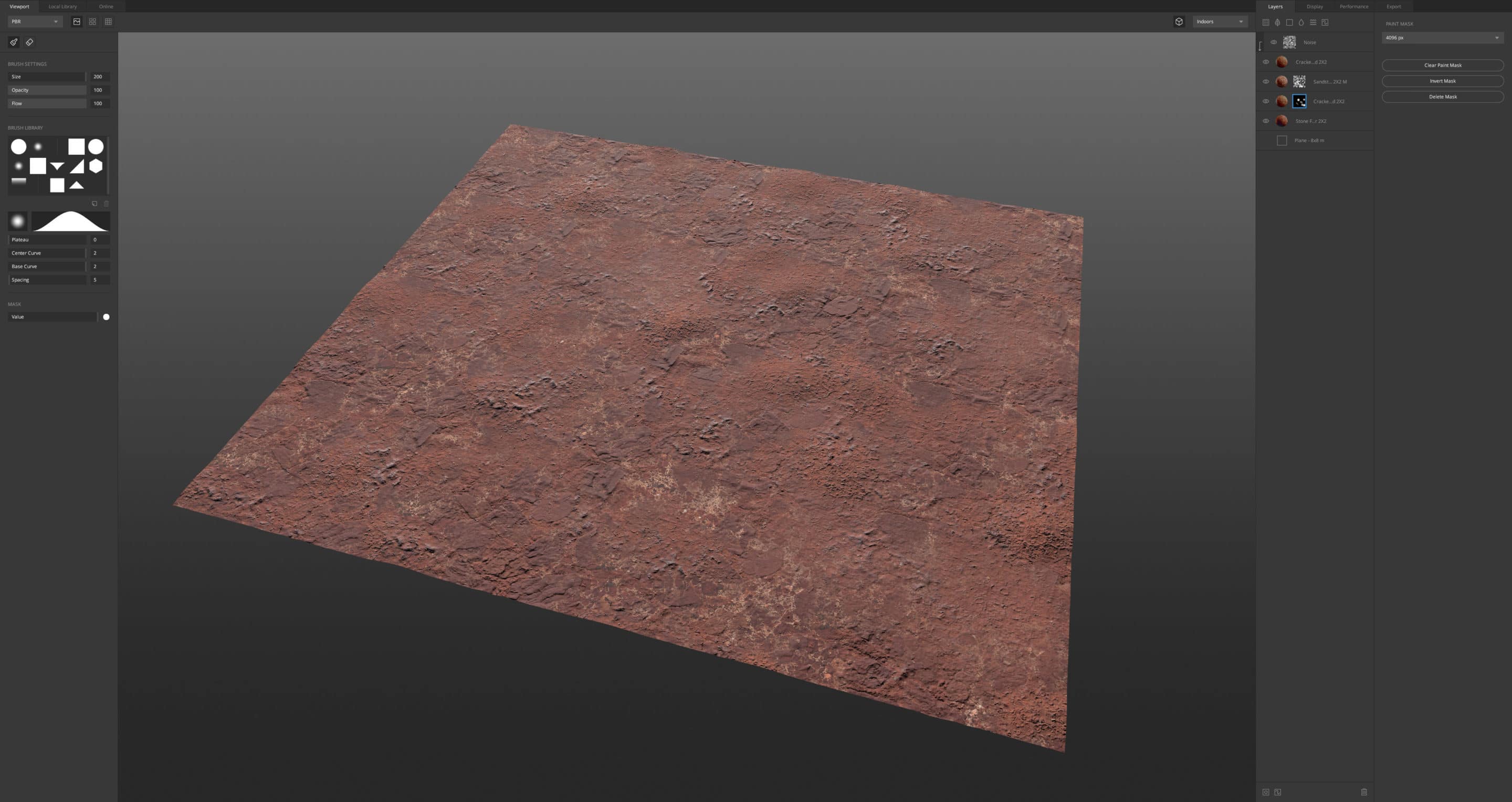
Relatively more can be written about arranging the assets in the scene. I find all areas of transition between 3d scans and the rest of the scene to be tricky. The shifts in surface intensity and lack of geological logic in those areas could be easily spotted and need to be taken care of a bit more.
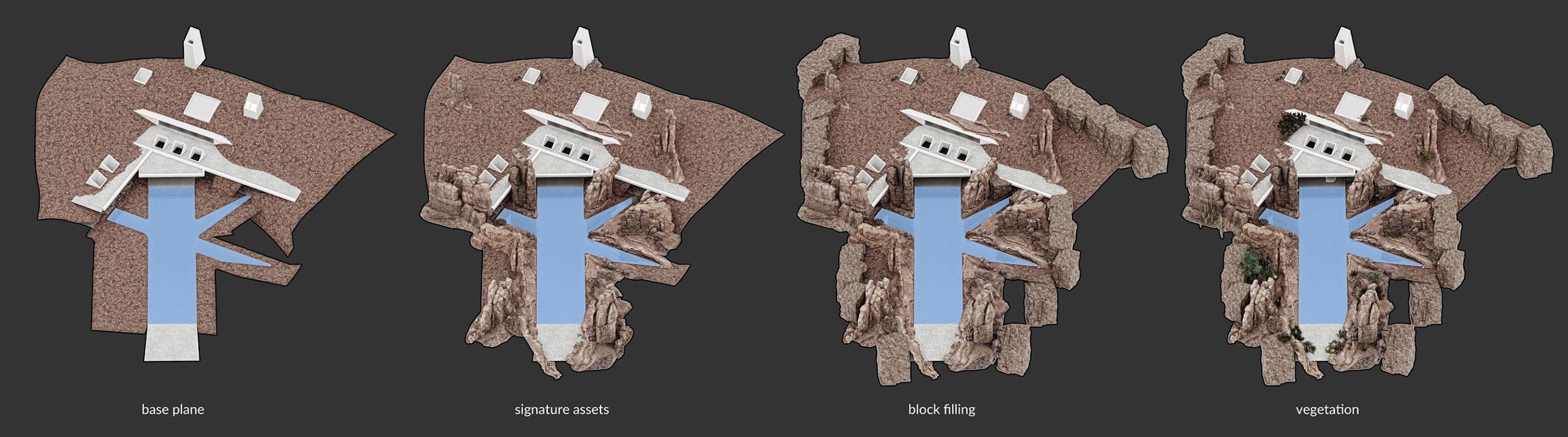
In this context, I started the scene building with a series of base planes surrounding the building. They aimed to prevent any holes and possible light leaks in the contact areas. I combined the large texture in Quixel Mixer and scattered some Megascans assets to ensure that this area appears as intricate, uneven, and matches the feeling of the more significant assets.
In the second step, I manually placed signature rocks around the water basin, trying the pack them tightly and balance the composition. Thirdly, I used generic rock blocks to fill the remaining holes and close the gaps concerning the specific camera views. I used quasi-cubical, lightweight objects, so I didn’t need to worry about optimizing them.
Last but not least, I manually placed vegetation, trying to utilize natural cracks in the rocks and complement compositions.
Composition
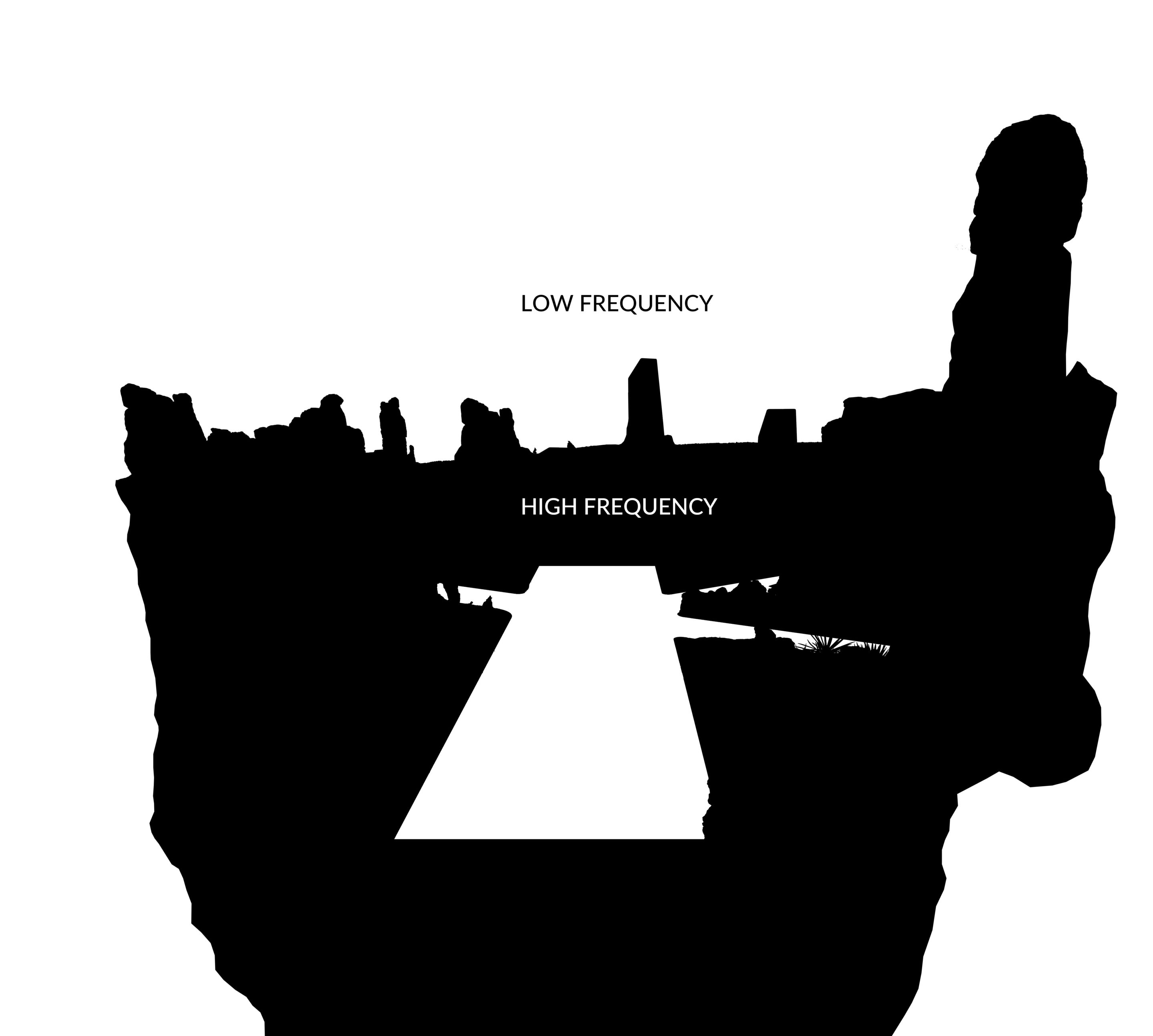
Compositions in this project are mainly based on contrast (in its broader sense, which relates to the general juxtaposition of opposites). I extracted simplified silhouettes (these images don’t tell me much more than an underlying feeling of the rhythm and balance) from three renderings to depict the general principle.
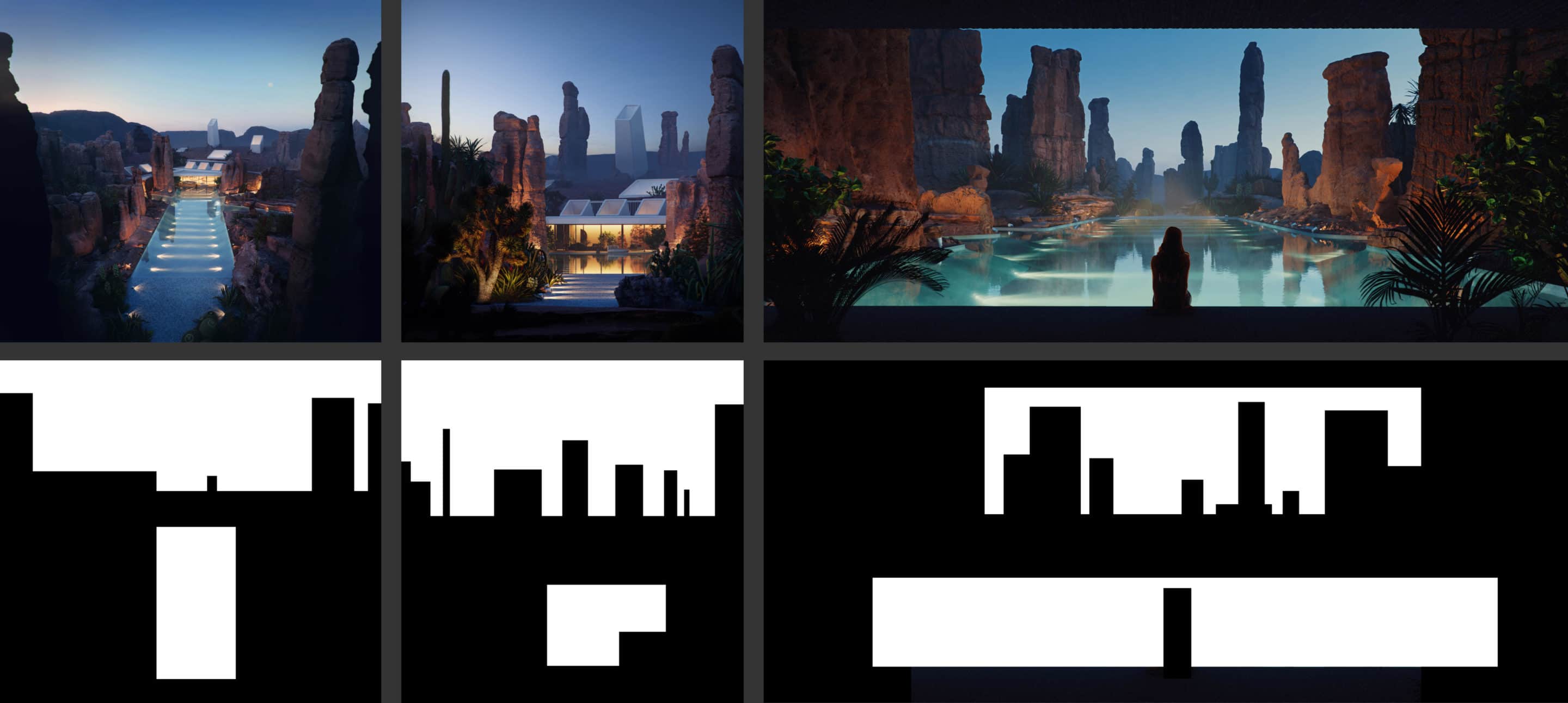
The marked areas are being separated by brightness, color, and frequency. The former two are pretty self-explanatory. The latter is about the difference between low frequency (low amount of details, low contrast, vast empty spaces) and high frequency (high amount of details, high micro-contrast, intricate surfaces) areas.
Usually, the high-frequency areas mark the point of interest within the image. We can easily spot this rule in some traditional paintings in which main elements are distinguished by more elaborate and intricate brushwork.
There is usually no work amount difference in this case in the 3d environment (at least not that straightforward), and those values get often mixed or neglected. In the end, the image can become overdone with great details all over it or have some pretty accidental variation.
In fact, the focal point in an image can be built pointed to by the accumulation of details as well as lack of it. In the example below, three layers of frequency can be spotted, and the low-frequency one constitutes the main point of interest.
Materials
I try to keep all shaders as simple as possible, so most of them are utterly basic. Shots with the vast field of view don’t take much of the advantage of subtle surface imperfections, so I didn’t apply much of them here.
Large area textures were the more significant issue as single materials used to span for tens of meters in this project, and I neither wanted them to tile nor to feel generic and bland. This is the perfect situation for Quixel Mixer, in which creating large span textures is a matter of minutes.
Lighting
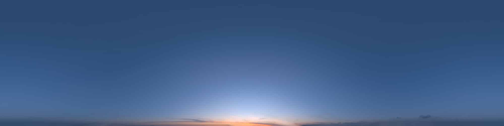
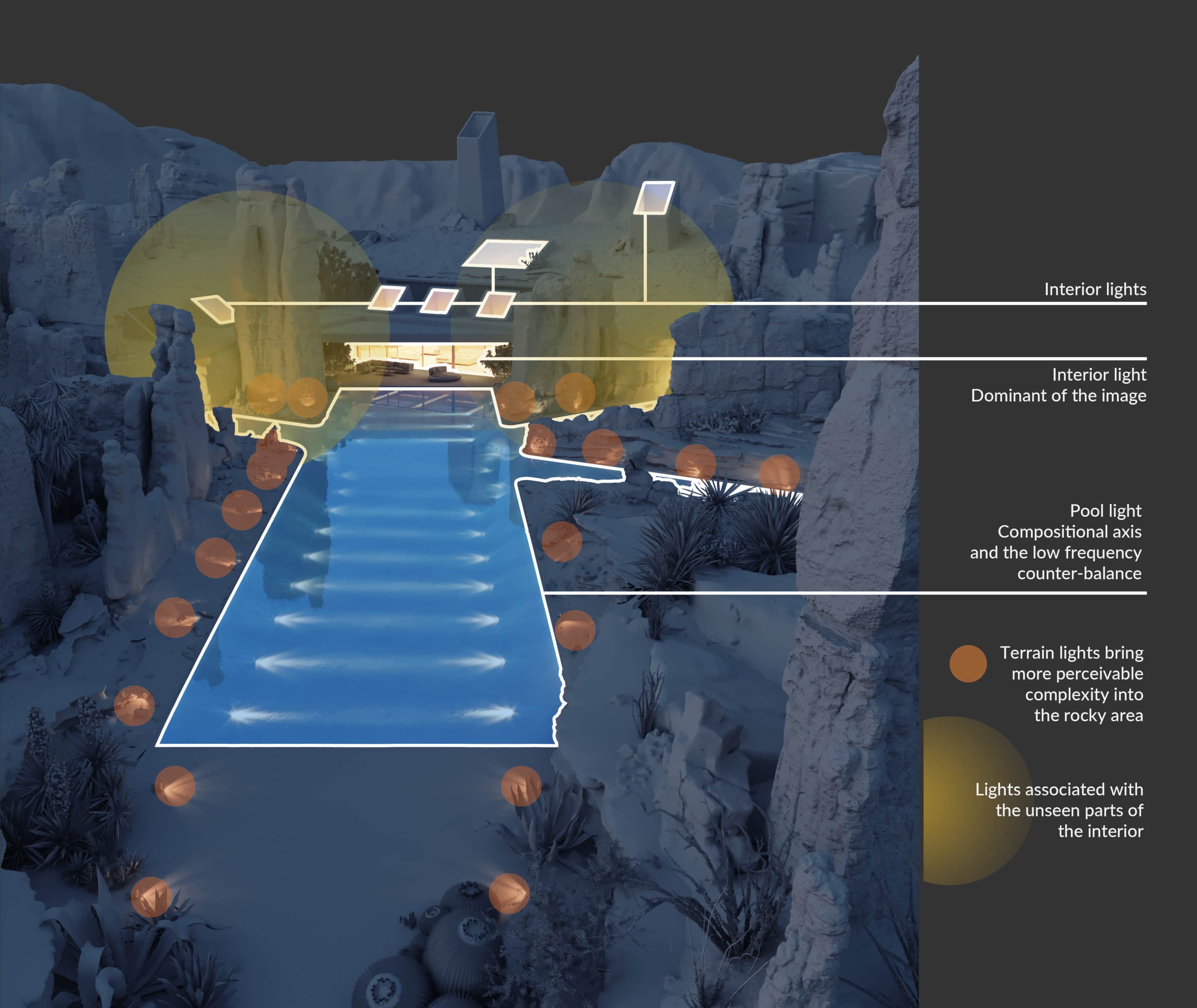
I decided to use only one lighting scenario for all the images in this project. I wanted to build on the specific feeling of dusk in a desert: something easy, intimate, and even slightly transcendent. The daylight views could be interesting visually but also interfere with this unified look.
All the exteriors were lit with PG SKIES 1957 HDRI map and balanced with additional artificial lights. They are listed and described in the image below. I used global volume material, which I tend to utilize in all types of scenes (even if extremely subtly) to diffuse the lighting.
Post-Production
I tend to maximize the amount of work performed in 3d and utilize Corona LightMix to have as little external post-production as possible. It is mostly just minor balancing and tweaking.
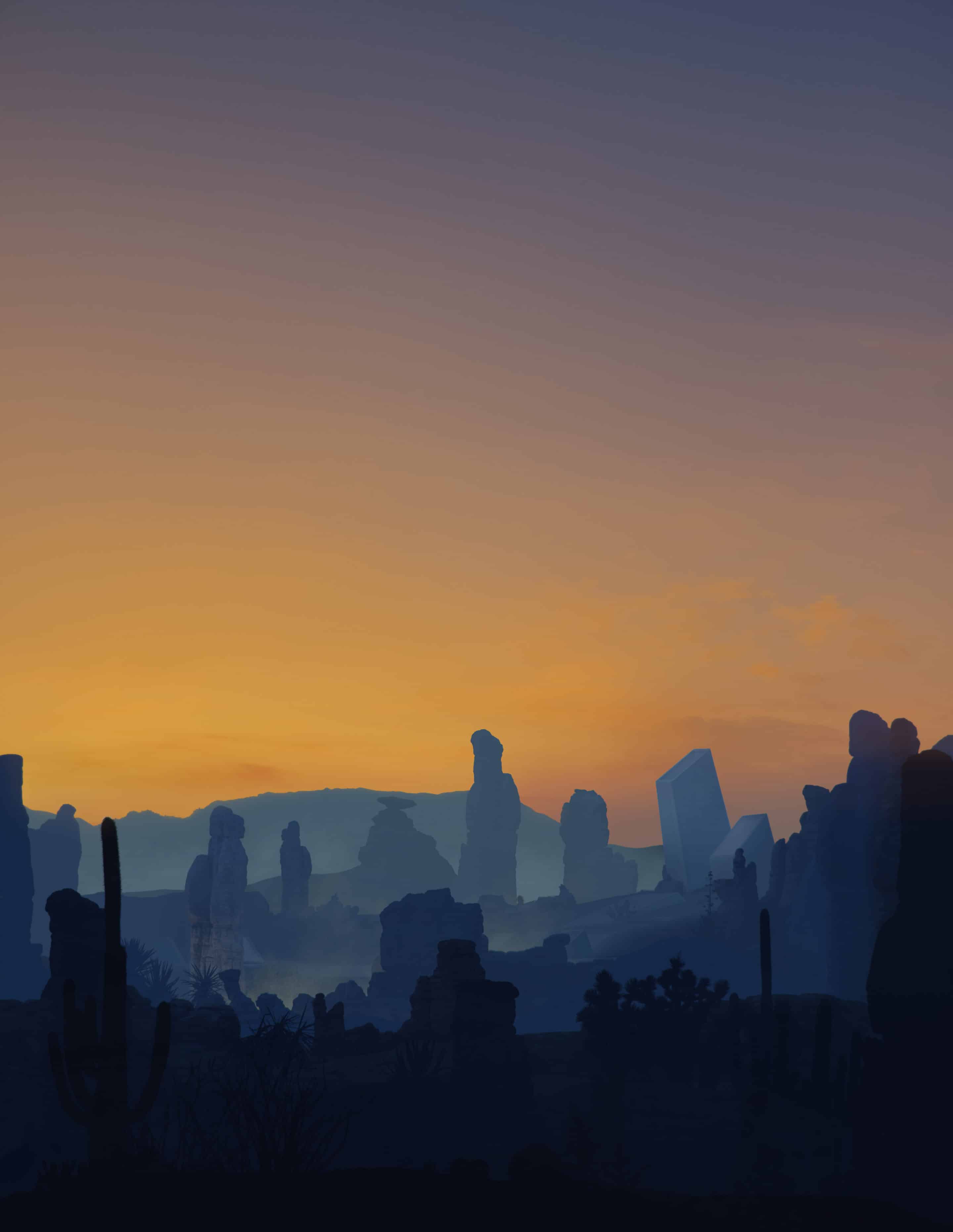
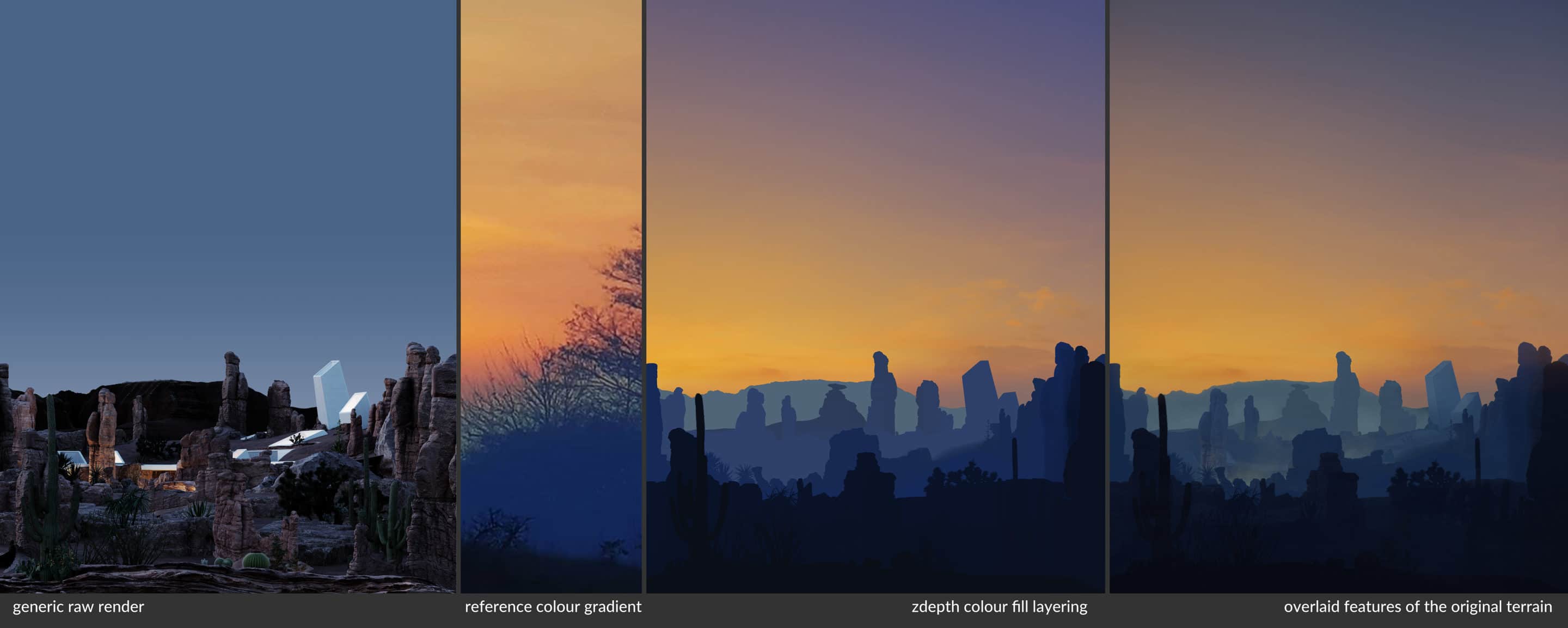
One image in this project is the exception, though, as it was highly stylized in Photoshop. When working on it, I tried to transfer the particular sky gradient from the existing photo. To do it, I rendered a pretty generic and unpolished raw image with additional passes. The most important one was Z-depth, as I manipulated it to obtain some interpenetrating layers. I filled them with pure colors to reconstruct the desired gradient and used the other passes to bring back the delicate features of the original rendering.
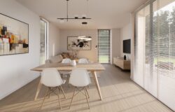
Interiors
Interiors play a secondary part in this project, and their primary role is to complement the outside perspectives with the feeling of spatial coherence. They won’t be covered in this tutorial.


Thank you for your attention, and best luck in your 3d adventures!


Start the discussion at talk.ronenbekerman.com