


Making of WeXo
The making of WeXo by Sonny Holmberg, lead in-house visualization artist at Henning Larsen in Copenhagen. Follow Sonny as he describes the process of making two images showcasing this new Innovation Hub in Växjö, Sweden. Primarily created with 3dsmax, V-Ray, and Photoshop.
Firstly, I would like to thank Ronen Bekerman for giving me the opportunity to share with you the making of my project WeXo.
Secondly, I’m delighted to contribute to the excellent collection of making of’s on Ronen’s blog. When I was new to architectural visualization, I learned a great deal from reading here about other artist’s work. Therefore, I am glad to be able to give something back to the community.
My name is Sonny Holmberg, and I’ve been doing architectural visualization professionally since 2013, and I am currently leading the in-house visualization department of Henning Larsen in Copenhagen.
My general approach to the creation of architectural visualizations is to have a flexible workflow that doesn’t limit me to work predominantly with either 3d or matte painting (2d), but the optimal combination of both.
When having a concept for how an image should turn out, I try to make a strategy of how I best and most efficiently reach my goal, while being flexible in amending comments from the architects.
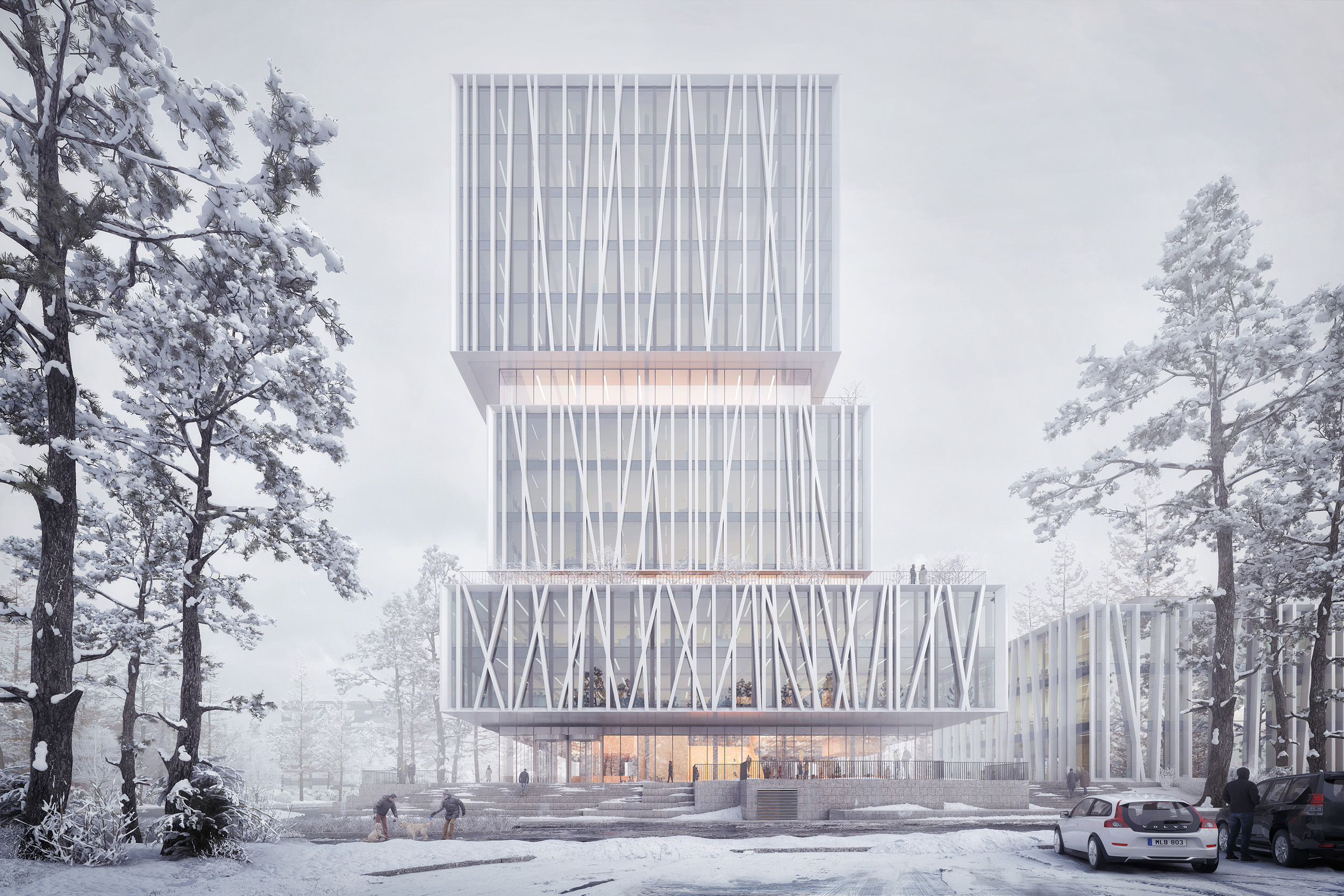
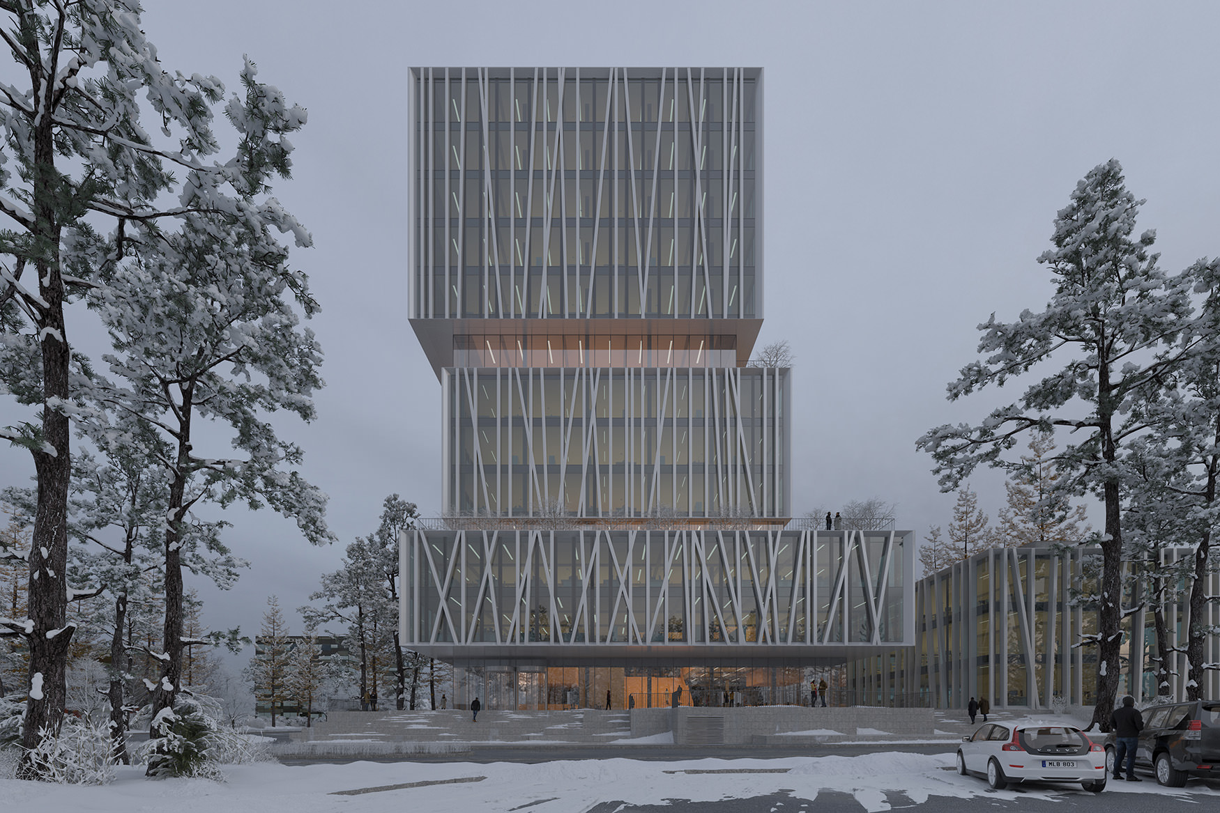
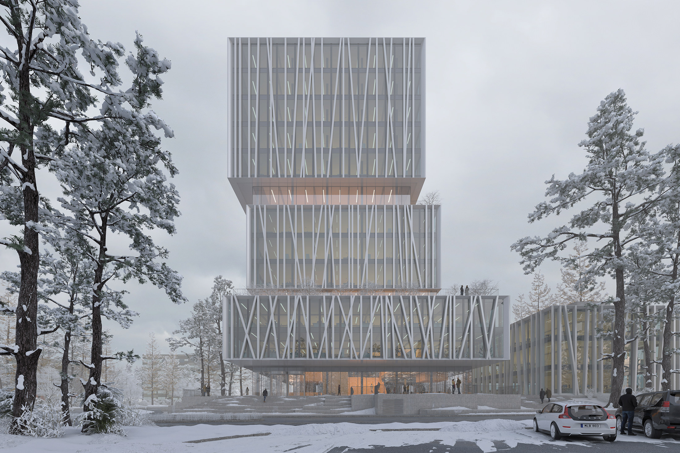
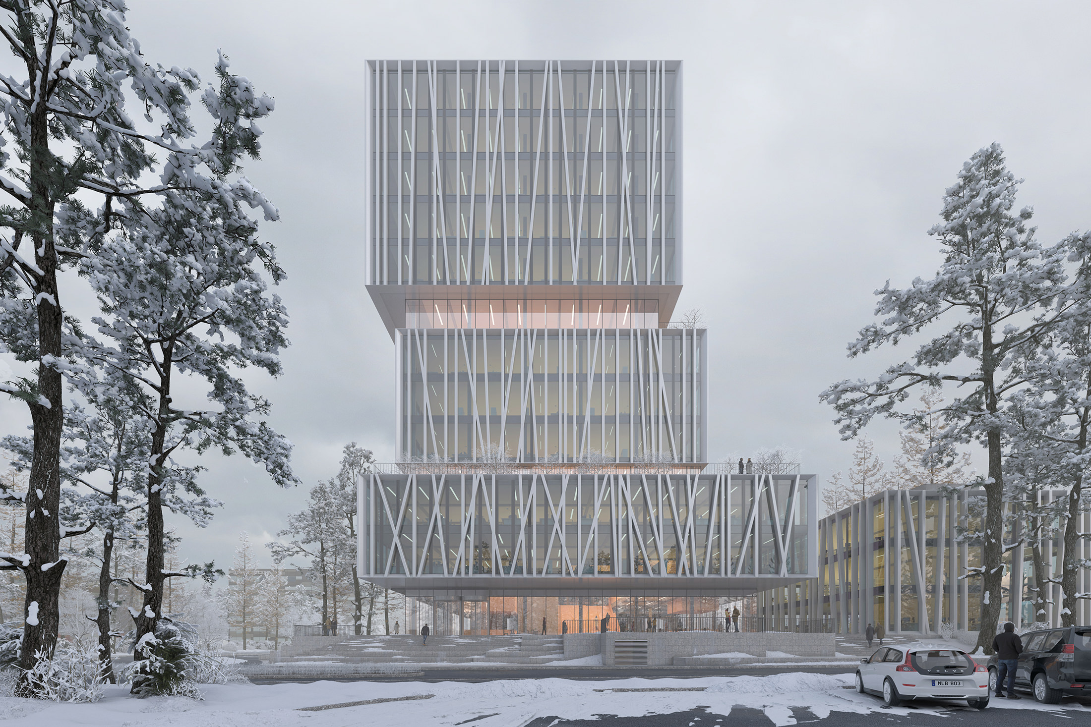
This is the making of two images I created for a competition proposal named WeXo we did in Henning Larsen recently. One image is an eye-level frontal exterior shot and the other one an aerial shot.
I’ll walk you through the process of creating the images and highlight a couple of tips I find worth sharing. My main toolbox consists of 3ds max, V-Ray and iToo Software Forest Pack + RailClone and Photoshop for post-production.
Modeling
The 3d model of the building originated from Rhino and created by the architectural team of the project. I always keep a dialogue with the architects on how to structure and model in a way that makes it easy to detail and work with after importing to 3ds max. This Rhino model was relatively clean and easy to work with.
The surroundings of the building like roads and sidewalks were modeled in 3ds Max. A method I find useful is to trace either a satellite image from google or a CAD drawing with the line tool. After a rough trace with only straight corners, I fillet all corners to match the curve of the road.
WeXo 3d Model in Rhino
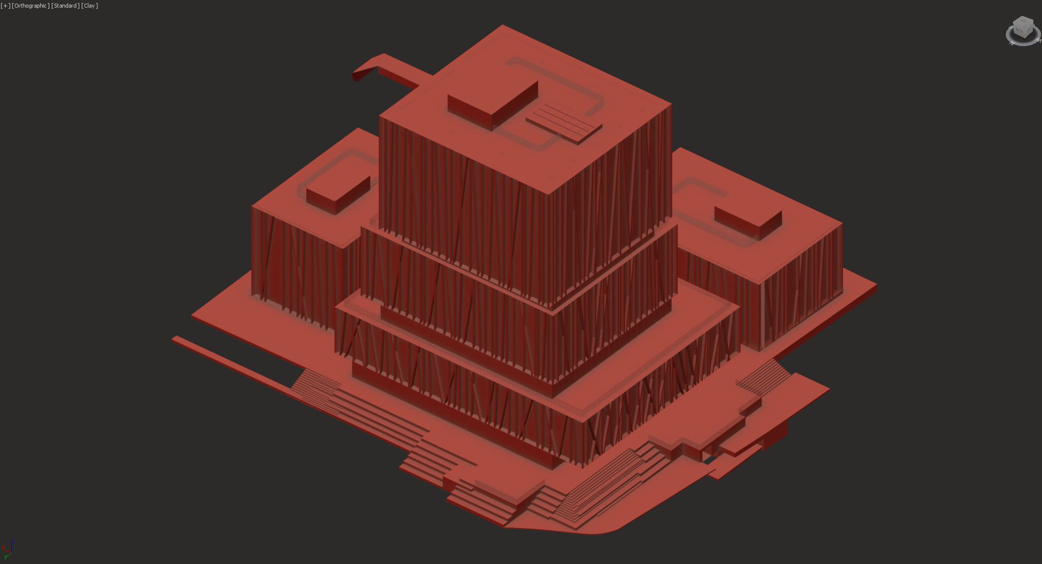
3d model in 3ds max
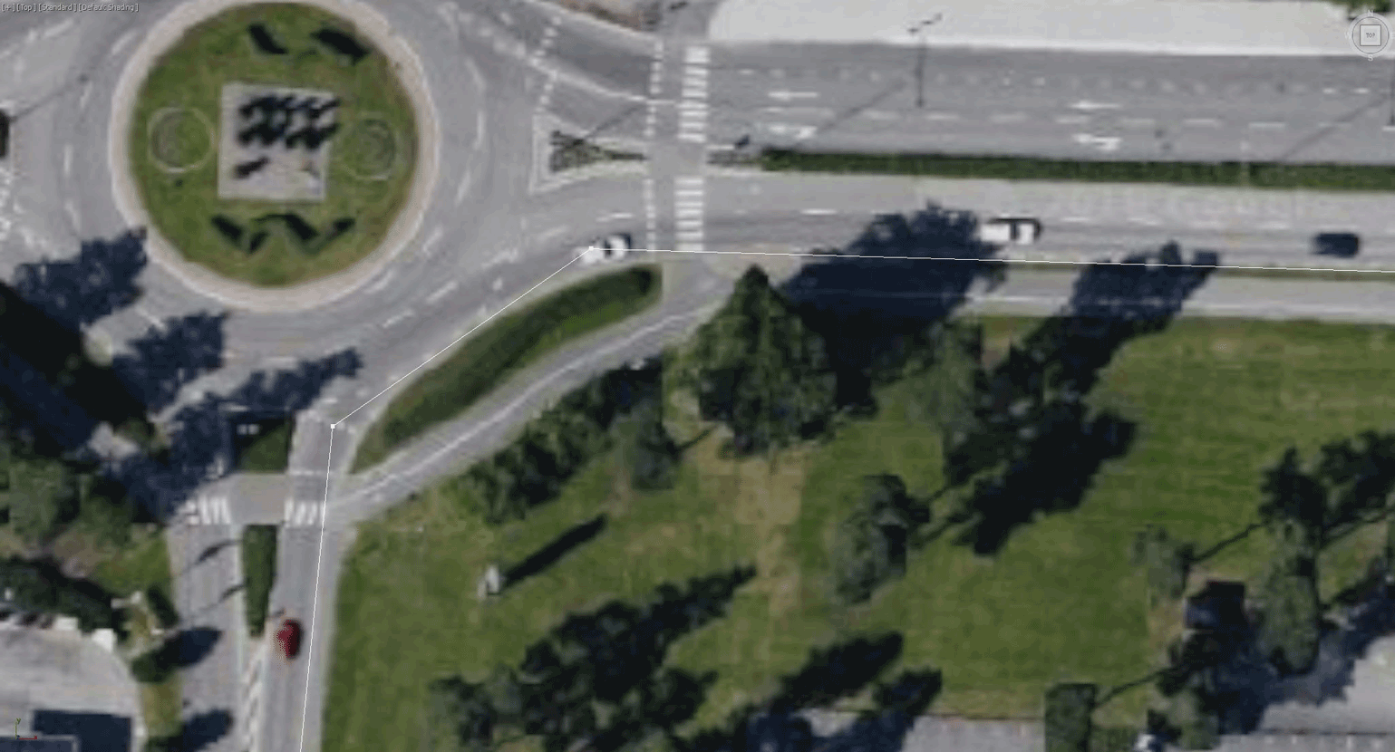
Tracing a google satellite image in 3ds max
The road in this project was sloping up a bit to one side. To create a slight slope, I do the following :
Select the street, sidewalks, and islands and add an edit poly and subdivide modifier to the closed splines. To be able to modify all at once I add an FFD (Box) modifier to all elements, and I adjust it according to the landscape. In this case, it was a minor modification to the flat landscape, but in more complex cases you can add more points to the FFD(Box). Another way to adjust or add detail to your scene is to add an edit poly modifier and use push/pull or soft selection.
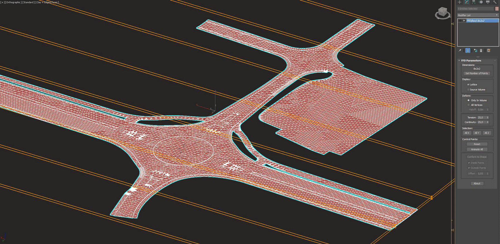
Lifting roads according to landscape on site.
The granite curb used in this project are a few simple boxes each with slightly different noise modifiers and UVW mapping to create some variation. The boxes are then arrayed along the spline with RailClone. Using RailClone gives maximum flexibility and scene performance. This is a straightforward RailClone element, but it provides the possibility to control dimensions and offsets from spline of the curb.
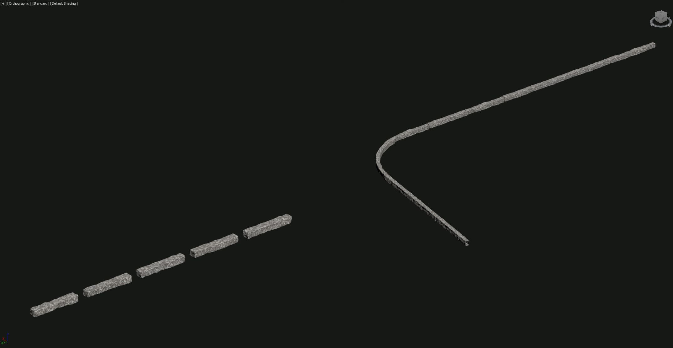
RailClone curb and segments.
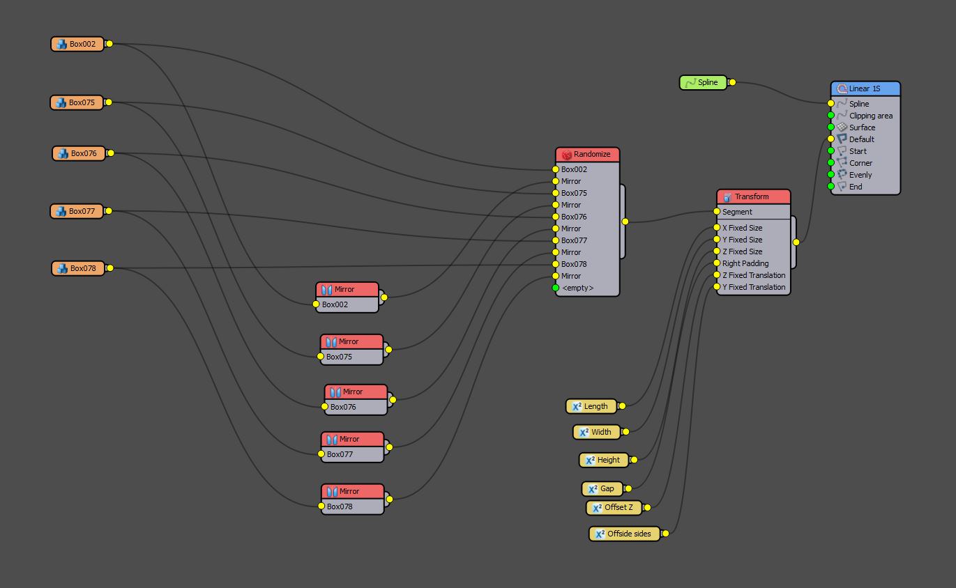
RailClone curb structure.
Composition
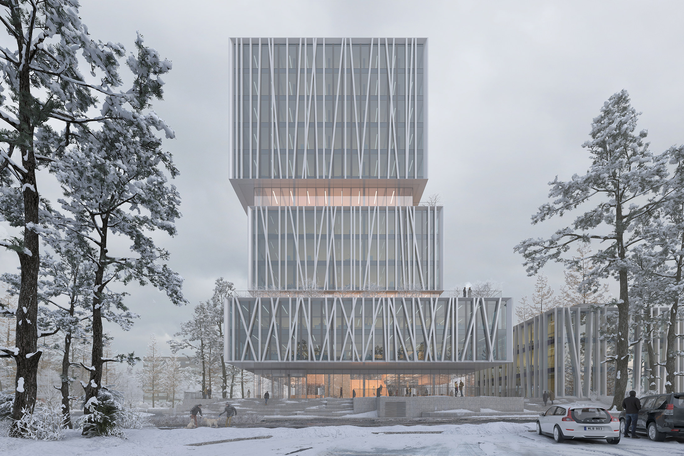
The project needed just one central selling exterior shot to go with the mandatory aerial shot. I tried a few possible angles, but the building’s architecture was screaming for a frontal composition for the main exterior view. Going for a snowy and misty mood in the image came from the fact that the project is in Sweden and because I believe the choice of materials from the architects would appear crisp and neat in such setting. This also gave the option to highlight the separation of the building’s “boxes” with some warm light.
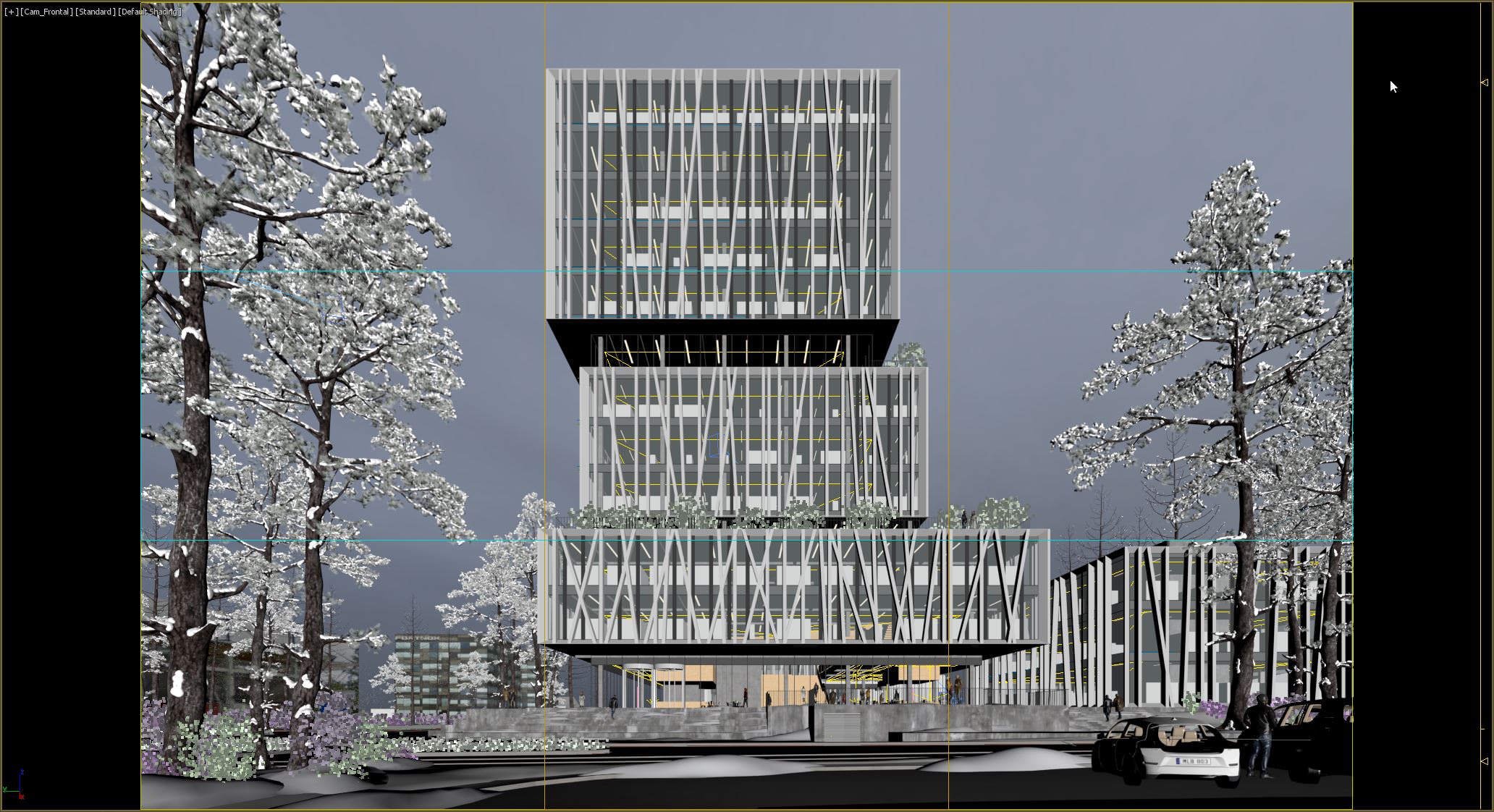
Viewport default shading in 3ds max showing composition with Rule of Thirds.
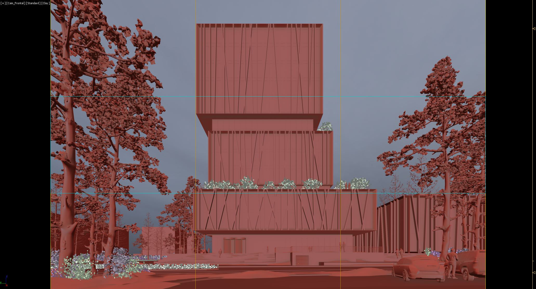
Viewport clay in 3ds max showing composition with Rule of Thirds.
To explain the visualization concept for the image I always try to use photo references. I look for images that can describe the overall mood and light but also references that tells how materials in similar lighting react. In this case, I have some photos showing misty, snowy situations, references that show how buildings with glass and metal appear in a similar situation and some showing the warm interior light I am after.

Reference Photos
Lighting
The scene is primarily lit by a VRayDome Light with an HDR image from NoEmotion.com. I find the NoEmotion HDRI’s giving great lighting for various situations. In this case, I actually used an overcast sunset HDRI which I have desaturated with a Color Correction map. This gave the nice overcast light I was looking for. The inside of the building is lit by VRayPlane Lights with warm temperature. Using materials with warm colors in the interior such as wood ads to that warm glow from the inside.
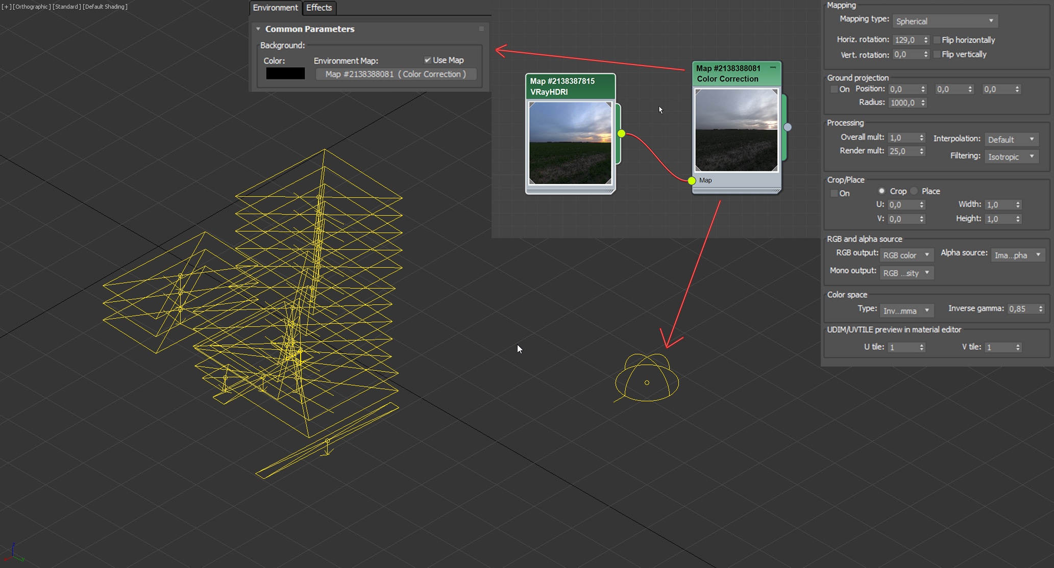
V-Ray lighting setup.
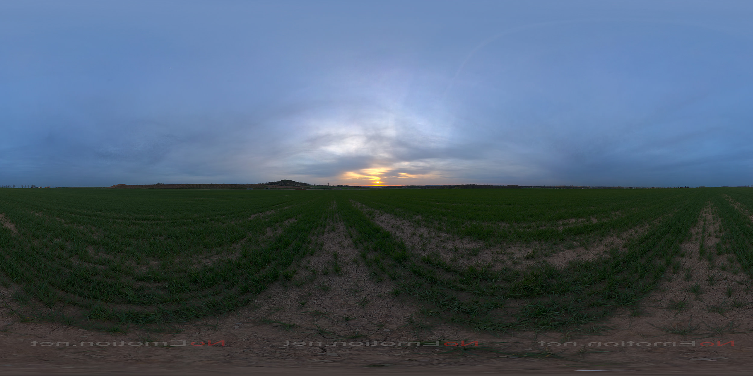
HDRI from NoEmotion without desaturation.
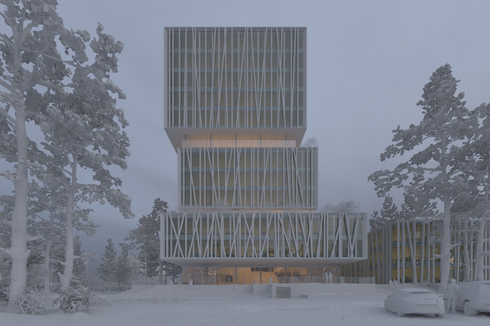
Simple clay render.
3d Assets
After mocking up the surrounding landscape and locking in the camera (overall composition), I start ‘set dressing’ the scene with the assets I find needed for the scene.
A thing worth thinking about at this stage is which elements you might want to add in post-production later and which ones are needed in 3d. If I know I will add something later in post-production like a tree in the foreground, I often add one as a placeholder in the scene for composition purpose. In this particular scene, I went for the solution to render out the trees and not adding them in post-production.
I always distribute and scatter my assets with the use of iToo Forest Pack and RailClone. I try to set up the 3d assets, I use the most, in Forest Pack libraries which can be a huge time saver. You can browse the assets in 3ds Max and load them in quickly as XREF objects and scatter them around the scene without the scene getting too heavy. I load in my assets through Forest Pack even when I need to place them manually.


Materials
The materials used in the scene are pretty basic. A few interesting ones to look at are the snow materials.
I’ve created three snow materials for the scene. All are set up the same way with scanned textures from textures.com. The three different types of snow were :
- Snow Plain
- Snow Rough
- Snow Tire Tracks
The Diffuse map is a composite of the Albedo and AO texture. Important to notice is the use of a grayscale 16-bit or 32-bit displacement map in the VRayBmpFilter to get a smoothly detailed displacement. Using 8-bit can give a “stepped” and less detailed looking displacement.
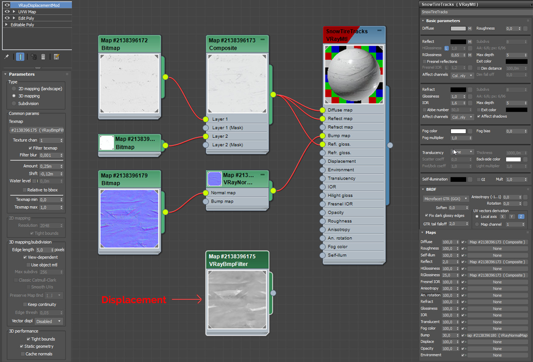
Snow tire tracks material editor
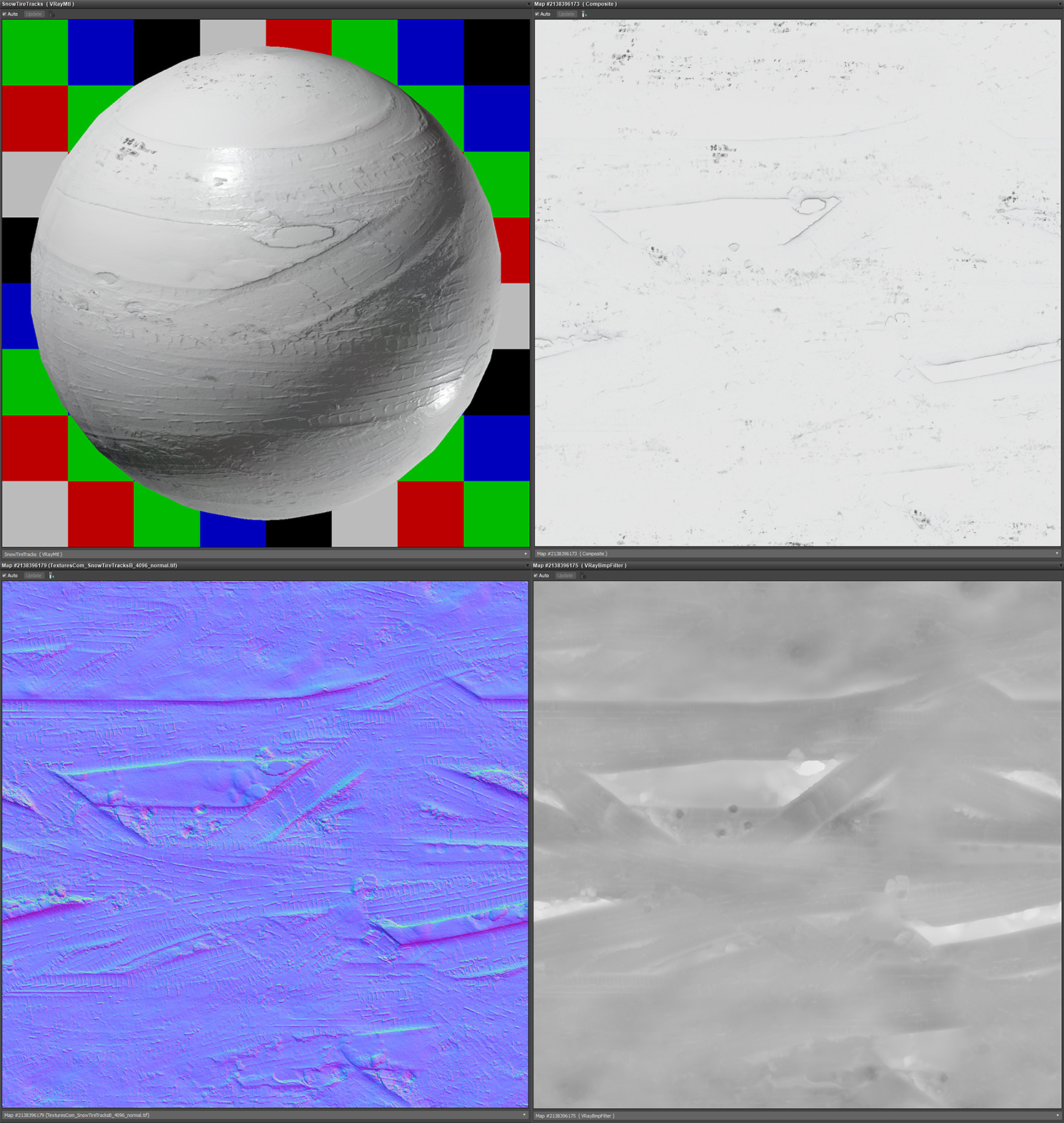
Snow tire tracks textures and preview
Another material is the granite tiles on the base and steps of the outside bit of the building. I’ve used a simple granite texture together with 3dsmax’s procedural tiles to create the base material. I’ve used a dirty concrete texture to create some icy looking bits to blend on top of the granite with a VrayBlendMaterial.
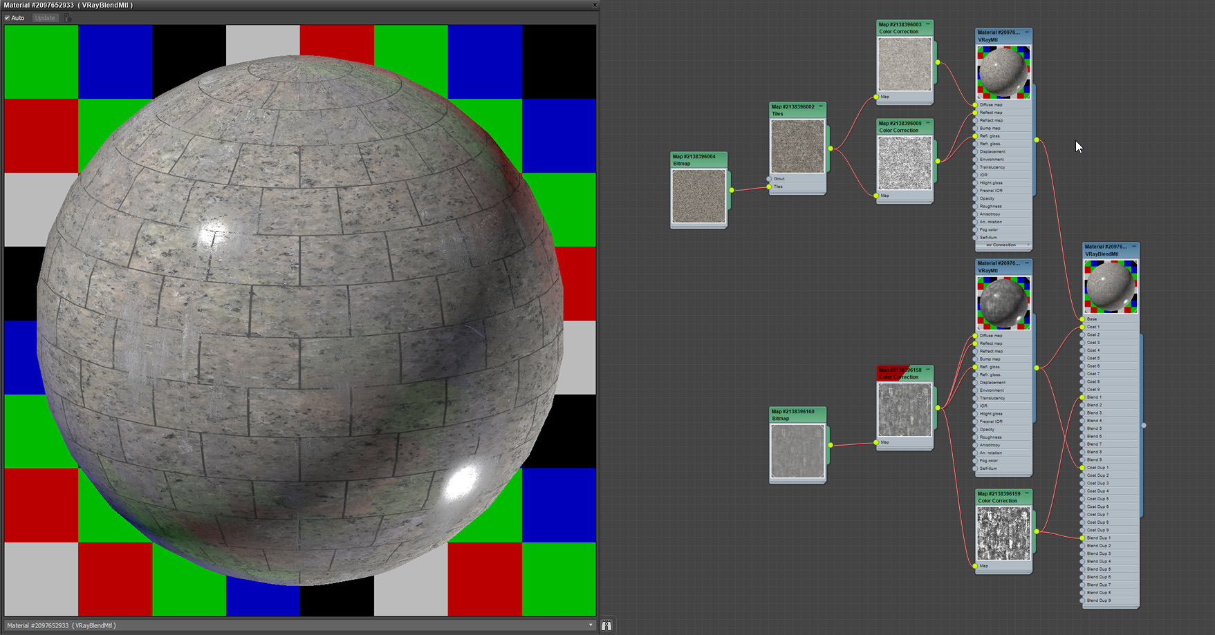
Granite tiles material editor and preview
Render Settings and Output
I use V-Ray CPU as my render engine, and my settings are really pretty generic. Render engines, in general, are becoming easier to use and there’s not much to say about the settings.
Render Settings
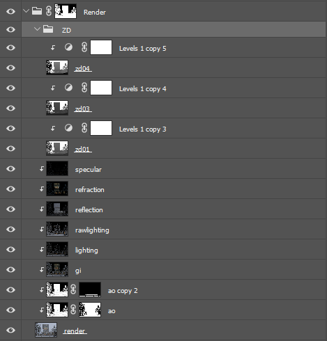
I always render out a lot of render passes to give me full flexibility in the post-production. Mainly, the passes are used to create various masks and control light, reflection and refraction. The main render passes used in the post-production
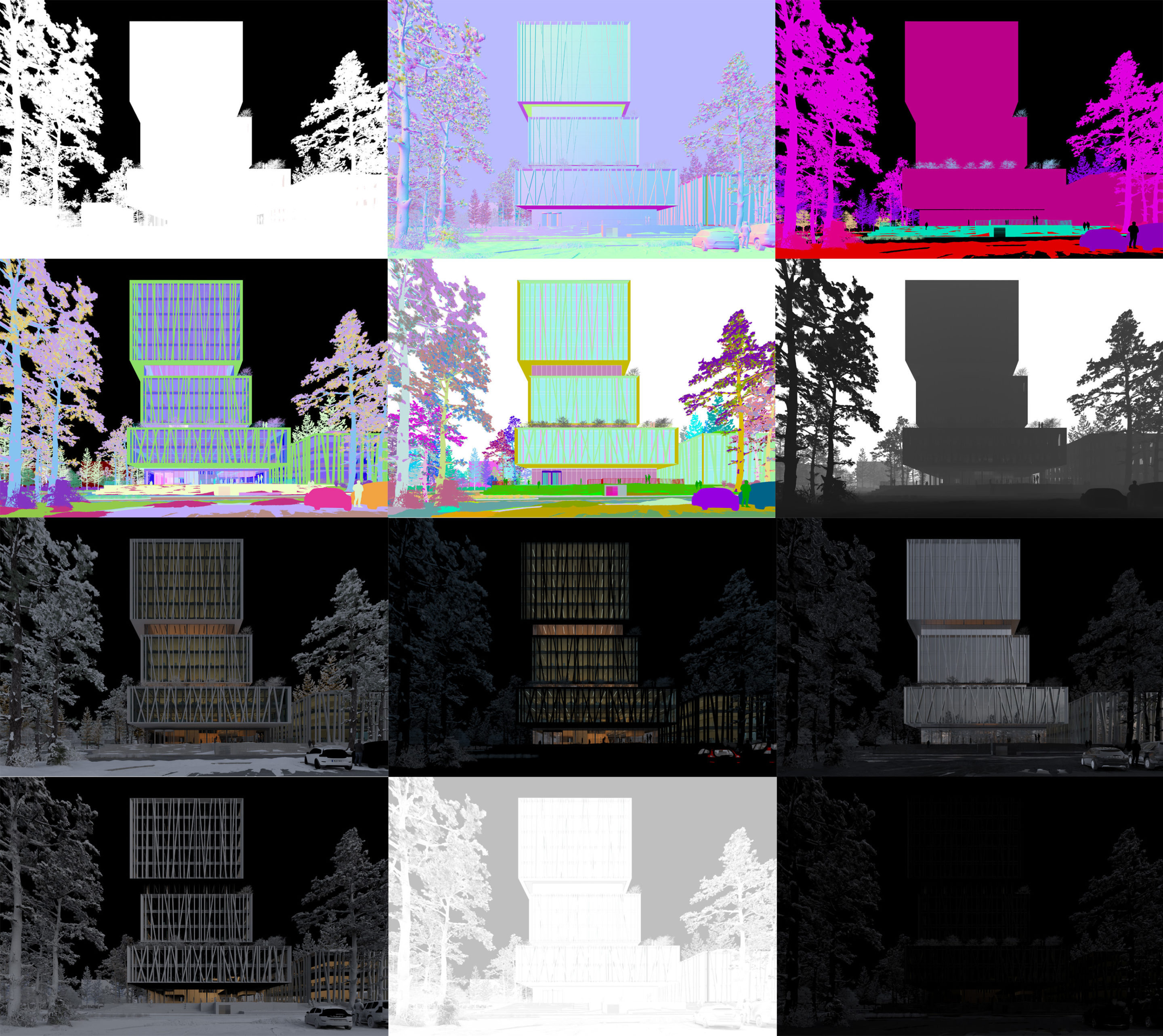
Render Passes
Post-Production
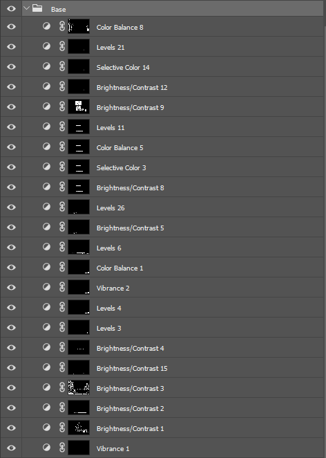
I work structured and non-destructive in Photoshop. This gives the flexibility to amend comments from the architects but also gives me freedom as an artist to reach my desired result. It sounds obvious, but not having to struggle with destructive and messy layers instantly improves the quality of your artwork.
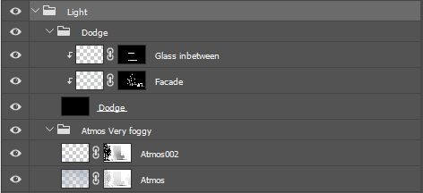
I structure my workflow in the following main steps :
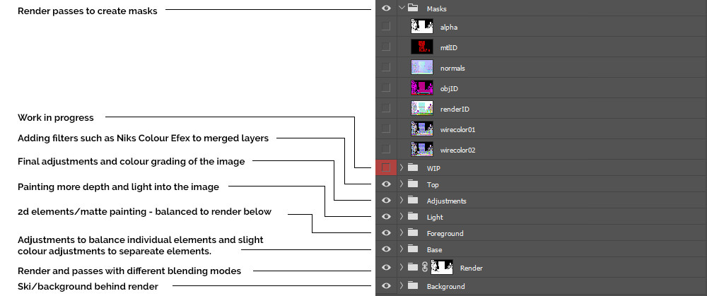
Photoshop files layer structure
I prefer to work from a flat 8-bit base render, making sure I have all the information in the image that I need for an optimal post-production workflow. I don’t blow out the lights from the inside nor from the sun if I have direct sunlight in a scene. I can always intensify or blow out lights if needed in the post-production depending on what result I am after. Notice there are no areas blown out (RGB 255,255,255) or areas that are too dark (RGB 0,0,0).
Raw render/beauty pass
Step: Render
In this step, I’m adding render passes with different blending modes (mostly color dodge, screen and multiply) on top of the beauty pass to bring out a bit of light, reflections, and depth in the image.
The result of the Render step.
Layer Structure of the Render step.
Step: Base Adjustments
The base adjustments are basically adjustments to separate elements of the image to balance everything together. Some elements might be too bright, some may be too dark, and some may need slight color corrections. Instead of spending time adjusting every material in my scene I prefer to make those minor adjustments in post-production.
The result of the Base Adjustments step.
Layer Structure of the Base Adjustments step.
Step: Foreground
Here I add all the 2d elements I need in the image. It can be people, vegetation, vehicles, and other elements to add detail and realism to the image. All 2d elements get balanced in terms of contrast levels, color and light according to the image as it appears after the Render and Base Adjustment step. This way everything comes together, and it shouldn’t be recognizable what comes from the render and what is 2d added in post-production. There’s no right or wrong way to achieve this, but it requires a lot of practice to get right. I have seen excellent images (including my own) fall apart because people in the images aren’t composed and balanced correctly.
In this image, I already have some good looking 3d people from the render, so I only added to that my “hero characters” – the two guys with their dogs. I’ve added some details to the snow and road in the foreground. For the building itself, I have refined the reflection of the glass.
The result of the Foreground step.
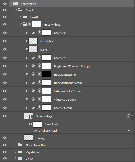
Layer Structure of the Foreground step.
The process of balancing people into the image in Photoshop…
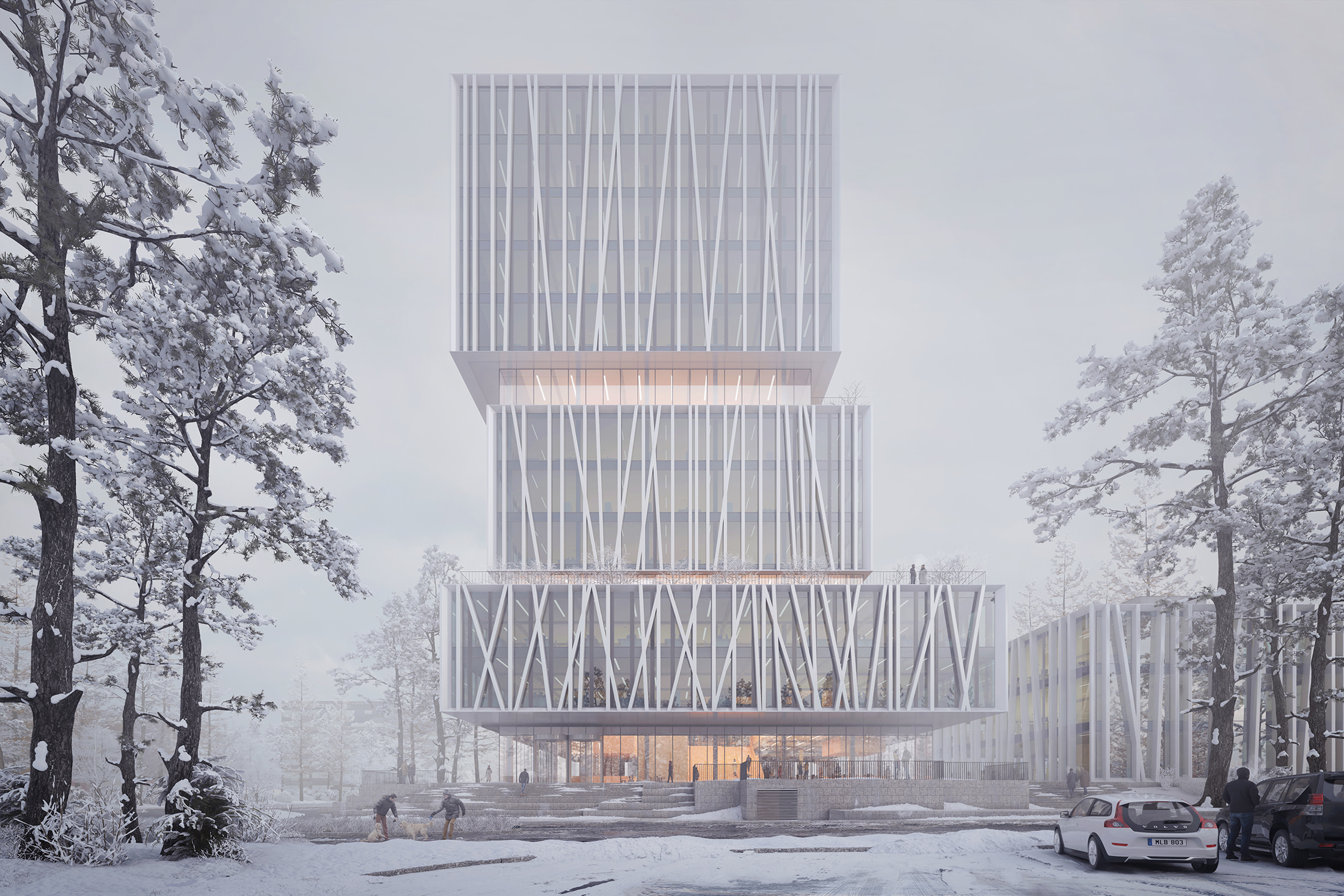
Step: Light
In this particular image, to reach the very wintery misty atmosphere I was going for, I exaggerated the mist very much. I usually take a color from the sky (to match the color of the image) and then I paint in some mist/depth with a soft low opacity brush. A bit of the heavy mist can disappear depending on how I add my final adjustments in the next step. Therefore a good tip is to always exaggerate at first and then you can still reduce or control the intensity later. I’ve also boosted the light a bit in the “cuts” to not lose them too much in the mist.
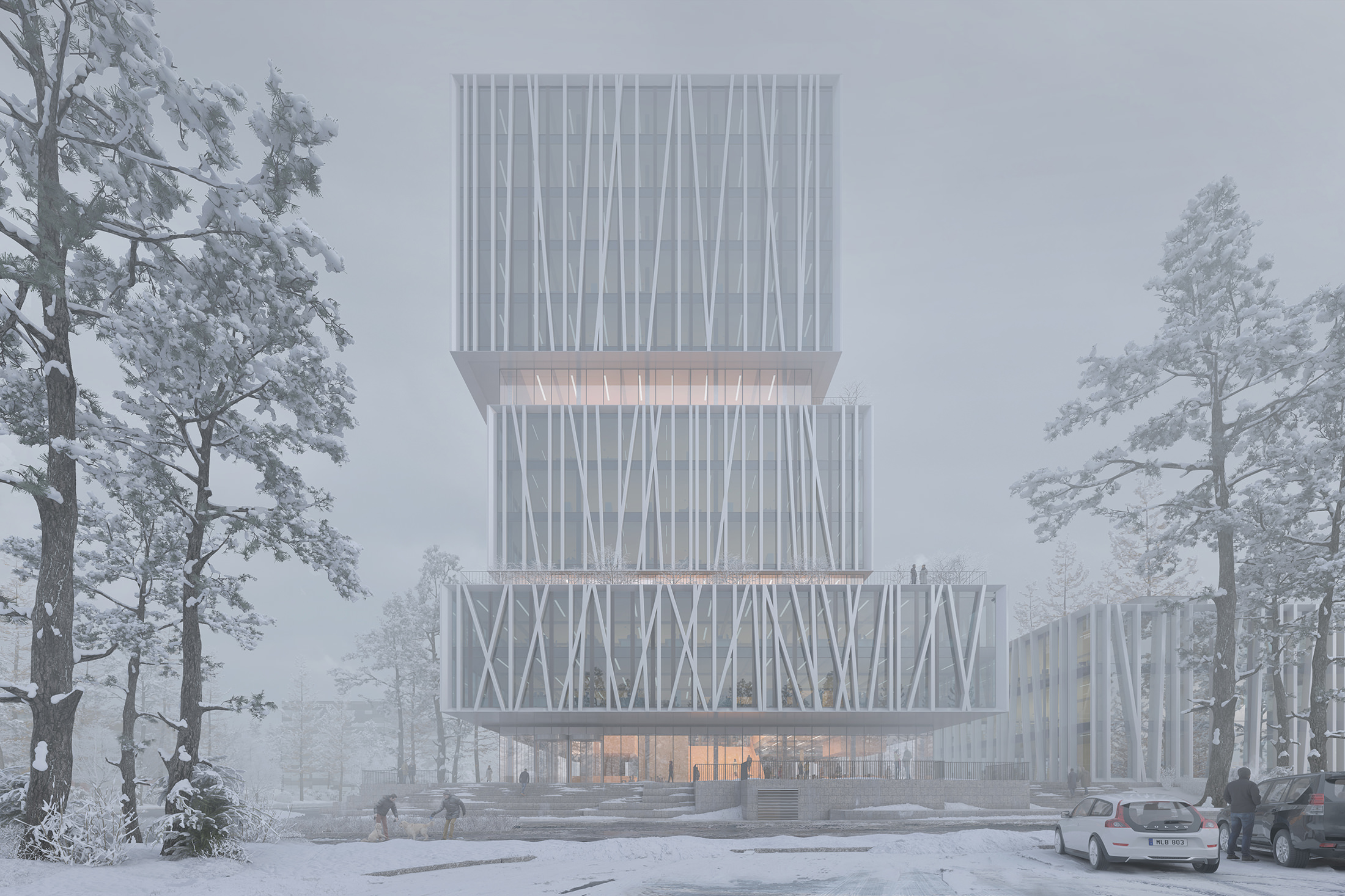
The result of the Light step.
Layer Structure of the Light step.
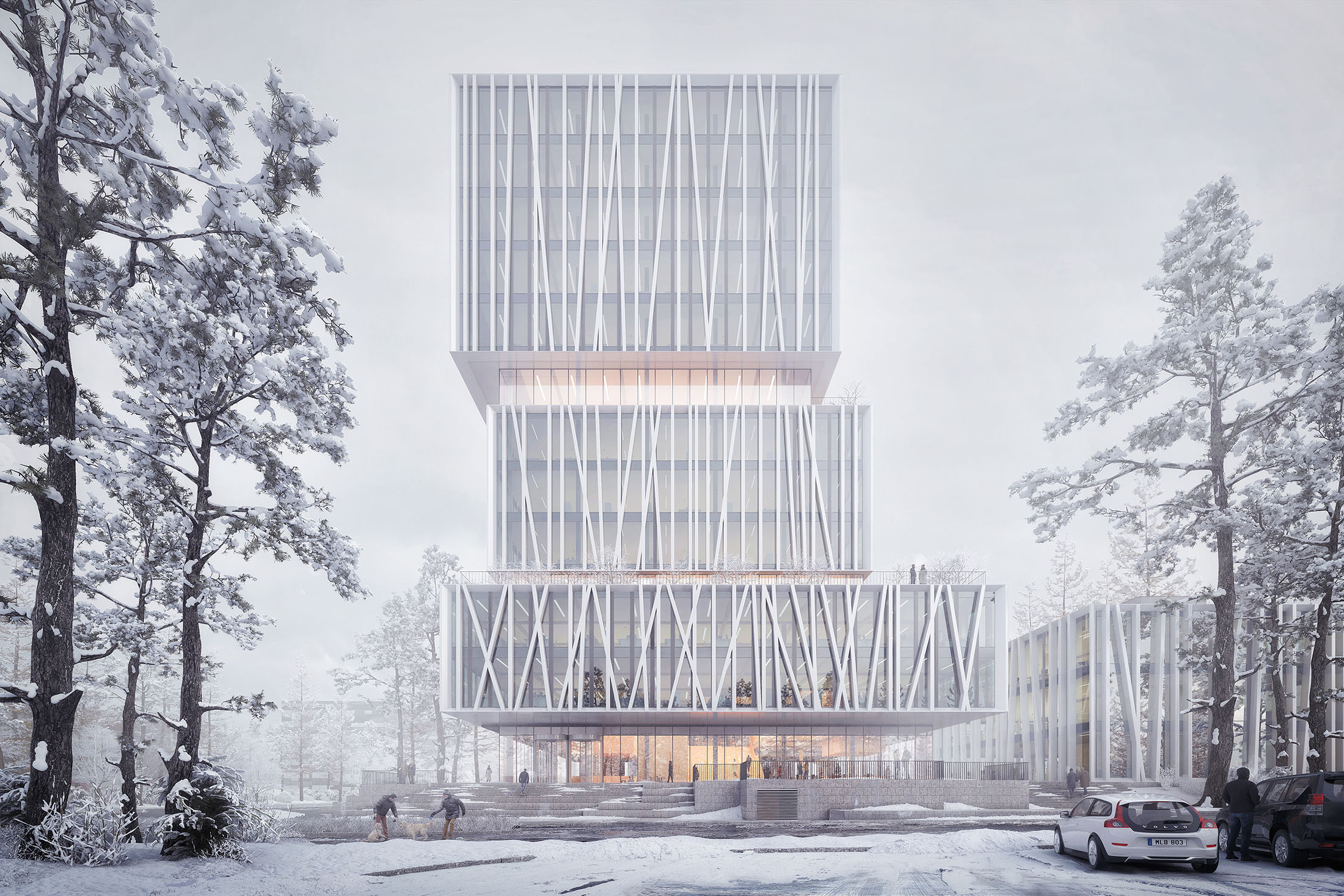
Step: Adjustments
This step is all about color grading and adjusting the image according to your liking. There’s no “one fits all” solution here. Having a reference (photography) that you are aiming to match is highly recommended. Try to match colors and contrast of the reference.
What’s really tricky with this part is that colors can vary a lot depending on which monitor it’s viewed on. Doing your post-production on a calibrated monitor with good colors can be a big help. I try to always work on a monitor with the same color calibration that works for me. That way I can adjust images to a similar contrast, etc. which gives consistency in my work and the clients know what they will get.
The result of the Adjustments step.
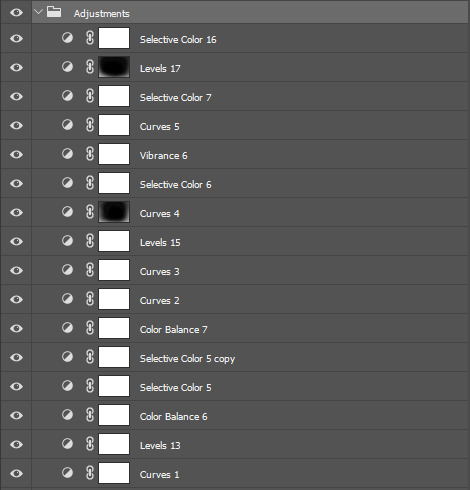
Layer Structure of the Adjustments step.
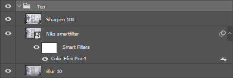
Step: Top
Here I merge layers on top of the stack (ctrl+shift+c and ctrl+v in Photoshop) to add some filters as the final touch of the image. The “Blur 10” is a merged layer with a Gaussian blur filter with a radius of 10 pixels. This adds a bit of extra contrast to the overall image.
Next, I’ve added another merged layer which I have converted to a smart object and applied some filters with Nik Color Efex Pro. What I find essential when applying Nik’s is to keep it simple and subtle in order not to overdo it. I mostly use the Glamour Glow, the Tonal Contrast (to bring out some detail) and the White Neutralizer (to control white balance in the image). In this image I actually boosted more with Nik Color Efex, than I would typically do.
The result of the Top step.
Layer Structure of the Top step.
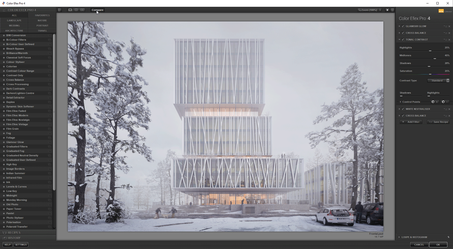
Before and after in Nik Color Efex Pro.
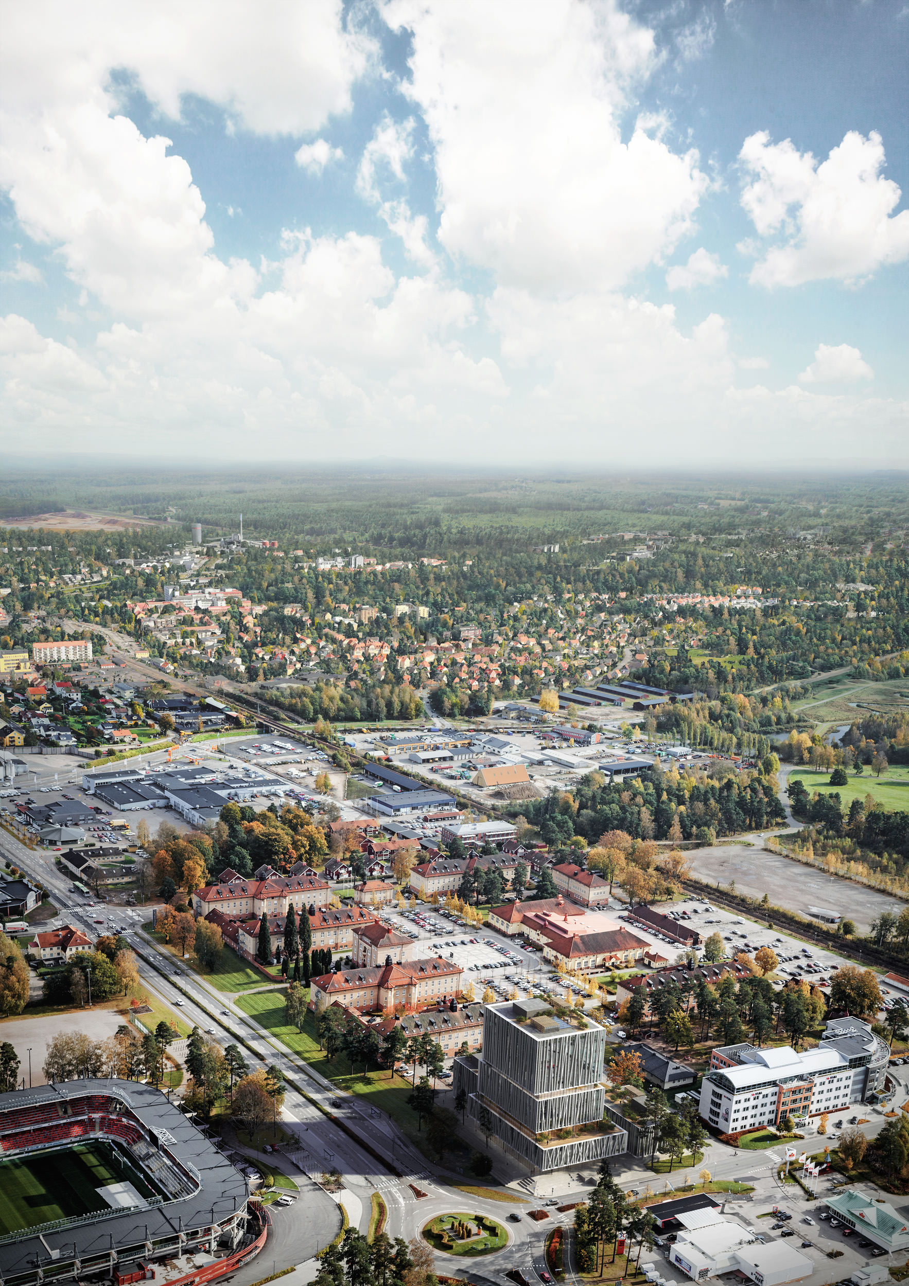
The Aerial Image
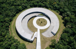
The second image I did for this project was a mandatory aerial image. The competition brief provided a drone photo showing just the close surroundings of the project site. I agreed with the architectural team that we should create a stronger composition and we went for a portrait format
image showing the Skåne landscape, horizon and sky in the background.
I roughly matched the view of the drone photo on google earth and placed that behind the image to get in the horizon and a starting point. I then used simple matte painting techniques to get in similar trees as from the photo and extend the background with aerial images of Skåne I could find online.
It was a quick process to create that image, but it turned out as we were hoping and created a much more powerful image.
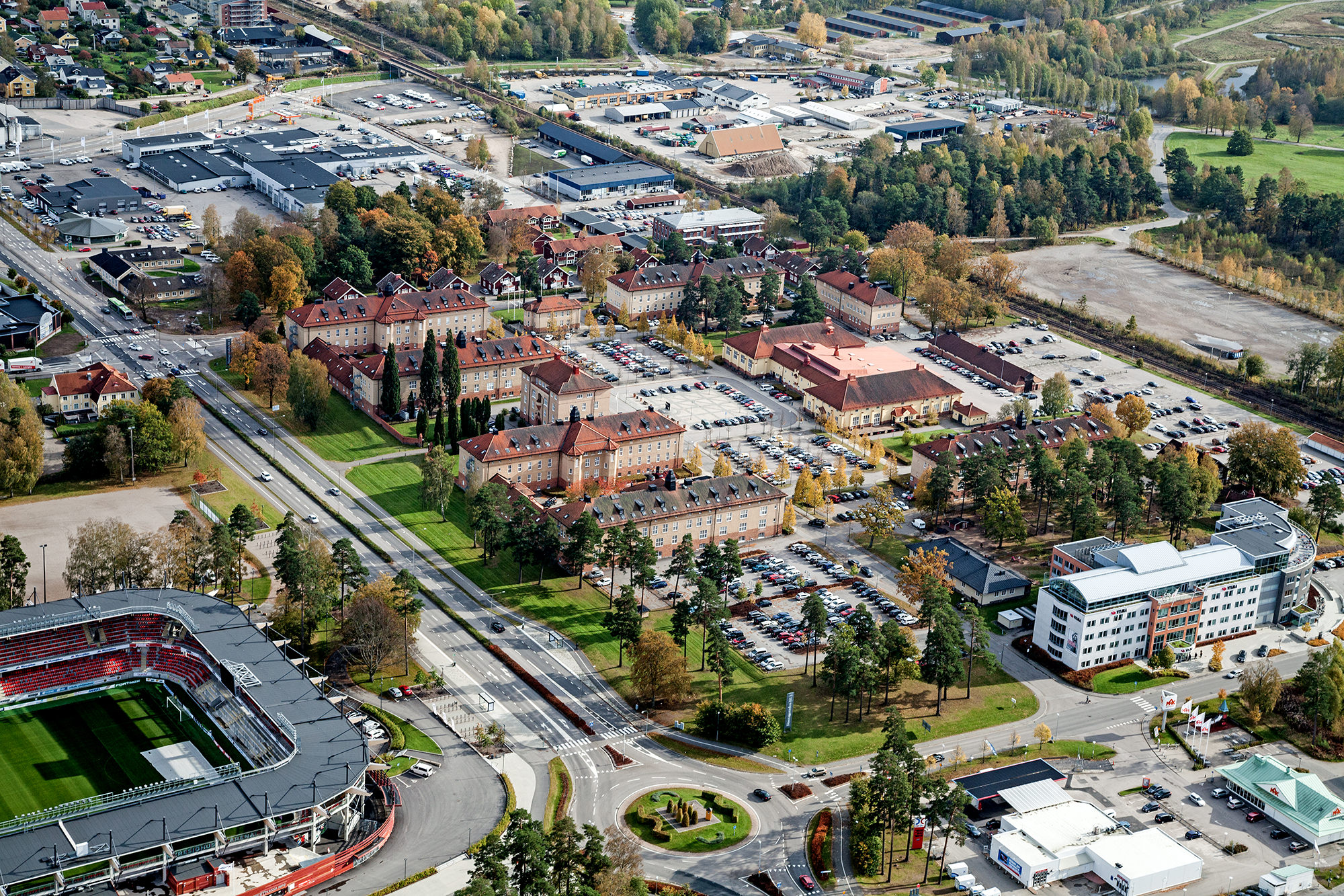
Mandatory drone photo provided by competition brief.
That’s it from me!
I hope you’ve enjoyed it and find some inspiration in my workflow.
Check out more of my artwork :
https://www.behance.net/sonnyholmberg
https://www.instagram.com/sonnyholmberg

