


Making of Apartment Interior by Romi3D
Romie Valentino’s White / Pink Apartment Interior awarded him as one of the week’s best back in September 2012, and today he comes back, sharing with us a little bit of the behind the scenes. Romie didn’t only do the 3d here, but also responsible for the interior design of the apartment. Enjoy this one and let us know what you think by commenting below.

Author : Romie Valentino
Romie Valentino is an Indonesian based 3d specialist, creating visualization for architects and interior designers. He’s currently looking for a full-time 3d job placement overseas.
Introduction
Hi everybody,
I’m very glad to share a bit of my 3d work here, on Ronen’s blog, and hopefully it will help and be an inspiration to you all.
This article describes key points in making of an apartment interior design project in Canada. I’ll cover approach to making materials and settings, specifically focusing on the specular channel of the material, as well as image composition and Photoshop techniques used during the post-production process.
Workflow Baseline
I always keep a few things similar at the get go of each project as that helps me keep things in order and allows me to focus on the main concept and specific design.
- I start with an in depth interview with the client to fully understand their needs.
- Run a fast initial concept check with the client to see we are on the same page before the real 3d stuff starts.
- Full production of 3d visualizations.
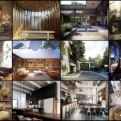
Below is the mood-board / inspiration collage that I had to go with initially…

The client’s goal was to convey a soft space combined with artwork, but not to much of it. My challenge was making this a clean look space with dominant white and pink colors without coming off too girly and/or boring. Adding a bit of black and purple as contrasts did the job of keeping things in check!
I was deeply inspired by the works of Samantha Pynn while working on this project, specifically from Ryan’s condo images. It had a lot of similarities to the project at hand and my ideas for it. After I finished with the interview and chat with the clients (skiping the fast check part for this article), its was time to bring to life to 3d visuals.
Units in check…
Unit setup is no small matter. Because i’m in south-east Asia and my friend is in France intending a move to Canada. I had to decide on the units and keep them constant during the process so all thing are proportional and in real-life size to allow for physically correct renderings. I worked in CM.

Linear WorkFlow (Yes… Again!)
I use the LWF method for my renderings. Much has been said about this and no once could make Linear Workflow simpler to understand than Matt Gorner.
So enough about it after this pic…

3D Modeling
In this project I modeled the basic walls directly within 3dsmax without CAD reference as I normally would. Starting with a line, than extruding it – adding chamfers where needed and using Booleans to cut holes (despite being a less recommended method of modeling in arch-viz).

After the base was done, I went on with modeling specific interior accessories.

For the floor modeling I use the popular FloorGenerator script, which made this process easy to control and fun too. You best refer to Bertrand Benoit’s article about Using the FloorGenerator Script in 3dsmax.

I also went in and added some externally made 3d models sourced from Evermotion’s Archmodel collection 64 – Oriental Gadgets.

I used Marvelous Designer to do the cloth on the chair. Adding that bit more of “Life’s dirt” to the image and overall realistic look. See Ramon Zancanaro’s in-depth article for more about 3d cloth modeling Marvelous Designer.

Lighting
Nothing very special about it really 😉
The apartment is averagely spaced with higher than usual ceilings, which could account for a sense of emptiness at the top. For that reason I used a few hanging lamps and simple lighting from the front. I’ve also added VRay Light Spheres differently setup for a bit of lighting variation in the scene.
No V-Ray Sun here… No V-Ray Dome Light here too!

Viewpoints and Cameras
This part I spent considerable time on, exploring the various option to show the space. You can get lost in technical 3d stuff and forget about the most important thing in the end – Show it correctly in terms on conveying the sense of space!
I used VRay Physical Cameras here.

Materials
Let’s run down a few materials used in this scene with screen shots…
parquet


white material on long cabinet


“A” letter rustic sign


Texturing
I usually unwrap using pelt to pelt mapping or simple box mapping… depends on the object really. This is a time-consuming process, but one that has big benefits once done.
if you wanna know more about it visit this UVW Unwrap tutorial.

After I Unwarped the chair model, I edited and textured it within Photoshop. I made sure the texture looks seamless by stamp cloning and tweaking it a lot until I got the result I liked.
Most importantly – YOU NEED BIG TEXTURES TO START WITH! I usually start with 2000px but can go all the way to 8000px. I found great textures over at CGTextures. All I needed was adjust the color to purple in Photoshop.
To make a specular version of the map, just convert your diffuse map to black and white. Play with levels and curves to add more contrast and really define those areas you like to be specular the most.
Specular is actually reflection of the surface.
See the images below for the before and after state of the chair…
no specular map(diffuse map only)

Above I used no specular map, just the diffuse map. Below, adding a specular map make the materials look like the leather it is. You can see how the B&W version of the diffuse looks after the edit and the effect it has on the material final look.

Many people asked me about how I made the leather material on the big ‘A’ letter I placed in the scene. Well… normally when I use an old texture, I always refer to old furniture stores, or find some stuff in a junkyard in my neighborhood Not all things are online you know.
Think about seeing it and feeling the texture in real-life? You will find you better understand it, and thus better at implementing it.
Rendering
Here are the render settings. I like to use adaptive amount of noise 0.07 and 0.001 for noise threshold to reduce overall noise in my renders.

I also add a bit of render elements for help during the postwork process. Not going all crazy with this one.

Post Production
Probably my favorite part of the process – where all of it comes together!
This is my first render result (raw render).

Then I went in Photoshop and adjusted the gamma.

I stacked all the render elements inside Photoshop using relevant blend modes such as overlay or soft lights layers.

To answer the questions about using the “blue fog”.
It’s not a fog, just a simple new layer, cropped as a circle, with blue color adjusted to soft light and blurred. A bit more tweaks with opacity – and that was it!

I use Magic Bullet stand alone software, and not in after effects. I adjust mood, lift the gamma, and brighten some spots.

Then I move to After effects to “play” with DOF (Depth of Field blur). I love doing this in AE because if gives me more control over it. I use Frischluft plugin, and that was a fun process.

Lastly, I used Knol Light Factory to add some lamp blurs.

I guess this is it for this one!
I hope that this inspired you in some way… especially newbies. I’m learned 3d on my own from scratch. Following the footsteps of those before me. I hope I can play that role now for you.
Be hungry – Get Better!
Final images below…


HI,
You rposted blog about 3d architectural rednering is good.
http://www.3d-architectural-rendering.com/3D-Interior-rendering.html
A new paint job on a bed frame or nightstand can be just as impactful as new color on the walls. If you can’t paint the walls in your apartment, paint your furniture.Thanks For Share Such A Great Information