


Customizing Textures for ‘Post-Digital’ Visualizations
Working in architecture over the years, Ryan Canning found that he’s often unable to find the exact material he needs for an image (really!), ending up manually adjusting one in Photoshop. Fast forward one year, and he built this tool that can help with Customizing Textures for ‘Post-Digital’ Visualizations called Architextures Create after learning web development as a hobby.
This might be a bit off-track, but this type of visualization is becoming increasingly popular in architecture schools as a design and development tool and deserves a showing. Besides, this tool is cool, and it would be great to see and help it evolve.
Here are three examples of this style :

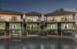
Villa Vught by Ara-Zárraga
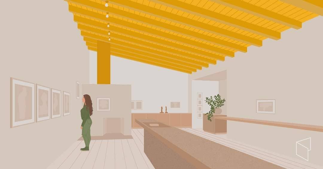
Casa Estudio by Alzado
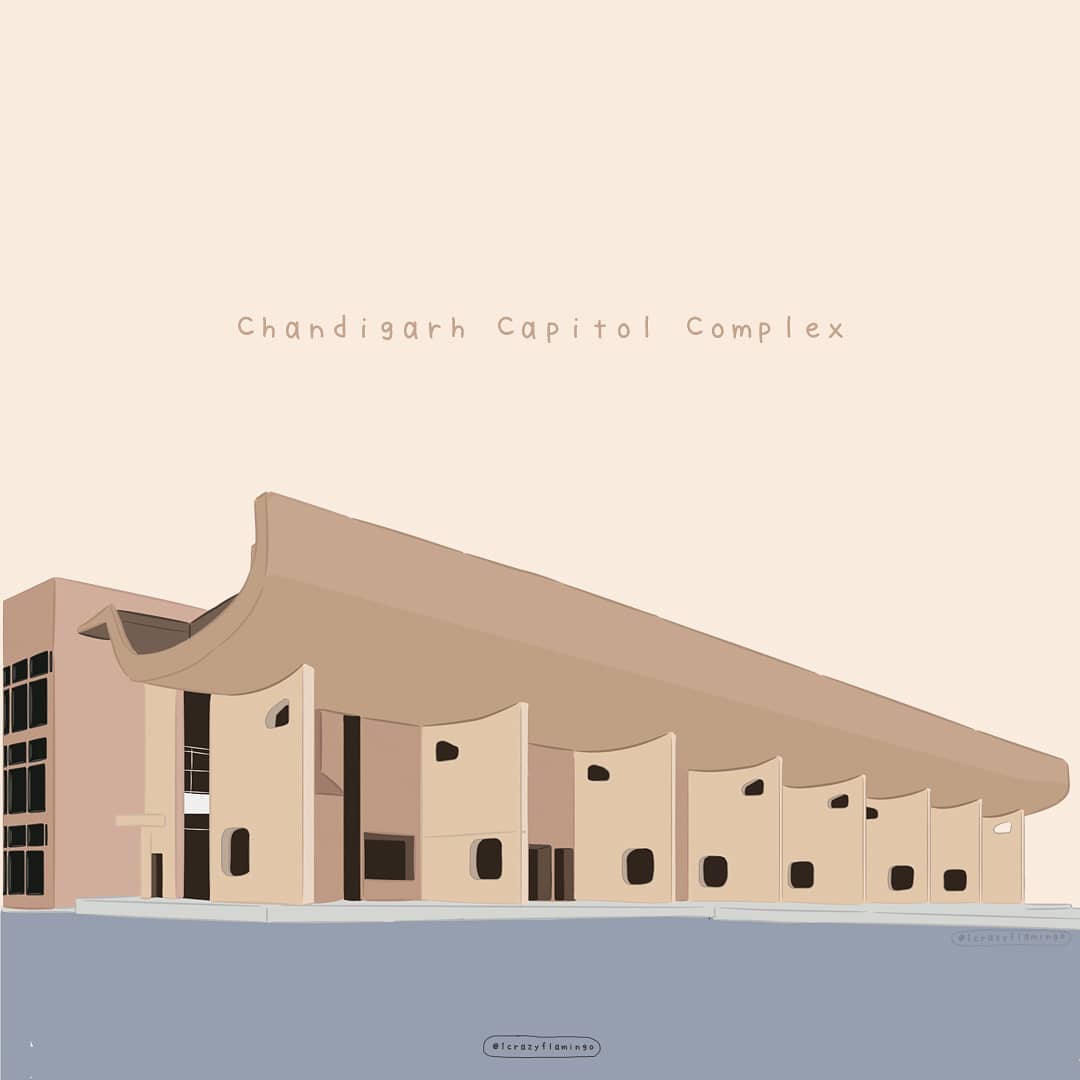
Chandigarh Capitol by Vishakha Sarpal
Before we look at a use case example, you should know Ryan made the site free for personal and educational use and offers Pro accounts for commercial use, which helps him continue developing it.
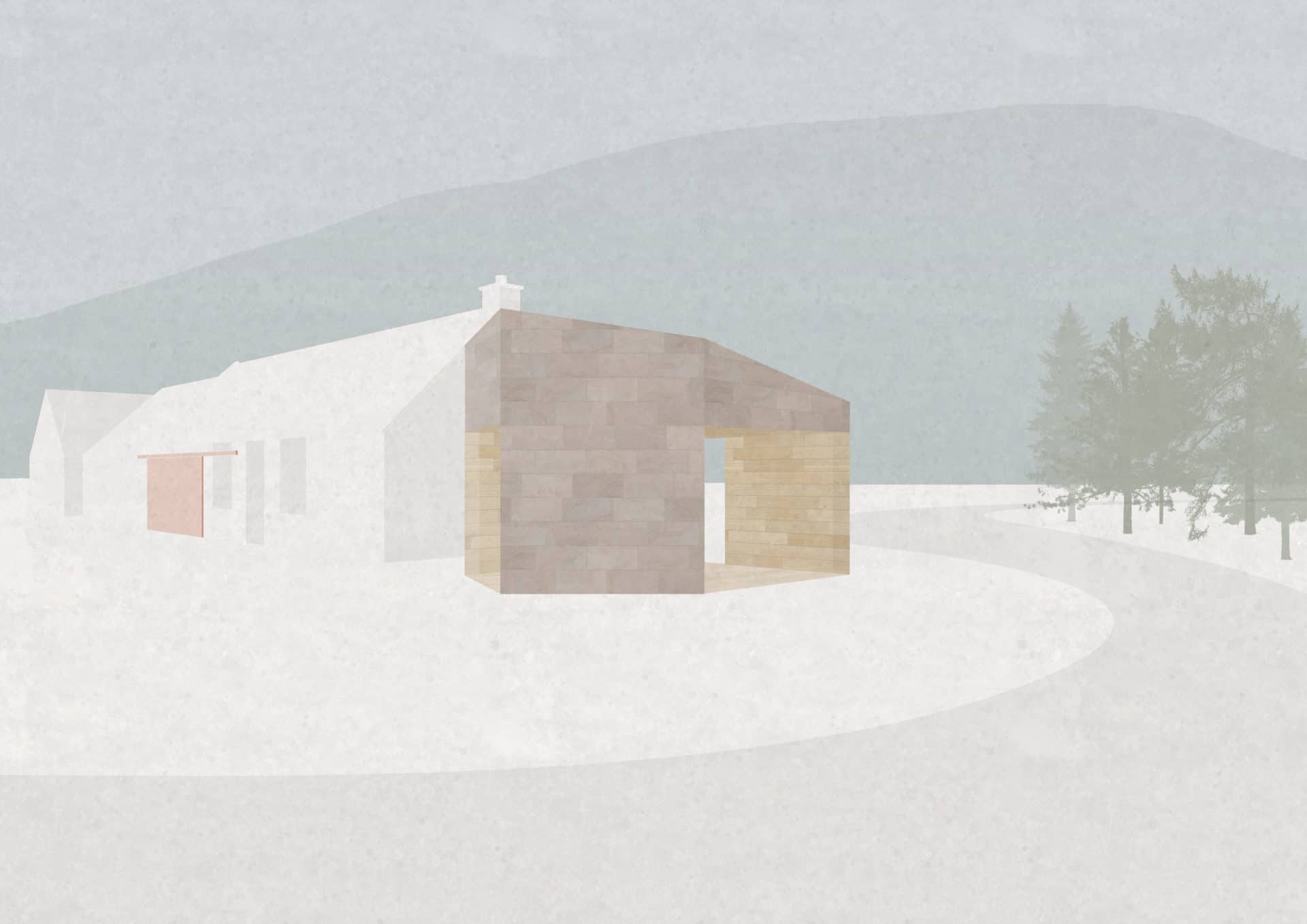
Image 1 – Finished image
This tutorial will show how to customize a sandstone texture in the Architextures web app and apply the texture to a perspective view in Photoshop. The view is a very basic illustration created to quickly show the concept design in 3D while still communicating a sense of materiality. This type of ‘post-digital’ illustration can be extremely useful in developing and presenting designs. It only shows the fundamental elements we want to discuss without spending time and effort modeling finer details that are yet to be fully resolved. During the early stages of development, this is particularly beneficial as your imagination will likely begin to embellish the details making the image a design tool as much as a presentation tool.
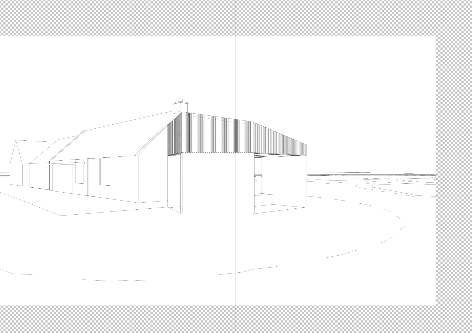
Line drawing taken straight from SketchUp and brought into Photoshop
Start by exporting your SketchUp model as a simple line drawing and bring that into Photoshop. The context and background of the image are composed of simple blocks of color that represent various features. In this example, I’ve chosen to only paint the gable ends, windows, and doors of the adjacent building so that the pavilion’s design remains the focus. Choose elements of your own image that define the main features and paint them to suit. Elements that are not modeled in SketchUp can be drawn in a raw form using the Pen Tool or Lasso Tool such as the road and mountain in the background of this example.
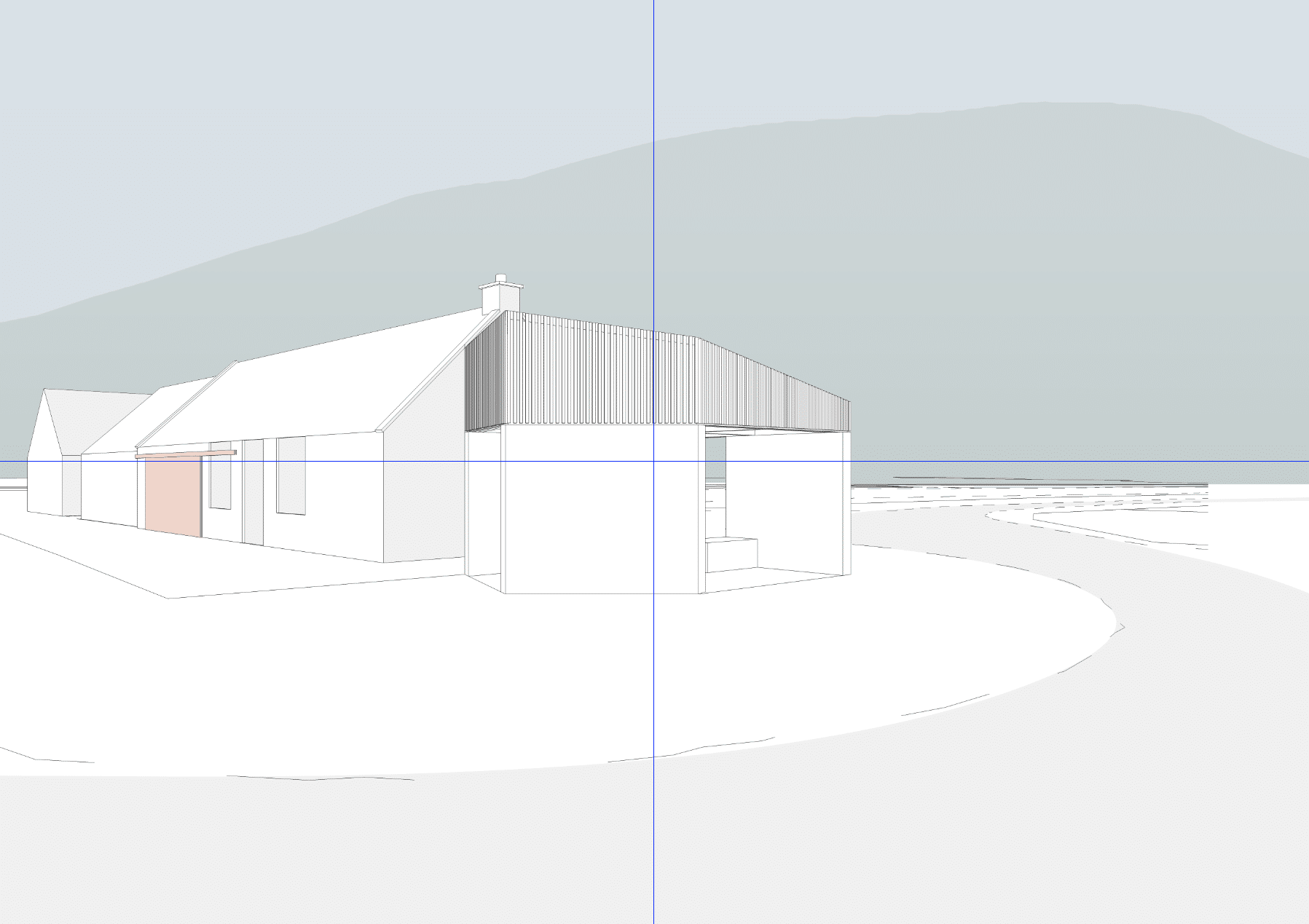
Image with block colors applied to the main elements
To represent the pavilion, we’re going to apply textures to the image to convey a sense of materiality. I’m using blonde sandstone masonry to the facade with timber lining to the inner faces for this design. I’ve found texture in the Architextures library similar to what I want, but I need to adjust the tones, dimensions, and pattern to tie in with the desired elevation treatment for this project.
Open the texture and click ‘Edit’ to bring it into the editor. Once you do this, the texture will load full-screen, and the control panel will be shown on the left-hand side of the window. The control panel allows us to set the various parameters that determine the texture design and is split into three main categories. The first of these is the pattern options that control the layout and overall image size.
The elevational treatment I’ve chosen for my design is Staggered sandstone masonry. The current texture uses an Ashlar pattern, so click on the pattern input and select staggered from the menu. For this the elevation, we need to cover a large physical area, so I’m going to increase the number rows and columns to 12, which is the maximum for standard accounts.
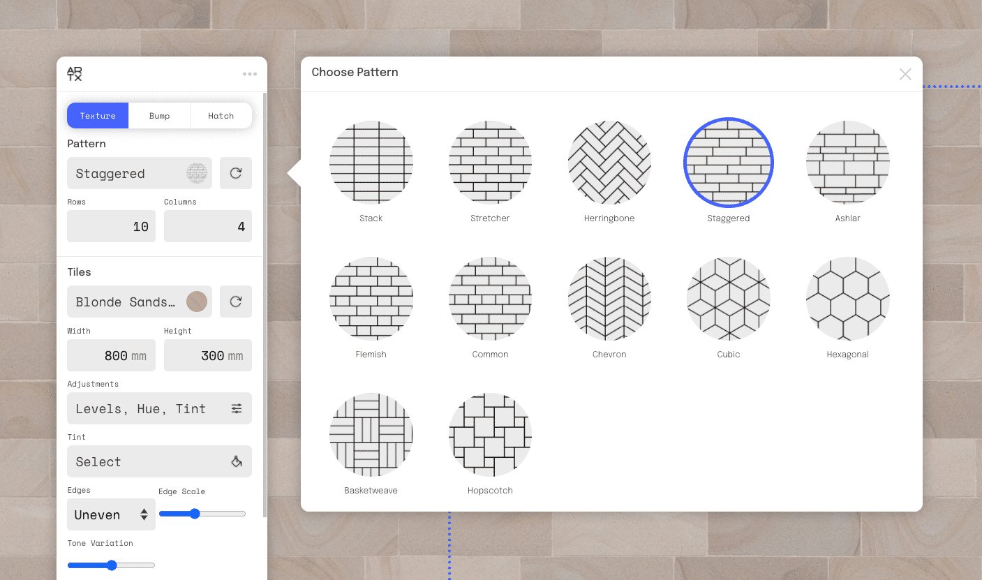
Select the desired pattern from the menu
The next section allows us to modify the tiles, the individual units that make up the pattern. This texture was already chosen as sandstone, but if you’d like to change this, click on the material to open up the menu and select an alternative.
I’ve designed the openings to be 2800mm high; therefore, I’d like the masonry to tie in with this setting out. To achieve this, I’ll set the tile height to 395mm, allowing 5mm for joints between each of the stones. This particular material’s tone is a little too vibrant for this application, so I will reduce the saturation slightly by opening the adjustments menu. The following setting controls the tile edges. To achieve a little more natural appearance, I’m going to change the edges to ‘Uneven’ and slightly increase the edge scale to make these more visible.
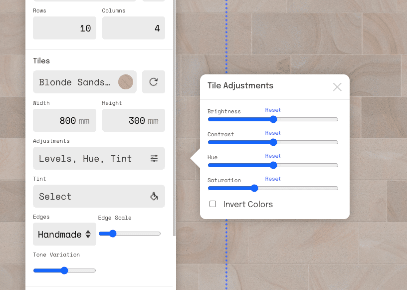
Adjust the levels of the material to suit your design’s materiality
The tile section’s final option is the ‘Tone Variation’ setting, which varies the levels of individual tiles at random up to the slider’s maximum level. More variation can give a richer appearance to the material but can make it easier to spot the repetition if you’re using the texture over a large area.
Less variation will make the facade appear more uniform. Test this yourself by moving the slider to both extremes and then set it to a level you’re happy with. The final section gives us control over the material, color, and sizing of the joints.
In this particular example, these are already set precisely how we need for the elevation. However, you might want to play around with these in your own project.
By default, the horizontal and vertical joint dimensions are locked and will match each other. However, in some circumstances, these might need to differ, which is possible by clicking the padlock icon to make the vertical dimension input active.
Now that we’ve created a suitable material for the elevation, we can click the ‘Download Texture’ button to open the download menu. For standard accounts, the options are limited to .jpg downloads at 1000px. This is perfectly suitable for many uses, such as the illustration we’re creating today; however, if you’d like more options, click on the ‘Get Pro Account’ button to learn more about the additional features or sign up.
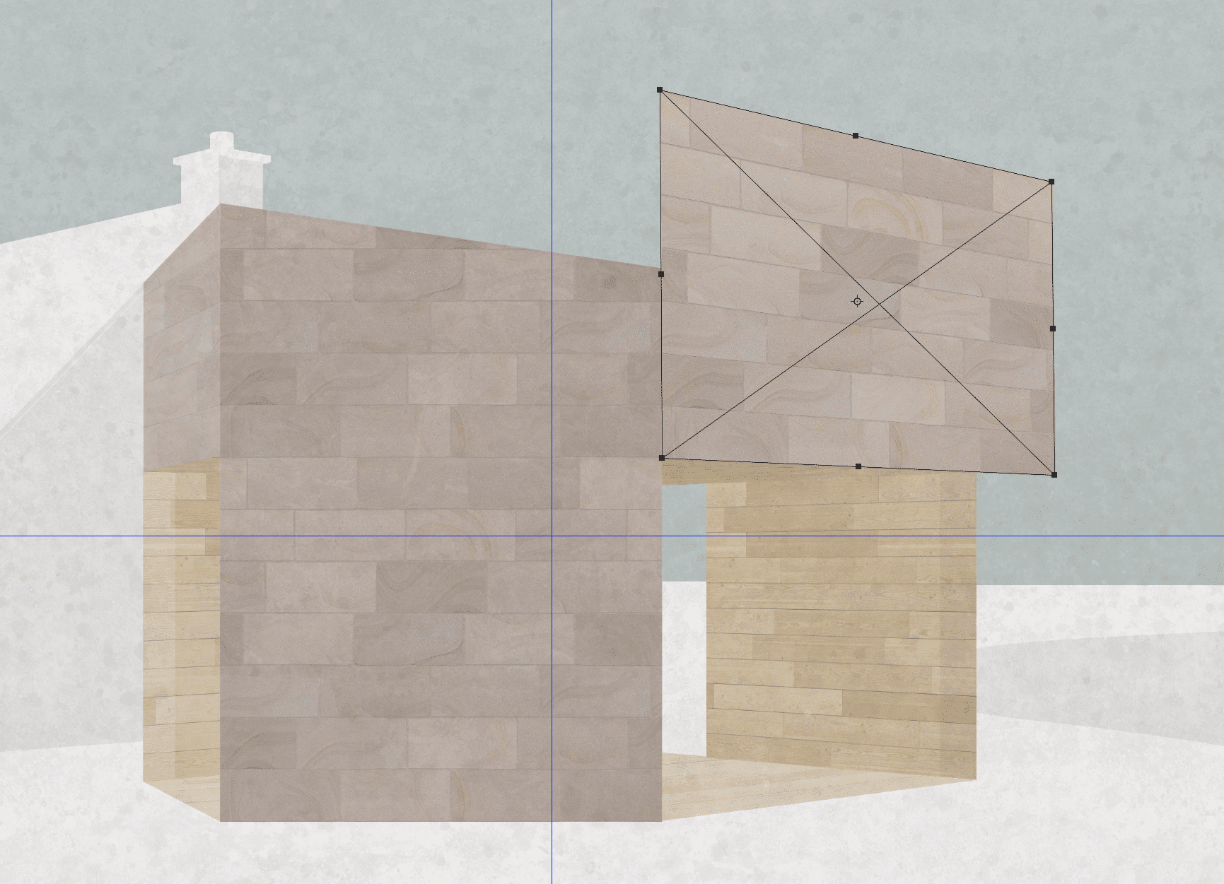
Use the distort tool to drag each of the corners of the material into the correct perspective
Once the image is downloaded, drop this into Photoshop and use Edit > Transform > Distort to control individual corners of the texture and drag them into the correct
perspective. It may be useful to reduce the transparency to reference the line drawing while doing this. Once distorted, trim the material to fit the face using either the Polygonal Lasso Tool or the Magic Wand Tool to create the selection. Repeat this process for each of the faces in the image. The second texture used in this example is Douglas Fir timber in a staggered pattern.
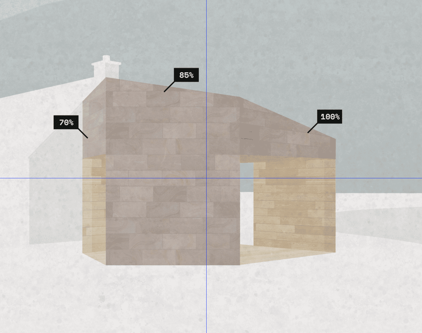
The opacity of each face is reduced to convey a basic sense of lighting in the scene
Once we’ve textured the entire design, we’ll adjust each of the faces to provide a basic sense of ‘lighting’ in the scene. This can be done either by adjusting the levels of the individual layer or merely changing the opacity. In this example, I’ve gradually reduced each face’s opacity from right to left, which makes each of the faces appear more defined.
To finish this image off, I’m going to turn off the line drawing layer and apply a concrete overlay to give it a bit more grain and add some trees. As you can, see images like this can be created too quickly using your existing concept model as attractive standalone images and design tools.


