The Project of Crematorium is my first undertaking into photorealistic archviz. This means very few people in the shot (in comparison to the overcrowded competition imagery) and so more focus on actual detail, materials, light and space.
What architecture really should be about.
I will write more detail to each image separately.
1. (Project Featured Image) This frontal image was the first camera position. I have suggested my friend Miguel to go for portrait format, which shows better the main chapel , which is quite high but not that spacious area wise. Additionally the shadow looked more playful in portrait format. Cross is gold painted wood of which you only see the metallic reflection while Jesus sculpture is made of raw polished massive wood. This is my hidden artistic interpretation as usually in catholic ornaments, Jesus is golden and cross has more modest material.
Even though you do not see the sky, the skylight is very present light source and suggests the immediate proximity of sky. To add more dynamics to the image the glass has a noise opacity map which creates moderate shadow “caustics” in the top of the image.
As for auxiliary artificial lights I have suggested to use concrete pendant lights Foscarini Aplomb. Additional backlight plane is seen as a reflection in the concrete and wooden pult on the right lower part of the picture.
For textures I used the highest available resolution from textures.com. Each image has unique concrete texture.
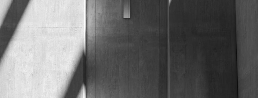
2. By the second image I have slowly fallen in love with portrait format for interior images. Here you can see the side of the chapel. The railing has copper material, of which again you see some backlight plane metallic reflections. Ramp has some hidden lights inside that illuminate the wall a little und thus creating more dynamic large concrete wall.
The godray is rendered using fog cube, there have been some dust particles added to it in Photoshop.
3. Again, portrait format. This time without direct sunlight only with some overcast environment and four artificial ies lights that throw interesting light cone onto the concrete walls. Luckily you do not see the light source so I did not have to think about the right light design.
Background photo comes from flyingarchitecture.com
4. This is the main entrance to the crematorium. I have to be ashamed of the quality of the plants because I have only used one type of grass blade and one tree type from laubwerk. I think black and white filter makes it still look half decent, so I am lucky to give up colour on this one :).
As far as lighting, I wished to recreate half cloudy/sunny atmosphere with patches of landscape that are covered by clouds and parts are exposed to sunlight.
Background image is courtesy of flyingarchitecture.com
5. Here, same applies as in the image #1.
6. Finally some landscape format! This is place where urns are placed. This is the only image with some slight DOF effect as I was unsure about the quality of formwork concrete texture. The gravel is scanned texture from real-displacement-textures.com. This was the first time I used scanned texture and difference between using only bump was immense.