


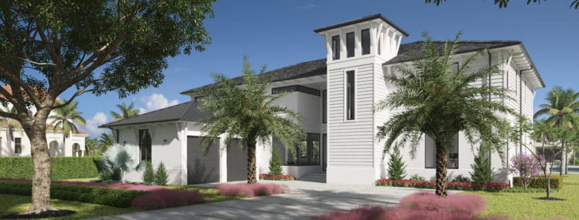
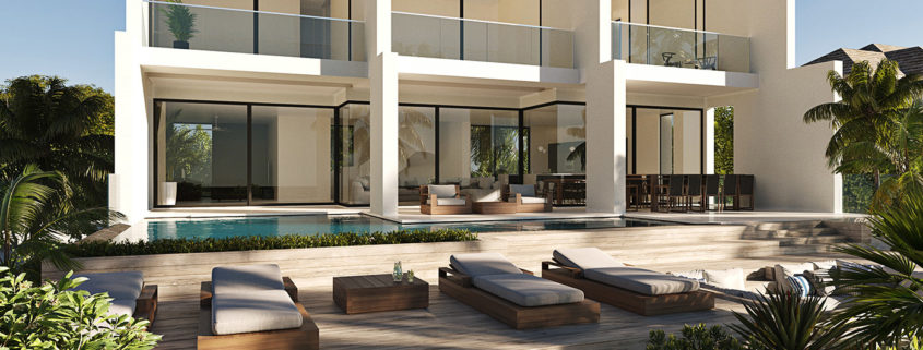
Modern house | Front yard
Hi everyone! We glad to represent our project showing Front yard. We would be grateful for your support on our Behance page https://www.behance.net/gallery/123184247/Modern-house-Front-yard
Access the Best Articles about Architectural Visualization. Learn about all aspects of crafting images that tell stories.
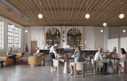
Making Of's Case Studies WorkflowsShare your work and get immediate appreciation through discussion, feedback, and a possible nomination for the…
![]()
A weekly experiment, exploring the creative minds in Architectural Visualization and more. Find out what makes us all tick and push the limits.
Listen Now! Subscribe on iTunesOut with the old and in with the new! In Converted, I’m asking you to take an in-depth look at existing architecture near you or one you love worldwide and introduce something new.
See Entries & Join! About ConvertedHi everyone! We glad to represent our project showing Front yard. We would be grateful for your support on our Behance page https://www.behance.net/gallery/123184247/Modern-house-Front-yard
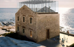
https://www.behance.net/gallery/126308367/HOLZBRUECKE-FULL-CGI
The idea is to create a bridge between a person and any location.
A bridge that will serve as a point of attraction and become a connecting element between a person and the environment.
Professional Visualization Studio «CH visual» is a team of creative people who help to present your projects, even at the design stage, with realistic visualizations and video animation.
We work with architects and developers in more than 20 countries and have gained strong trust, in particular, because of implementation the most creative ideas and solutions.
Our goal is to make our animated video films and images evoke feelings and tell stories about the objects from which they are created. Our focus is on understanding these architectural objects and perceiving their future implications.
“CH visual” – virtual view into the future!
https://chvisual.com/
oksana.chvisual@gmail.com
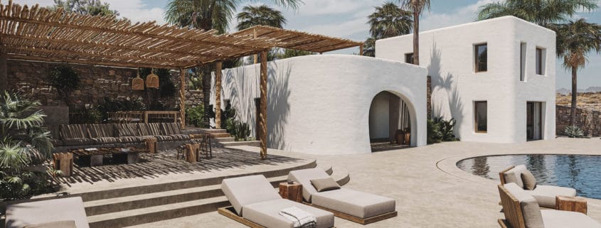
F-Loulos Villa is a hospitality project in Mykonos by Chorografoi. Tropical vegetation blended into the wild land of Mykonos, creating a place of calmness and relaxation.
Creating various plants and trees variations to avoid repetition was a key for this particular project. Every palm was custom designed and placed in order to give the tropical feeling accurately.