


Making of WeWork – Tokyo Ark Hills
I’m very happy to share with you today, one more making of by WeWork’s Visual Studio team. Today they cover their Best of Week 09/2018 awarded work “Tokyo Ark Hills”. They produced a pretty cool animation for this location and I hope you’ll learn and enjoy this article!
Here from WeWork Headquarters in New York City, we are pleased to share the process behind our recent project Tokyo – Ark Hills. We would like to start out by thanking Ronen Bekerman for his support and continued perseverance to progress the industry to a higher level. We have all been longtime supporters of this blog and are glad to have the opportunity to contribute ourselves.
INTRODUCTION
The WeWork Visual Studio team spent two weeks developing this project which includes still images, 360 VR tour, and animation. Some essential details went into the making of this collection, and we’ve broken down some of our favorite elements for everyone. Utilizing common settings within Corona Renderer, we took an interesting approach to our detailing process and adopted it into our workflow for this fun project.
PROJECT DIRECTION
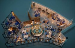
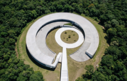
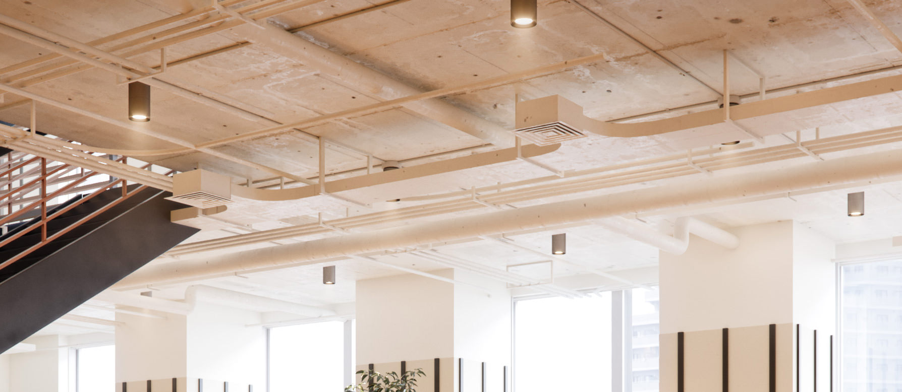
Since first hearing that WeWork would be expanding its footprint into Japan we were excited to see the new design aesthetic and use it to create something unique the team could use to help build WeWork’s brand. We began to study Japanese office references to get a sense of what we wanted the space to feel like.
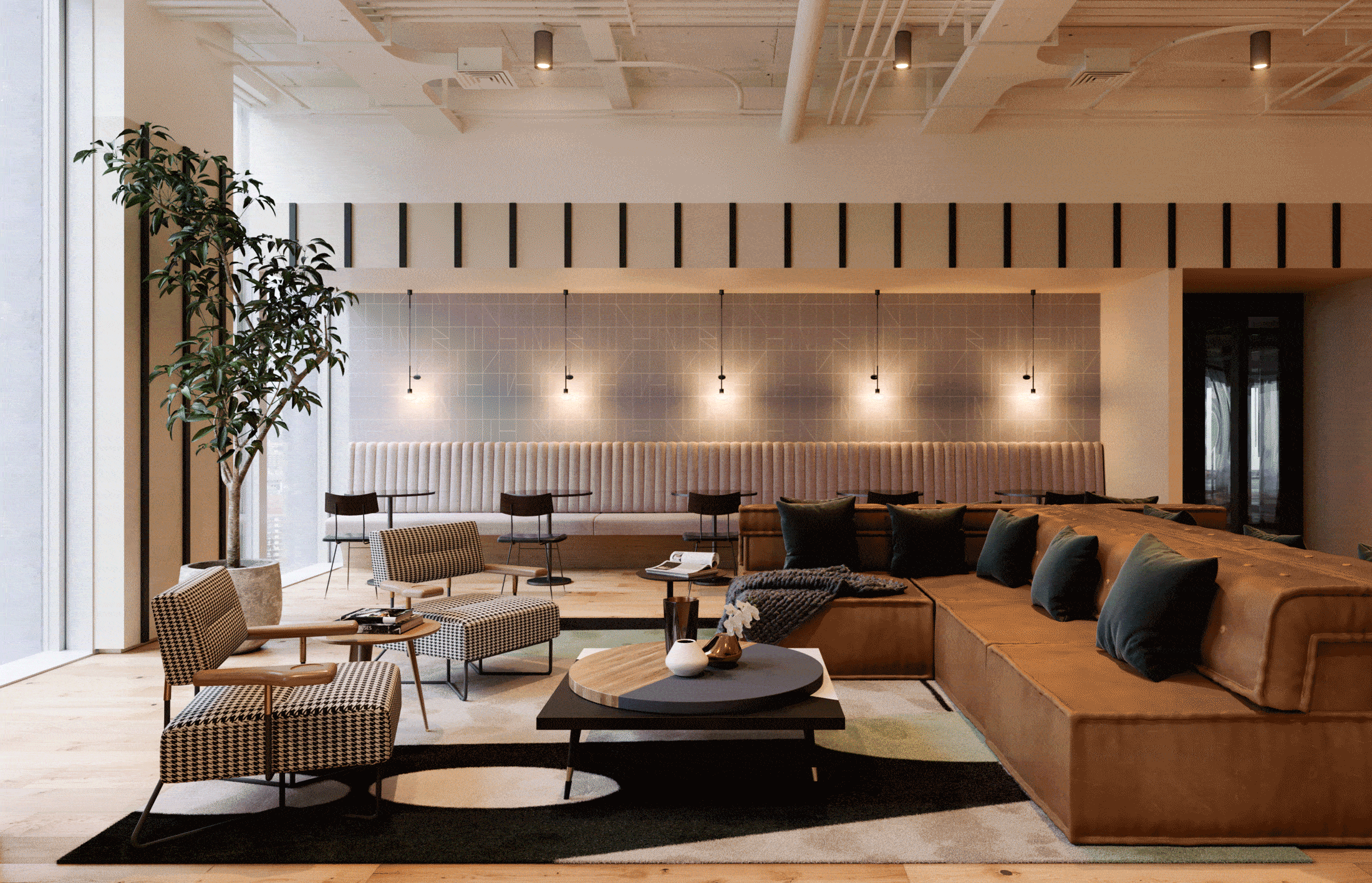
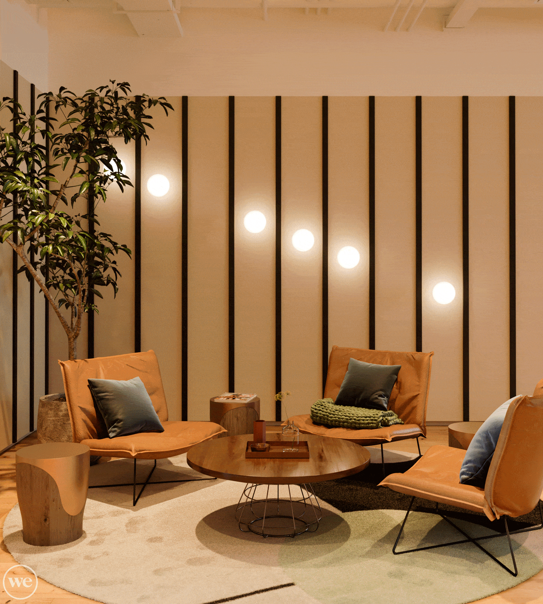
Since our in-house visualization team mainly works on new market projects, we are often tasked with presenting the WeWork product to people who are not familiar with its brand. It was important to represent the WeWork brand accurately and ensure the images depicted the quality that is known in Japan. Below are a few references that helped drive our approach to this project. We initially loved the cozy feel of these spaces and how the warm vs. cool lighting made it feel like you were working from home.
")
")
")
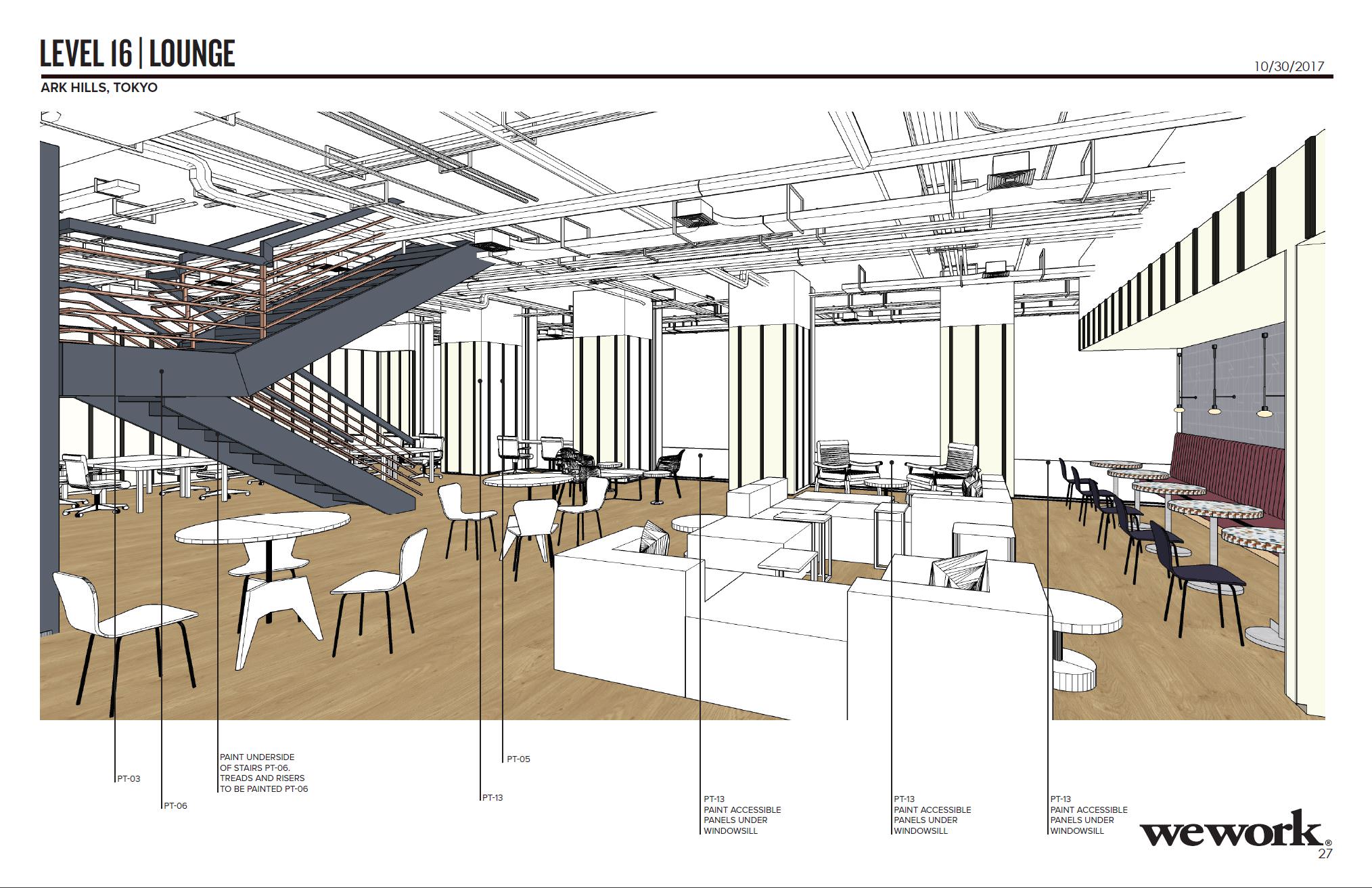
3D MODEL
When we receive a new project from our design team, we will have a design package that looks something like this. What we start with is a SketchUp model with the furniture, light fixtures, wall colors, basic textures, etc. This gives us a good starting point to further detail and develop when brought into 3ds Max.
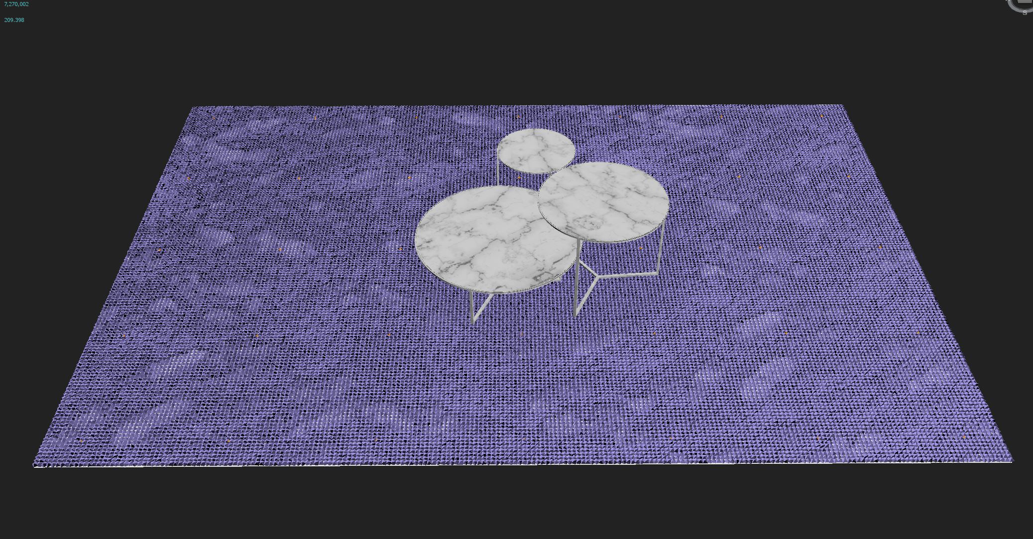
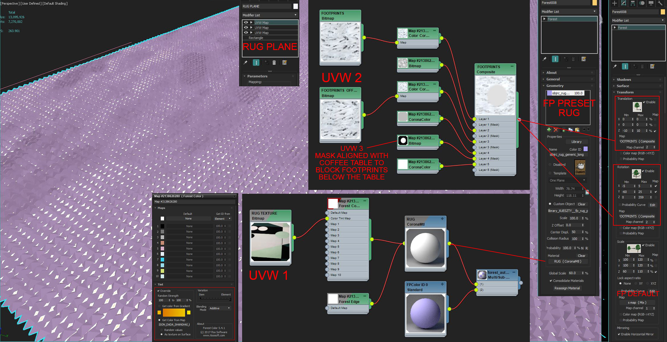
FOREST PACK RUG
We generate the rugs in 3d using some presets that are built into Forest Pack. Using these presets are a great way to add more realism to something that might often get overlooked. To take it one step further we’ve gone through and added a second level of detail by introducing footprints into the rug. This detail, although subtle, gives the rugs a worn-in look to help make space feel inhabited.
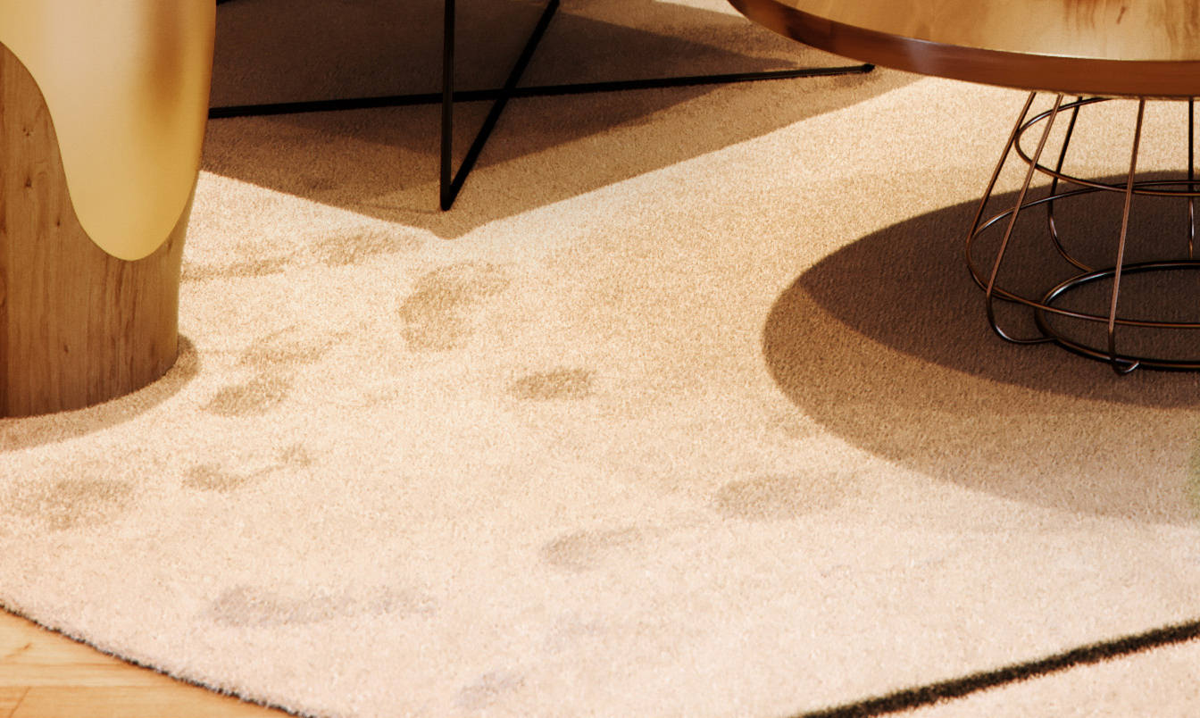
Once we created our own preset with footprints it is easily transferable to any rug we need to make no matter the shape or size. It even has a built-in mask to make sure no footprints appear underneath the coffee table. Can you say nerd alert? With the use of a footprint in the snow, texture map plugged into the Translation, and Rotation slots and a few different UVW maps the process is straightforward to set up and customize yourself.
LIGHTING DEVELOPMENT
To achieve the overall warm/cool lighting we used specific color temperatures for the interior and exterior lights. The exterior lighting uses a Peter Guthrie HDRI plugged into a Color Correction map. The Color Correction is used to tint the HDRI ensuring that it is only emitting a more saturated cloudy blue color than the original.


The interior lighting is set up with Corona lights using IES profiles and a color temperature of 3500K. To further push the look of the lighting directly in the render we added “light cones” with a Corona Renderer Fog shader applied and placed them just below the spotlights. The result is a nice directional glow from the lights that are consistent with each image as well as 360 renders.
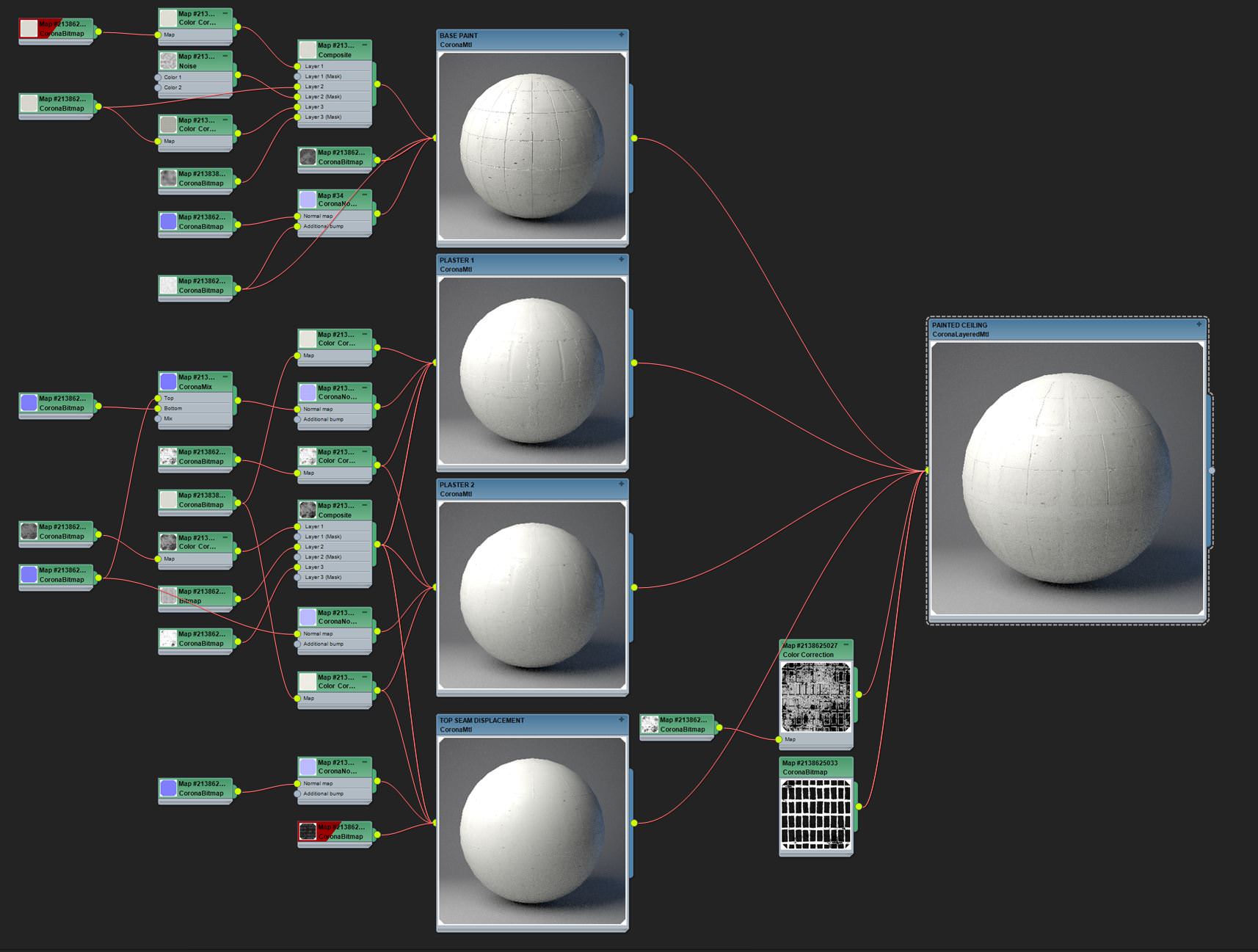
MATERIAL CREATION
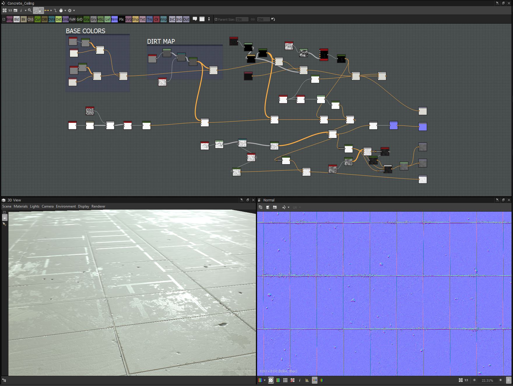
For this project, we made two custom shaders with Substance Designer including the painted concrete ceiling and the circle pantry tiles. For the ceiling, we output 16 different 8K texture maps from Substance to make four different shaders of paint and plaster that were then combined into one Corona Layered Material. This new approach with Substance is refreshing to provide more control over how you want a material to look like. We’re convinced that the sky’s the limit with Substance.
Below are some screenshots of the final Substance graph and how it translates into the Corona Renderer shader.
ANIMATION
The animation was completed after the still images were finished but we wanted to push the project a bit further. We decided on the concept of “Tokyo Unboxing” – an opportunity to create a timelapse of the final hours of a WeWork project build.
All of the animating was done in 3ds Max with the help of a great script called Key Transfer.
Each object had to appear, move once, move twice, then settle into its place. This would need to repeat over 75 times, so we had to figure out a way to speed it up. To get the objects to appear and disappear the visibility parameter was keyed for each object. Using the Key Transfer script, you can key one object and then select all of the others and transfer the keys. It also can offset them at the same time.
We then had to manually adjust the timing a bit to make it look more random.
It was necessary to space the keyframes close together in order to get quick movements. We initially had them spaced too far apart, and it looked as though the furniture was sliding around on the ice. Not good! In the end, we had about 6 – 8 keyframes per object.
Below, in the screenshots, you can see each object’s trajectory and how many keyframes were needed to get the randomized timelapse look we wanted.


RENDERING
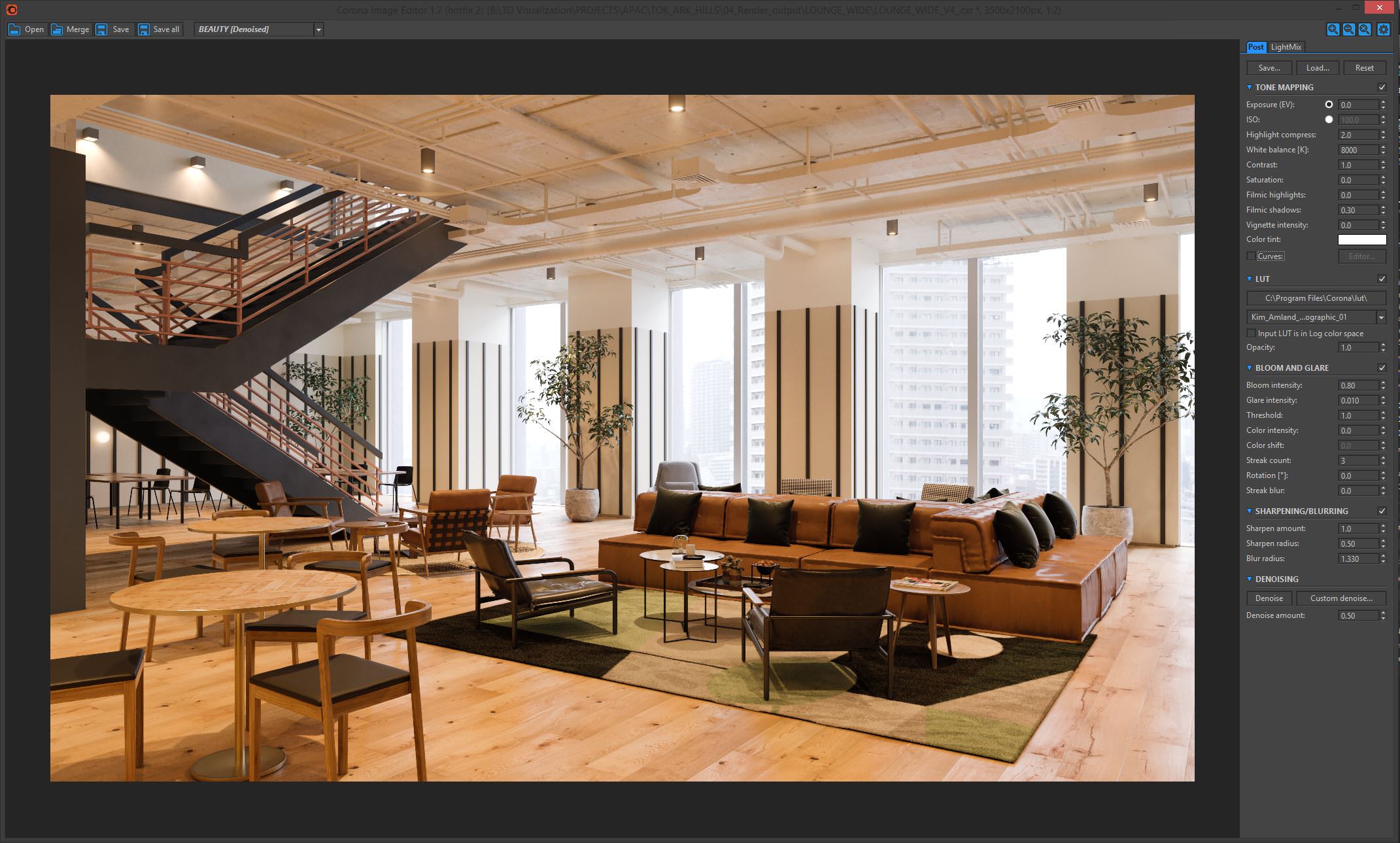
Since we’re using Corona Renderer, there isn’t much we can discuss here render settings which we happen to love.
So nothing extraordinary on that subject. The Corona frame buffer and Corona Renderer Image Editor are powerful tools that we take advantage of to make less work in post-production.
Below are some of the typical settings we’ll use within the frame buffer including LUT files, Bloom and Glare, Sharpening / Blurring, and LightMix.
POST PRODUCTION
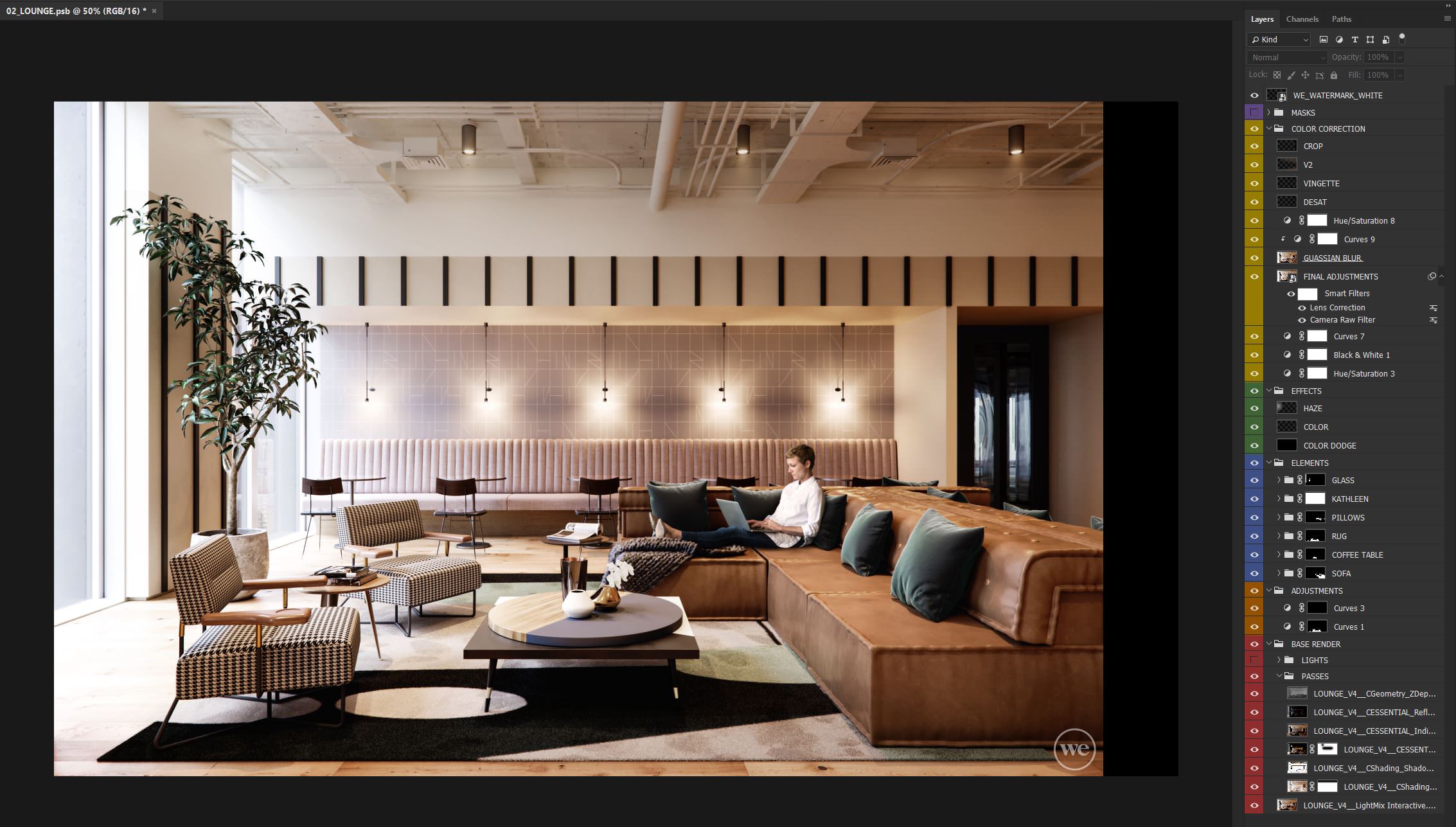
Our approach to post-production work is quick, simple, and organized. We often spend only 2 – 3 hours per image. Since we are generating much of the detail and realism right out of the render, there is not much that needs to be adjusted in Photoshop. With that being said, we still appreciate the power that Photoshop can have on finishing an image and generating a unique quality that can be copied across multiple images and projects.
In an industry that is quickly moving toward hyper-realistic images, 3d everything, and obsessively copying photographs, we believe there is still reason to leverage the post process to set one’s work apart. This is where we build up the mood, light quality, and atmosphere to make our images more evocative without the worry that it isn’t “photo-real.”
Typical Photoshop layer stack.
ENTOURAGE INTEGRATION
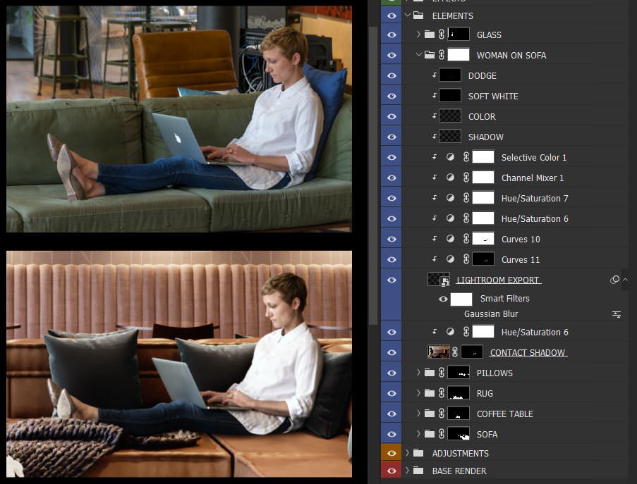
The one part of the post-production process that takes up the most time is the entourage integration. We love it, we hate it, it’s never right, something’s off, its the skin tone, no it’s the hair color, too sharp, too blurry, and this goes on for hours… Sometimes you even need to double check a day later to give your eyes a fresh perspective on the scene. There are not many real secrets to share here except that it comes down to two things; training your eye and putting in the time.
When integrating entourage, we study the smallest details of what can convince the eye. We often stage the scenes and take the photos ourselves to make sure we are starting with quality images as well as naturally posed people. Once the person is posed correctly and placed into the render, this is where the use of Photoshop and Lightroom kick ass.
Even the smallest adjustments can make a huge difference when blending a person in. Blurs, Sharpens, Curves, Color Balance, Hue/Saturation, Channel Mixer, Selective Color, Lens Corrections, we use them all for different reasons. Below are some vignettes of the adjustments and an example of what a typical stack of adjustment layers looks like.


The development of the concepts we’ve shown allowed us to link our images back to the “look and feel” from our initial project direction. Footprints in the rugs or fog around lights may seem unnecessary at times, but we believe the smallest details can make an image. To us, this is the level of detail needed to create the sense of space we strive to achieve in each of our projects.
This collection has been used around the world by WeWork’s Sales, Marketing, Community, and Public Affairs team as communication and sales tools.
This location is now open in Tokyo and through the use of our visuals the building was able to open at 100% occupancy.
Lastly we would like to thank Ronen again for choosing to showcase this project. We are delighted to share some insight into our process with everyone and hope you can apply something we’ve shown to your process as well.
We are happy to answer any questions below.
_
WeWork Visual Studio


Nice work. Love to obsessive details in layer organization and photographic people for each specific scene.
Nice. So realistic!
làm phát cho ôn bài cũ đi
Very nice 🙂 I love the way to get the perfect white balance by playing around with the RGB channels of the map! Btw, which HDRI was used here?
The HDRI that was used was Peter Guthrie’s 1313 Cloudy
Thanks Jake, congrats again for the great work.
Thanks!
Great set of images and animation!
Thank you for putting together a making of, I am also interested in finding out which HDRI you used?
Thanks – I love the images.
Would be very interested to see your rug footprints texture, and screengrabs of the FP setup of where you plugged it in.
ahh my apologies I see you did add a screenshot – just can’t see it clearly. Any chance of a higher res image?
This is the map that was used for the footprints.
https://uploads.disquscdn.com/images/18b04e712242a27ed224625081f34c6d63b0665f46db80f4117d6ce2c8597778.jpg
Awesome. Thanks so much for sharing.
NIce project and great renders. Is the animation on the website because i didnt see it in this post?
Ahh got it, its in the original post
What geometry did you guys use for the carpet to get that fur feeling. Great job on the carpet!
The rug geometry comes from one of the Forest Pack Preset rugs.
Just curious – What is your process for importing the Sketchup file into Max? Would love to know!
We import the model directly into 3ds Max as a SketchUp file. ( Sometimes this only works if you save it as an older version .skp file.) This way we’re able to link / preview the materials already applied in the model to speed up our process of texturing everything. Once everything is loaded into Max we’ll go through and organize everything into layers and get rid of any unnecessary geometry not seen in the views.
Awesome, thank you. These are stunning images!
wow… respect. your work give impact to me. thanks to showed your work!