


Maison Mentana Case Study by Christian Behrendt
Christian Behrendt focuses on some key aspects of image making in this case study based on his recreation of “Maison Mentana“. With photorealism pretty much solved, we should all get back to basics and focus on what makes an image work in the first place. Let’s us know what you think in the comment section.
First of all thanks for reading, and a big thanks to Ronen Bekerman for giving me the opportunity to write this making of about my latest personal project “Maison Mentana.”
Important to know
Please consider this article as a start point for a discussion on the topics I raise. I’m also preparing some diagrams, which did not make it into the article yet, but I think it is better to put it out there for you to read and comment as I make these and will share a bit later (work, work, work – you know how it is).
Please share this around so more people can see it and join in on the discussion.
Let’s get started!
In 2011, when I just started working in the ArchViz Industry, Ronen published an article about the making of Trojan House, and it’s gratifying to be contributing once again after many years, with all the experiences I gained working in the industry.
I often get asked by people how I do my materials, my lighting or what my render settings are, etc. so they can improve their images. But when I look at their images, I often see that it’s not the technical aspects holding them back, but more general elements of design, composition, color, etc. The fundamentals of creating images.
With the increase in realism, we continuously see nowadays in renderers, 3d scanned models, and textures, captured materials, etc. it’s easy to obsess over realism while forgetting that it’s only a small part of what makes an image to be a good image.
Often times being too faithful to realism can even stand in your way.
I’m confident most people can do better shaders than me, are faster & better modelers, have better knowledge of render settings, etc. So I’m not going to focus on these topics. And even though I’m still a novice in design, composition, color, and photography I still want to bring your attention to these topics. Why they are important, why you should invest your time studying them, and how I approached them on this project.
About the Project
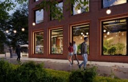
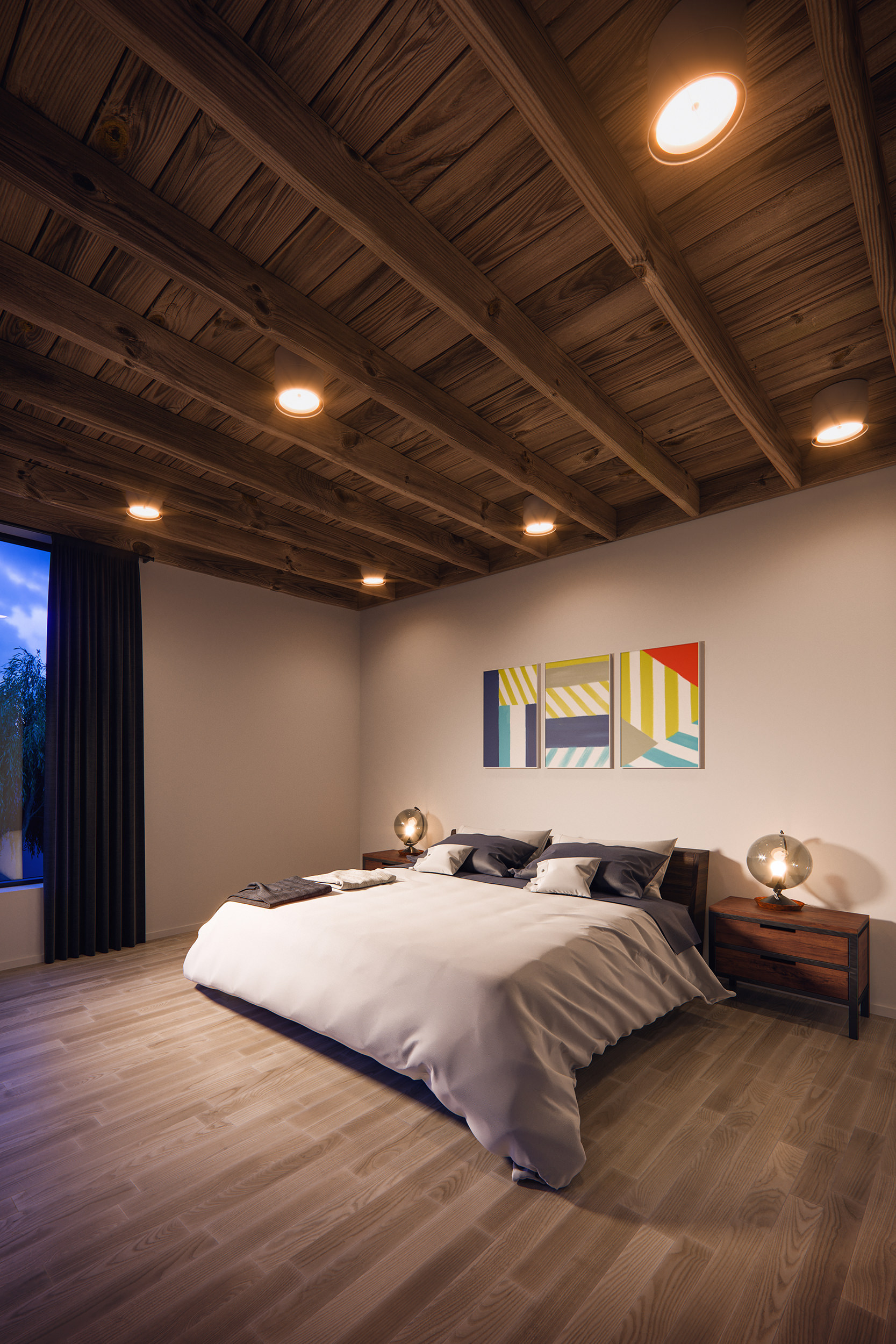
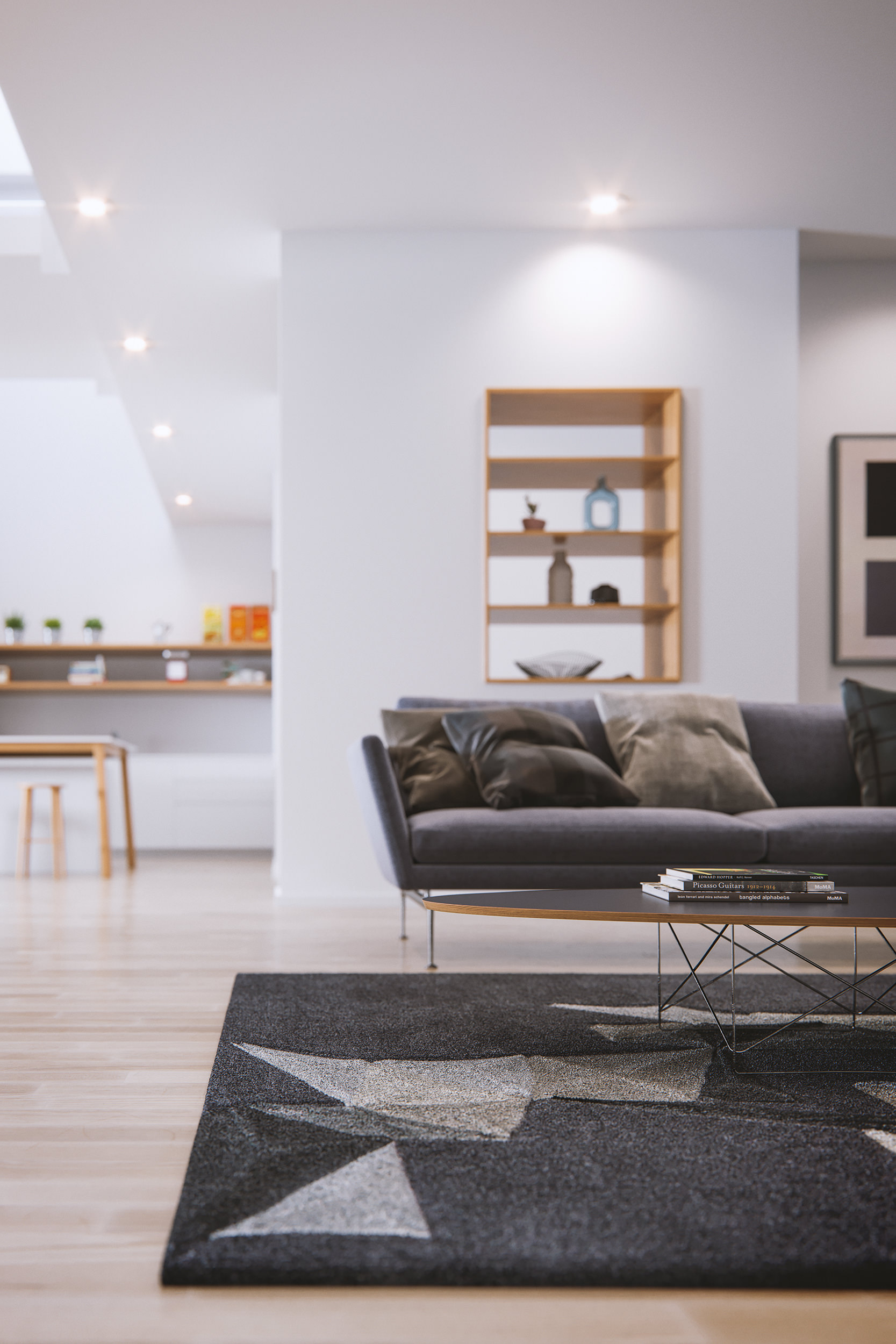
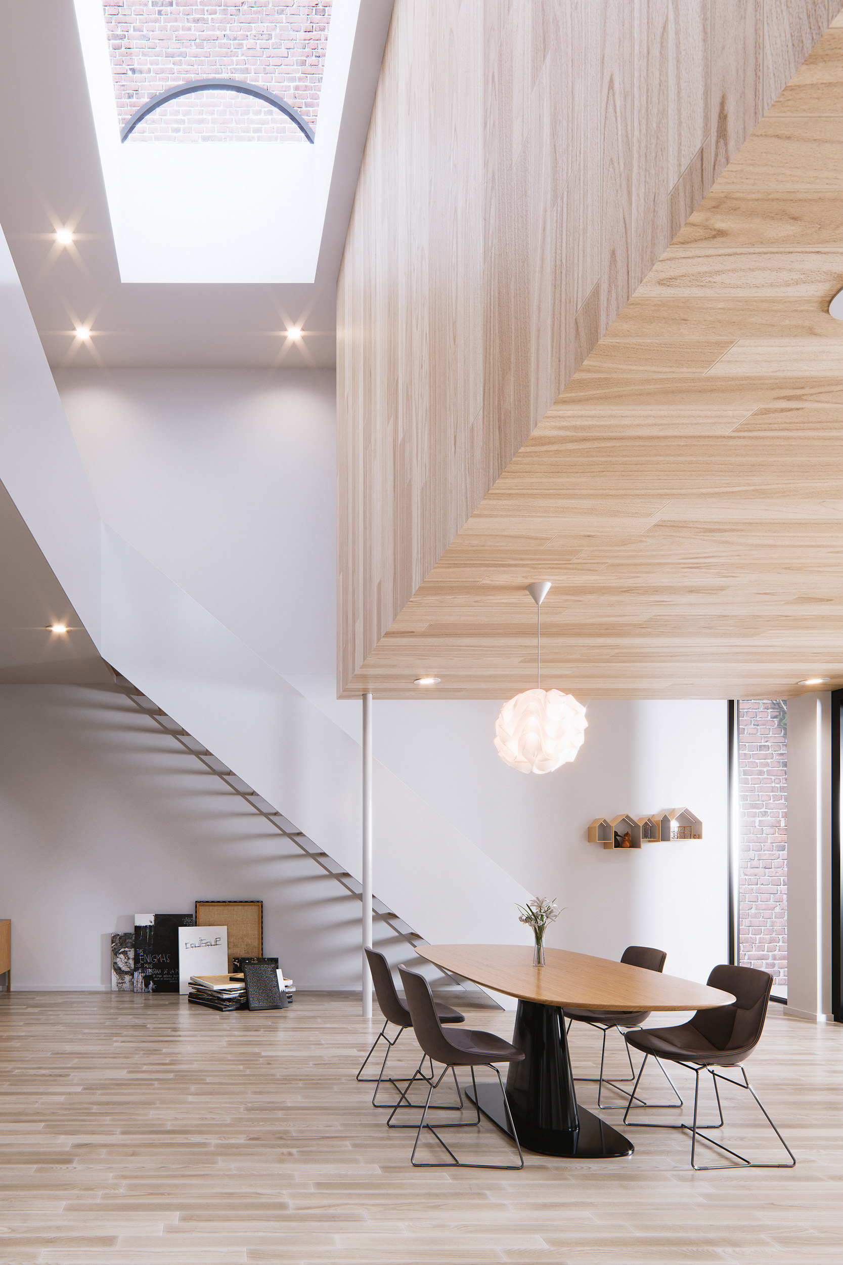
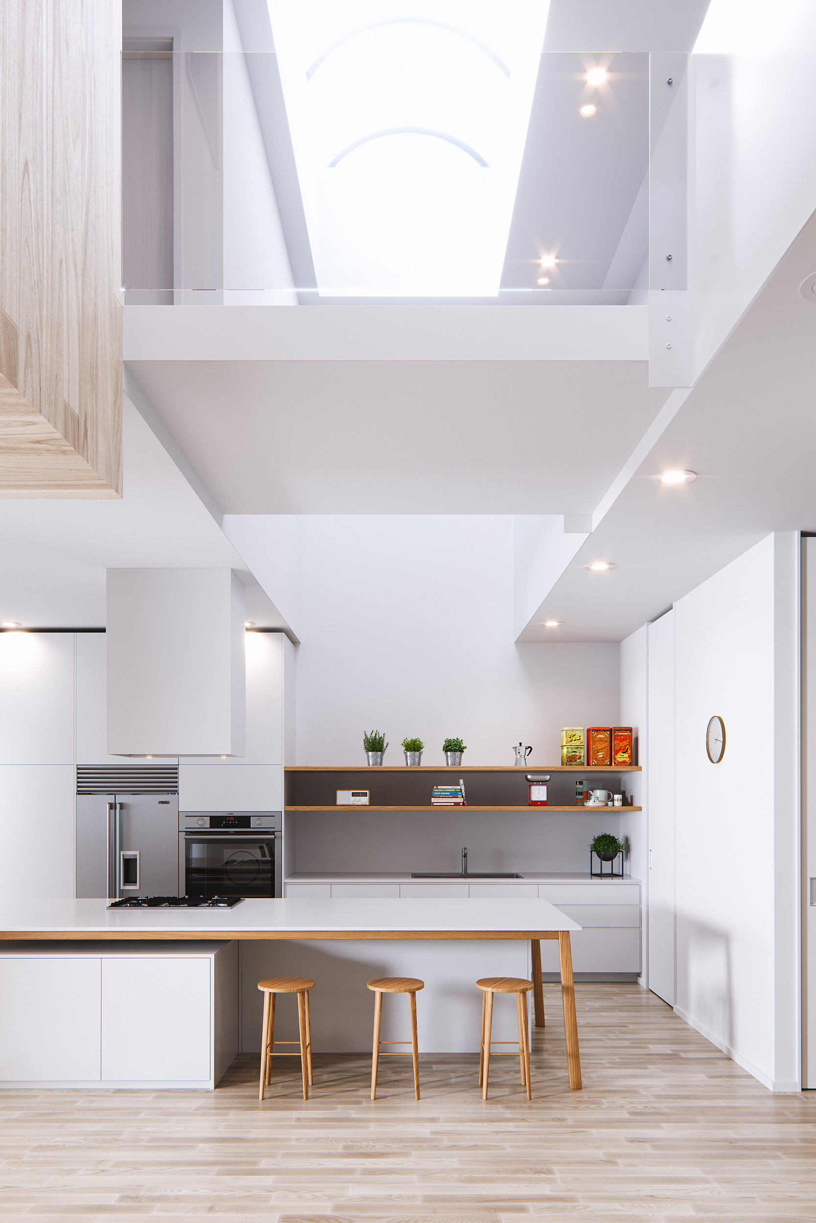
I decided on doing a single family residential housing project because this type of project allowed me to deliver a lot of shots in a compact space. I could cover various types of rooms, interiors & exteriors, a lovely & small garden with some vegetation, exciting lighting scenarios, etc. Lots of variation going on, while not having to model complex architecture or large environments.
I also decided to keep it small because with personal projects I often tend to abandon them if I drag them out too long. As I’m not an architect or designer, I also decided to recreate an existing space, as I didn’t want to get held back by architectural design issues.
During my years working in the field, I learned a lot, and I can give valuable input when needed, but it’s not my job to design spaces – it’s to visualize them. So I merely browsed ArchDaily for a project I liked, and that fitted my requirements and finally decided on Maison Mentana.


Furthermore, I wanted to use this project as a study on Corona Renderer for C4D. Over the years I’ve seen it growing and people showing a lot of very lovely renders, so I wanted to give it a proper try, as I’ve been looking for an alternative to V-Ray which I’ve been using on most of my architectural projects.
Also during the last couple of months, I took a step back from just ArchViz and started getting into the more fundamental topics I’ve mentioned in the introduction. I wanted to solidify the knowledge I already had and build on that further and finally bring it to use in a personal project. In a way where it might be a bit easier compared to a commercial project which often has a lot of restrictions that prohibit certain types, styles or approaches and also doesn’t allow the time to experiment.
Composition
Let’s begin with composition. At its core, it is the essential aspect of every image, yet as far as I can tell maybe also the most misunderstood concept. While it is good to know about things like rule of thirds, golden ratio, etc. If you think that’s all that’s to it you miss a lot of valuable aspects.
Composition at its core dictates how viewers should read your image, how the eyes wander through the picture, what they are supposed to look at. It’s the foundation of your image storytelling, and at this stage, realistic shaders don’t matter. I’m sure everyone regularly browsing this blog showcase, Behance, etc. will have noticed by now… Even if you only look at thumbnails of 100x100px, you already can tell if you’re drawn to an image or not.
It’s here where you decide whether or not you even bother to watch a bigger resolution. And many images don’t succeed at this stage, because their composition isn’t well thought through and not drawing people in, and if you don’t get people past this stage you’re work might be wasted.
Because all your talent for realism, shading, modeling etc. won’t matter if you can’t present it in a way that people are immediately hooked. Especially nowadays when you have to compete with thousands of great artists all around the world and being bombarded with images left and right. If you don’t get the basics right, you will drown in that ocean of images.
An excellent composition should be well thought through and in turn, will influence every aspect of your image, because it’s so much more than mathematical rules for placing your objects of interest.
Trying to explain composition in whole would certainly take too much time and overstep my knowledge as I have still to learn a lot myself, but I’ll try to show you which aspects I find most important in my work and why. But also bear in mind that for every rule, idea, hypothesis, etc. there are exceptions.
So, how do we achieve a good composition?
In general, you could say, the easier and more elegant a composition is, the better it works.
I kindly place a reminder here, as said above, there are always exceptions. But even if you were creating a chaotic war scene with a lot of action, if you’re viewer isn’t sure where to look, he will disengage, he will miss the important action, he might even get bored to the point he doesn’t care to watch at all anymore.
So with our goal in mind (for example “Hey! Look at that cool skylight and how it creates a nice lighting in this room”) and our approach (keep it simple and elegant) we can now see what tools we have in our belt to achieve all this.
For me it comes down to these aspects :
- Focus
- Perspective
- Shapes
- Contrast
And they are all related to each other and should play together like a finely tuned orchestra.
Contrast
Let’s begin with Contrast, as in my opinion it’s the most important, and impacts all other aspects as well. Contrast is so important because without it there would be nothing for our eyes to make out in an image. If everything is the same, then there is just nothing to look at.
So to have anything discernible at all, you need contrast.
Contrast plays a role in much more aspects of composition than you might be aware of at first.
The most obvious of course is simple contrasts in value and tone. Those two will mainly factor in structuring the basic color concept for your image, e.g., what materials you might choose, what lighting scenario you are going for, which parts of your image will be in shadow and which will be lit, and so on.
But apart from that, there are many other areas in which you can use contrast to enhance your composition. I’m just going to name a few, but once you have grasped that contrast doesn’t merely refer to pixel values, but to design aspects you can apply it to almost every aspect you can think of – which is why contrast is so influential.
Some key areas which come to mind for me when thinking about contrast are level of detail, camera focus, aging/weathering and materials in general. Areas in your image where you put a lot of geometric detail, many props, etc. are more likely to grab the viewers eye over less populated areas, objects in the camera’s focus obviously also stand more out over objects out of focus and so on.
So to conclude – using this concept of contrast will allow you to guide the viewer’s eye through an image. Use it thoughtfully, be aware that it’s about more than just pixel values and try experimenting with it in areas you might not have thought of before.
Focus
I briefly mentioned rules like the rule of thirds and the golden ratio. These rules are essential for placing your object(s) of focus, and they work because our brains are wired to just prefer specific ratios/flows over others. By no means, you always have to align your Object of focus 100% perfect, but if you bend the rules too far, the viewer will have the feeling that something looks off.
However, it can be even worse if you don’t have a focus object at all. Like said before – if your eye doesn’t have a starting point to dive in the viewer is likely to disengage pretty quickly.
I won’t go on explaining specific rules because I’m sure many will already know about them. I also encourage you to read Lasse Rode’s article on this blog – “Photographic Approach in Architectural Visualization“.
When thinking about focus and using the compositional rules, also try to think about contrast. Can you strengthen your focus by using contrast in lighting, material, detail and so on?
As I said before – all aspects of composition are tied together and play hand in hand, and if you learn not to use them as isolated ideas but connect them your images will improve drastically.
Perspective
The placement, orientation, focal length, etc. of your camera obviously is also of enormous importance.
In architecture, I mainly prefer a quite simple approach using the one-point-perspective for most shots. It’s a very straightforward perspective to understand and non-distracting, you’ll most likely end up with leading lines to guide the viewer’s eye, and it gives the most undistorted perspective view of the space possible.
All very important aspects when considering architectural visualization.
Using more dynamic perspectives can of course work also, but I mostly stick to one-point-perspective for my main shots and then get a bit more dynamic with additional & detail shots. As always – try thinking about possibilities to strengthen your perspective with contrast regarding placing of objects, lighting, etc.
Shapes
This might be the most abstract of the four topics. In the beginning, I mentioned that a simple and elegant composition is most likely desired and will succeed.
When thinking about shapes, try breaking down the elements of your image to big, simple geometric shapes – lines, rectangles, circles, triangles, etc.
At this stage, your composition should already convey your idea correctly. Of course, a lot of factors will be left out at this point, but it will be the foundation on top of which you then can layer all the rest. If your composition doesn’t hold up at this stage, you might run into problems later, which is why you should take your time and get it to work here already.
Apart from this broad scope approach, shapes also play an essential role at later stages. The way you place your objects can create lines that point to the focus object, the same with the direction of light & shadow.
You can also play with contrasting shapes. A sphere in a line of rectangles will stand out. Try thinking about how the basic composition should work, which shapes work the best and then go figure out in which ways you might be able to achieve this.
As mentioned before, please take all this with a grain of salt.
There are exceptions to all these ideas, guidelines, or whatever you might call them. I also didn’t go into too much detail, as this would take up way too much time and there are plenty of great resources out there already.
I just wanted to draw attention to these aspects of image creation, because in my opinion there are the most important and often are overlooked by many people, because they solely focus on realism.
Try to learn about traditional painting and concept art. By diving into those topics, I learned a lot, because there these aspects are much more prominent because realism isn’t this significant obtrusive factor as it often tends to be in visualization.


Cheers,


Great looking images!
It would however be nice if you mentioned the photographer (Adrien Williams) who took the original photos which you have clearly copied/used as inspiration seeing as this is an article focusing on composition.
https://uploads.disquscdn.com/images/de52e0e084e795bcb9b115438ad9eff759fff1e838b3cd339ae133f73af75f55.jpg
Hi Fish_2000,
you’re absolutely right, Adrien Williams should’ve been mentioned & credited more clearly, I can see that the Link to Ronen’s Blogpost might not be enough (his name is properly credited there).
Also what might not haven been made completely clear through this article is, that the project Maison Mentana itself for me wasn’t intended to be a compositional study – like stated it was primarily a way for me to test out Corona Render, and for doing technical stuff I indeed often decide to recreate beautiful images, so I can focus on the technical aspects. Ronen then approached me to see if I wanted to write a making of for this project, but I did feel that a lot of the times making of’s read very much the same, and all topics/techniques have been covered pretty thoroughly – this is why I decided to write something on composition instead.
I did and do not want to take credit for the compositions and Adrien Williams’ great work. While doing this project I also got to really appreciate the shots he decided to take, as you move around with the camera in this space you quickly realize it’s very challenging to capture it properly, and he did it perfectly.
I hope you can see the contents of the article and the renders/their intention as two distinct things and I’m sorry for the confusion.
Best
Christian
Fantastic ! Your way is too much awesome & i learned a lot feature by your article. Thanks a megaton . The thumbnail criteria was in my mind for some days & you mentioned it. thanks.
Great article, I love the simplicity and even better how the images confirm accurately to the rules.
Great piece.
Thank you