


Photographic Approach in Architectural Visualization
Lasse Rode did a remarkable job with his previous articles featured on this blog, and this time is no different. Following the publication of his &tradition renders, I asked Lasse if he can share more of his Photographic Approach in Architectural Visualization. Although we all seem to compare rendering to photography in the end, I think you’ll learn a thing or two about how to get started with this in mind after reading this article which describes an Architectural Visualization Workflow. Enjoy it!
Introduction to Photographic Approach in Architectural Visualization
Ronen asked me to write an article on the Photographic Approach in Architectural Visualization after I published my remakes of the &tradition photos done by Jonas Bjerre-Poulsen (who also is the designer of some of the pieces shown, together with his partner Kasper Rønn at NORM architects, Copenhagen). I thought it would be quite a challenging task to do and I was not really sure if I could tackle it. But here I am, and I cheerfully thank Ronen for giving me the opportunity to write this article.
I wasn’t completely sure if aiming to describe how to get a “photo-realistic” render or more towards about how you apply photographic rules during the visualization processes. After thinking about it, I came to the conclusion that those things somewhat belong together in a way but can also be separate from one another.
I am currently working on a set of images for a commercial project that somehow have a painterly feel to them, but the rules described in the following article would apply still. In our (beloved) chosen profession as visualization artists, we have to put things in the most comfortable setting as possible which would come to play in various other aspects besides just aiming for “photo-realism”.
This is why this article ended up being more about setting up an image in general or the rules of thumb I use most of the time. They are not complete and of course there might be better ways. Some of them may have been also described in the past by classic painters, graphic designers, photographers, etc. So consider this more of an eclectic basic compendium of the things I take care of in my daily work.
One important thing (and if you want a clear rule), is the thing that sets a still image apart from an animation! The still has to tell a story in a single static frame, while an animation has the luxury of many more frames and the movement to do that. Therefore, it is very important for the still to be easy readable and come to its point very precisely.
Composition
Finding a good composition is one of the hardest parts, much the same as a most important one. For me it helps a lot to start with classic compositions like a central perspective and so on.
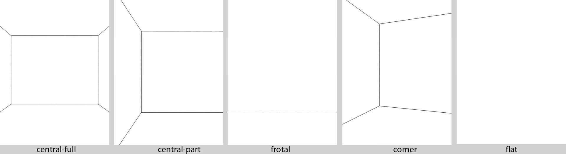
The key here is to keep it as clear and readable as possible. Reducing the perspective lines makes you understand the image quicker.


Of course this goes for interior renders as well as for exterior renders, just inverted sometimes (see corner-perspective, which is referred to as a 2-point perspective).
Most of the time I work with photographic references, and with some of my personal projects I try to reproduce photographs to a certain degree… some more than others. Of course, when reproducing a photograph my personal creative input into it is minimal (I’m trying to match the photo), but I learn something from it every-time that can be used on actual live client projects the next time. Basically, that is what it is all about when doing personal projects – Testing and developing ones skills in an environment free of the usual production constraints like time, money and others comments. You can then carry the things you learned along to other projects if they have value.
After getting the composition right, I’m also paying attention to the “depth composition” – the way I’m layering the image with the classic foreground / middle ground / background scheme. This is a very simple rule but it really helps in making your point with a still by taking advantage of our depth perception. You should always try to work with Depth of Field in various degrees, which is one of the most effective tools you have to enhance this effect (other methods use color and brightness as depth cues).
As you can see in the schematics below, it is very simple to achieve but also very effective.


You can see in the images below how this effect comes into play, helping you focus on the part of the image the creator wishes you to focus on. Of course, this is more obvious in short-range close-up shots, but this can be a strong tool when applied smartly on large scales scenes too.


You will also notice that if you try to apply the famous “Rule of Thirds” onto your images they become somewhat balanced composition-wise . Just try to align the main parts of your image with the grid and see how it might help you.
Don’t think of it as simply placing the obvious “lines” in the scene, but more about the key “story” elements that you place in specific areas based on such a grid to balance things out.

Applied on the two images you have just seen this would look like this…
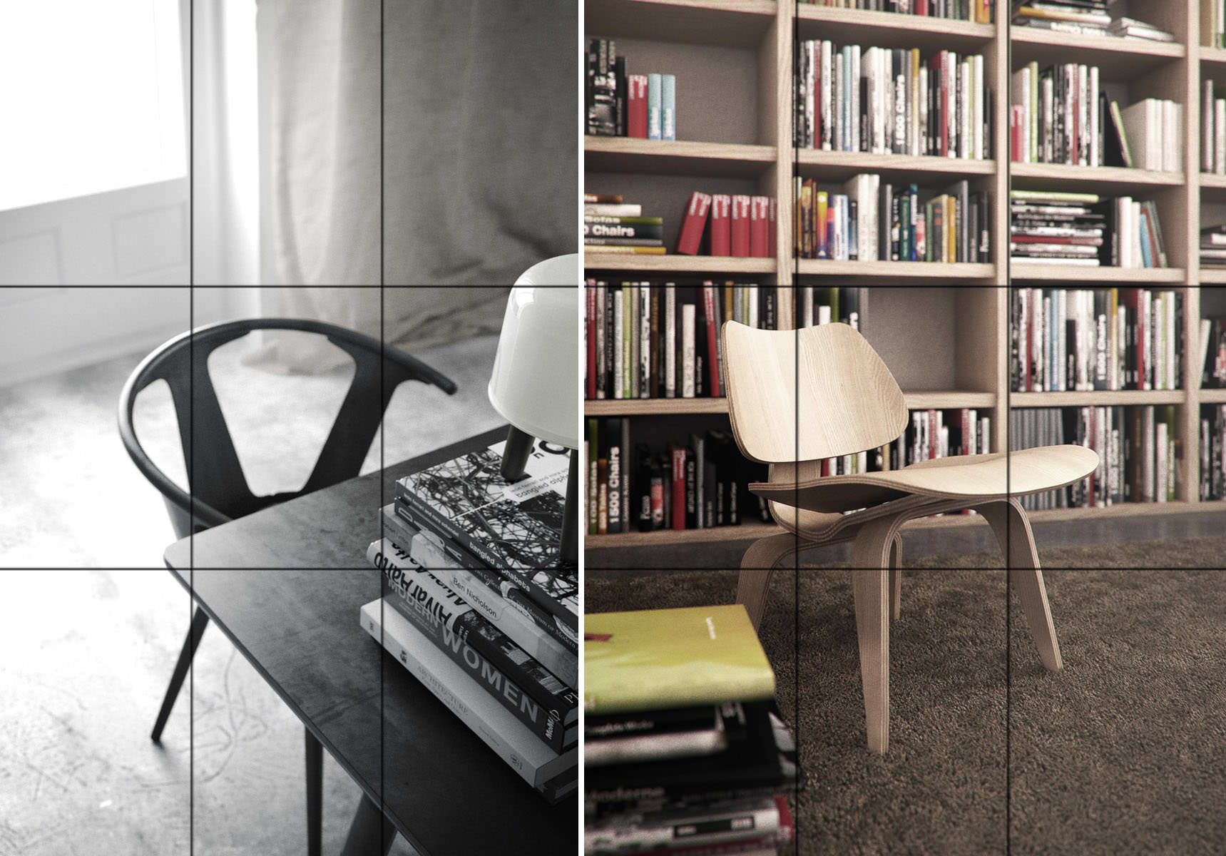
Many cameras have this grid implemented in the visor as a feature. Photoshop also shows this grid when you use the crop tool. 3dsmax also has these grid options in safe view mode… It absolutely makes sense.
Focal Length
Try to avoid using a focal length shorter than 30mm. I often use something between 35mm to 55 mm.
Wide angle is being criminally abused in arch-viz since we are always tasked to show as much as possible in a single image. I’ll remind you that we do have superpowers inside the CG Matrix, and so we can see through walls by cutting them, hiding them or use camera clip planes. This will help avoid the distortions of a wide angle focal length by allowing us to go back and narrow it down.
Regardless of that, I think it is important to think about how we – as humans – view the world.
I find it really important to try and come as close as possible to what you would see in reality.
Each human eye has a viewing angle anywhere between 120-180°. Combined it amounts to 130° and very similar to what a fish-eye lens can offer, but we can’t actually “see” all this field – Our central field of view is what counts and amounts to 40-60° which is the equivalent of the 50mm “normal” lens, considered as having the best resemblance to what we humans see. You can learn a lot more about this on Camera vs. The Human Eye over at the Cambridge in Color website (Great source of insight on all thing related to photography).
Modeling and Shading
Considering modeling, it is more of a general statement that I want to make here, rather than a technical manual or something like that. You really should aim to get your models as accurate as possible. Get the general proportions and the fine details right and that will do the job.
You should really force yourself to a certain minimum level of detailing, but do consider the visibility of such details in the final images you will make. Time permitting, I would always suggest doing as much detail as possible so you can later explore any view you like without any limitation.
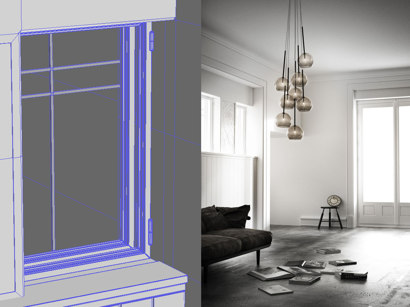
As you can see in the screenshot below, the window has been modeled to a level that makes sense regarding its distance from the camera and the resolution the image has been rendered finally.
The same logic also applies to the shading/materials. You can dramatically enhance your images by using the right and good textures.
The real world is a highly reflective place! Pure diffuse is pretty hard to come by actually, whereas in the CG world it is very easy to diffuse your scenes to the death.
Most things reflect light in a certain way and the biggest difference is related to the surface glossiness. Considering this – all of your materials should have some level of reflection and have maps assigned to their glossiness and reflection slots. Don’t be lazy on this one – It can have a great impact on the final look.
I can recommend reading Bertrand Benoit’s Materialism and Snow White’s Coffin articles on his blog regarding this topic. Great useful tips there.
Natural Lighting
There is a lot that has been said about this topic, but let me point you to Peter Guthrie’s HDRI related posts as well as the HDR Image Based Lighting 3D Scene Setup article by Ronen Bekerman which are a great resource on this subject, focusing on the use of HDR images as the base for natural looking lighting with or without the combination of other light sources.
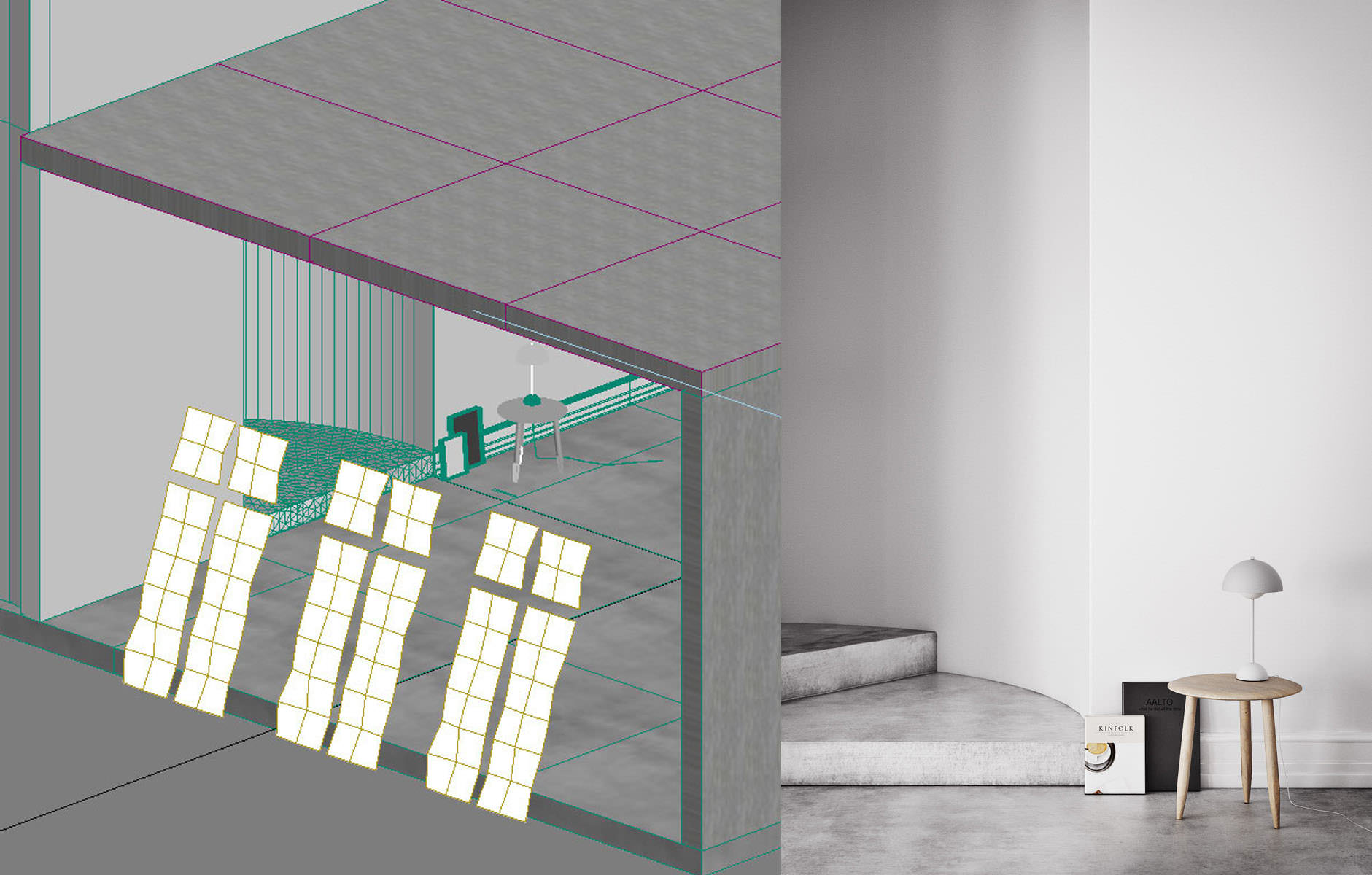
One thing that is important to address though, is the issue of controlling color and lighting angle / diffuse.
In the image below, for example, it worked best using three planes slightly slanted, deformed by a noise modifier with a light-material applied to simulate the light I wanted to reconstruct from the original photo.
Only this way it was possible to get the really subtle shadow-gradient on the wall and the round part behind the staircase.
Color Balance
To get a balanced feel, of the whites in a scene, you should take care that only the very brightest spot in your image goes up to almost complete white. The rest of the whites in your render should range around 190 -220.
You also should try to let the darks play a role in your image. Always remember to make it look balanced and not have too many overexposed or underexposed areas.
The main thing that is really is important to pay attention to here and understand, besides the world being reflective, is that the world is also a very grey place.
That might sound a bit depressing, but it is not meant to come across like that… It is just that it is all shades of grey (some say 50).
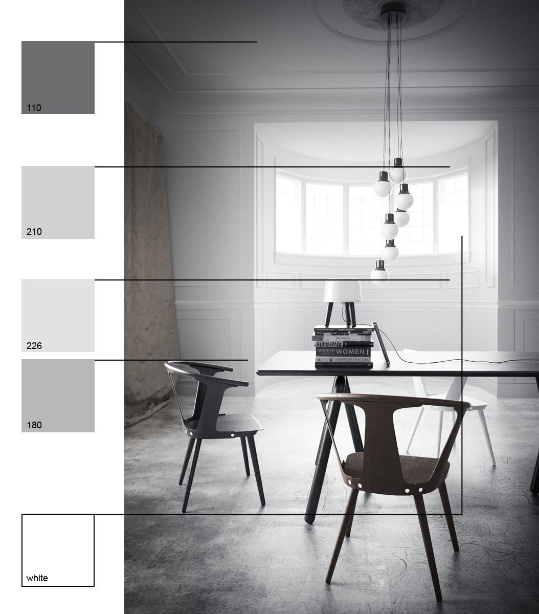
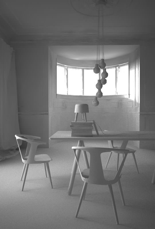
As you can see above the only thing that is really white in this scene is the overexposed window. Everything else (brown elements aside) are shaded between black and light grey. Even the white walls are not really white. Of course, this image is somewhat dark to start with, but anyway you read the walls as being white.
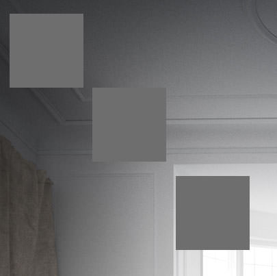
The distribution of dark and light areas in your image is a very relative thing too. You should keep that in mind. The following image shows quite well what happens with the same grey placed in different areas of the image. Notice the area within the gradient… the grey square looks like having a gradient itself! But that is not the case. The color is RGB = 110,110,110 everywhere.
To make you image consistent in colors it should have a clear concept of coloring.


The easiest way of course is having all shades of grey and one key color, but there is so much more to that I can’t really go into within the scope of this article.
I made this series of Casa Barragan some time ago. Each one has its own coloring, and yet they all feel as being part of one series. Considering Barragan’s architecture and use of color, taking it into the coloring of these renders, has allowed me to make them all be part of the same set – colorwise.
Further Reading : The elements of color / Itten, Birren
Rendering
There are a lot of resources on this topic to be found on the web and elsewhere and I am sure there are a lot of people around that know more about it than I do, but I would like to share some of my personal insight about this topic.
There is one thing that I really find important for an image if you are aiming at photo-realism, and that is GRAIN.
Don’t fear it! A slight and subtle grain in your image might just make it look more PHOTO real. The super clean smooth look sometimes is the one to scream CG out loud. Ironically, using lower render settings can help you with this grain 😉
An Example
let me share with you an image by Sarah Dorweiler. You might have come across her work on the forum, she is a 3d visualizer based in Berlin (and a very nice person).
She told me her main tools are SketchUp for modeling and Indigo Render for… well… rendering. It has an unbiased render engine which is also worth keeping an eye on. The main advantage in rendering unbiased for sure is the clarity in the details, and the subtle grain these engines produce due to the way they work… You start with lots of noise and it clears up during the process. You rarely (hmmm… never) get a 100% converged result – so you always have some noise.
You can feel it in this image… not only that it is a beautiful picture… it also has this a “gritty” feel to it, very haptic.
Considering V-Ray is the render engine I use the most, I want to try some things with it here. Some of the things described might also be transferable to other render engines.

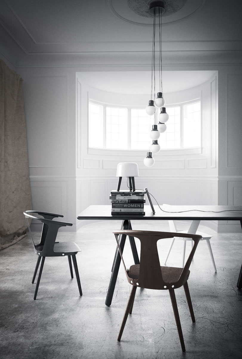
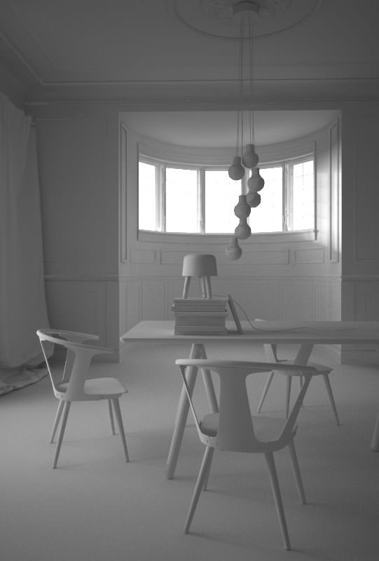
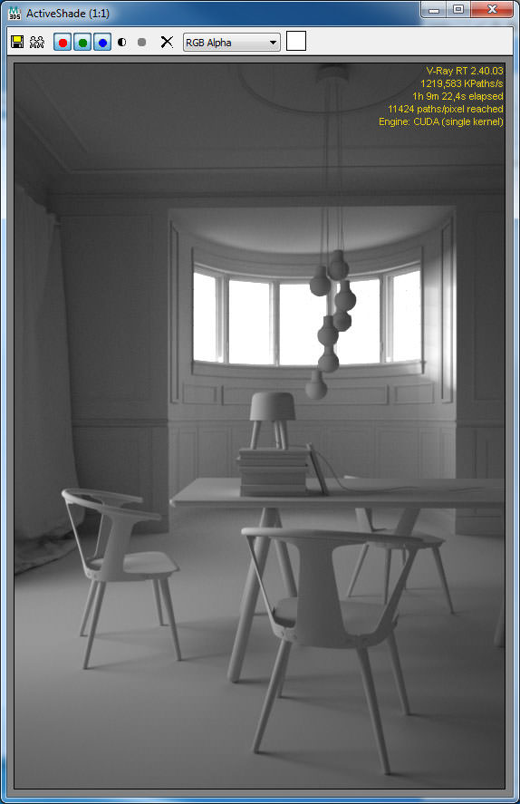
I’ll use the image with the three chairs as a testing environment.
I have applied a standard light-grey shader to everything in the scene. This scene is actually very stressful for the GI, due to the very few openings the light could enter the room… It is just the small windows in the front, and a large door on the left, so light is being bounced a lot here.
I used an HDRI applied to a dome for lighting this scene. Light subdivs set to 64.
I did these tests at a resolution of 800×541 pixels on a 4-core i7 (the slowest machine in our studio).
Irradiance Map / Light cache technique
First, I would like to give the standard Irradiance Map / Light cache technique a try. As you can see, rendering with default settings the outcome lacks a lot in quality… there are lots of splotches everywhere, the geometry and details are almost lost.
When switching on the filtering in the LC and the detail-enhancement option in the Irradiance Map, the image looks better. It still has some issues with splotches. It also took long to render.
In one version I did crank up the Irradiance Map settings. Made it finer and used more hemispheric subdivs. It is better, but still has ugly artifacts near the windows. The rendering time went up to a ridiculous 4.5 hours. One solution could be adding some skylight portals, but this would not contribute to faster rendering either.

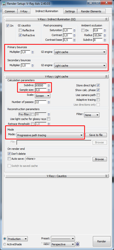
Progressive Path Tracing
V-Ray also has the ability to work in an unbiased mode. You have to set both GI engines to Light cache, set the subdivs to the max (65000) and the sample size to 0. Change the mode to Progressive Path Tracing (PPT).
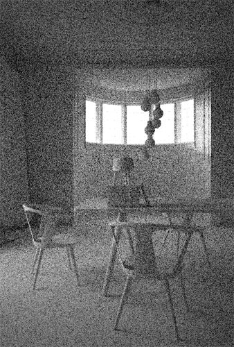
The rendering process would look like this… (similar to what other unbiased do).
And after running through it would look like this…
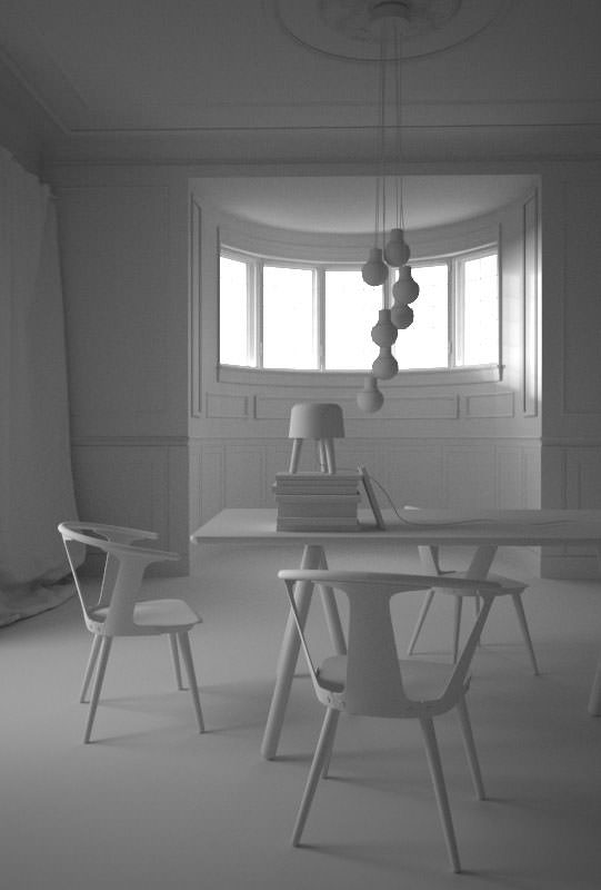
Well, this took very long to render (8 hours), but in the end it looks quite decent, I think. It has the right amount of grain and the details come out very good!
When talking about unbiased rendering we should not forget the latest GPU technologies. You might have heard of Octane Render which is having a great evolution over the last years. I have tested this as well and it really looks very promising.
In this case I tested the scene with VRay RT with the Cuda engine. I have a GTX 660 TI installed in my current workstation which sports 1344 cuda processors. As you can see, the result after about 1 hour of rendering is similar to the 8 hour PPT result. Even more contrasted which actually looks even better.
Brute Force GI
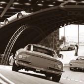
Lastly, I want to give full Brute Force GI a chance, as this was the technique I used for rendering the images of the &tradition set.
You might have noticed brute-force as a quite slow and time-consuming technique. Well, this can be… but if you fully play out V-Ray’s adaptive DMC sampler it can be quite fast!
It works quite good for me setting the adaptive amount of the DMC sampler at 0,995 (so almost 1), set the subdivs from 1 to 8. Leave the color threshold at 0.01 for the beginning… the noise threshold in the settings-tab is used to control the noise.
Don’t forget to pre-filter the Light cache, as this will give nice details.
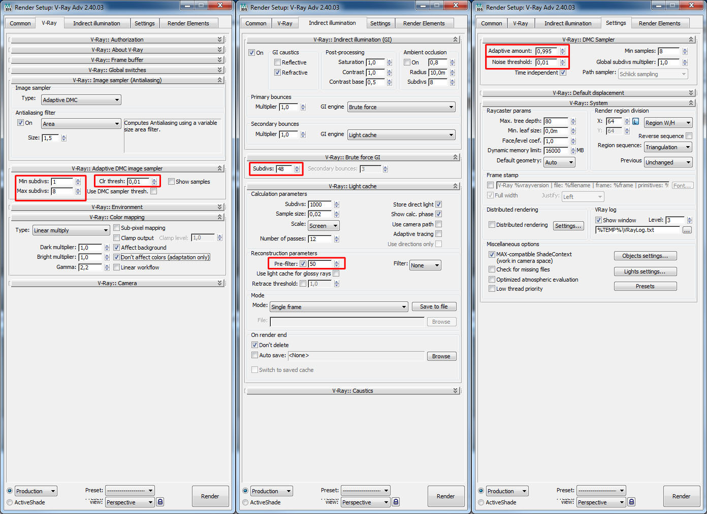
So, the following images show the Brute Force output with different noise thresholds from 0.5 down to 0.001. You can see a very large difference in noisiness very interesting here is, the difference in render-time ranging from 9 minutes (worst quality) to 16 minutes (best quality).


For the version with noise threshold of 0.001 I now lower the color threshold slowly to 0.005, 0.002 and 0.001. This causes the render-times to go up to 30, 41 and 43 minutes. You can notice there is almost no difference in noise between the render with 0.002 and 0.001. After all, the noise reached a level I would take as a good one 😉


Conclusion of Photographic Approach in Architectural Visualization
Of course you can use what ever render engine you like, and in the end it all depends on how you manage your Architectural Visualization Workflow and your deadlines. 3d artists working with traditional (non GPU based) unbiased engines are able to get their images out in time just as 3d artists who use faster methods. It all comes down to how you organize your process.
I prefer the Brute Force workflow because it is sometimes really faster than a IM/LC setup (or at least on par, and delivers better quality results). It does have its traps though, where render-times explode! So be careful!
An IM/LC setup would be a good place to start perhaps… to be on the safe side. You can still tweak it to be fast if you are ok with some quality-issues. This is one of the big strengths VRay has to offer.
The Advance of GPU
I’m very much looking forward to the enhancements of GPU based technologies. My current graphics card has 3GB of VRAM which is quite good but still has some air for improvement. Compared to traditional unbiased rendering setups it offers great improvements in render-times. compared to biased rendering with V-Ray you can already get good and faster results.
I can’t really come to any final conclusion on this, since we always strive for better quality and render-times are relative to what you have on the table. A render farm surly stands more to gain from any kind of render-time improvement… we 3d artists aren’t robots, so we do have down times and can render long as needed. other times we just render it out dirty (no matter what render engine is used).
Postwork / Photoshop
There is this thing called the Post Production stage, but in my opinion, it also plays a big role in the actual Production process. There are visualizers who actually do the main part of their work in this stage. So let’s not sell it too short!
The Goal of the Visual
The path I chose to follow depends on the goal I set at the beginning. What I’m aiming for considering the time frame too. Producing images for a competition is a different ball game than producing high-end interior visualizations for a real estate marketing print ad. It simply demands completely different things from the process of making these images and from the images themselves.
In the &tradition project, the Post Process stage was very minimal. Most of what you see came out with the render. A photographer does not have the power of CG in his hands as we do, and so most times their post-production stage is also minimal (considering architectural photography… other fields may display extensive post-processing). In our field, most of the render engines today are able to produce photo-realistic images. You must keep in mind that it depends on you to tap into it and take advantage of the full potential. If you take the challenge and work on all aspects of your scene – modeling, composition, lighting, textures, materials, colors, styling, etc. then you are at the point where your raw render is the final result or very near to be one. You’ll be left with minimal post processing just the same as a photographer.
A Small Tip
About those final tweaks to your image…
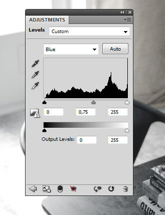
Aim for subtracting values rather than adding to them. So for example, if you want something to be more yellow, reduce the blues. That somehow works very good and does good things to your overall result. This sounds a bit esoteric, I know, but I think the reason for this is that you avoid overexposure of certain areas and disturb the overall balance of your image and keep the colors in the lower levels.
So finally, I hope I did not bore you with my bag of half-knowledge and esoteric ideas of how images work/do not work. At some parts, it may sound somewhat banal, but that sometimes is how everything comes together. An addition of simple things. I’m a big fan of the KISS principle (Keep It Simple Stupid) or Less is more!
This is just a part of my view on what Photographic Approach in Architectural Visualization is and other things 3d related. I hope you enjoyed digging through this 🙂
kind regards,
Lasse.
Author: Lasse Rode / Studio XOIO
![]()


The Berlin-based studio xoio has been established in 2006 by Peter Stulz and Lasse Rode. It is specialized in high-quality emotive architecture and product visualization. The team at xoio consists of people who have an architecture and design background. That provides a strong understanding of creative processes and the ability to give support in questions of design.
This one is from way back and could use a refresh! I’m sure many of you, who just got started when Lasse first wrote this article, can now add your own take on this topic.
Haha, Yeah this is really old… but many things are still valid!
Of course achieving photorealism is not much of an issue any more - hardware and software developed to a point where other things matter. (All those techie quirks… oh well, they are in the past thankfully).
Also photorealism lost its “wow” moment in meantime, at least in our field - also to a point you can really ask what it is then? The reason the photographs I re-made back then “wowed” me is far more important.
I have seen works and met artists over the years who really do great stuff - on a level it floors me. All are photo-real, all are great.
So for me today the quest again is “what is a great render”? Or “what is a great image”?
Answers, anybody?
And we can all welcome @LasseRode to TALK as well!