


Making of Seaside Feeling
I like architectural designs & visualizations with water in them. Make it seaside and I absolutely LOVE it – but then, who doesn’t? That’s why it didn’t take me long to reach Pedro Fernandes and ask him about how he made the “Seaside Feeling” image you see here, up above. Pedro has freelance experience in really interesting companies such as Vyonyx, Crystal CG and F10 Studios. He’s portfolio showcase both full 3d scene resulting images as well as dominantly matte-painted works, so it is interesting to learn how he goes about creating an image. Enjoy!
 Author : Pedro Fernandes Arqui9 is a Freelance Project, founded by Pedro Fernandes, 3D Artist (Currently residing in London). He is a fully licensed Architect, dedicating himself solely to 3D Art, specializing firstly in Architectural Visualization and now in Environment Art and Matte Painting too.
Introduction
Hi to all, I was recently contacted by Ronen Bekerman to write a Making-of for this little project I did a while back. Ronen has done a lot for the ArchVIZ community and he continues to be one of the most consistent players out there delivering quality content for us all. So, big thanks to him, and now its my time to give a little something back so heres the making of “Seaside Feeling. A bit about myself first My name is Pedro Fernandes, and Im a freelance 3d artist. Im a fully licensed architect who soon enough decided that making visuals and digital art was the way to go. I have a passion for experimenting and I’ve tried everything from the heavy modeling and texturing with VRay.
To the really intensive painted and matte painted images and projections
Ive managed to work at some really interesting companies. Some of them being Vyonyx, F10 Studios and Crystal CG. I must thank all of them and the artists who work there, as they had a big influence on what I do.
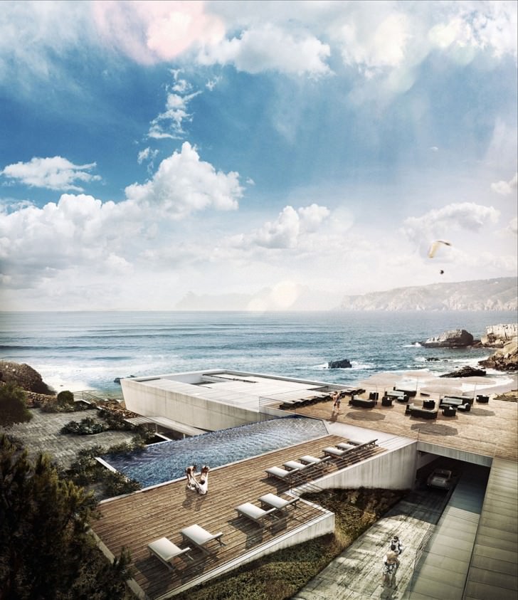
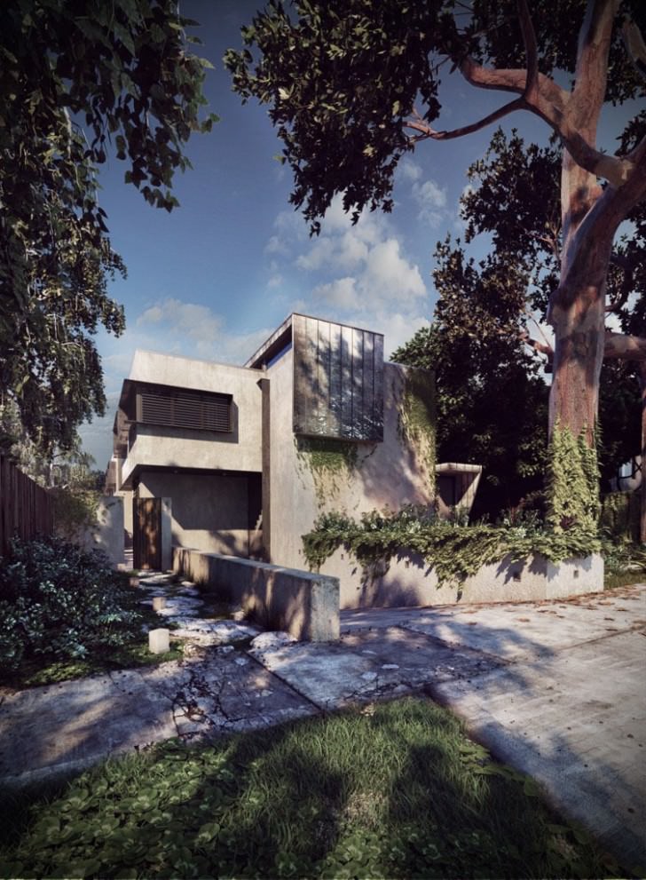
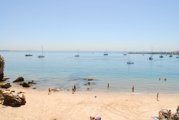
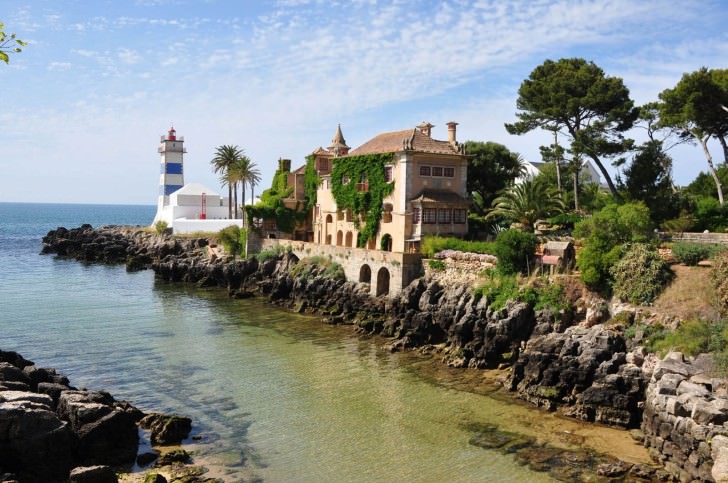
This work here is based more on the matte painting qualities of an image. It is a project based in Lisbon, Portugal (where I was born) in a beautiful place called Cascais. It’s a cosmopolitan seaside city right within the outer limits of Lisbon, I highly recommend you to visit if you get a chance. I did this work a while back, although I changed a few little things mostly in coloring and small details to fit this Making-of.
Inspiration
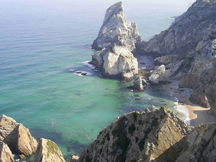
Inspiration wasnt too hard to find, as there are many photos of seaside coasts scattered around the internet. From an early stage I knew I wanted to do a faster matte painting image, as I knew time was of the essence. Im a huge fan of the trio MIR, Luxigon and of course Vyonyx, so I knew I wanted to do this one similar to the style those 3 showcase. I gathered some inspiration reference material and decided to go forward-looking at tones and colors that I wanted to portray in my scene. Next, I proceeded to gather some site context info
3D SketchUP Model Supplied
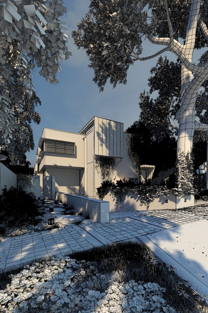
The model supplied was very well done and required minor adjustments only. I proceeded to import the base SketchUP 3d model into 3ds max, where I started quickly mocking up the file.
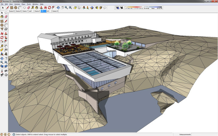
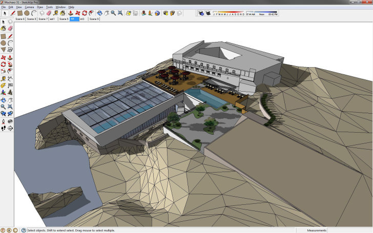
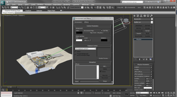
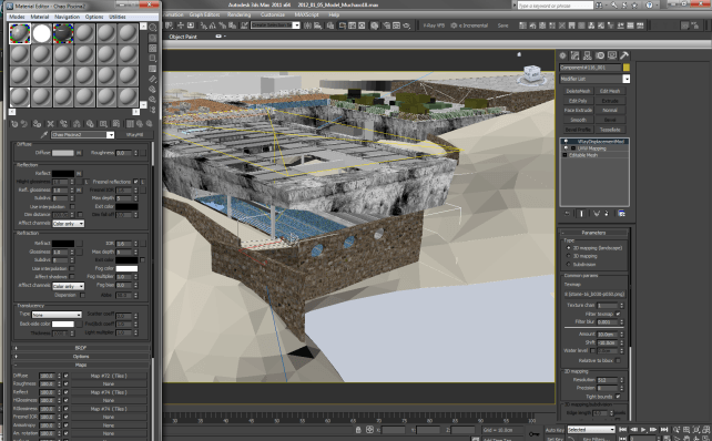
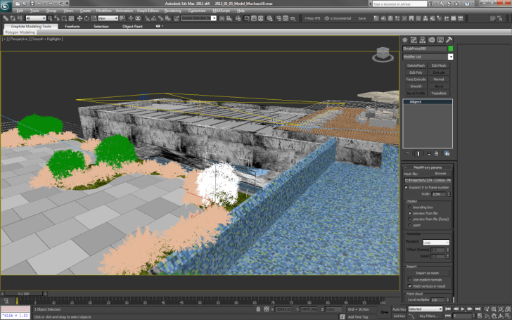
3d Studio Max Setup
Everything in the 3d Studio Max setup is very basic. I knew from the beginning what I was going to do and didn’t want to spend any more time than necessary in the 3D phase. So, here is a basic breakdown of the 3D scene
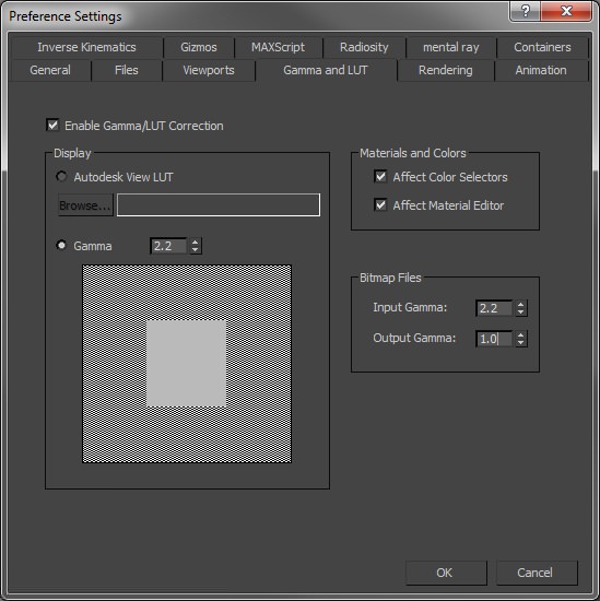
Gamma
Theres always quite a lot of talk on Gamma. Im not the biggest expert out there, but this is the way I’ve worked over time and seems to blend in with the norm at the major companies. I output the gamma to 2.2 through V-Ray on final render, this wont matter much if you dont work in a linear work environment, but in case you do and you output to other composting software such as Nuke or Fusion, it can make a difference.
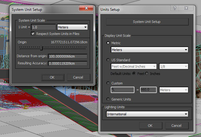
Units
Another important thing to remember is the basics of a file. In my case I use the metric system and as such I have my scene defined to meters for display and also as system units. If you prefer to work in CM or other you can do this through the display units without re-configuring your file units.
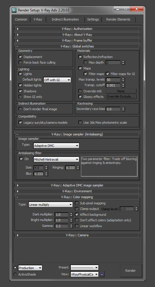
Lighting
Lighting once again didn’t have to conform to other cases, where more 3D elements would be used and was done with a simple V-Ray Sun and a V-Ray Sky in the environment slot. These were then linked up and voila! Sun should be ticked invisible so it doesn’t mess up the spec highlights. A sky portal light was also placed above pool area to let some light flood inside pool area. One thing I usually see happen with some relatively new users is forgetting to tick, the Affect Shadows Option in V-Ray Materials, Refraction, this will make it possible for shadows to be cast through the glass.
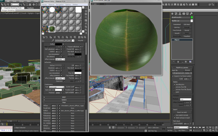
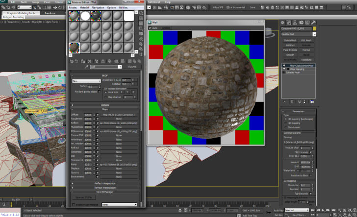
Texturing
Nothing out of the ordinary here. I just used a displacement on the rock texture, so I could create a similar effect easily without needing to paint as much. This was not as relevant in this viewpoint, but I decided it would be a good base as I had the freedom to move around the camera as I pleased.
Camera
This camera was one of the key shots used. I wanted to convey the connection the see had with the architecture, and how the design not only lent itself to that elements but also configured itself around the terrain and pre-existing pool. I liked the architecture within the shot and that in itself was already very inspiring. The camera just came naturally. Note I used no vignetting and white balance was set to neutral, so I could have as much control in post as I wanted to.
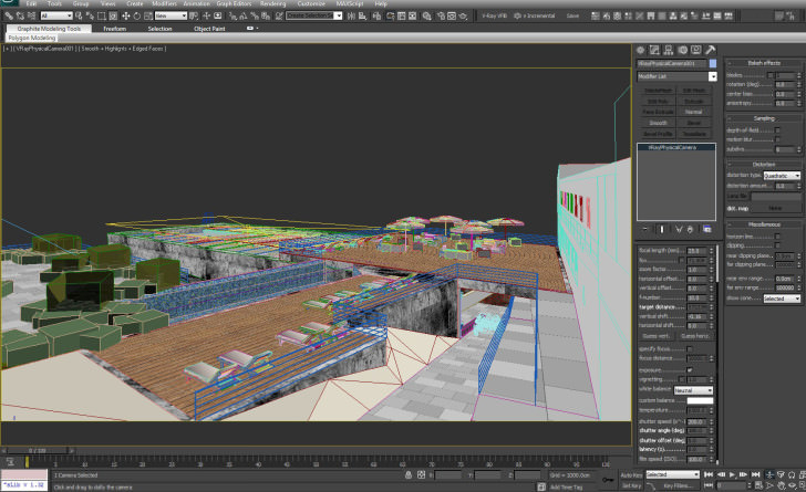
Proxies
I did however use some proxy bushes within the gardens, sometimes it can be easier than doing everything in Post with 2D images, but then again its just down to personal preference.
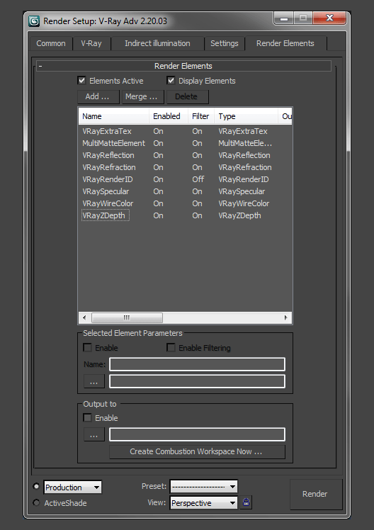
Render
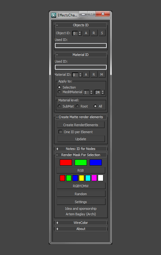
Render Elements are your best friends Let this sink in well! Render Elements are your best friends in Matte Painting. You can isolate certain parts and bump up reflections, lower shadows and increase lighting all through these. I tend to use and abuse multi-mattes as it lets you render out the elements you want. There are quite a few online tutorials for this, so Ill move on. You can also use a handy little script, which I started using through a friend of mine called Simoni Nastasi, titled EffectsChannel. It’s a great little script that will configure all your render mattes and multi-mattes.
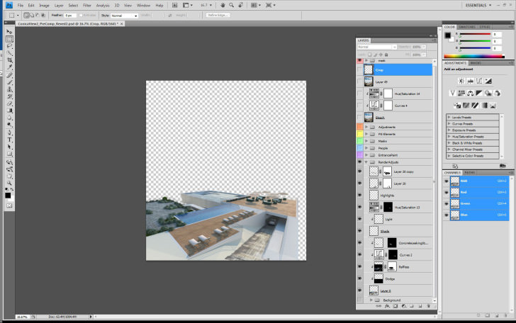
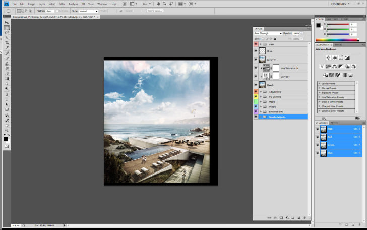
Photoshop Postwork
And thus, finally, we arrive to my favorite piece of the process, where the magic really happens. Although I look back on the image and know it does have its defects and it isnt perfect, Im also conscious that sometimes we have to constrain ourselves to tight deadlines and try and make the most of what we can. Thus, the difference between personal work and professional work. Im pretty much never satisfied with any image I create and think there are always so many ways to better it its always good to have this personal auto critique, but at the same time dont let it get you down comparing your images to whats out there. Try and enjoy what youve made and know that next time you will create something better. And now for my favorite part!
Raw Render
This is the raw render I started out with. Its always best to work within a large resolution so you can compress all those details on your final output. I didn’t go too high on this one, but I would usually go to about 4k or 5K wide images, depending on what has to be done.
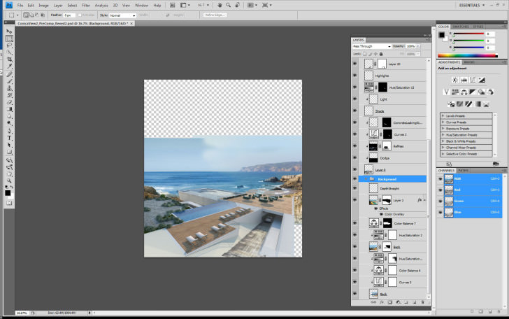
Background
I start layering in the background images, from reference material gathered from the architects and also from the net. Preferably I would have visited the site and taken my own photos, but time was of the essence. I also recommend a great image source from Vyonyx, called Gobotree, use it and abuse it. Its fantastic. Also make use of the well-known cgtextures.com I try and firstly adjust the levels on each photo to match within the scene, getting into color balance after this. A nifty trick is to turn your image to gray-scale through Hue/Saturation and then check if any of the levels are off.
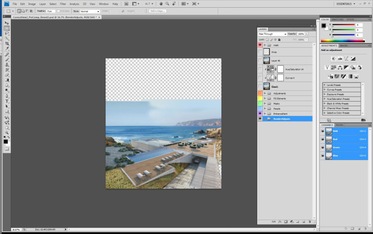
More Textures
More textures are layered in, making sure they match the perspective and also colors. Its super important to check that you achieve proper depth within in your images. As things recede in space they get hazier and tend to desaturate to an environmental tone, bluish in this case. Another little trick is to keep flipping your canvas, as your brain will get use to seeing the same image and will start to not pickup on obvious mistakes. It gives you a fresh look on things.
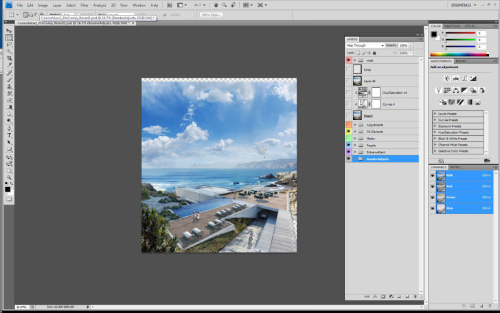
Foreground Elements
More foreground elements are added. This time dirt and shadows are overlaid and multiplied to images, also using the Render ID Mask for certain selections and changes to colors, overlays and materials. At this point during the process I tend to blend and mix all colors to the base color grade I have in the image by using Levels first and then Color Balancing to adjust the tone. The major curves / contrast adjustments will be given in the end.
Adjustments and Lighting
Here I’ve painted in some light / shadows and highlights. Were now moving on to our final image. Ive used curves to give the contrast I need and also painted in some light through dodge layers. I apply a bleach bypass, which you can use a filter from Magic Bullet Pro or Nikon Effex, but in this case I did it manually. Firstly Sharpen the image, then desaturate it a little while increasing the contrast through curves or brightness contrast. All tonalities are mixing together and we’ve achieved a global look to the image.
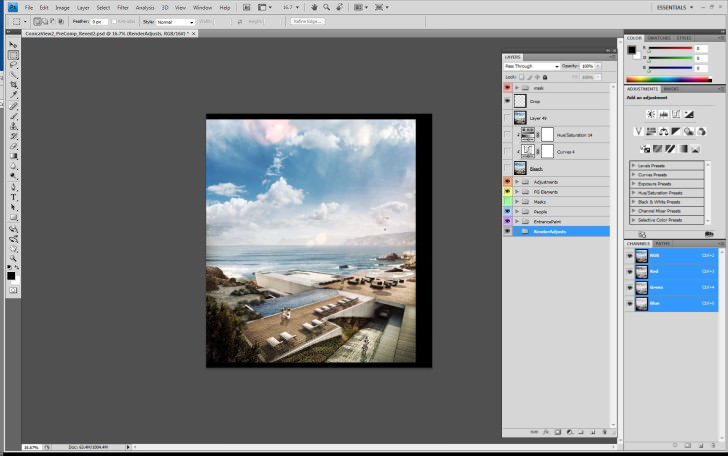
Final Shot
After all done, the final crop is applied and here we are left with the final image…
In conclusion
This was one of many techniques within Architectural Visualization. its never really just about the tools in the end, but more about the vision. I hope you have enjoyed this little making-of and have also had a bit of fun, as I have certainly had. Hope you enjoy some of my other works too, especially a personal piece I did a couple of months ago, with some heavy matte painting and video projection. It will be the next breakdown! http://vimeo.com/45989870 Fire away with comments down below!


Trackbacks & Pingbacks
[…] this piece in his now famous “making-of” series, we’d previously made one called “Seaside Feeling” which was very enjoyable and thought it would be great to actually do […]
Comments are closed.