


Making of Adelaide Housing by Arqui9 Visualisation
Pedro Fernandes is a frequent blog dweller, sharing great work featuring a style approach I like a lot. He posted making-of articles here won numerous Best of Week award. This article of his stand the test of time! he is sharing the process of creating the visuals for the Adelaide Housing project for an architectural studio called Architects Ink. There’s great insight in this article… so dive in and enjoy!

Author :Pedro Fernandes / Arqui9 Visualisation
ARQUI9 VISUALISATION IS AN AWARD WINNING BOUTIQUE ARCHITECTURAL VISUALISATION STUDIO BASED SOUTH OF LONDON. IT’S CORE FOCUS IS THE CREATION OF BESPOKE MEDIA CONTENT FOR THE ARCHITECTURAL COMMUNITY. THE STUDIO’S FOUNDER AND DIRECTOR IS PEDRO FERNANDES, ARCHITECT / VISUALISATION ARTIST / LECTURER.
See all of Pedro’s Forum Threads…
Firstly, I’d like to thank Ronen Bekerman for contacting me to feature this piece in his now famous “making-of” series, we’d previously made one called “Seaside Feeling” which was very enjoyable and thought it would be great to actually do another.

Introduction
The studio has grown over the past few years and I’ve gradually made the transition from freelancing into the business, which now is starting to strike roots around the globe. This set of images was created for an architectural studio called Architects Ink, located in Adelaide Australia.
A special thanks to the studio, who really went out of their way to let us keep quite a lot of our artistic integrity. It was a fun process, as the architect in charge of the visuals direction had quite some experience in the field and was open-minded to let us continue with our process and also make some very witty observations (extra pairs of well-trained eyes are always a plus).
Approach and Strategy
Those who know Arqui9 Visualisation, know by now we are quite heavily focused on post-production, we have made a few tutorials on YouTube, that shed a little light on this process. We firmly believe, there is no right or wrong in visualization. Interpretations and techniques are personal and professional choices that really should be adapted to each circumstance and individual… we thought this time around we could actually write something that benefited pretty much the entire spectrum of the visualization field.
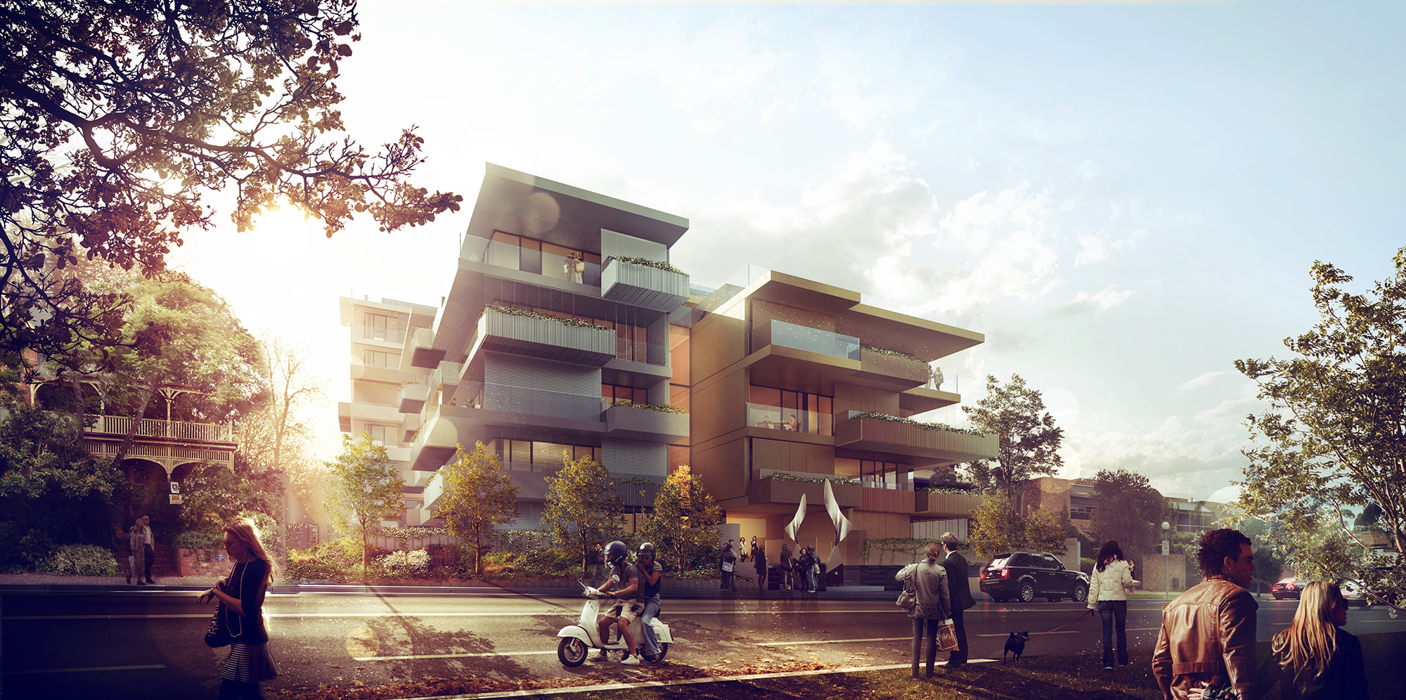
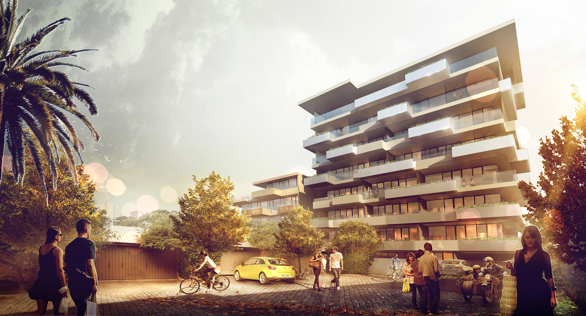
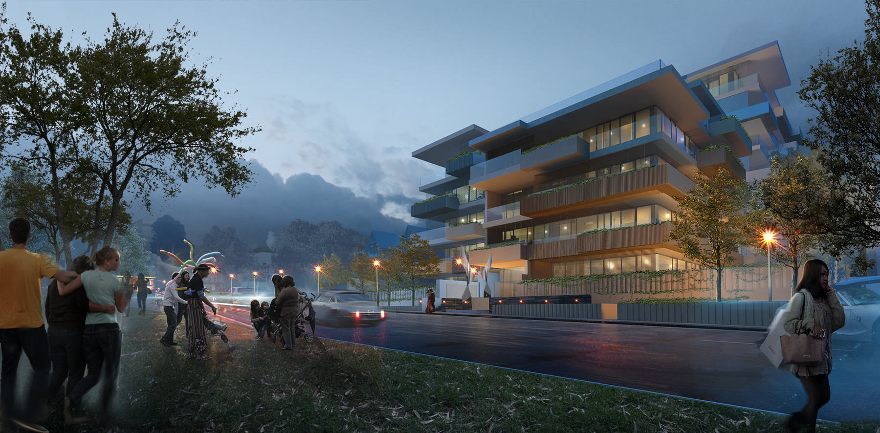
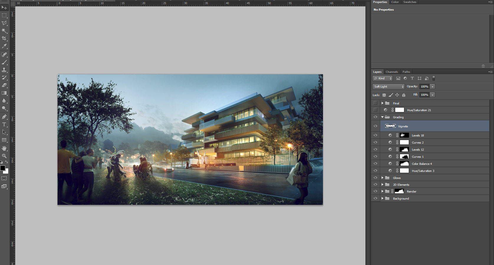
We were asked to create a set of images for a housing complex in Adelaide. The architecture itself was quite interesting and had an interesting formal housing strategy behind it, which I wont go into too much detail of. The building itself relates quite heavily to the park in front. Below you can view the final result of the set.

References / Mood
When searching for inspiration, generally, the building form shouts out its own language and style for an image, a faint glimpse of an idea arises, this is when we actually start to look for reference which may also open our minds a little more.
We find this technique we call “personal intuition reflex” most helpful as it very natural for us and enacts instincts and experience gathered, thus the importance of actually absorbing art as a whole in all forms – cinema, theater, dance, music, and many others, so our mindset dont conform to a unique trend or style.
Easier said then done… I know!
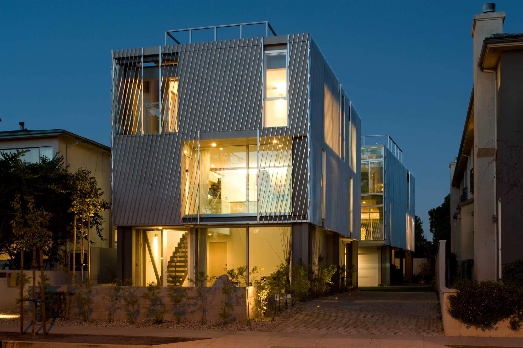
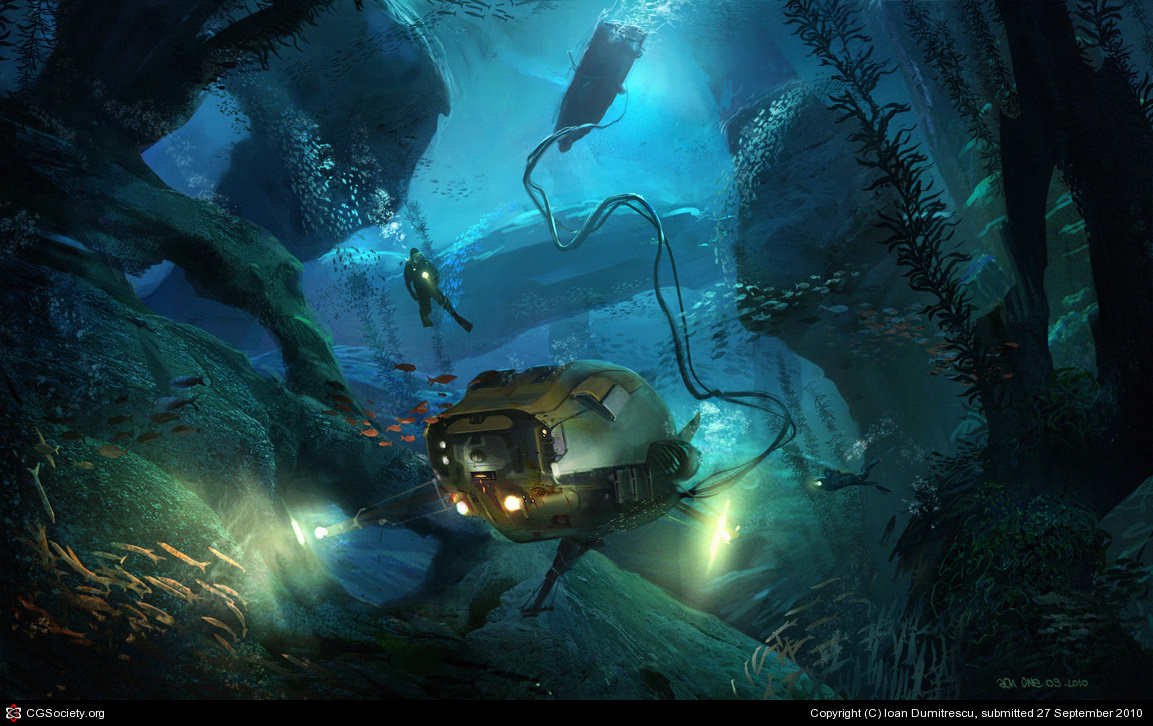
Below you can see a set of reference photos. As you can see they span various styles.
As mentioned, the client was quite open to stylized approaches and thought it would be great to show the building in its various types of light and differentiated visual forms (the one we are actually showing here wasn’t the final version but was none the less our preferred version).
When searching for inspiration and reference, the focus isnt really on finding high-quality 4K resolution images, as it is on searching small thumbnails and abstract forms and colors which give us some indication of our initial direction and theme. The above examples are but a few that came into play, again a refined search will always help you focus more and limit possibilities.
Lighting and Texturing
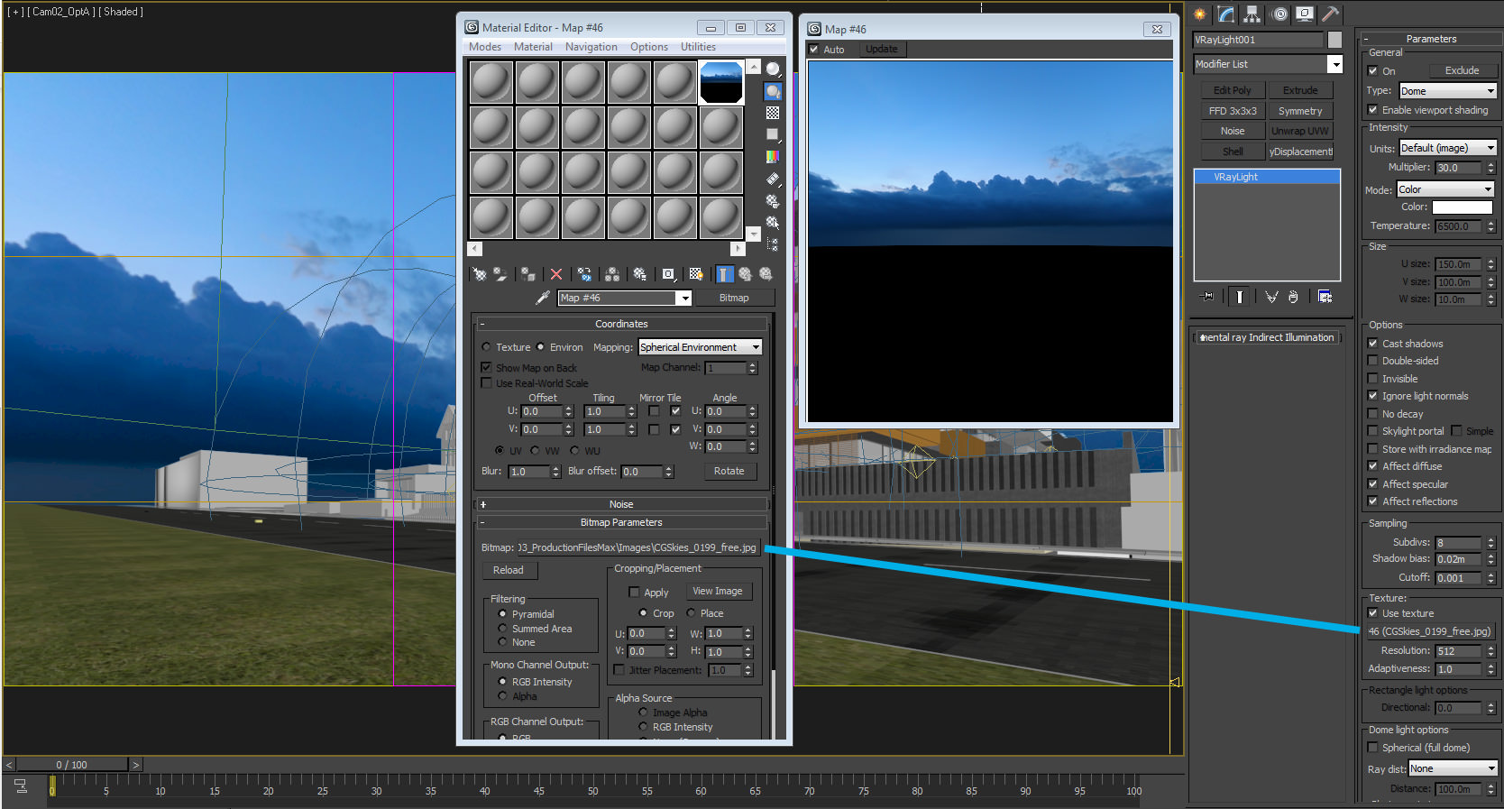
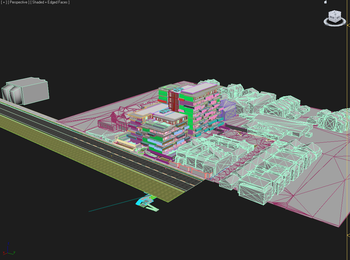
In terms of lighting, a simple dome light was used with a spherical map from cgskies.com, HDRIs can also be used and of course with better results. Above you can see a simple wireframe render to demonstrate the lights used.
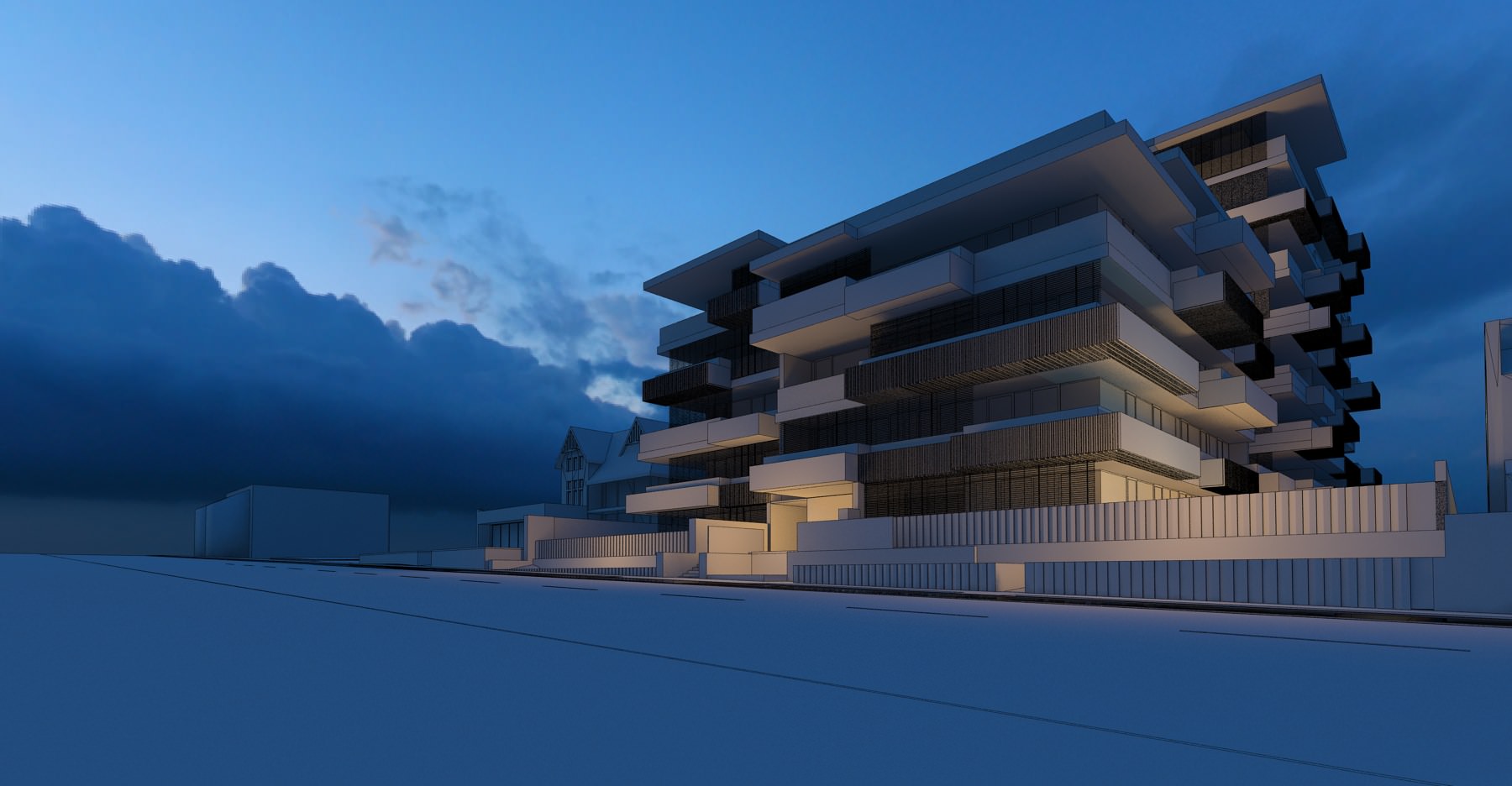
IBL for Dome light settings
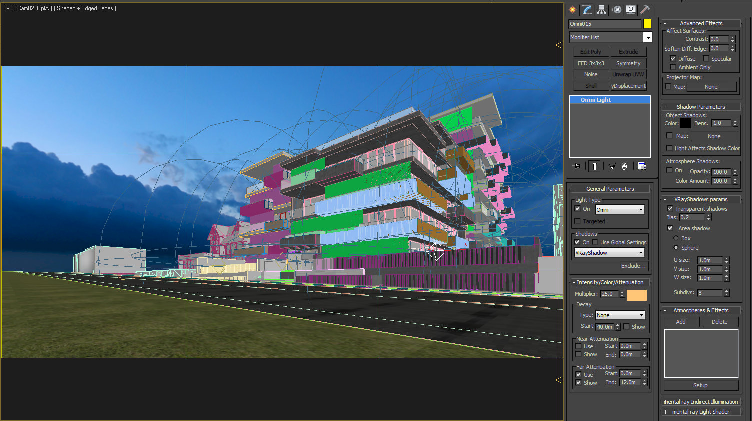
Placement of Omni lights in strategic places also helped to place emphasis on the base and entry point to the building as shown below. Nothing too complex here…
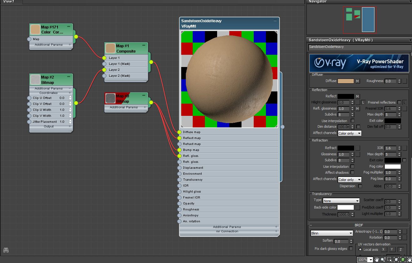
Texturing
Textures were quite simplified as we knew a lot of post would be added to create the look and feel we needed. You can see the Sandstone texture, which among all is probably the most complex one.
Composition
Being one of the vital factors in any piece, the composition is generally a compromise of various factors, which cater to both the clients vision and also your own artistic creation. Your job ends up being to demonstrate and show-off the full potential and fourth dimension of an architectural piece.
I tend to divide compositions in various factors :
Eye Direction
Your eye needs to be guided and balanced through the piece. Through light and shadow, you create lighter denser tones and contrast, which in turn attract and detract your eye. Although you are seeing the final piece demonstrated above, it represents the initial vision and ambition that is then translated along the way into this final piece.
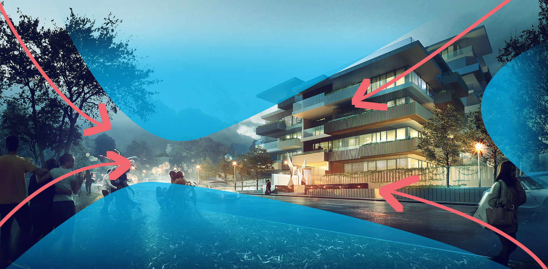
Just like any trip, you need reference points, visual guides of interest. Imagine when you visit a city like Rome, you have your main attractions, but then you also have the beautiful small streets which aren’t really your main stopping points but which add to the sum of the parts to create beauty.
This brings us to our next point, depth and form.
Depth and Form
You could possibly identify 3 to 4 depth planes in this piece. Darker more contrasted areas will pop out as the foreground plane and the lighter and less contrasted areas recess as we progress forward, this also helps one feel inside an image and create depth.
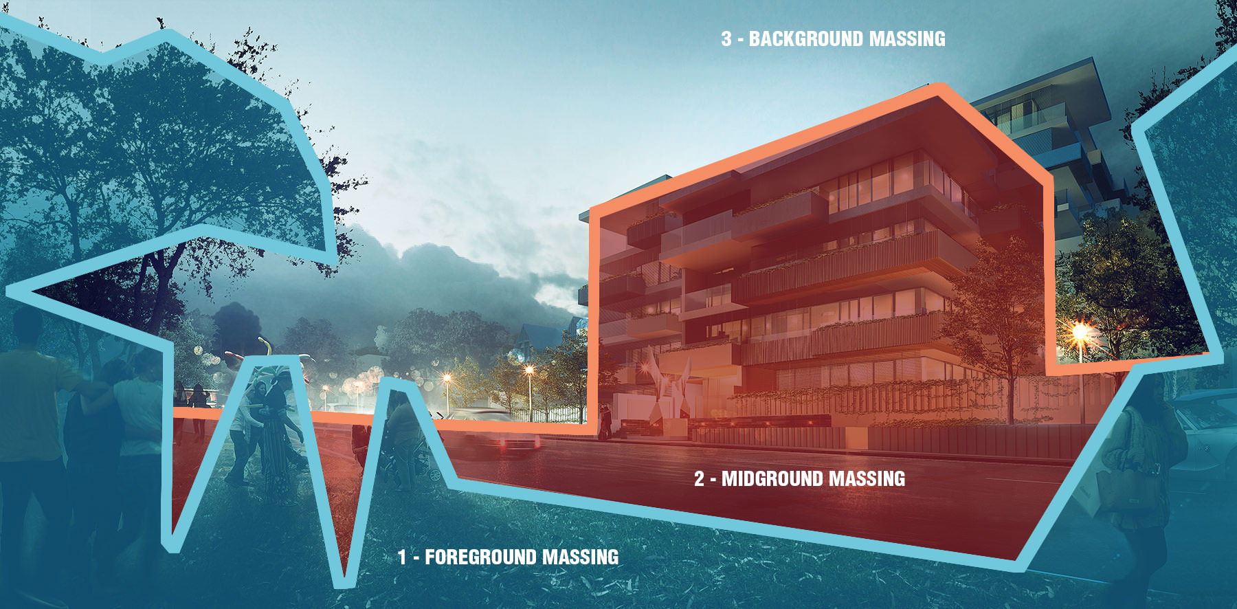
If you begin to squint your eyes, you will see forms balance themselves out, which leads us onto our next graphic.
Tone and Color Balance
Tones and colors are interesting subjects and could probably be debated forever, I suggest a quick Googling of color theory to have a firm grasp on their importance. However below you can see what I’ve called sweet spots. These are focus points that balance the image, generally triangulated points that bounce off each other, be it with bright intense points or even black contrasted points that draw the eye and balance it out.
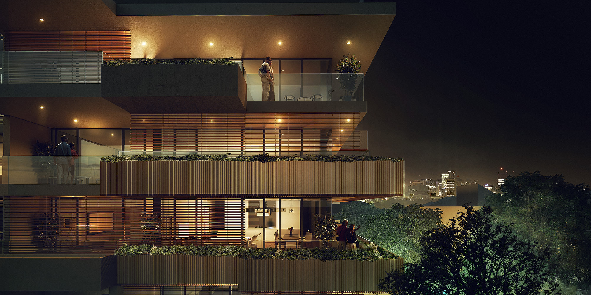
These also help to determine the most important aspects of the architectural piece, which in this case was its relationship with the park in front and also the grandiose balconies and opened living spaces.

When working on an image we dont generally use these types of grids (rule of thirds) , but you can really somewhat start to feel them with practice.
Post Production
And here we are, one of the main phases in our process and where things really start to take shape and come to life. Every artist has their unique way of compositing and not to say that one is right and the other is wrong, but the main goal is to create a unique visual that really brings your architectural piece to life.
A general comment that springs to life with our approach is “what if the client changes the camera”, simple answer – That means you’re going to have a lot more work! That’s why it is important to have a quick and simple first phase to lock down those cameras and variables. You can see below our quick process with drafts to get a sense of mood and feeling for an image.
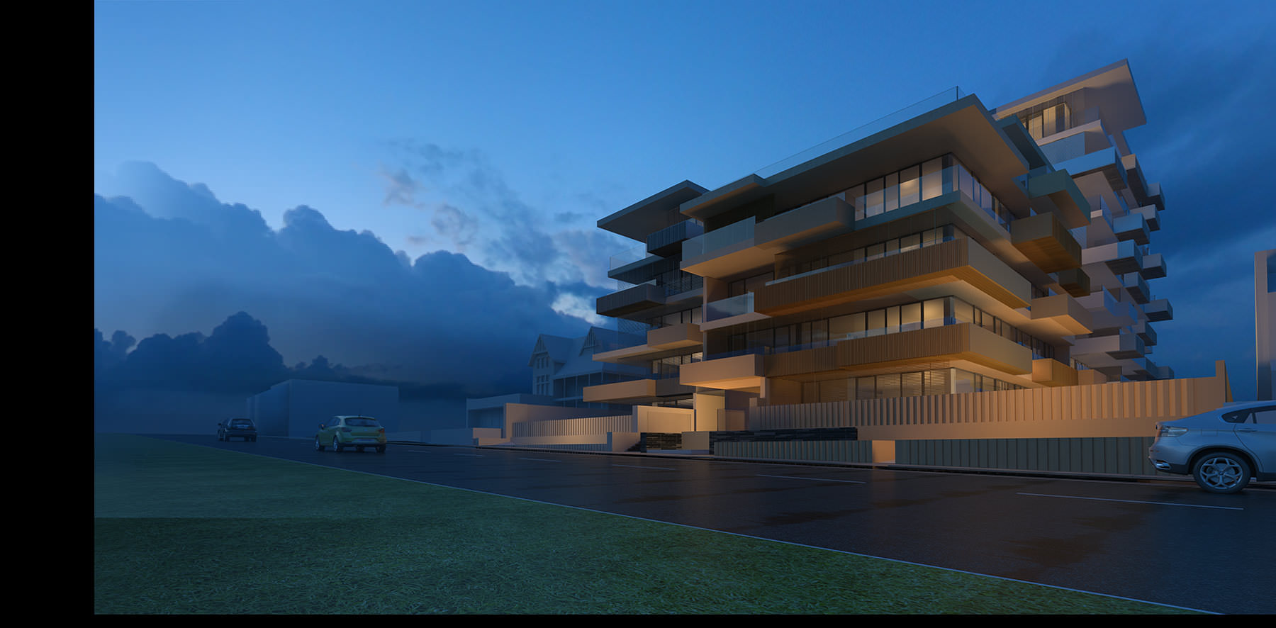
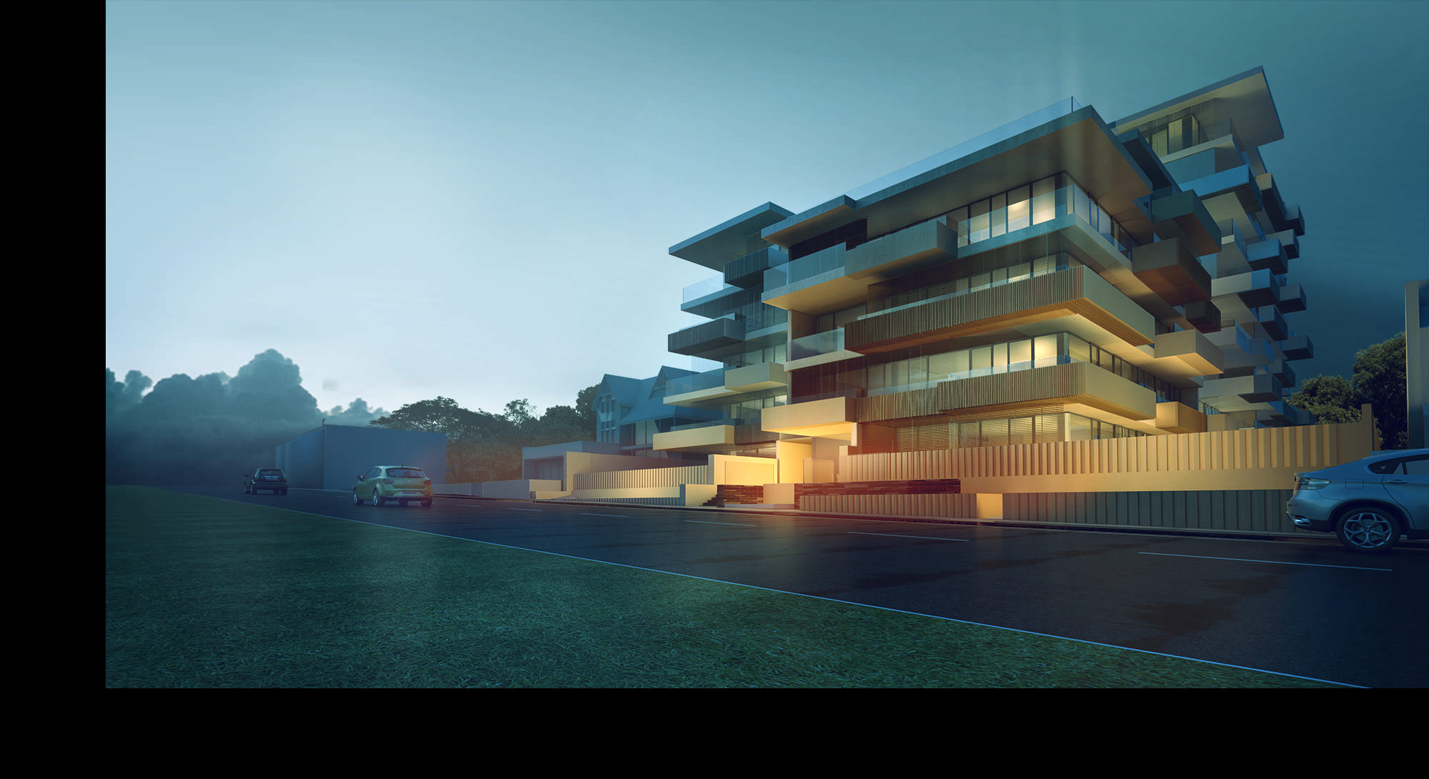
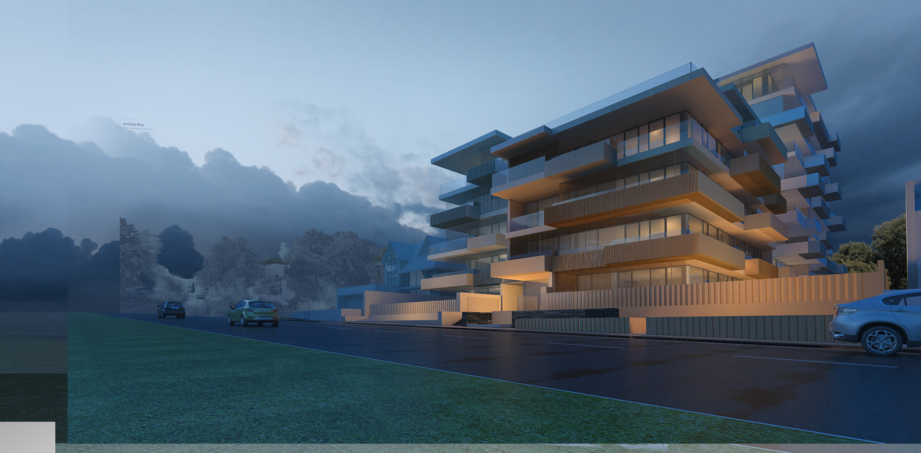
The set of images below demonstrate a quick glance at how a initial raw render relates to a draft and then to the final output.
The Raw Render
The Mood Draft
The Final Output
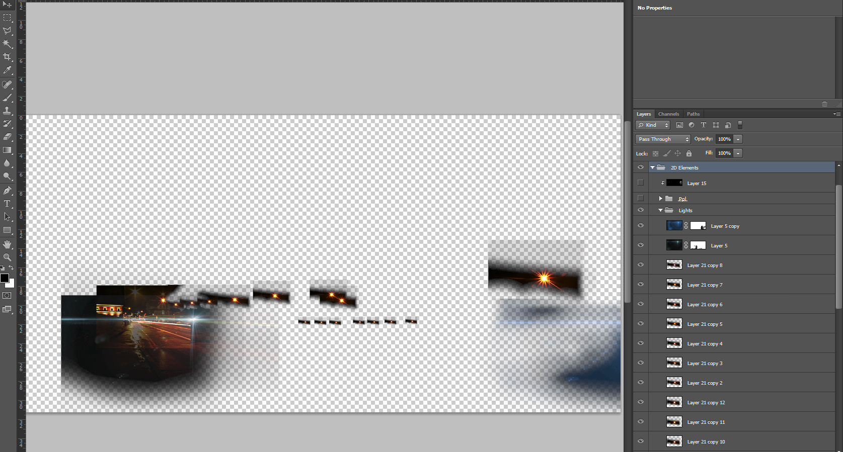
Post-production Breakdown
Render Passes
Render passes are your best friends, you can practically “bring life to the dead” with render passes – bring back burned areas, darkened areas and even relight an image. Below you can find some of the ones I use, these are probably the standard ones in our process.
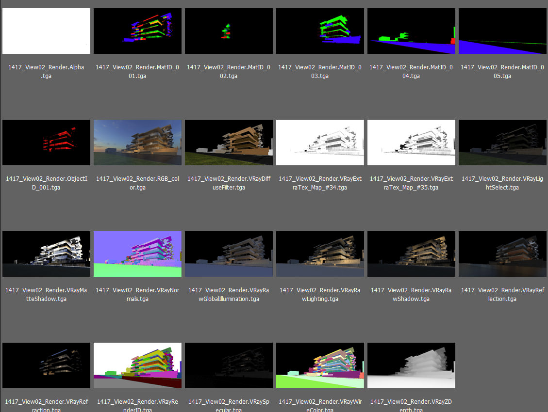
So let’s start our post production break down.
Raw Render
Our blank canvas in which we already have an initial concept and idea of forms and light. We end up extending the canvas to accommodate more of the park life and relationship which is quite important to this building.
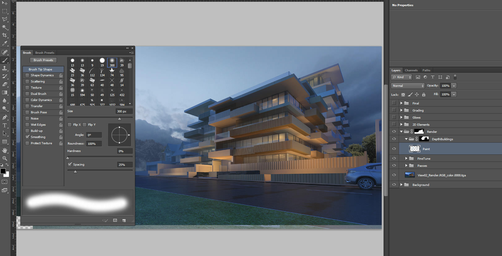
Render Corrections
In this phase, we use our ZDepth pass in screen mode to add in depth. We also color correct using curves or levels, adjusting and lifting black-point to eliminate some of the darks In the above image you can see how depth has been painted in with a standard soft brush to create a further separation of context from the main building.
Inserting 2D Entourage
Entourage plays an important part in any scene, buildings are for people and surroundings, they coexist with us, so there’s something quite intricate about how we represent their surroundings.
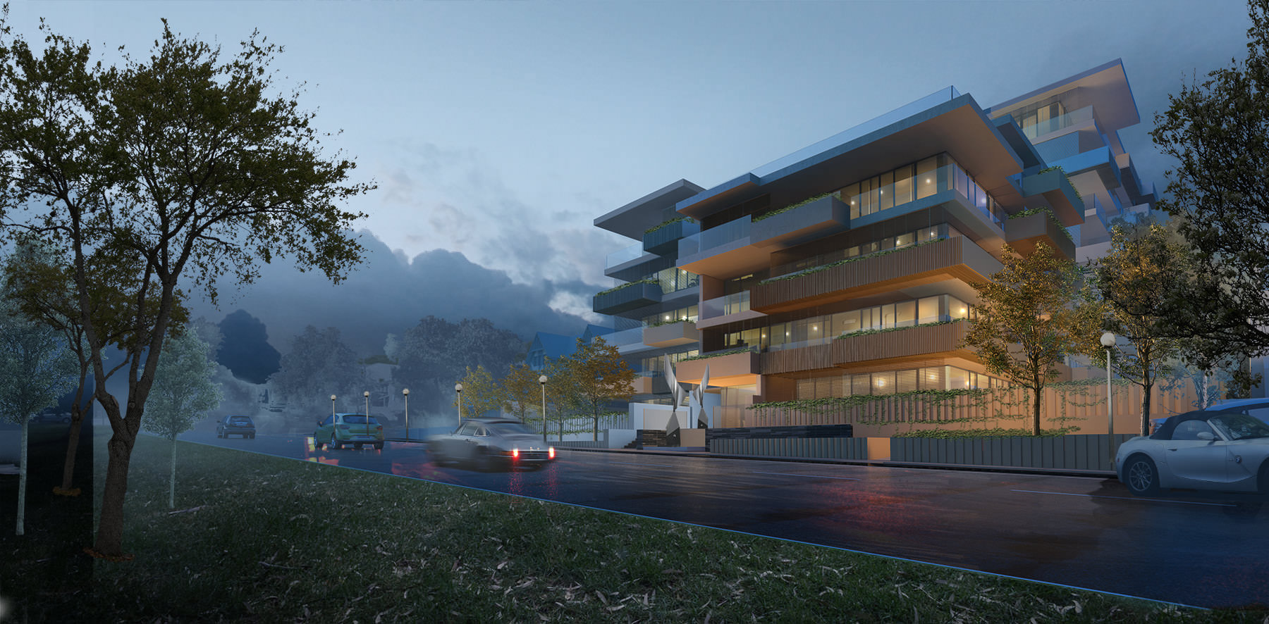
All the rules of thirds and Fibonacci sequences are great, but linked without a story they are merely but formal mathematical expressions. In this phase trees, cars, people and corrections are being made in a fast pace. When inserting entourage, there are two main steps, which are quite simple, levels to match context and also color correction. I’ve made a tutorial that covers inserting entourage into a scene (people in this one, but can be applied to all other materials)
You can see how more extras and lights have been inserted.
Lights are added by simple setting their blend mode to screen or any other transfer mode that suites, you can also do this with a brush if you desire.
Lighting and Grading
This has to be one of my preferred phases, as it really enables quick visual changes. It’s also the one which require most balance and a contained hand / eye as it’s quite easy to go a little too overboard – an extra set of eyes also really helps.
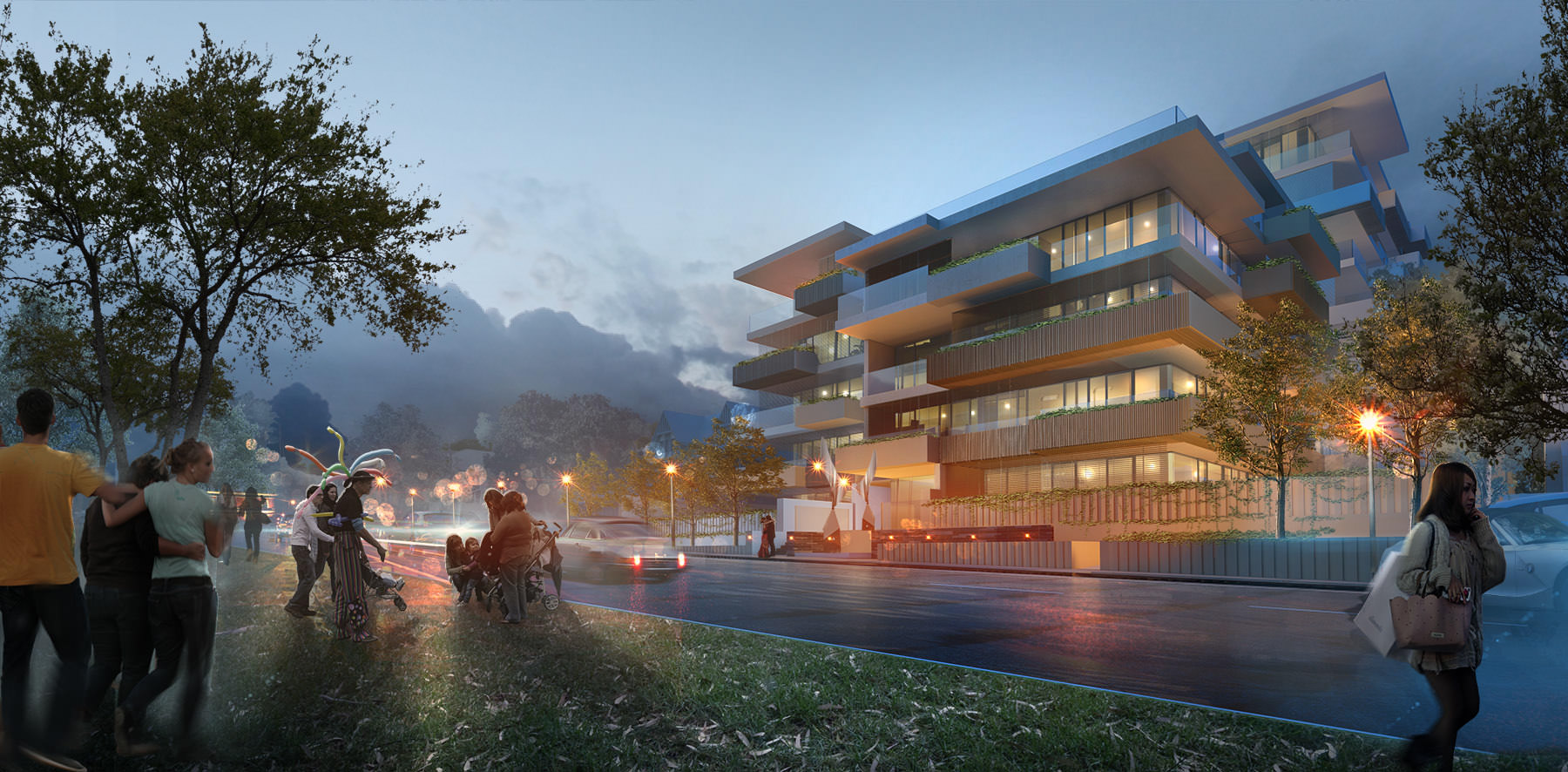
Using a combination of layers set to overlay mode, I start painting in focal areas and highlighting the most important aspects, our eyes will be naturally drawn to the hot-spots, it’s a play on the initial balancing and form construction which we discussed in the beginning of our tutorial, I’ve also covered this quite extensively on my YouTube video about depth compositing and post production.
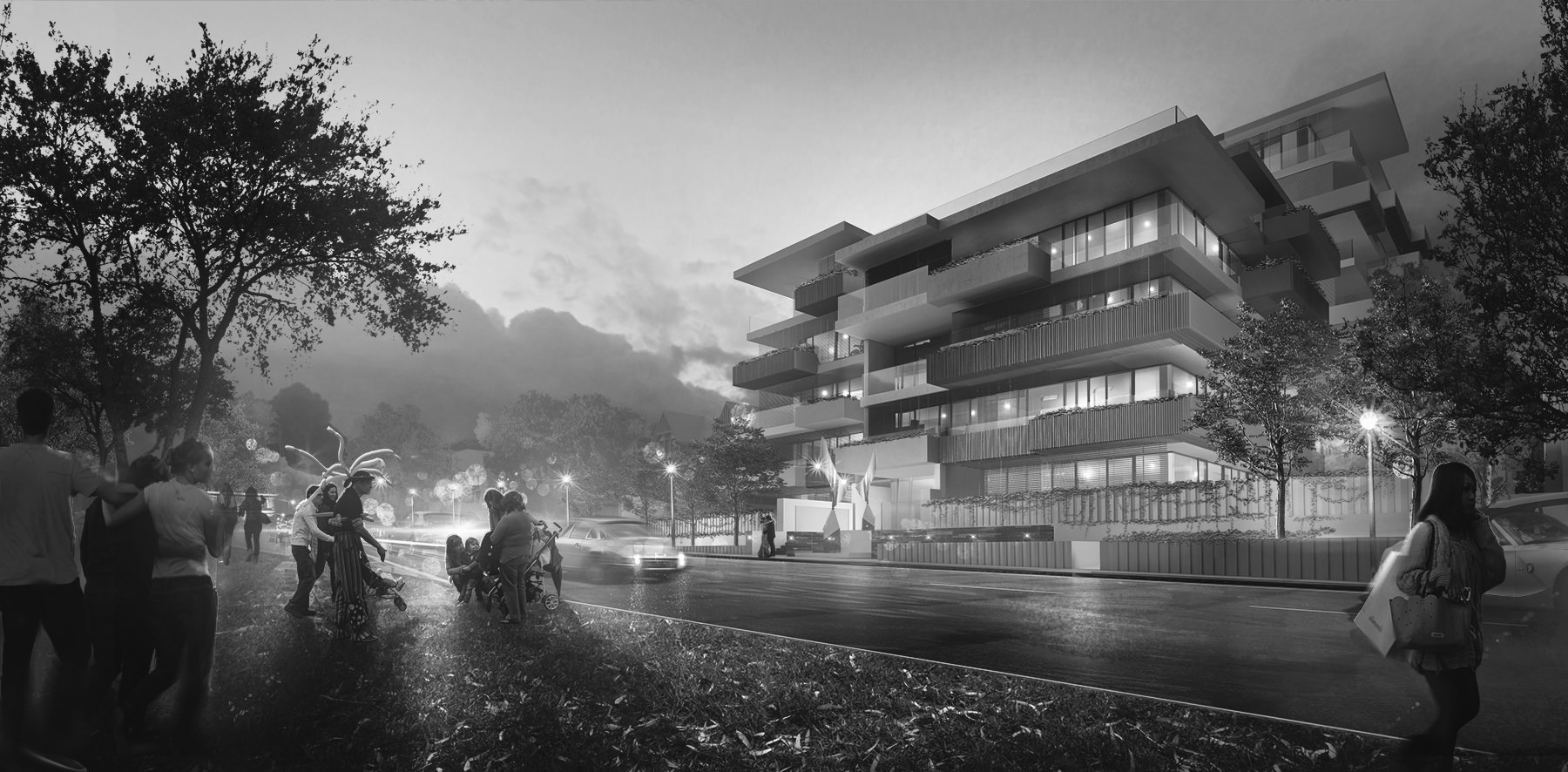
The final grading is very simple and is all about upping contrast, crunching colors down a little by desaturating gradually the entire image.
A quick black and white verification to see if everything is working visually in terms of depth and contrast.
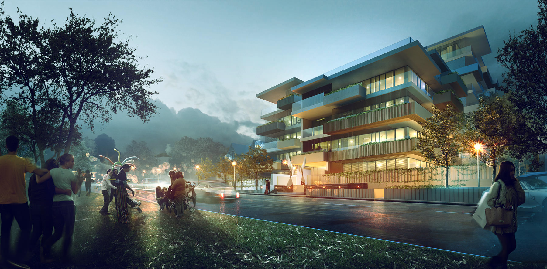
Final Adjustments
For the final adjustments I’ve simply added a little more contrast / desaturation and used an unsharpen filter within Photoshop and voila we have our final product.

Final Thoughts
Thanks to Ronen for this invitation, I hope you’ve enjoyed this short tutorial and breakdown of the image and hope you follow Arqui9 Visualisation on facebook – fb.com/arqui9visualisation
If you are interested in working at Arqui9 Visualisation, feel free to drop us a speculative
application at info@arqui9.com
Look forward to writing again some time soon.
Pedro.


Outstanding!
Indeed it is – superb work!
Awesome!
Great Stuff 🙂 Thanks for sharing Pedro Fernandez 🙂
could you tell us what is the method of painting lights? like the rays of light between the two groups of people? i’ve been struggling for ages now with that, and never achieved something i wanted. is it some blending mode in PS, or something else?
U0001f44d
Good article! Thanks Pedro 🙂
Ronam Santos
glennbret Hi there, this is a simple one, just a soft brush, with white selected and paint away with low opacity. Voila!
i hope i’m not late with my question, but anyways: what photoshop tools did you use for the mood draft? i must admit, that even without all the elements added later, the mood draft captures the essence of the final image, and it really looks good.
It is perfect! Could i download your psd file to learn? Thanks you very much!
Must read article. Thanks for sharing..
For 3d rendering visit
http://www.3dpower.in/
awesome
the software used is 3dsmax issit?