


BrainTRUST Session 3, ‘Exposition Center’ by Gert Swolfs
It took a long time, but here is BrainTRUST session 3, featuring a work done by Gert Swolfs The Exposition Center. Check out the feedback by Adam, Alfa and I about this snowy, winter scene.
The BrainTRUST is a group of well-known and respected professional 3d artists and members of this community. Their aim is to provide detailed and constructive critique for images you submit. These critique sessions, once finished, are edited and published on this blog for all of you to read, learn and further comment on it.
Session Image Description by Gert Swolfs
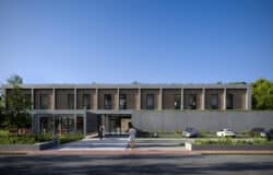
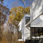
This image is a commercial work done for an architect office in Belgium – Robbrecht en Daem Architecten.
The project is a polyvalent building with places for exposition, meeting and teaching, situated in a protected landscape called “Het Zwin”. The images were made as an entry for an architectural competition. That’s why there where only two weeks to make 6 images (two exteriors and 4 interiors).
All the images were made by one person myself.
As you can see in the wire, there has been a lot of post production in Photoshop (the whole environment). This way I could win some valuable time. The background of the image consists of about 4 different pictures, mainly of trees, that I took on site.
one of the main aims for this project was to have as little impact on the environment as possible – build between the trees.
Although I am pleased with the result for the time frame given, I look to improve and advance a few steps up I would appreciate the BrainTRUSTs feedback on that.
I used the following software :
- 3d Studio Max
- VRay
- Photoshop

And the same viewpoints in wire mode.

Gert added a few more images later on So we can have better context but the feedback was made for the first image.

And two interiors


Thank you very much,
About this Session
I took your comments from the previous session into consideration and introduced the Critique Overview Section to start with. This section summarizes the key points mentioned by the BrainTRUST members in their full critique along with my own personal feedback too, since it was impossible not to add this in during editing.
You can then go and read the complete feedback by each member to get more in depth and detail.
Session Members
Critique Overview
The key points covered in this overview are:
- CG and Photographic Elements Mix.
- Point of View.
- Image Style & Intent – Coloring & Depth.
- Modeling & Materials.
So, Lets get started…
CG and Photographic Elements Mix
For starters, the blend between CG and Photographic elements is performed very well at first glance. The perspective, consistent coloring and light levels match very well and I can read it as being a single piece.
All in all the image looks pretty balanced and you can’t really notice transitions between CG to Photographic areas at screen viewing resolutions. You can only start to see some issues when viewed at 100% size, and being a 7000px+ in the original image – you really get a front row seat seeing it all 😉
Although these issues will rarely pose any kind of real problem in visualization (thinking back about the discussion we all had about Luxigon’s Wadi Rum Images some time back) It is nice to get the “back of your fence painted too” like Paul Jobs suggested to young Steve (Very interesting read by the way, Steve Jobs![]() book).
book).
So, at the “back of the fence” we see…
- The trees in the middle of the image have a slight lighting balance issue that makes them seem a bit self-illuminated. The snow around them and how it acts with the pavement seems also a bit odd… less worked.
- Most of the photographic elements added are floating and lacking shadow details. The people, for example, are rather important for this project Im sure but technically need more work done on them. grounding them with proper shadow – even with no sun in the scene, and also balancing them each to fit the lighting is very important. I know how hard this can be and how we just want to skip – fast forward it… not an option here i think.
- Anti-aliasing is evident in the edges between CG and Photos. Any kind of post work to lessen this effect will go a long way. Feathering the edges in PS might do the job.
- The chromatic aberration on the Matte is too much distracting. Maybe some photo filtering can take this off or lessen the effect a bit.
Point of View
A big part of what makes the image, is the chosen point of view. The one you submitted for this BrianTRUST initially is much better then the second exterior image added later for more context.
Positioning the camera in way that we see the pavement, leading towards the main entrance from left to right, is a good one. This serves the story and actual circulation on site. The actual building facade keep going in its own diagonal from right to left suggesting the continuation of the circulation path and that is great too – the image keeps telling us a story.
But few things tamper with this story telling process, and could have been done better…
Most important one… you stop the story by not showing the interior very well. The Snowman and near tree block the entrance view, and the flat nature of your image weakens the overall story that could be told here.
Consider what could have happened if the image got more of a portrait aspect ratio to it… adding more foreground snow below and sky with possible tree tops visible above (ending of the canopies and seeing just clear skies).
In such a case, I would have taken the camera above a bit, thus exaggerating the diagonals of the pavement leading towards the entrance and the facade path going all the way back. That would have emphasized the circulation much better with the added depth to the image – just by changing the POV and aspect ratio.
Image Style & Intent – Coloring & Depth
Technical things aside, considering the subject matter, the image is rather boring (as any photo can be too). I find it hard to dive into it and wanting to know more – understand what I see. I feel it is our job as visualizers to try and lure the viewer in.
The chosen time of day, and subsequent monotonic gray look goes against the attempt of showcasing the life in the exposition building and around it. I think you totally missed the interior life on this image, which in our opinion should have been the main focus of the image… That and the connection with the outside – how it invites you in.
There is a story to tell here – and it is not being told. Or, we are just to bored to pay attention to it.
The sky is pure white, and in a snowy scene this doesn’t look all that good. White snow below – White sky above – and a lot of snow hovering in the middle too on the trees… the image lacks depth this way and is rather flat looking.
Adding blue for the far background and some fog could do wonders to this image. Some emotive qualities are badly needed here… you should try and experiment a bit more with colors, mood and try to draw attention to the interior parts of the building more than you do now. Playing with colors, and color contrast can help in that regard.
It can be achieved relatively simply just by changing time of a day to early evening and turning your colours to blue-vs-yellow / cold-vs-warm color scheme. We know that original background photo isn’t the best, because it shows just gloomy, diffuse lighting but with bit of work you would be able to actually paint light back in relatively easy.
Check out the following suggested look & feel I roughly sketched for you (using the iPad 2 for the first time for doing such a thing… with a Wacom Bamboo Stylus, SketchBook Pro app and Snapseed app).

There have been some great snowy projects featured on the blog, that could serve as great reference for a similar look & feel… such as…

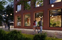
This one features a gentle blue tone & fog to convey the sense of depth in the image.

Here the strong contrast between the cold blues & warm colors help to lure your gaze towards the comfort of the cabin… notice how you first focus on the red jacket on the right and then move left (SOA AD2 attendees would know what the hell I’m talking about here 😉 – I must say… in this case the RED theory works. VARA CHE BEN)
Modeling & Materials
The pavement / path is rather important in the scene and and in the foreground, so it needs more detailing then it currently has. The edges between the snow and the pavement need better work (definition) and in a scene like this one would expect some snow / water on the pavement itself.
The snow on top of the path and building canopies is looking rather flat and floating… too monotonic. Some variations in the “clumps” of snow on top would go a long way in adding to the realism of that detail (I’m no expert on snow load baring structures, but can these canopies even take such snow on top?).
For some great tips in getting the snow just right, check out Bertrand’s 3D Snow Creation Tips.

Last thing about the wood cladding of the exposition center exterior… it is a rather large surface to cover with a wood texture the seems more fitting as a floor then a wall facade… it is also very flat looking. adding displacement or actually modeling the planks could help with better definition… perhaps some scaling too. making the planks bigger, but this may be a design constraint you had to face.
Ill now hand you over to the Trust members full feedback, and look forward reading your opinion about this session in the comment section below.
Adam Hotovy
Hello All, Let me add my little critique here.
The image looks good in first glance. Some small problems will appear once you zoom-in and it puts the image a bit down.
Coloring
I do not know what was the main purpose of the image – If it is to be a technical correct representation of the structure or have more of an emotional impact and attract the viewer in.
The colorization would be acceptable in first glance, but if you would like to “sell” your image / design, you should try to experiment a bit more with colors, mood and try to draw attention to the interior parts of the building more than you do currently.
It can be achieved relatively simply just by changing time of a day to early evening and turning your colours to blue-vs-yellow / cold-vs-warm color scheme. I know that original background photo isn’t the best, because it shows just gloomy, diffuse lighting but with bit of work you would be able to actually paint light back in relatively easy. But as I said, easiest (and most elegant) solution would be to go more to evening scenario.
Modeling & Materials
I would try to improve edges between snow and paving, also I would add some snow, puddles/ice and dirt on that path. Try to make step between path and entrance more distinct in the image.
Once that’s done, you have pretty nice base to experiment with colours / lights. Maybe try to experiment and bit exaggerate aerial perspective/depth by adding fog.
I really like those kids in right corner.
Alfa Smyrna (pixela)
This is my first BrainTRUST session. Last year, when we were talking with Ronen about this sessions for the first time, I told him about a need I have to get some real critique that will help me advance my level of work. I actually sent one of my images last year for these sessions too, but I was not so lucky…
So now I will try to make a critique in an “architectural school” feedback style…
CG and Photographic Elements Integration
Although the lighting and scale of the render and all additional elements are matching, I see that there are some integration problems:
- The trees in the middle of the image has lighting problems so that is why giving the feeling of self-illumination.
- The edges of the render has strong AA issues.
- The steel columns of the canopy in the foreground has a different point of view (looking up) than the overall image and this brings a un-matching perspective with the columns. Even the crop of columns is showing this.
- Most of the photographic elements added are floating and lacking shadow details. The choice of people images are great and they make the render alive but they look they are not stepping on ground.
- The snow added to the roof of the building is looking flat and floating.
- I think adding some fog into depth will add more to the scene and make a better integration.
- The chromatic aberration on the Matte is too much distracting.
Point Of View
I like the Point Of View (Camera Angle). It makes me feel standing inside the courtyard as a viewer. I think the tree behind the snowman is blocking our view to the nearest entrance of the building and should be removed.
It will be better to shift the viewers eyes towards the entrance and inside the building with various elements. At this point, I would like to agree with the comments above that it is essential to emphasize the interior of the building more then it is done currently.
Modeling
The pavement, being a dominant foreground element, needs more detailed modeling. As it is one of the main elements that interacts with the photo, I believe it is essential to make the item more detailed to have a more realistic and well-combined result.
Materials
I think there are some problems with wood materials.

The wood cladding looks more like a floor texture applied to a flat surface. I think it would also be better to feel some of the surface tactile properties. Some textures are highly repetitive. I also notice some UVW mapping problems on the pavement.
Hope you find this useful,
Alfa.
Session Closing
Thank you very much for taking the time to read this article. If you like to get such critique on your image do submit it using the BrainTRUST Image upload form.
You can upload more than one image per project by using the form multiple times.


A tremendously good read. Not being an arch vizzer myself I might have missed this point, but shouldn’t people reflect in the glass surfaces?
@MartinBrinks
Reflecting people may be hard to do if you have not taken the pictures yoursef, since you would need two different point of views (back and front) of those people. Bu ti Think you are right, they should reflect in the windows in the second picture.
Great reviews, very constructive. It is a benefit for everyone.
@MartinBrinks
Reflecting people may be hard to do if you have not taken the pictures yourself, since you would need two different point of view (back and front) of those people. But I think you are right, they should reflect in the windows in the second picture.
Great reviews, very constructive. It is a benefit for everyone.
@MartinBrinks Doing people is hard enough as it is – the reflections are even harder! but it needs to be done… now easy way around it though. unless you use 3d stand in people to serve as guide of sorts.
amazing………..realy inetresting
I really wanted to read an article like this! Very interesting..
ps. The Red theory works perfectly in the xoios Mountain Retreat image!! 😉
And the color scheme that you suggest remind me the “Blue hour” rule. Always mentioned at SOA AD2!! 🙂
The amazing thing about articles like these are that, unlike the most Tutorials and Making-Of where you get to know how you created the image – Is that in these, you get to know, what people think when creating or improving the images.
In order to reach that “The Story of the Visualization”-element, I think it’s far more useful knowing what the thought-process behind the image is, rather than how it was made.
The critics should go to the Zwin and see for themselves how the athmosphere is. Every archviz image shouldn’t be like a Peter/ Bertrand/ etc. style.
Apart from that, technical critics are great.
I love to reading BrainTRUST articles. Congrats!
I love to reading BrainTRUST articles. Congrats for the 3rd session! It’s really great.
Hey Guys,
first of all I want to thank Ronan for taking my image to be in the next BrainTRUST session.
I feel honoured to be critiqued by Adam Hotovy, Alfa Smyrna and Ronan in such an elaborate way. Sometimes you looked at an image so long you dont see where to improve it or if its even good or bad. The critical eye of a professional bystander is worth so much to take an image a few levels higher.I’ll try and cover each of the key points in the critique.
1. CG and Photographic Elements Mix
The image was made to be printed on an A0 panel, hence the big resolution. This gives all the problems talked about. On first look the CG-Image blend seems fine, but when you look at it at full scale the problems become clear. Unfortunatly my Photoshop skills arent good enough at the moment to fix all those problems. For example i always struggle with putting in people and giving them the correct lighting and shadows.
In my usual workflow i try to do as much in 3dsmax as possible, and Photoshop is just for some colour correction, levels,… In this image its clear that was not possible. So the first thing i’ll put on my to do list is try and enhance my skills in Photoshop.
2. Point of View
The lack of the interior story telling is spot on. I actually only see it now when its pointed out. I remember putting in the tree and the snowman because the interior wasnt that nice in the image, so my first idea was to cover it up. Strange i never thougt about giving the interior more love in the image.
3. Image Style & Intent Coloring & Depth
This is wat i was hoping to get when i send in my image for review. The mood of an image can tell a story, and thats where i mostly get stuck. Ronans sketch tells it all. I see how the image can have a different mood and tell a more in depth story.
On the other hand i had some pointers from the architects to take into account. This image had to show the relation between the building and the surrounding nature. Because it is situated in a protected landscape this was very important for the architects. The biggest problem was that at the time it was snowing so all the pictures taken were with snow, and i had to somehow blend the building in it. This was my first attempt on a snow render.
4. Modelling and texturing.
Not much to say about that. Everything pointed out is correct and could have done better, especially the pavement in the foreground.I will have a look at Bertrand Benoit’s snow creating tips.
I learned alot with all these tips, and i will take them with me in the images to come.
grtz,
Gert
ps. Ronan, its actually Gert SwolfS with an S at the end 🙂
@Gert Swolfs My bad with the name!!! should be all fixed now 😉
I’m very happy we were able to help you… these session are actually also good for us as critique givers and I also learned a few things just by looking in depth in other works and then reflecting upon my own works, workflow, style, etc.
I hope more of you will send your work in and we will do our best to cover as much of it as possible.
Cheers
Hey Guys,
first of all I want to thank Ronan for taking my image to be in the next BrainTRUST session.
I feel honoured to be critiqued by Adam Hotovy, Alfa Smyrna and Ronan in such an elaborate way. Sometimes you looked at an image so long you dont see where to improve it or if its even good or bad. The critical eye of a professional bystander is worth so much to take an image a few levels higher.I’ll try and cover each of the key points in the critique.
1. CG and Photographic Elements Mix
The image was made to be printed on an A0 panel, hence the big resolution. This gives all the problems talked about. On first look the CG-Image blend seems fine, but when you look at it at full scale the problems become clear. Unfortunatly my Photoshop skills arent good enough at the moment to fix all those problems. For example i always struggle with putting in people and giving them the correct lighting and shadows.
In my usual workflow i try to do as much in 3dsmax as possible, and Photoshop is just for some colour correction, levels,… In this image its clear that was not possible. So the first thing i’ll put on my to do list is try and enhance my skills in Photoshop.
2. Point of View
The lack of the interior story telling is spot on. I actually only see it now when its pointed out. I remember putting in the tree and the snowman because the interior wasnt that nice in the image, so my first idea was to cover it up. Strange i never thougt about giving the interior more love in the image.
it’s a very good idea this sessionwork, very usefull for everyone so as workflow for do better everyone works
I really like the features of BrainTrust session 3… The critiques are excellent! Please keep it up!
@LauLau81 Will do our best 😉
Continuing on the glass reflection subject, I noticed this on Dezeen. What strikes me is all the bending of large glass surfaces, the slightly different angles even glass on the same surface has, the reflected light on the ground outside, etc.
http://www.dezeen.com/2011/12/14/bolgen-by-mapt-2/?utm_source=feedburner&utm_medium=feed&utm_campaign=Feed%3A+dezeen+%28Dezeenfeed%29
@MartinBrinks That is great looking reference for this type of glass facade.
I’m realy glad this BrainTrust session started again. The critical eye of a professional is very important to improve your skills and level!
@Gert Swolfs keep posting your work!