


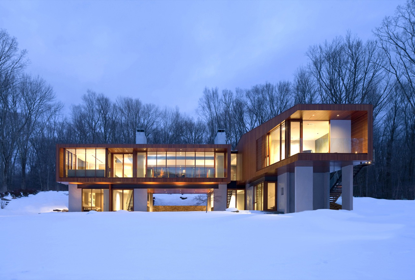
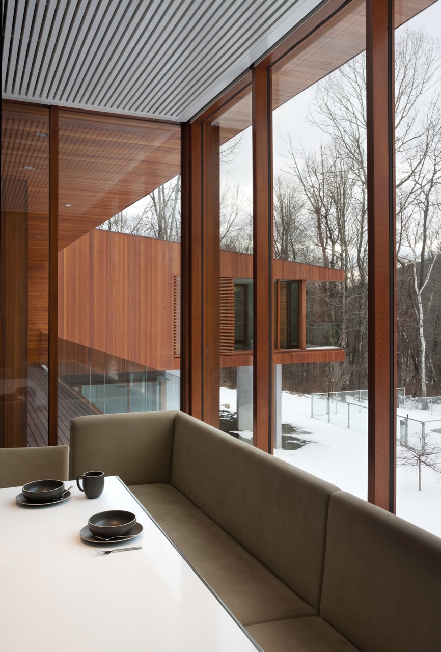
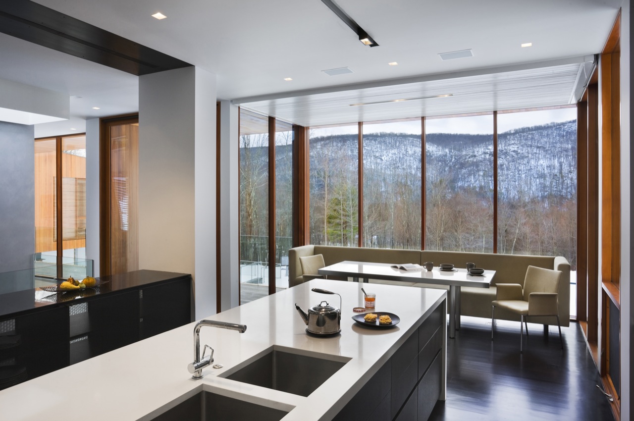
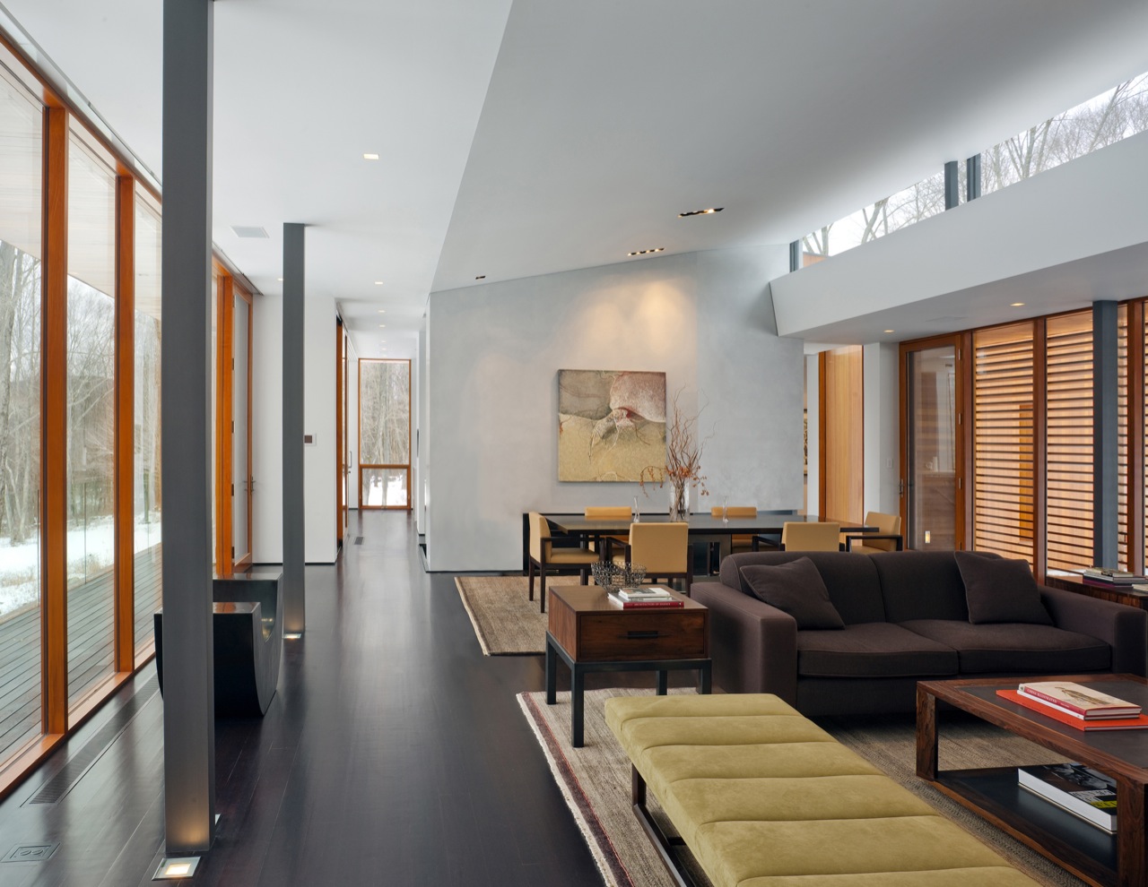
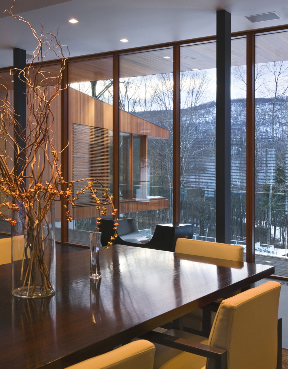
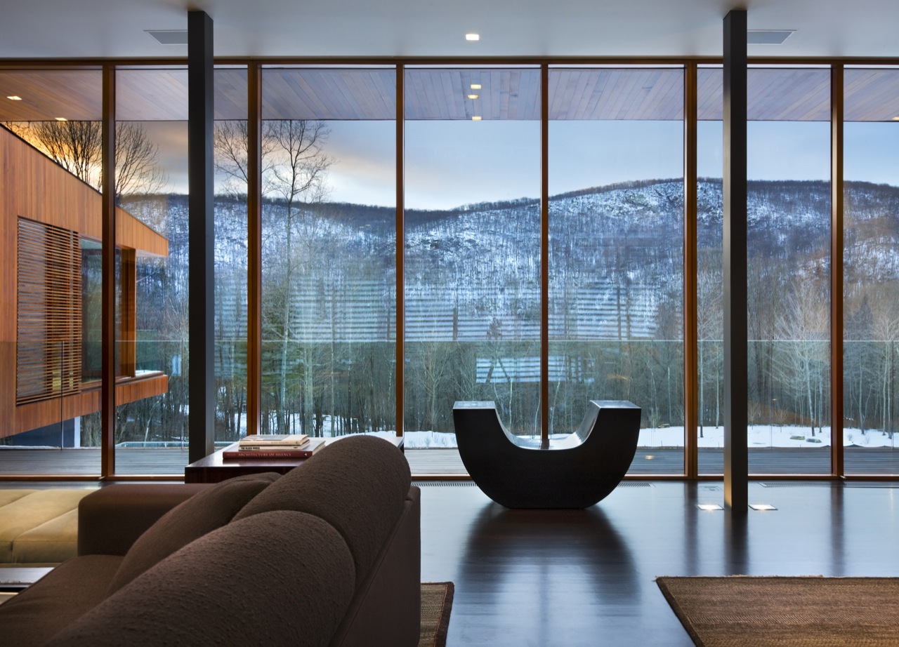
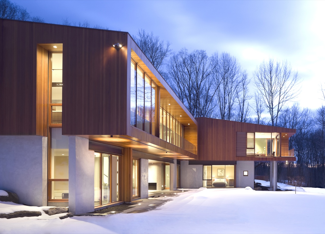
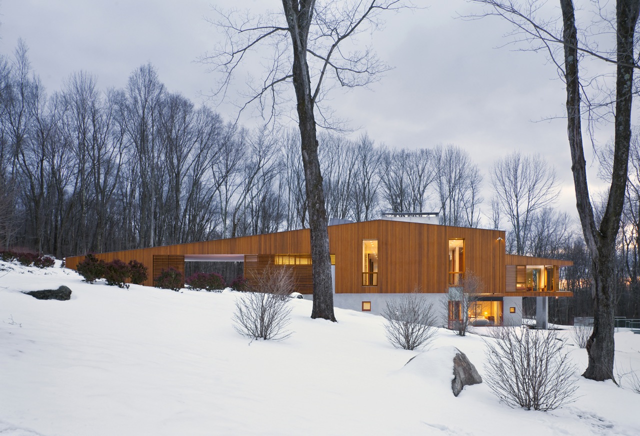
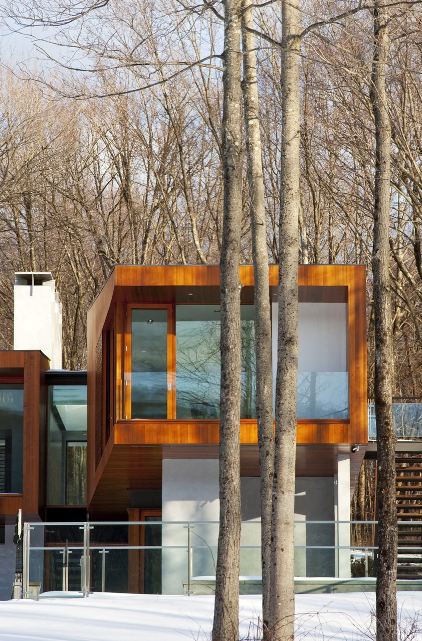
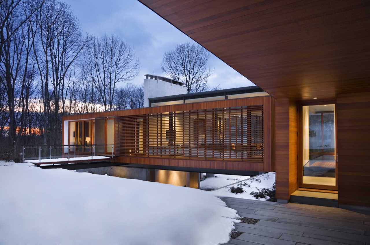
Bridge House / Joeb Moore + Partners Architects
Dusky blue in the snow wood houses tend to look great all the time and this one is no different. Bridge House by Joeb Moore + Partners is great as design an photography reference. I really like the blue / orange contrast and bare trees as background… makes a nice environment to showcase a house
Photography by David Sundberg/Esto
original post Bridge House / Joeb Moore + Partners Architects at archdaily


like a piece of art.. very beautiful images!
What i hate most is sometimes when you´re working for a client (normally another architect) and you try to work this way (blueish vs orange colors) the comments of the client are like this: “oh is the env going to be this blue in the end? this is wierd”
Not allways ofc, but many dont understand this type of mood actually happens all the time in our lifes. But still once they see in 3D they think its too fake.
Jacinto
MetroCúbicoDigital
Yup and they are the same kind of client, that expects the exact pantone or dulux color tone of their walls and windows to be found in every shot regardless of the lighting situation. If they’d only have a closer look at the environment, they’d notice that a white ceiling actually never appears white.
Beautiful shots though and it makes me wonder how it is possible that no one stepped on that snow yet 🙂
great find ronen! Really cool house and the photography is superb.
outstanding ! i love it !
Love this house!
Great looking images!