


Making of Butterfly House by Thiago Lima / Part 1
Thiago Lima‘s “Butterfly – the book and short film” project is a remarkable undertaking. One that awarded him Best Visualization of the Week NO. 12 and lots of respect from our community. The concept of the Butterfly is rooted in his childhood painting play with symmetry and the desire to create something different in terms of subject matter for an architectural visualization project acting as a staging ground for developing and perfecting his skills further. Join him in this first part as he describes this undertaking from concept through 3d modeling, texturing, lighting and camera selections. In part 2 which will be posted soon, Thiago will cover the rendering and post-production (stills and short film) as well as focus on some of the bigger challenges he had to deal with during his work and how he solved them. Enjoy!
![]()

Author: Thiago Lima
Thiago Lima is a Brazilian artist specialized in architectural visualization & advertising. He is a graduated of Graphic Design, bringing this knowledge into the field of architectural visualization offering a unique approach. He won the 2012-2013 3D Awards Non Commissioned Film category with the Butterfly Short which is the subject of this article. He now focuses on 3D online training/courses and workshops around the world.
Introduction
First of all, I want to thank Ronen Bekerman for the opportunity to share this project making of here on his blog which I´m a great fan of. I really hope this article will help and inspire other artists to think about their workflow and the images they create.

I finished the Butterfly project back in May 2013 and this is the first place that I´m posting a making of it, so I´m really glad for the invite. I want to thank all my students for keeping me moving forward.

I’m going to share with you a lot of details and my workflow used in the making of the project “Butterfly – The Book and Short Film. This project was awarded with the 3D Awards – Non Commissioned Film category for 2012/2013. The Idea was to create a huge FULL CG scene, with exterior and interior shots to show everything that I learned in my few years working in 3D. For this I had to create a really unusual architecture design ready to be shot in open wide or closeup views. In order to do this, all the tinny rocks, grass, leaves, trees, etc. were modeled and textured with high quality textures.
You can see the Full project (101 still frames + short film) in the Butterfly post on my website and the short film is here below :
The Concept
I used to draw butterflies a lot when I was a kid. The way I did it was by drawing only half of a butterfly on a folded piece of paper… Symmetry took care of the other half.
This play with symmetry and the butterfly has been on my mind and became relevant when it was time to pick a theme for my project. I always thought about creating a new architectural situation using that mirror idea to create a new image. Many ideas crossed my mind but I never did it… until now.
I was really fed up with the same kind of 3d architectural images showing the standard BOX house in the woods or the usual lofts with the same furniture, so I kind of combined these two themes and expanded on them to come up with a unique scenario based on the mirrored butterfly concept.
I´m not an architect, and I really don´t know if this project can be done in the real world but actually – it doesn’t really matter to me… This is a personal project targeted at getting better in what I do first and foremost.

References
Yes… you probably assumed so… there have been lots of references gathered for this project.

And here are some of them :
Gathering good references is one of the most important parts if you really want to achieve high levels of realism in the 3D field. In the Butterfly project I mixed a lot of design styles and tried to make it all work together.
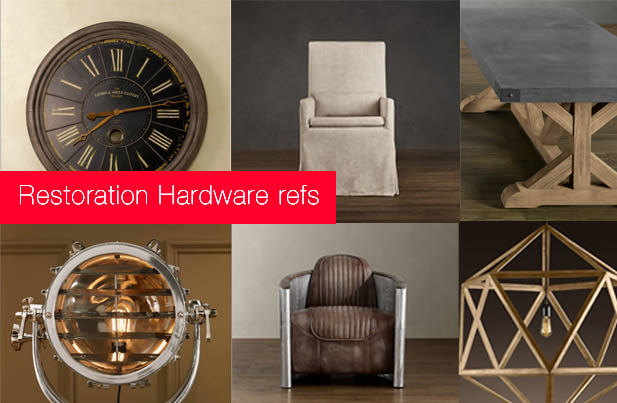
I have a lot of weird references, but in most of my projects I explored Restoration Hardware and Arhaus, both of which mix a lot of classic elements within modern solutions of design. Most of my personal 3d models are based on Restoration Hardware´s furniture design. In this making of I´ll talk about some of the most important models of in the scene.
About Unique 3d Models, Textures and Materials
This is one of the most important parts of the 3D work for me… Creating your own elements and your own textures. I think this is so important because it really makes your work your own with that unique touch no one else has.
I like to compare our models and textures with the painter colors palette, this is one of the most important things that makes his work unique. And obviously, in this case I also include the Butterfly house design which is not so common to see out there. 99% of the models on Butterfly project were made by myself.
3D Modeling
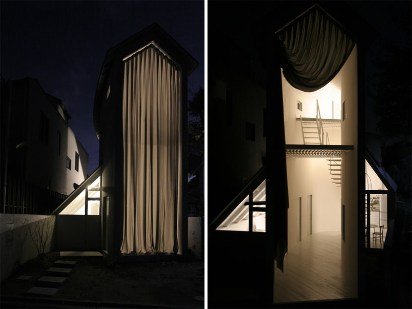
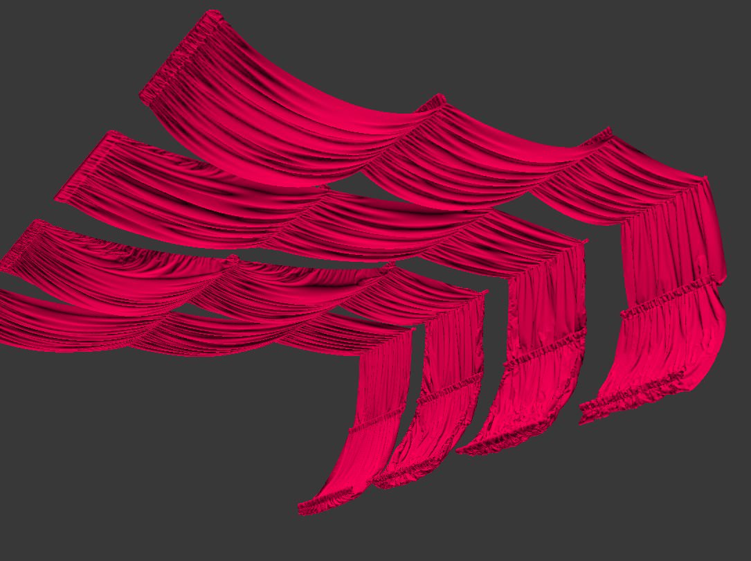
Fabrics
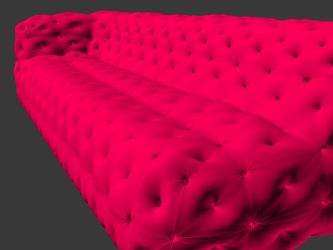
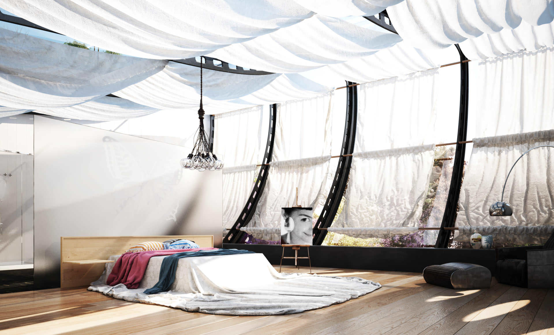
All the fabrics in the scene – curtains, cushions, sofas, etc. were modeled using Marvelous Designer. I didn’t use any kind of new technique worth going into here. There is much about Marvelous Designer already posted here on Ronen’s blog ( Bohemian Sofa by Eduard Caliman | Bath Towel by Nikki Candelero | 3D Cloth Modeling by Ramon Zancanaro ) and at the official Marvelous Designer forum for you to follow. For the suspended curtains I used some tubes to hold the fabric and simulate it. I just assigned a bit of elasticity to the fabric to fix the hard edges. The rest was default settings.
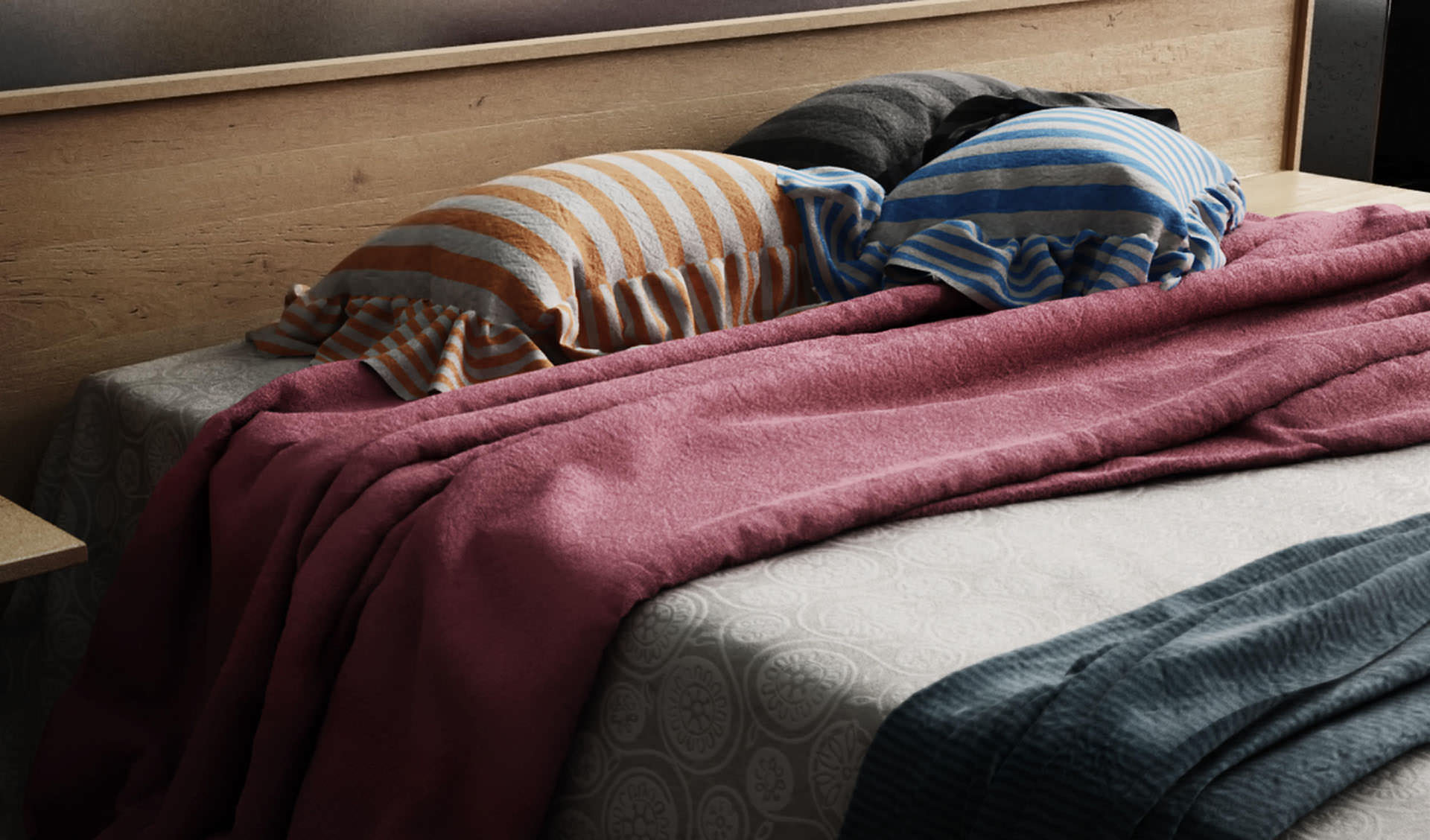
I used my references a lot in order to achieve a nice look for the fabric modeling. One of the most important things I noticed is the folds scale – it can really makes your scene seems bigger/smaller depending of fold size. Also, the fold size needs to be proportional to the fabric thickness.
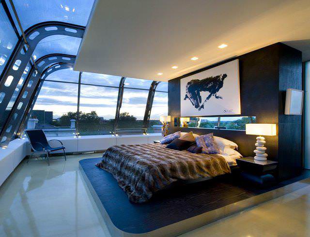
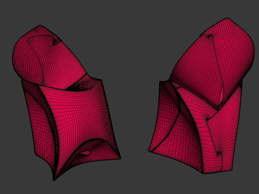
Flux Chair
The flux chair actually exist, you can find more information about it at www.fluxfurniture.com. This was one of the hardest models that I ever made. The Flux chair is a fold-able chair, so in this case, everything is really fluid and organic.
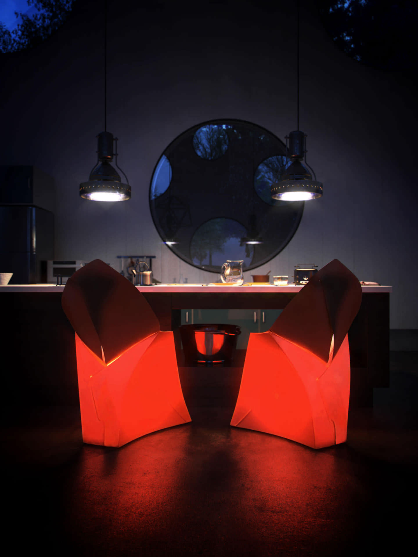
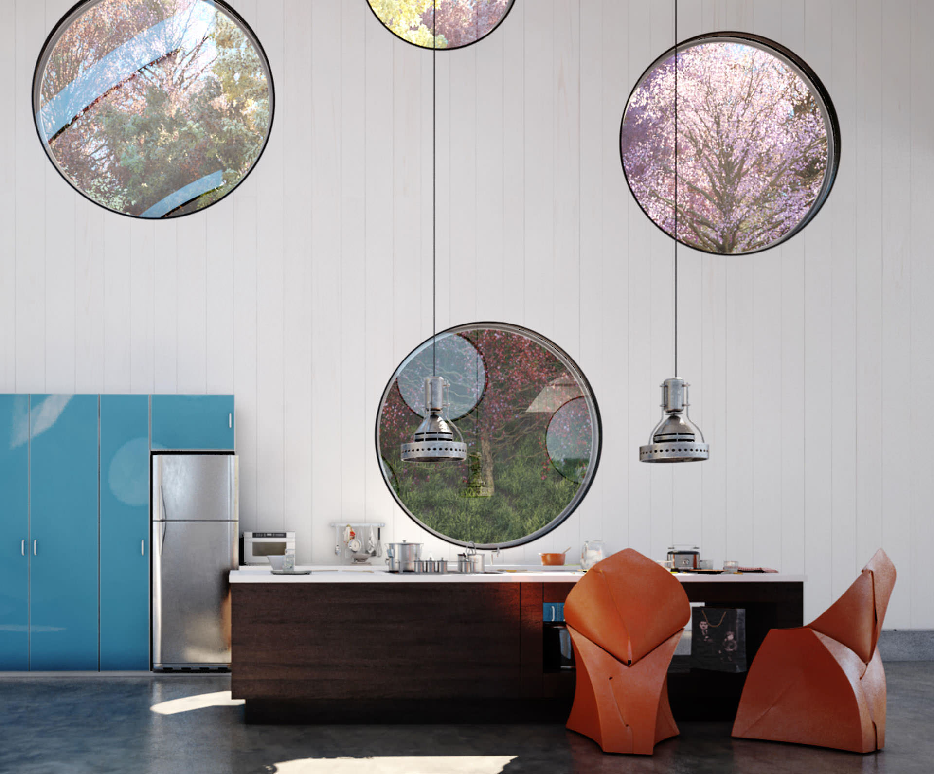
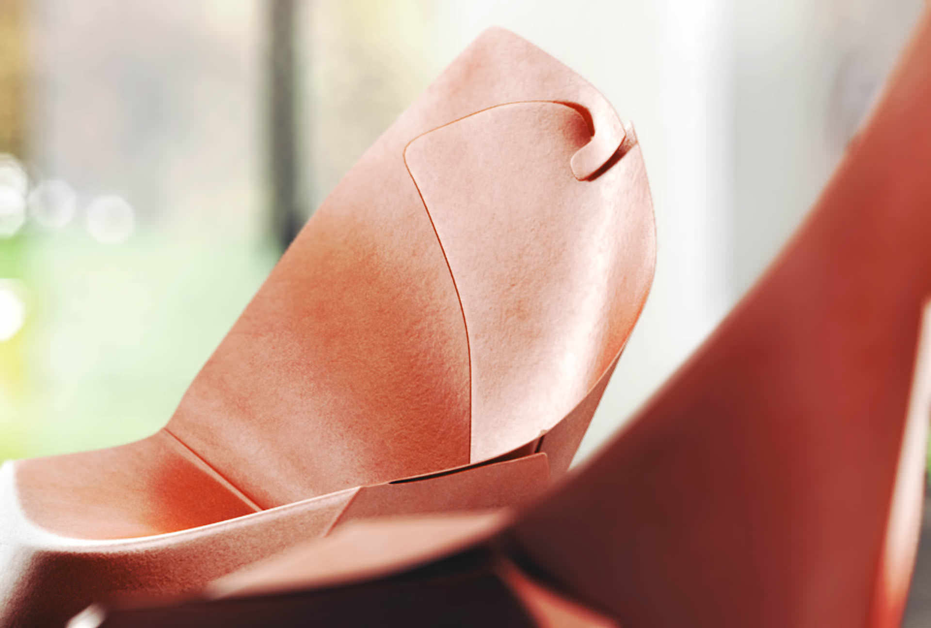
I watched the folding video on flux website a lot of times until I understood it all. The modeling process was really based on it, and I basically started from a plane and go on extruding edges until I reached the final model. That was really hard. The nicest part about flux chair is that it can be lit from the inside as you can see in the first image, giving it a nice and very unusual look.
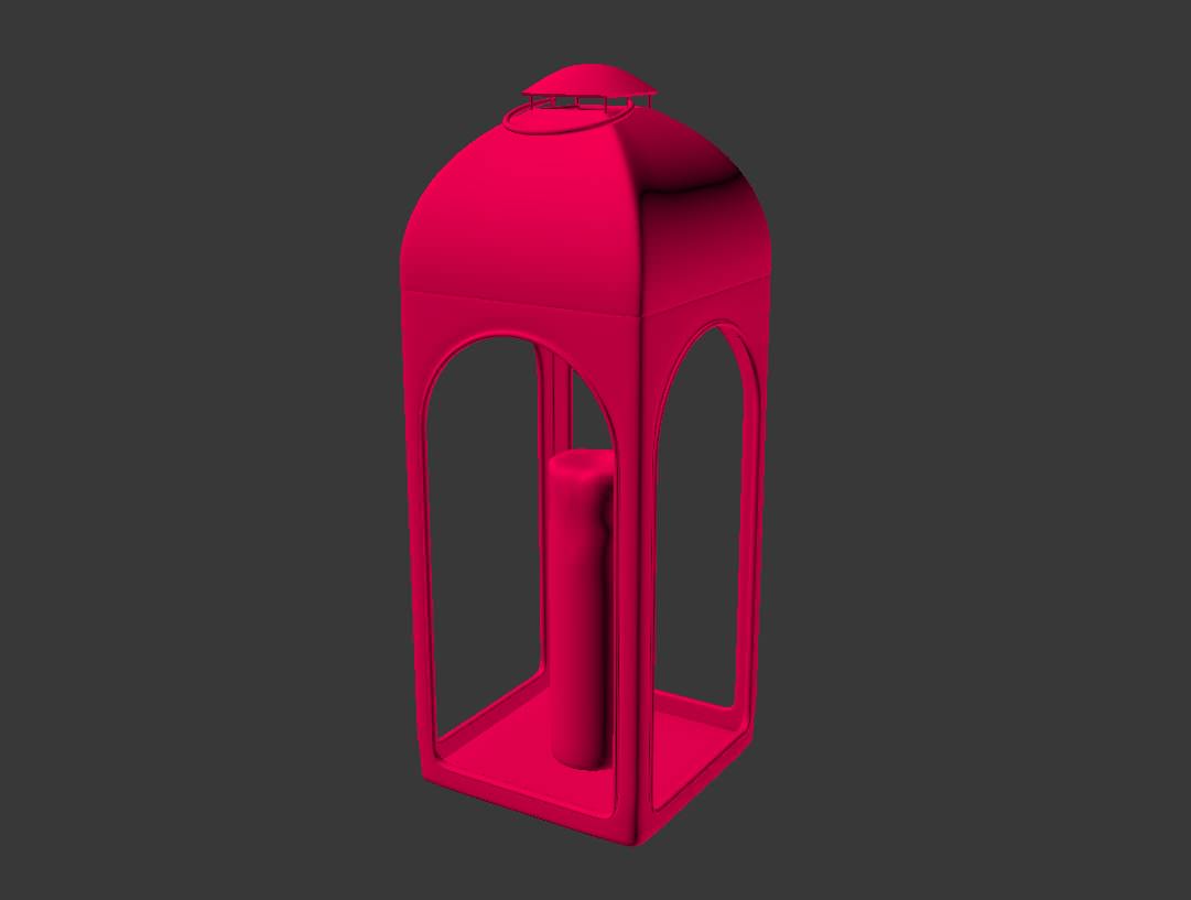
Restoration Hardware Models
Here you can see all the models based on the RH ones. All the models were really easy to do. Just simple polygon modeling using lots of extrude, chamfer, inset and lathe. A nice technique was used on the library, To simulate a group of books I used in some places just cubes with 5, 6 books texture projected, as I have a lot of books on the shelves this technique saved me a lot of time to fill every space.

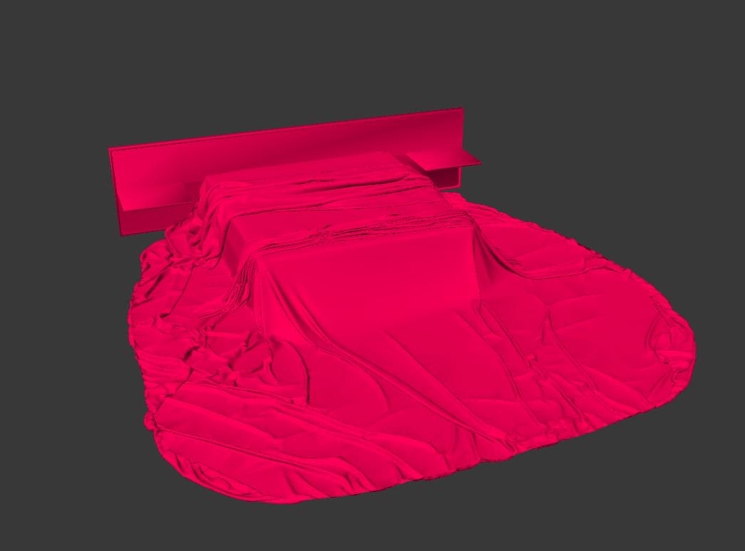
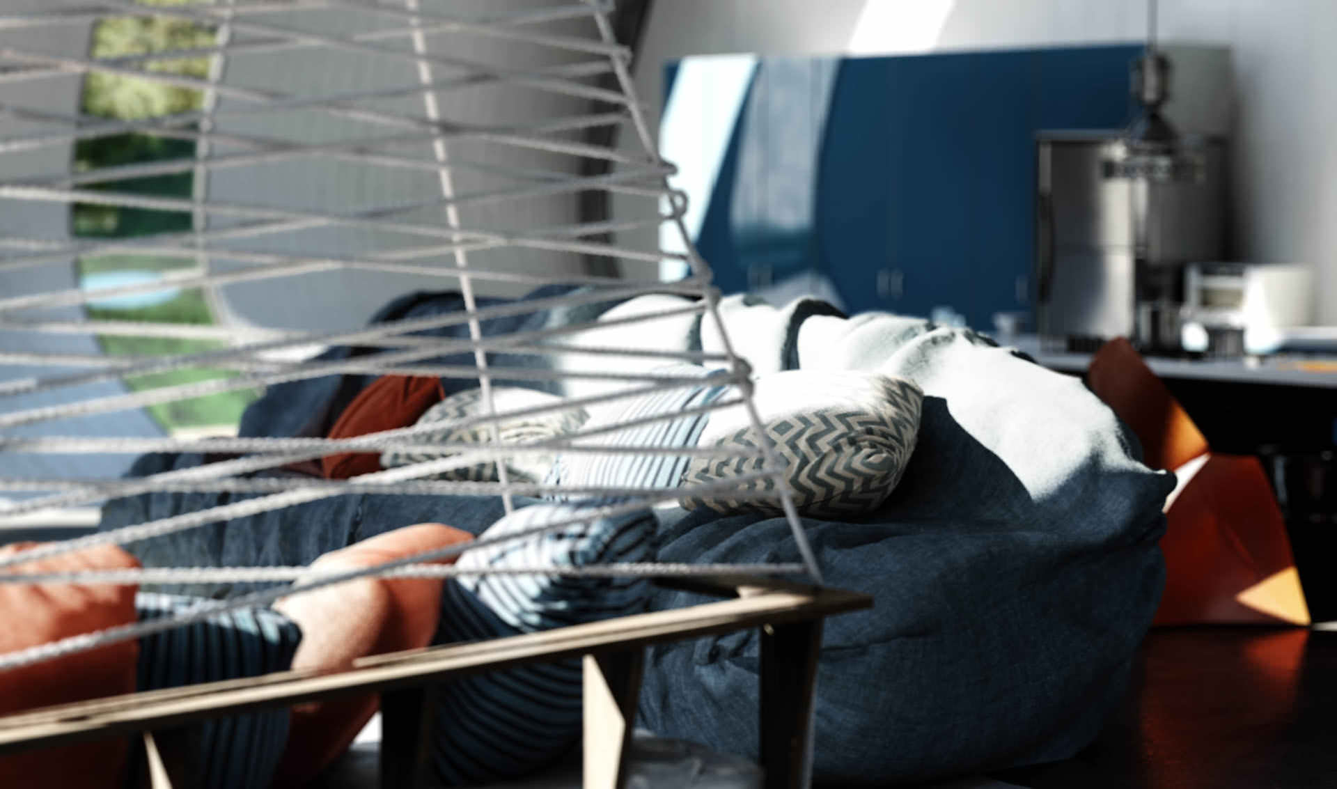
Suspended Sofa
This suspended sofa is one of the nicest models in the scene in my opinion, taking advantage of the great height of the house were it is placed. The cushions as I said before were made in Marvelous Designer. I created the ropes using a Displacement Modifier applied on a line with thickness, from distance the model seems really believable, as if it was modeled with cylinders and Twist Modifier.

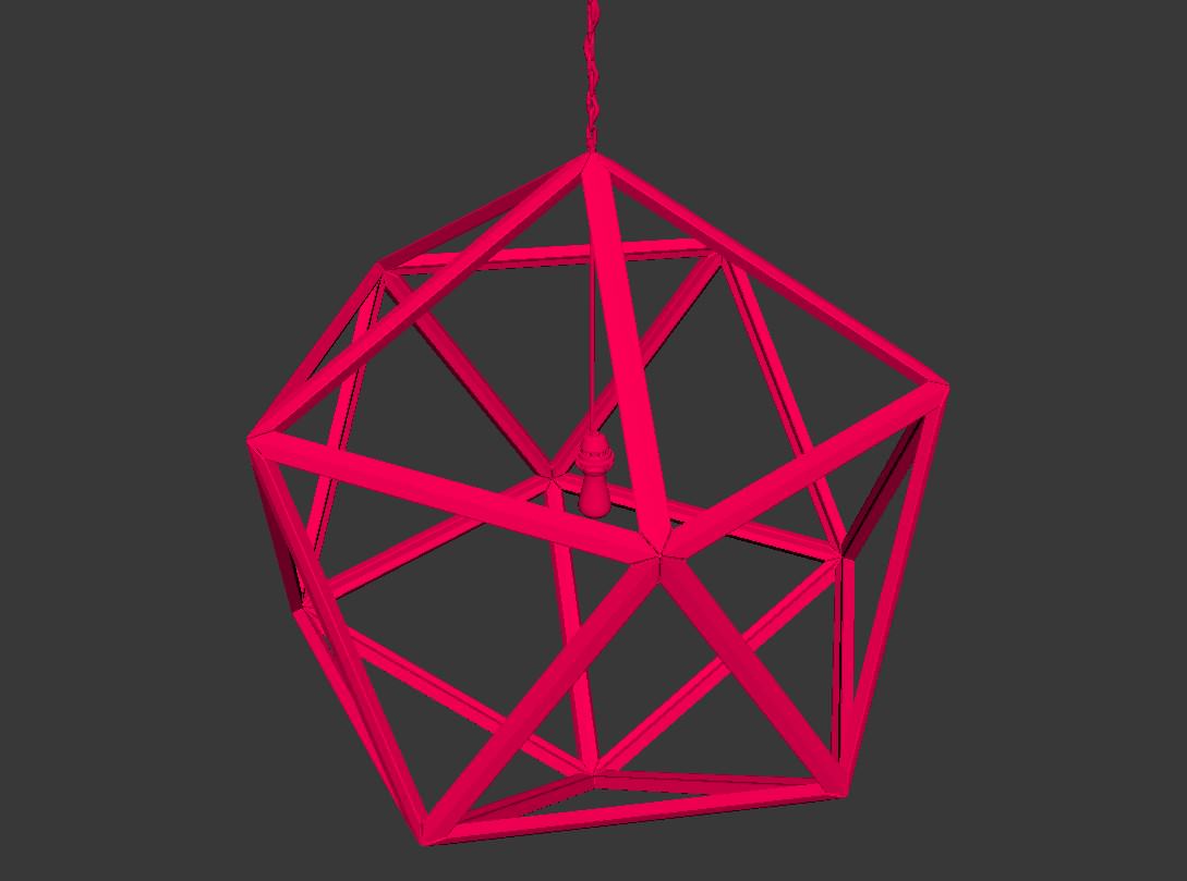
Bedroom Chain Lamp


More Modeling Details
Below you can see shots showcasing the use of the plugin/scripts : Floor Generator, Rock Generator and RailClone.


Textures, Mapping and Materials
I like the texturing stage a lot and it is where you can really make your work shine and unique. It is also the best place to start if you want your work to be recognizable too. I base my textures on those available at Arroway and CGTextures for the most part, but taking your own photos for texturing is probably something that should be part of your routine.
Mapping texture I actually don’t like that much… even hate it a bit. That is why almost 100% of my models are assigned with just a simple box UVW map. I’ve developed a workflow of mixing a lot of textures per material blending them in many ways, creating a kind of procedural texture based on a seamless textures just so I don´t need to open the mesh with UV Unwrap. In fact, I think there are just 3 objects in the whole Butterfly project which were correctly UV unwrapped.
As for the materials (shaders), I´ll note this again, forget about the settings and focus on the references in hand. Figure out how they behave and only then translate that into a V-Ray material. For each material I’m gathering as much references as possible from various angles and light conditions so that I can fully understand it and remake it.
The single most important factor in getting a realistic material is variation.
Use a lot of randomness while mixing and blending the textures to avoid tiling and monotony. Also keep in mind that almost all surfaces in the real world have some level of reflection.
Try to focus on your material’s behavior and don´t worry about doing a complex material with a lot or connections, blends and composites. In my workflow I normally put a diffuse map, add a color correction to turn it monochromatic and link it to the reflection and reflection glossiness slot. After that I play with the percentage of influence of each map. That way you can get variation on reflection and glossiness based on your diffuse texture.
Lets see some examples.
The Glossy Concrete


Lake Water
For the lake water I just mixed a lot of noise with different sizes, the smallest ones masked by biggest ones in order to achieve a random & procedural result without worry about body of water size or mapping.


Flux Chair Polypropylene


Refrigerator Metal


To make a metal like this I think the most important thing is the influence of the map. See that I just used 10% of the map on reflex and glossy, leaving the main glossiness of the material at 0,9. I was lazy to convert the texture to black & white so I used the color correction to do this and adjust contrast, of course is saves time to create a lot of versions of same map.
Stairs Green Glass Text


This is a very simple material, the tricky part is the map with the text written, I want the letters like a perfect and clean glass and that´s why they´re white on the map (pure white = 1.0 glossiness) so I just made a lot of tests darkening the color on the rest of the glass. Another thing is the fog color which is what gonna give this green color tone to the glass. A nice way to work is to set the color that you want and decrease fog multiplier until it rewach the expected result.
Carpe Diem Mirror


cushion-fabrics


There are two more materials that I want to show you but I wont go into details. Those of you familiar with V-Ray enough will be able to remake them.
Cold Heineken Bottle


Bench with Mud and Drawings


Camera Work
The composition making is probably the part that I enjoy the most. It is really fun to find nice camera positions. I like to think about my possible camera positions ahead of time because there´s a lot of elements that you don´t need to model, or can model as low poly if you already know where your cameras will be.
In my workflow I like to put the camera in a place that I think will be nice, based on the elements in front of it. Later on, after I put in lights and assign materials, I’m re-thinking these positions and play with the possible emotions I can achieve with the composition, lighting, colors, etc. Thinking what kind of story I can tell.
I like to think about who lives in that house or what emotion that place needs to express with the final images. With that in mind you can show this personality of the place with the decor, with the color of lighting or even with the arrangement of the furniture items.
I strongly recommend everyone to study about theory of colors and photography if you really want to make your works a impressive and expressive too. This is an order of magnitude more important than looking for what kind of camera settings were used by some artist.

As you can see, when I´m working with composition I like to simplify everything in my mind, the image on the right is something like my mind construct before start modeling, so when I finish I try to achieve a similar result.
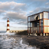
See the rule of thirds applied in this shot, putting in the intersection the important points of the subject. The darker background helped to cut out the house from it, which is sometimes hard to do in night shots keeping the realism. You can see the same thinking in other shots of this project
As you already know there are 101 still images rendered from this scene, so order was mandatory in setting up all the cameras! It was all about proper naming of cameras actually, nothing more than that.
If I don´t use DOF or Motion Blur directly in render, I’m not worried too much about the camera settings. In most cases I just use the default ones. Sometimes I change the white balance to pure white, since that way the colors will not be affected by the camera. The use of ISO, F-Number or Shutter Speed will work JUST the exposure – to get more or less lighting.
Lighting
Lighting a scene is an art. you really need to get out of your box (box = computer) and look around your world seeing how the light bounces, how it casts the shadows (and color of shadows).
A great reference for this are movies. You really see how they are good at expressing emotion with lighting. Watch movies with a critical eye trying to find the minimal amount of details which make a scene convey some emotion or feeling and think why that happened in terms of the aspects related to our work and a bit more too – it will not do us any harm to think like movie directors from time to time. In that regard, I’m always thinking about the emotion that I want to pass along to the viewer via the shot and it makes me think completely different about where I’m going to place my light sources, etc.
Before we dive into the technical part, I’ll share some file settings :
Units = cm/inches : I hate to work with meters even in such a big scene. I feel much more comfortable using values like 1, 10, 100 instead of 0.001, 0.01 and 0.1, but that’s just me.
Gamma = 2.2 : I use linear workflow, but in some shots I want so much more contrast that LWF may not be that necessary.

When I create my lighting I always like to keep everything as simple as possible… In other words, use just 1 light.
In my workflow I like to paint everything in almost pure white, like RGB 245,245,245. In some cases, like interior shots, I put the final main color of the textures (or just diffuse textures) that I´ll apply on walls and floor, cause it will affect the bounces, contrast on the scene and color bleeding.
I’m probably different than most in that I almost never use HDRI’s in my scenes for a simple reason – I hate to wait long times for renders. I recognize the power of using HDRI’s but it does take some optimizing and it does not win over the speed of using V-Ray Sun + Sky. Add to the mix huge amount of polys for the light to bounce around and things can get slow very fast! Another big advantage of using just V-Ray Sun + Sky is the freedom of changing the light position/behavior however you like.
In 99% of the Butterfly shots I aimed for a very contrasted lighting / shadows result. Sometimes this is hard while using gamma 2.2 which tends to “washout” the renders. To solve this, I decrease the value of secondary bounces on render settings, that way you´ll get less bounces and darker shadows. I do not recommend to go down below 0.6 because renders will start to lose color bleeding and GI color in the shadows making your shots seems more like illustrations (you might like that though, and that is one way to get there).
Another important thing is the color mapping. The more linear you use, more contrast & light burn you´ll have, because of that I use reinhard starting at 1 which is the same a using linear, but then I can decrease this if I get really overexposed areas and information is lost.
I don´t get sticky about settings and methods. I start rendering and looking for things to improve, like more/less lighting, more/less specular, position of shadows and what it changes in the whole scene. I recommend this to everyone, forget about settings and parameters and focus on final result using a lot of references to get to it. So that´s all.
Daylight and Dawn
As you can see I just use Sun + Sky (on override GI) and a .JPG spherical image for reflections and background. That will probably be replaced in post, but it kind of helps set the baseline for that ahead of time.


I set the V-Ray Camera to white color balance and I like to create winter with just 1 V-Ray Light. If It´s an exterior shot I just put it far away with a strong intensity. I like to work with V-Ray light because of the shadows and how easy it is to control shadow softness by just changing the size of the emitter. Sometimes I use a spherical image for Background & Reflections as I shown in the daylight method.

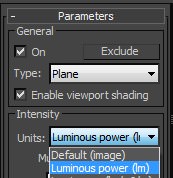
TIP : If you just want to change your shadows smoothness without changing the intensity of light, you can do it by just changing the intensity type to luminous power and change the size of the V-Ray Light.

Night Lighting
Night shots are the exception. I use a V-Ray Dome Light with and HDRI because I think the tones and final result are so much better than what I can get with V-Ray Sky GI, without a great time difference between both methods.

TIP : Activate “store with irradiance map” on for the V-Ray Dome Light. That will make a pre-computing of lighting with irradiance map so your final render will be faster, just pay attention to it because this function makes your shadows softer, sometimes even vanishing, which is not that big of a problem as I seek only blue GI tones and nothing else.
After that, I can start the creation of artificial lights. I use V-Ray Sphere Lights for the most part and IES ones only where I really need them.
TIP : The smaller the sphere, more sharpness is in the shadows from that light. Explore many references for seeing some artificial lights project shadows in real the world so you better recreate the effect.

End of Part 1
I hope you liked this first part of the making of and I’m sorry if I missed something important… more is coming in the 2nd part, where I’ll be covering rendering, post-production (stills and short film) as well as focus on some of the bigger challenges I had deal with, so if you have questions just leave a comment below and I´ll be happy to answer here or add it to the next part, whichever is best.
Cheers,
Thiago.

What workstation do you use ?
Why buy your tutorial without you butterfly tutorial examples
Adham Agha everything was made in just one i7 960 12gb ram gtx580