


Making of Urban Plaza
I came to know Jeremy Kay and his work following a comment he made on the Hand Made by MATERICA D_SIGN post. I immediately liked his hybrid approach and style of visualization, using SketchUP as the modeling tool and then doing all the rest within Photoshop in a painterly kind of way. Visiting his portfolio I find that his images have a unique look and feel to them, and I asked him to share his process of creating one of them. You’ll find that this approach, done right, offers fast production times with a lot of flexibility and freedom in the creation process. You don’t even need much to start with to get a great result coming out, and you can easily develop a style of your own that will differentiate your visuals from all others out there.

Author : Jeremy Kay
After receiving his degree in Environmental Design from the University of Colorado in 2003, Jeremy began his career as a designer for Communication Arts in Boulder, Colorado. During his time there he was involved in multiple large scale entertainment and retail oriented projects located around the world and learned the value of blending the disciplines of architecture, graphic design and placemaking to create truly unique projects. In 2007 he helped open the new Boulder, CO office for LRK Architects and worked as a senior designer on several retail and resort projects throughout North America. Jeremy opened studioJDK in the fall of 2010.
Introduction
Most of my illustrations usually occur during the early phases of design. They are meant to be emotive images; capturing a certain spirit and energy of the place with a conceptual feel to keep conversations open regarding architecture, the landscape, etc. I find that this is where the ‘hybrid’ drawing becomes an invaluable tool in the communication of ideas.
There is a looseness and energy to this style of drawing that still captures some of the ‘sex appeal’ of the high-end finished renderings while maintaining a fluidity that allows for easy modifications and interpretation.
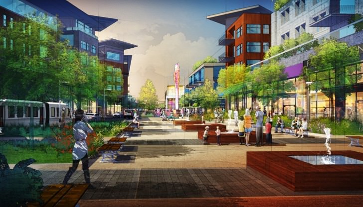
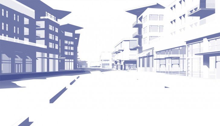
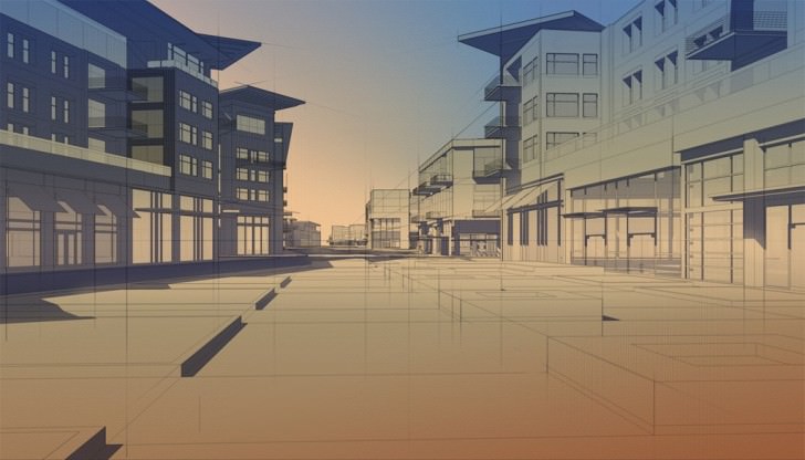
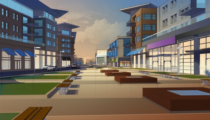
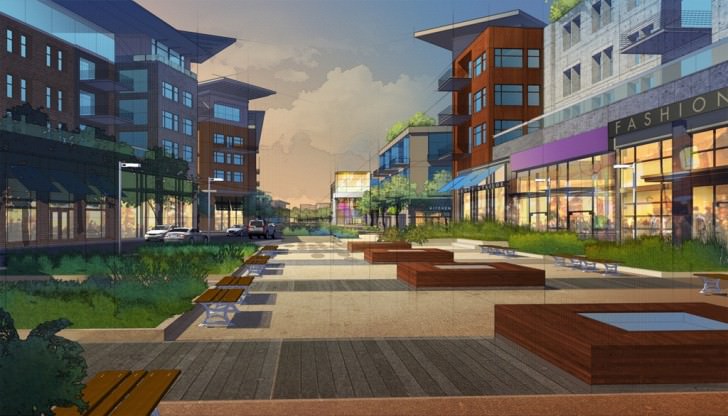
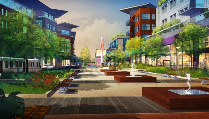
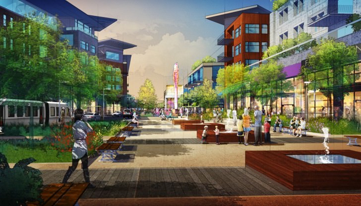
The following image is a perfect example of my workflow. This illustration was one I did for the very talented group of architects over at 505 Design in Boulder, Colorado. They were working on a mixed-use, urbanist community in New Orleans and needed some visuals to show the ‘feel’ of the project before any of the architecture was ironed out. I was given a SketchUP model with minimal conceptual architecture and a hand sketch on what this particular plaza should start to look like.
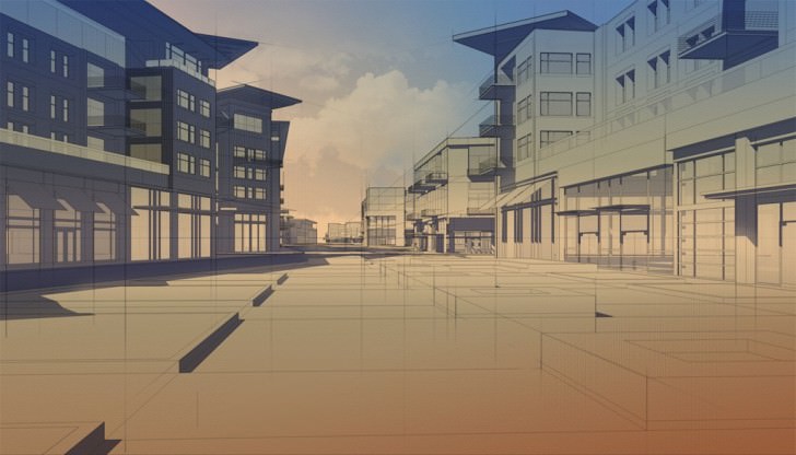
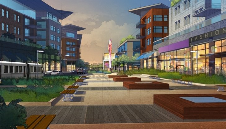
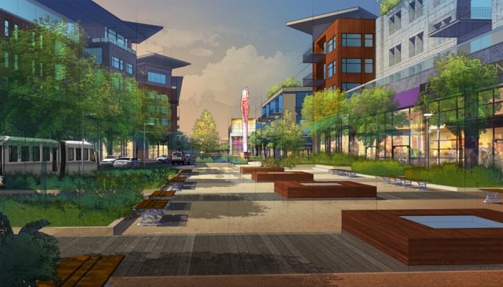
This is the end result
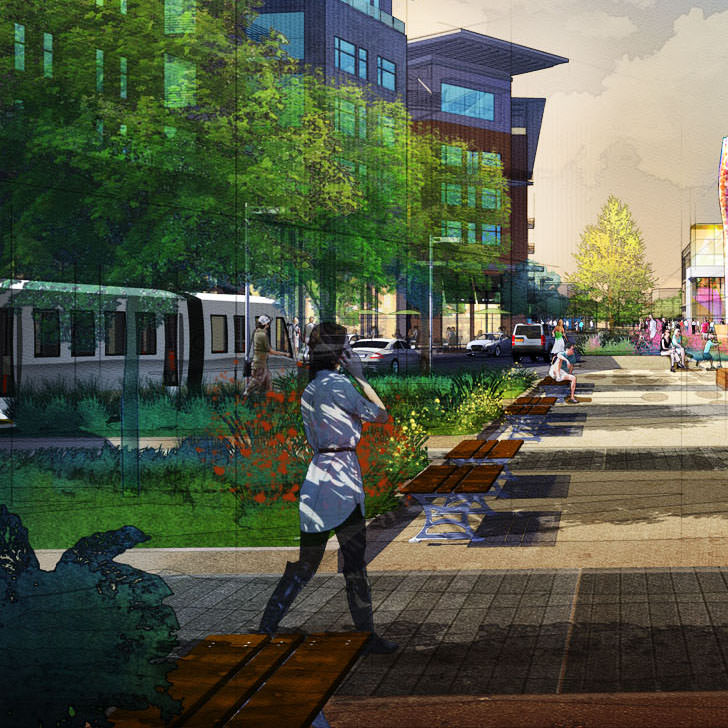
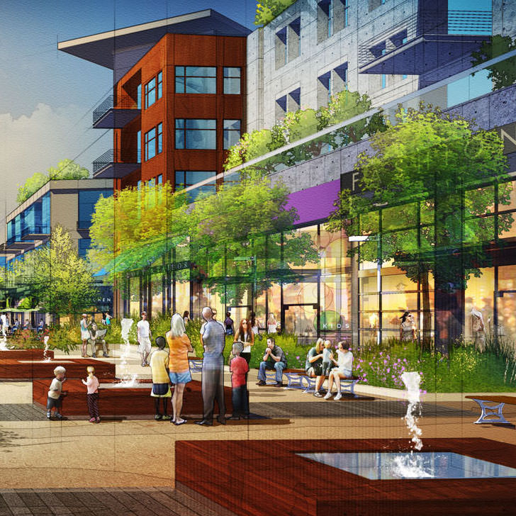
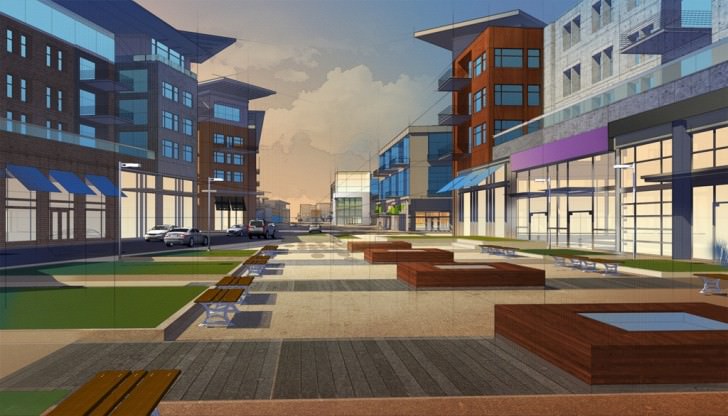
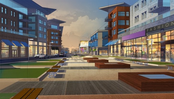
two original size crops from it…
Below is my workflow
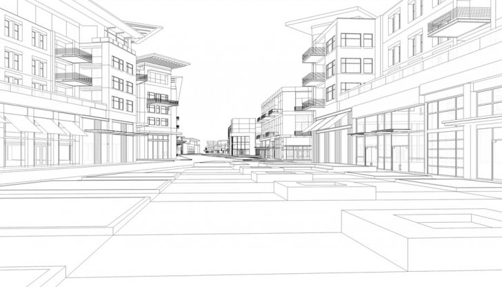
Step 1 : SketchUP Export.
I typically export 3 different ‘layers’ from SketchUp before I start in Photoshop. The exports are usually 3000px in the smallest dimension (for example, for this horizontal piece, I made sure the vertical dimension was 3000px. This made the horizontal dimension almost 5000px) and I make sure they are all the same export dimension so I can ‘stack’ them in Photoshop.
First, in SketchUP, I’ll export just the black and white lines with profiles set to 1. This ensures that none of your curved surfaces loose their line-weights. It also doesn’t affect the thickness of existing lines which gives it a nice, even consistency.
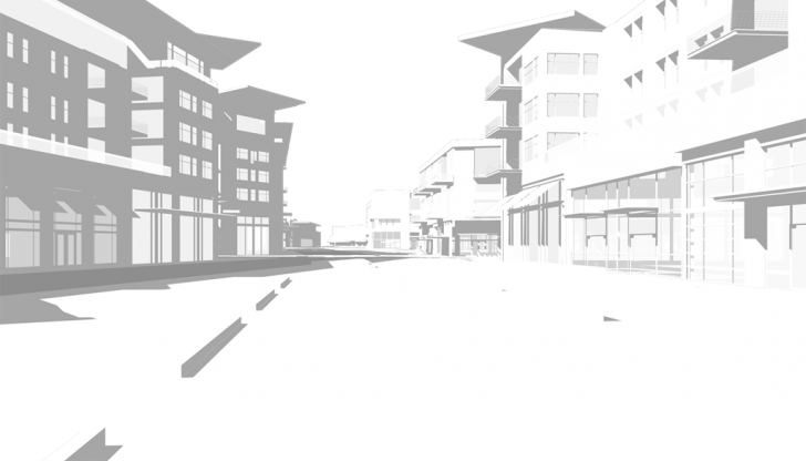
Next I’ll export only the shadows with line-work turned off.
Finally, I’ll export any of the ‘amenities’ in the scene, like cars, light poles, etc. Basically anything but trees or people. This is a shortcut I use to make sure I have an easy way to select anything on that layer and make adjustments.
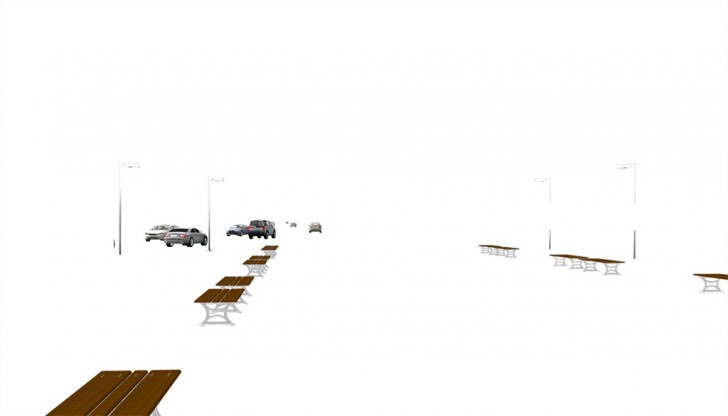
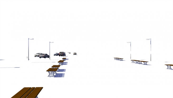
You’ll also see here that I exported a separate shadow layer just for the amenities in the same way that I exported the overall shadows.
Step 2 : Drawing Prep.
I’ll start the Photoshop work by opening up my line-work from SketchUP. I’ll then copy and Paste-in-place my SketchUP shadow layer on top of the line-work and set it to Multiply. At this time, I’ll also do a bit of color adjusting to the shadow color so it takes on a bit more of a blueish hue.
I’ll also, with a very faint eraser brush, erase parts of the shadows in the distance to simulate depth. Finally, I’ll sometimes dodge/burn in some areas to simulate ambient occlusion, although in this example, it doesn’t look like I’ve done so.
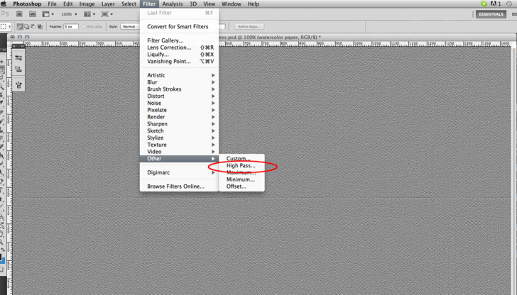
I’ll then open an image of some nice textured paper, either from my library or from free images on the internet. Setting the paper layer to ‘soft light’ and then using the Photoshop Filter ‘High Pass’ has worked for me in creating a nice soft texture.
Set and leave this layer on the very top of your layer stack. You may need to adjust levels or transparency as you go along to get the desired effect. This style of drawing is all about exploring what works for you and your clients.
The final prep-work for my drawings typically look like this.
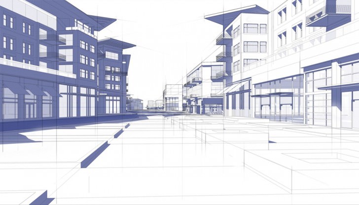
You’ll notice I have a bunch of ‘pencil strokes’ in this image. This is a style choice for me as I began my career doing a ton of hand-drawn work using colored pencils and mayline rulers.
I always liked leaving the construction lines I used in the finished drawings as I felt it gave them added depth. You can also use these lines to help lead the viewers eye and to simulate subtle reflections in the ground plane.
Again, this is all about your own expression.
Finally, I’ll group my shadow and line layers and set the group to Multiply. This way, these layers will continue to ‘show through’ my layers of paint.
Step 3 : Wash.
My first step before I do any serious digital coloring is to set a general tonal wash for the image. I like picking colors that have a nice mid-level value. This will help direct the overall color palette and give your drawing a better overall consistency. I’ll set this layer to Normal and place it beneath my Drawing Prep group.
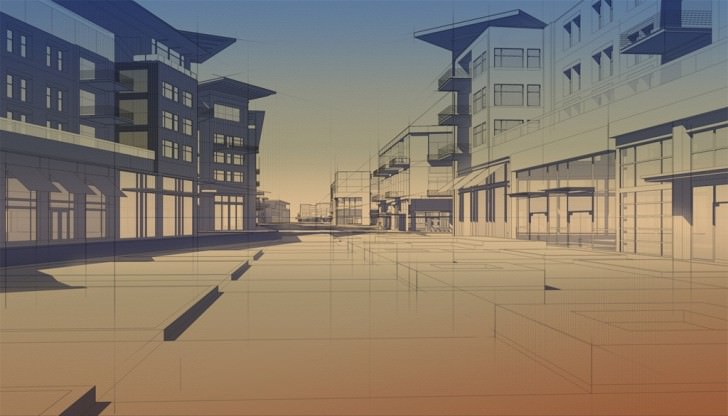
Step 4 : Sky.
Creating a new layer set to normal (on top of the wash layer), I’ll use the lasso tool to select the sky area add some subtle gradients to separate it from the wash.
Next, I’ll use a custom cloud brush (you can find loads of these all over the internet for free and some for purchase) and dot in some clouds, messing with color and transparencies to achieve a desired look.
I’ll then add a subtle ‘stroke’ around the clouds. I’ll do this to almost all the pieces that I put in the illustration. Again, this is a personal style choice, but I feel it blends better with the SketchUP line-work and helps create a consistent, pencil-drawn effect to the image.

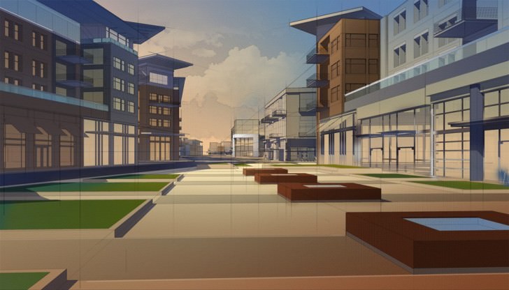
Step 5 : Color Block-In.
I’ll create a new layer, set to Normal and begin blocking in general colors. In this stage, I know I’m going to be adjusting the colors and adding texture at a later stage, so I just want to get good tonal range and Hue down in the appropriate areas.
Step 6 : Place in the Amenity Layer.
See how it suddenly pops when I add that SketchUP layer? By adjusting the Levels on your SketchUP amenities layer, you can really get the cars, etc. to stand out very quickly and easily.
Step 7 : Block in Windows.
I’ll quickly select the windows and paint them in on their own layers (layers set to Normal). Typically, residential windows on one layer, retail windows on another. This helps me with quick selections in the future.
Step 8 : Texturing.
I’ll typically spend only a short amount of time texturing these illustrations. To achieve the photo-realism of high-end 3d renders with bump-maps,etc. would just be too time consuming for an image like this.
I’ll grab textures of brick, concrete wood and anything else I’ll need, use the transform tool to make sure the perspective is generally correct, then set the layer to Overlay and mess with the hue/saturation to get the desired effect. I’ll then erase out whatever I don’t need. You can see that the textures can have a significant effect on the color block-in. Experiment with what you think looks appropriate.
Step 9 : Texturing the Storefronts.
I’ll add in nice and warm interior photographs of retail stores, restaurants, etc. to add energy to the storefronts. These images I usually set to Hard Light and then sometimes mess with Photoshop filters to blur them out if there is too much detail. I’ll also start adding general store names to indicate signage, add awnings, etc. anything to add color and richness to the retail experience.
Step 10 : Background Landscape.
At this point, I’ll consider the architecture relatively done. I’ll still add a bit more detail later, but now it’s time to add everything that dwells ‘in the space between’ the architecture.
I typically work from the background then towards the viewer. In this step, I’ve added some quick trees without any texture. I’ll add a slight stroke to them (as I did the clouds) and then paint a few highlights to some of the trees that are catching a bit of light. In this case, I just used a simple brush with spatter to get the vibrant yellow-greens. You can see that I’ve actually set this layer underneath my SketchUP amenity layer as I wanted the cars and light poles to appear in front of these trees.
Step 11 : Ground Cover.
Painted with a few custom grass brushes (which you can find online, or make your own), I actually have several layers overlapping each-other to create depth. Starting at the back, I’ll paint in some bushes, adjust the colors if I need, create a slight stroke around the bush then create a new layer in front and repeat. Creating separate layers for each layer of vegetation allows you to adjust colors as need be and you can really start creating nice, rich effects if you toy with it. When I’m done, I’ll place an overlay layer of some texture (this could be a photo of concrete, grass, leaves – really anything to add texture), set the texture to Overlay and then adjust hue/saturation as necessary to get the right look.
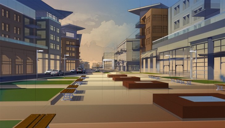
Step 12 : Adding Additional Elements.
A great benefit to digital painting is the ease at which one can incorporate changes. The client wanted to add a specific piece of artwork and a commuter train while I was already working on the drawing. This hardly interrupted the workflow as I was able to patch in the art and export the train from SketchUP in a short amount of time.
Step 13 : Adding Trees.
Believe it or not, trees (and people) are actually some of the most time-consuming work. I want to add trees that feel as conceptual as the environment, but still feel lively and rich. Entourage is always a great way for you to differentiate yourself from other artists. For me, I use a combination of three layers for each tree. The first layer is an actual image of a tree taken from my library. I’ll set that tree image to overlay. I’ll create a new layer below the tree layer and set it to Normal. I’ll then paint in some general lighting direction, shade color and any other hits of light I’d like to see on that Normal layer. Because the overlay layer of the tree image is above, the texture of the leaves is preserved. Finally, I’ll stroke the outline of the tree, like I did with the shrubs and clouds, to hint at them being drawn in. Tree shadows are set to multiply and typically consist of just transforming a copy of the tree image into the right perspective.
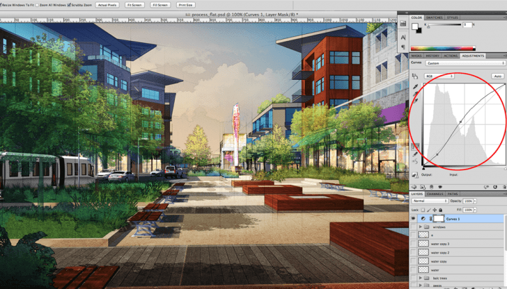
Step 14 : Flattening and Curves.
At this stage, once I’ve dialed in the trees, I’ll usually save a flattened copy of my Photoshop file. My files sizes can get really large (1 GB or greater), so flattening this image so I can work on top of it makes a huge difference in computer performance.
I’ll always keep the original layered Photoshop file in case of changes.
If I do need to make a change, I’ll do so in the original file, save out a flattened .tiff, then place the revised .tiff into the new Photoshop file that I’ve created.
The first move I typically make on the new flattened file is I’ll do some quick adjustments.

Sometimes I’ll just use Levels, but often I’ll set up a Curves Adjustment layer and keep that layer at the top of my layer stack when working on the new image. Here, I’ve just adjusted the overall curves to really pull out the lights and darks of the image.
Step 15 : Window Detail.
Next, it’s just adding a bit of movement in the windows. In this case I just used a layer, set to normal, and painted some abstract strokes. I did add some subtle reflection in windows that would be reflecting other parts of the architecture. For instance, in the corner where the wood meets the concrete on the right hand side of the drawing, I simply copied and pasted some of the concrete area into the windows.

Step 16 : Flowers.
Using the Photoshop brush, set to spatter, I’ll paint in some flowers. In this case, I also added some more trees to the balcony on the right hand side of the image.

Step 17 : Water.
For the pop-jet fountains, I used another custom Photoshop brush of a water spout and had the ‘wet edges’ option checked in the Photoshop brush palette. I had the layer set to Normal, but turned the opacity to 80% or so. I also copied and pasted some of the base file into the foreground water feature. I then flipped it vertically, applied a motion blur filter to it and turned the opacity down to around 50%.
Step 18 : People.
Aside from trees, people take the longest to get right in the drawing. I can spend almost a whole day just on people if the drawing is big enough.
I used to hand draw all my entourage, but I find it much more convenient to use photographic sources these days. The first step I take is to place all the photo files into the drawing and scale them according to the horizon line and where they appear in the drawing. I’ll leave each person (or group) on its own layer so I can easily move, modify or delete them if need be.
Next, I’ll spend time with the dodge and burn tools to create highlights where the sun would be hitting them and darken the shaded side. I’ll also use hue/saturation and curves if I feel like there needs to be more severe color corrections. Finally, I’ll add the same style stroke around them so that they carry the same ‘feel’ as the rest of the illustration.
For the shadows on the foreground girl, I copied and pasted her layer, set the copied layer to multiply, adjusted the hue/saturation and then with the free-form lasso tool, quickly ‘cut-out’ areas where the sun would be filtering through the trees.
Step 19 : Final Adjustments.
After the people are dialed in, I’ll put the drawing away for a few hours (or a night). It’s easy to get really sucked into your own work and become accustomed to what you see on the screen. Stepping away for a while allows your brain and eyes to recalibrate a bit, and you’re able to see your drawing in a new light when you return.
In this case, I felt like it needed a bit more punch in color in the foreground. I created a new Overlay layer and painted in some reds to the foreground right, some cooler hues to the left and some light areas just to create a bit more contrast on the building outline to the left.
I also Burned out the edges of the drawing to stop any ‘eye-leak’ off the edge of the illustration. This wasn’t much work, maybe 5 minutes, but I feel it helped the drawing. Sometimes I’ll do a lot more correcting after I’ve stepped away. It just depends.

All in all, this drawing probably took me a little under two days, which is about my average for these types of drawings.
In a world of beautiful 3d renders, the ‘hand-drawn’ look has definitely been overshadowed in the past few years. I’ve found this hybrid style to be a natural bridge between the two and a perfect solution for conceptual representation.
A hybrid artist can use ‘messy vitality’ in his/her drawing that creates a great energy and richness which engages the viewer and creates excitement without getting lost in the minute details.
Thanks for taking the time to read this post. Feel free to ask me any questions.
Jeremy


It would be great to know how many of you here use a similar technique…
And what modeling app you use to get started?
Gr8 Job there 🙂 Real good workflow and Technique .
@ronenbekerman Makes a change from photo realistic images
@chapter7design Sure does! it works well and probably better in early design stages, conceptual work… I find people connect with this more
Very well done! Thank you
Nice to see NPR artists in the spot light! Great work.
Great read!! I’ve recently started doing some of these at work in an attempt to get that emotive rendering. Quite a step in a different direction than photoreal.
If this is helpful to anyone, I’ve found this step works well for an AO pass as well: Copy the “lines only” layer from the SU exports and apply a slight gaussian blur and set to multiply. Adjust opacity to look right in the corners and paint/erase out where it’s unnecessary.
Great stuff, again!
@ferrarod1 Great tip. I find myself blurring the sketch up lines all the time – but never thought of using them as an AO pass. Thanks!
@ferrarod1 Yep, Pretty cool method of doing this! 😉
@ferrarod1 I would add a Z-Depth pass sometimes to help with the depth definition of the visual… with gentle fog and controlling color shifts… mostly adding blue haze at the back.
great stuff , very eye catching result,the only problem is you can only produce one image each time …
@Amar 77 If you can output an image like the one above in 1-2 days than it is not such a big of an issue… right?
@Amar 77 It’s an interesting dilemma, as yes, I typically only work on one image at a time, but I’d be interested to know how long it would take to texture/render/post-process a ‘batch’ of renders?
@JeremyKay @Amar 77 Let’s see what @JeremyKay can say about this, as this image was part of a set… how long did it take to complete it all?
@ronenbekerman @Amar 77 This image was a part of a 3 image set – done within about a 5 day turnaround, if I remember correctly. Not sure how much sleep I got, but it got finished. 😉
@JeremyKay @ronenbekerman true…it would take some time also for the typical render , but i admit ..the result you got …really worth it…great job again !
That is crazy talent right there. Incredible. Great job, and so interesting to read all the processes it takes to achieve this look. I’m in awe.
this is really great… thanks.. a real talent.. this one needs a lot of practice to get the hang of it. wll try this one
Just amazing!
Inspired me to try it out.
Is it possible to export out only shadows and line work in 3DS Max?
@Joshessel Using VRay there are edge tools you can use but none that will allow extending the lines I think…
I used a plugin named Illustrate! in the past for rendering out cool line work from 3dsmax… check it out at – http://www.davidgould.com/Illustrate/index.html
Hi! I like this example of Visualization. I know Photoshop pretty well as graphic designer but I just got started in 3d visualization. So I wonder if you could suggest books, video courses about this kind of techniques? Thanks and regards from Luxembourg. Sacha
@Sacha Heck Sacha, there really is a wealth of knowledge out there regarding digital painting. Believe it or not, I actually draw a lot of inspiration from video game and movie concept artists. Check out the likes of Feng Zhu, Ryan Church and a bunch of other guys over at the gnomon workshop. (http://www.thegnomonworkshop.com/) What they do isn’t an exact match to what we do (we’re tied down by reality), but their methods and techniques are superb and something to aspire to.
Also, it’s always important to have a good, solid understanding of traditional rendering methods if you’re aiming for the hybrid or painterly effect. I was fortunate enough to work with Michael Doyle, the ‘godfather’ of colored pencil and marker drawing (http://www.amazon.com/Color-Drawing-Techniques-Architects-Landscape/dp/0471292451) and he taught me much of what I still use today in digital illustration. Thomas Schaller (http://www.twschaller.com/) is also someone to really look at – especially if you like the watercolor look.
In the end, it’s about finding your ‘voice’ and separating your work from the crowd. Best of luck in your new endeavor! Feel free to ask any more questions.
@JeremyKay Hi Jeremy! Ok cool, thank you very much for your tips and links 🙂 I’ll check this out.
In regards to Amar 77’s comment: I’ve just finished a similar rendering to this one with some slight variations in my approach. I’ve gotten an affect very close to what your producing here in a short time, multiple renders for a little less than 15 hours worth of work (including modeling and rendering, budgeted 22 hours). But views can be quickly and easily changed on the fly.
With my deadlines the way they are, the end result in the least amount of time is key. My process involves a lot more work in SketchUP and a lot less work in Photoshop. Starting with the development of a fully textured model, with entourage and people in the scene. Like you said, People and trees are very time consuming. If their rendered and a filter is added in post it seems to cut down on a ton of time. A home made sketched line style is also important. Export and stacking is the same but I’m also using a photo real render in the process. Once the V-Ray render (usually 5-8 minutes) is exported its run through a water color filter software which really makes it look like a hand rendered image, then its stacked in the collection of images, PP is added and its exported ready to go. I’ve gotten it to sort of a plug and chug scenario.
So Jeremy, how do you feel about more time spent in the modeling end of things? I know its just a different process, but having the ability to change views and exporting with materials allows a little more flexibility in the development of multiple views for a client quickly and efficiently. While I might be sacrificing a little bit of the “hand rendered quality” I’m gaining it back with the volume I can produce in a short amount of time.
Also, thanks again for a great making of. I really love your process!
@TedVitale Great insight, Ted. I’ve just recently been experimenting with maxwell for sketchup as an underlay (mainly for light quality and textures) and the results are pretty interesting. I’ll make sure to share when I can.
Someone once told me that ‘lines are so friggin’ important’ with regards to an illustration. Because sketchUp line-work is now THE line-work, I do like to spend extra time in the modeling stage of a project to make sure the lines can really work for the view. I still feel like I gain more flexibility by texturing in photoshop, mainly due to the fact that I may need to change materials or colors, but completely understand why you would prefer to do so in the model. I’d chalk this one up to a ‘push’ or fair trade-off either way, wouldn’t you?
Suberb work, thanks for sharing. I was wondering about how you created the hand drawn pencil lines, are these created over a print of the original, scanned and the matched again to the digital image?
@ggorski Linework can be created, all digitally, in one of two ways. Either by using the line tool and setting your lines to Multiply, or by using a very small paintbrush, like 2px, picking a point by clicking once – then holding the SHIFT key – pick your second point by clicking a second time and Photoshop will strike a straight line between the two points. By setting the line-work to multiply and adjusting the opacity, the paper texture shows through a bit and makes it look exceedingly ‘natural’. I typically use about a 60-70% grey color as well. Hope this helps!
Great post, great stuff, great blog! Congrats and thankyou, Ronen!
This guy is good!
@JeremyKay amazing stuff and thanks for sharing! i’ve been out of the arch illustration world for 7 years and now might get back into it: this is the NOW, computers are the medium, but this style still has an artistic edge to it! its not how we do it, its that we do it at all! i’m inspired!
Excellent post. I love your work. One quick question that I always am interested in. Do you use a Wacom Tablet for you Photoshop work or just a mouse?
@diacovoni I use a medium size Wacom Intuos 3 and am looking at upgrading soon. Besides my computer, the Wacom is my most used piece of equipment!
Export the lines separately, “This ensures that none of your curved surfaces loose their line-weights.” Arrrgh – I never thought of that – excellent idea.
@LesMoore Yes – keep profiles at ‘1’ in sketch up when you export line-work, but model with that option unchecked. If you leave profiles on, it’ll chew up RAM and make modeling go slower…
hi jeremy, I want to kwow how do you export only the lines from sketchup, what format do you use, because when I open the file in photoshop it isn’t onliy the lines, it is a black and white picture!
@TinchoUrtasun I’m not sure of Jeremy’s exact process but I know the process I use gives a similar effect. Export the image as a high res jpeg. I go for about 4000px wide. When it exports it does export with a white background, but when you bring it into photoshop you can over lay it and set the layer to Multiply. That will get rid of the white background and leave you with only the line work. The other way is to export just the autocad 2D line work and edit the line weights in illustrator then bring them into photoshop just as line work. It’s a little longer process if you use the autocad export but you can have more control over the line weights.
@TinchoUrtasun Try setting the layer to ‘Multiply’ in the Photoshop layers palette. You can then use other ‘paint’ layers stacked below the Linework layer and the lines will still show through.
Love the style and love seeing other people’s workflow and process…thanks for the article.
One question @JeremyKay would you mind elaborating on how you obtain the stroke effect on the clouds? I’ve been trying different methods that involve selecting the edge of the cloud, but find that that there isn’t enough contrast or variation between cloud brush stroke and background to adequately outline the cloud.
@Architect02116 You can always try adjusting the brightness/contrast of the lines, or copy and paste-in-place a time or two until the lines are as dark as you want them.
Exciting and..is really nice..!!!! Ronen you are my leader. I use sketchup ,…but not so..I will follow you anywhere…see you soon 🙂
How do have the constructions lines appear?
Thank you for sharing your workflow with us. I am going to try it on my next project. Cheers!! : D