


Making of AP002T Tower
I’m happy to introduce an article by Nicolas Richelet, offering insight into his visualization workflow relying mostly on 2D techniques in Photoshop. Fascinated by the works of Luxigon, Mir & Labtop, Nicolas started a personal exercise in exploring their style of visualization which he shared on the forums under the thread – #ap00t Tower. Since I was fascinated with this style myself, I started the Black & White Tower miniMAX challenge on the forums (which Nicolas took part in too) as a way to further explore this style with others. Since then I’ve asked Nicolas if he could share more insight about his workflow and he kindly distilled it into this article. Enjoy!
Introduction
These images were made with a goal of studying the style of Mir, Luxigon & Labtop. Its a personal project that allowed me to explore a bit of this kind of rendering styles. In this making-of you will find some tips on how I made some specific parts of the images and an insight about my 2D workflow. I hope you will find some interesting stuff to help improving your own skills.
You might like to read the following articles before or after this article to get in the mood even more…
Interview with MIR
Interview with Luxigon
Wadi Rum Desert Lodges by Luxigon for the great comment section!
Inspiration
Before beginning the project I made some research on websites for renderings and architectural stuff and here is what I found that was useful to me
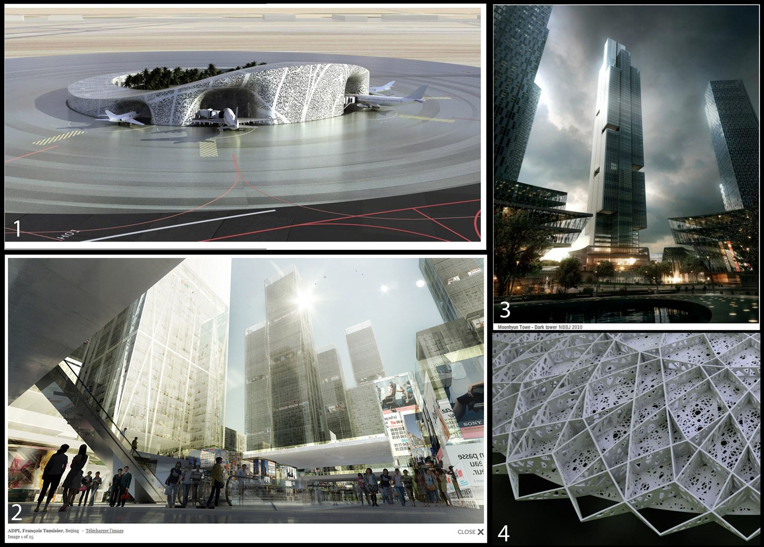
In the image above you can see:
- OMA, Jeddah Airport – Artefactory Lab
- ADPI, Biejing – Labtop
- Moonhyun Tower MIR
- Ateliers Jean Nouvel, Le Louvre, Abu Dhabi – Artefactory Lab
The major elements I get from these images were Composition, 3 points perspective, Wrapping and mood.
The 3D Tower
Mass Plan
Here you can see how all the different part of the project are designed.
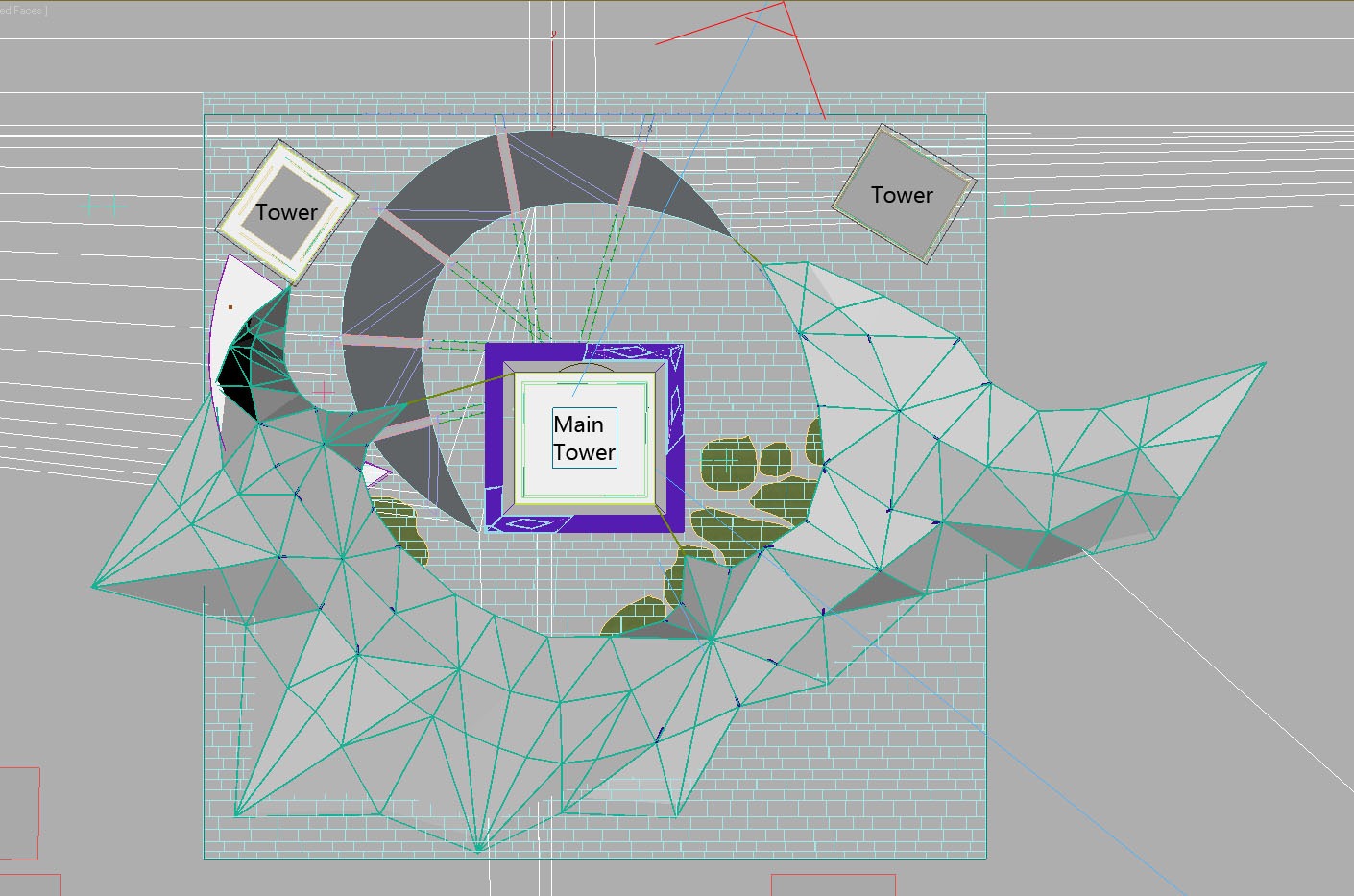
Concept
Here are the different parts of the towers: The floors, Pillars, glass and railing parts, and the wrapping.
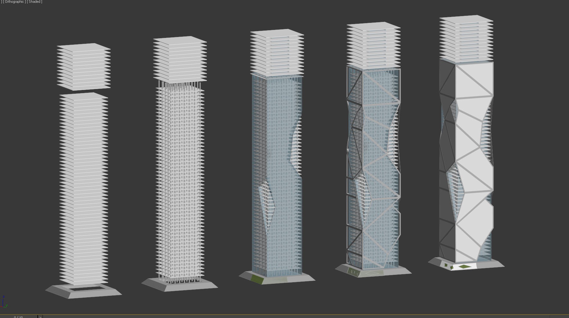
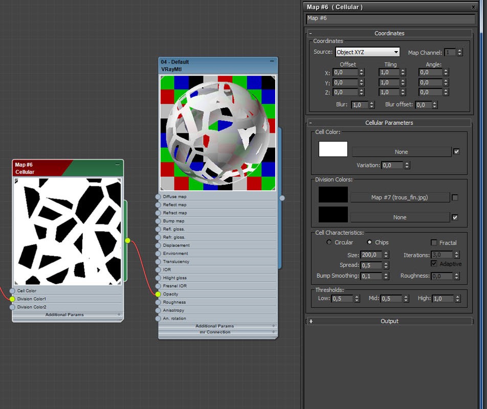
Wrapping Texture
I used a 3dsmax procedural map called cellular to make the wrapping element of the towers. This type of texture can be set with different shapes, and I choose the CHIPS one. There is a bit of reflection in the texture to catch light and environment, but thats all very simple.
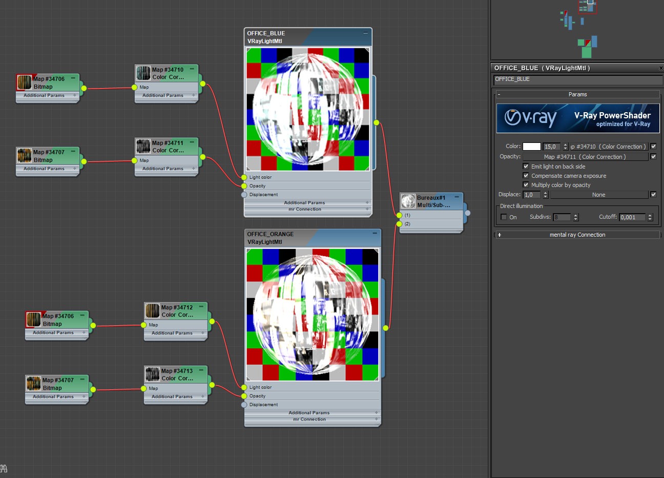
Lighting Main Tower
For lighting the towers interiors, I was inspired by a Vyonyx tutorial and populated all the floors with textured lighted plates. I made a multi-sub-objet material with slightly different V-Ray Light shaders. The plates were placed with the help of the Multiscatter plug-in and concentrated on the borders of each floor, so we can see them from the point of view.

You can see below the shader of the office-lighting-plates. This is a Multi-Sub material with two slightly variations, one blue and one orange color. You can add more color variants if you want too. Using V-Ray light material allows me to light the office ceilings at the same time, giving the feel that they are occupied and busy.
Lighting Background Towers
The transparent background towers were textured in Photoshop but the textures was made in max. I made a render of some tower elevations, without the wrapping element, and this made me some 2D textures I used in post production. You can download these textures if you like
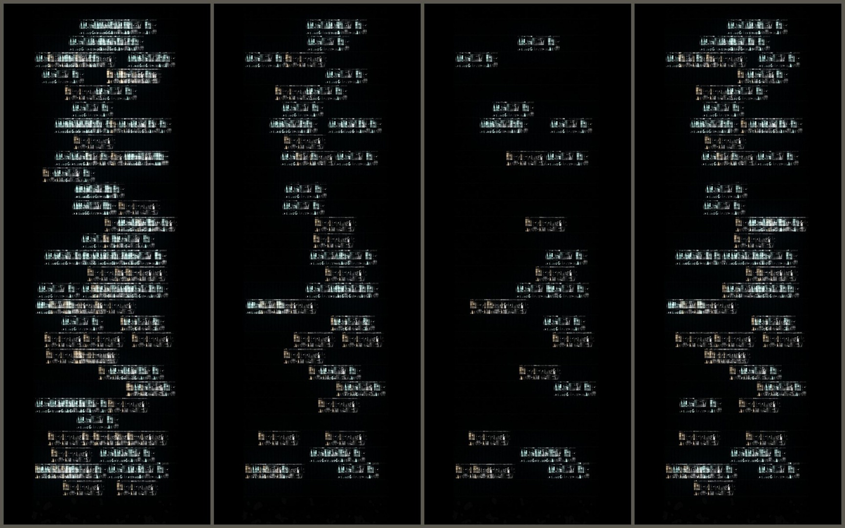
Map_Buro_01.jpg | Map_Buro_02.jpg | Map_Buro_03.jpg | Map_Buro_04.jpg
Im using them in Photoshop in screen mode most of time, and duplicate them when needed to increase their power.
2D Post Production
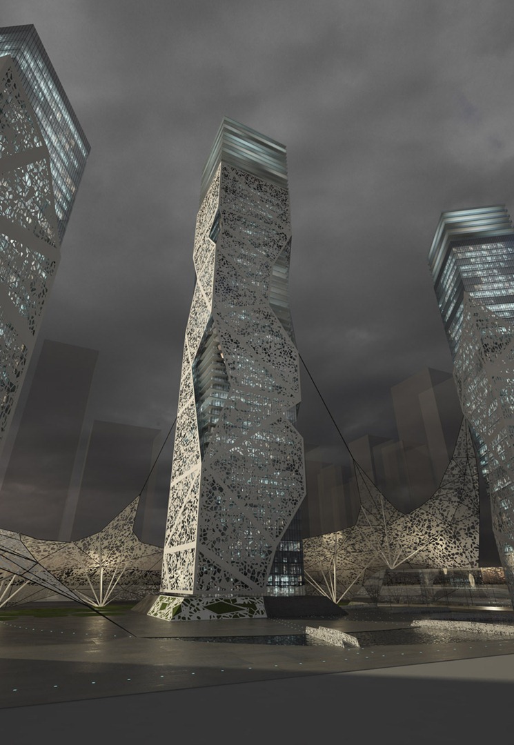
Heres the Brute 3D Render before any post production done on it
Color Grading
Im using different type of adjustment layers for color grading and contrast settings. You can see below the ones I used on the tower image. The most important for me is the Black & White adjustment layer. Here, the layer is in Overlay mode at 95%. This gives more punch to the rendering. On my composition, the Group containing the adjustment layers (called SETTINGS) is usually on top of the other groups, so it affects all the elements under it.
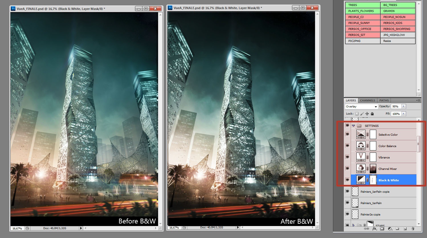
Wire Color & Object Selection
When I made this image a few months ago, I was using the V-Ray Wire Color render element to select different parts of the image. This can be useful if you want to be able to color correct or paint everything on the image, or if you want to create masks when you add people or foliage behind 3D elements.
Now Im using PSD Manager 3 from Cebas. it allows me to have more controls on the masks I want to get from my 3D rendering and outputs a PSD file directly with render, render elements and masks inside. Its a real-time saver.
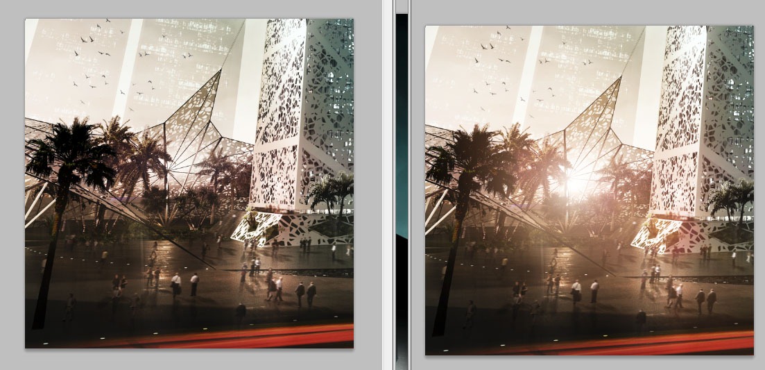
Light Effects
- I have three options to make light glows, sparks and lens flares:
Paint with a soft round brush, in screen or overlay mode, usually to add glow to an existing light source. - Finding light source images on the web (google images) , putting them in screen mode and cleaning them a bit to fit with my scene. This way is interesting because there can be unexpected and interesting result mixing some other source elements. This method is very good for experimenting.
- Using Photoshop plugins like Knoll Light Factory to create lights (see Lens flare example below, made with this plugin).
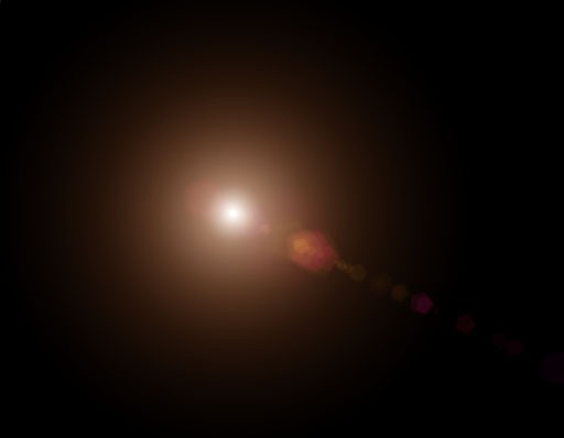
Here you can see the benefit of the same Lens Flare sample on the image. It really adds the atmosphere to this part of the scene.
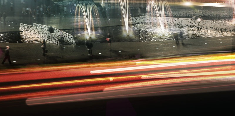
Car Lights
Adding some car light streaks works the same as light sources and flares. On this image I took a night photo with light streaks (found on Google), and made it fitting the perspective with the Photoshop Transform tools. It was composited in Pin Light fusion mode. I added some styled painted streaks to add a bit of chaos in the middle of the straight red original streaks (see white and orange ones on the close shot below).
People
The look of your cut-out people and the way you are inserting them in the composition contribute to the overall quality of the image. Their clothes, color and attitude must be chosen with great care.
People must fit with the identity of the building(s) surroundings. In this image, even if the camera is away from the people, it was important for me to choose good people, because, even if you cant see the details in the distance, you can always feel them.
When I put cut-out people in post-production, Im always trying to choose people lighted in the same way the scene is, and if I dont find enough that fits, Im choosing uniform lighted peoples and paint light and shadows on them. In Photoshop, Dodge, Burn and Sponge tools are useful to me for this task.
Putting a lot of people can be a very repetitive and boring task. To help me saving time on this, I made some people boards. This is big PSD files where I have put many cutout peoples in there; each file has people sorted by category casual people (backlight, front light, uniform light, office, shopping, children, seated, and so on). This way, I dont lose time opening individual people cutout file, selecting the alpha channel, copying & pasting. Im just dragging people from their board to the composition.
When I need some kind of people, I run a script via Photoshop that simply open the file I need (according to the script buttons below).
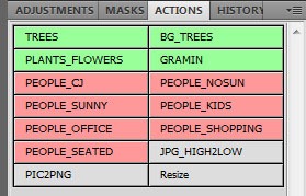
And here is one of my people board
My (Actual) Photoshop Workflow
In my professional or personal work, I always try to make my Photoshop files as clean as possible, naming and sorting layers in groups. These groups are always the same and are always on the same level. This allow me to update my rendering quickly when I need to make changes requested by me or by the client.
On this project, I was not as organized as usual, I experienced ton of things and this leads me to a nice image and a big mess in my PSD File. Thats why I dont show too much screenshots of it, I dont think this would be of any help.
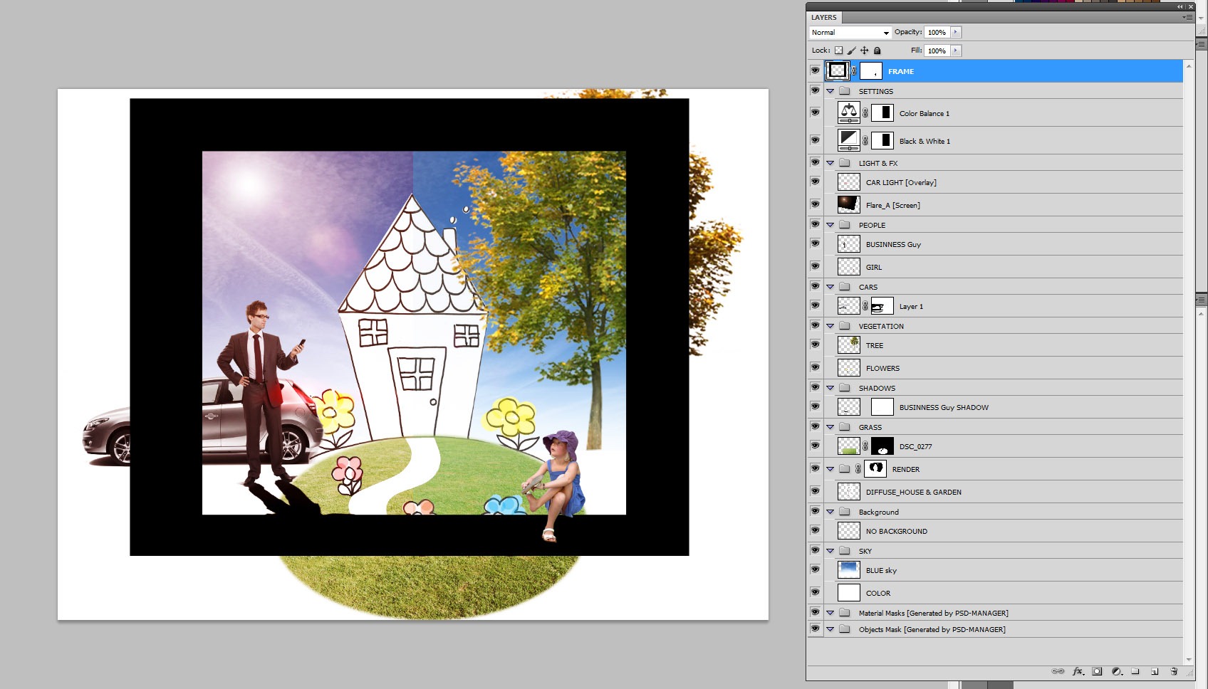
See below a screenshot of how the structure of a typical PSD file Im working on looks, on another quick test perspective (no 3D involved!).
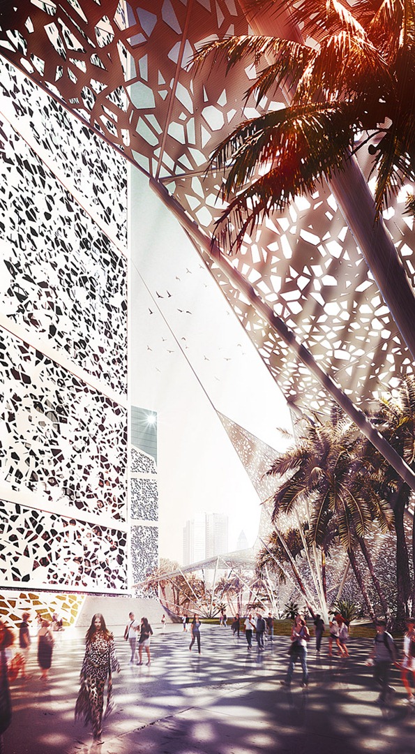
Thats all for this making-of. You can see both final images below and If you have any questions, ask away and Ill do my best to answers them all.

Following your requests, in the comments, I’ve provided the original PSD file for the “CHIPS” image, reduced to manageable size of 352*640. The layer structure of the file is a bit messy, and don’t reflect my actual Photoshop workflow.
[wpsharely] [/wpsharely]
Cheers,
Nicolas Richelet.
After several years as Jazz Pianist, Nicolas decided to dive into the graphic world by learning design & painting using digital tools and making visualizations. Nicolas did an internship in “Architecture Studio” Company in Paris, following later with a course at the Beaux-Arts School in Marseille to further develop his artistic skills. He then worked 2 years in Atelier 4, an architectural company in Clermont-Ferrand.
Nicolas joined the V-Pictures studio in Bordeaux in 2006 and after four years decided to leave it and go about his own way working mainly on images for marketing and communication, national or international architectural competitions, always exploring other creative fields, matte paintings, or another challenging works.
Nicolas won 2nd place in the RailClone miniCHALLENGE and featured on the cover of 3DWorld Magazine 142 with his entry in that competition – “Falling Apart“.

Nice to see you there Nicols!
Adding people to images is a pain in the ????, but it is a must to have for conveying the feel of a place. I really wish there was a fast, simple and good way to do this then one by one…
The “shader lighting” tips for towers interiors is simple but so efficient! Thanks a lot for sharing nicolasrichelet !
You’re welcome 🙂 @mattguetta
Very inspirational to see your workflow – thank you 🙂
adding people by Photoshop this way seems really interesting. Where did you get all the cutout-people from? Did you go in the city and took photos of walking people?
Most of the are from photos but some comes from collection like viz-people.com.
@NicolasRichelet sir can you please elaborate the procedure of the cellular map.. i tried it but i cannot get the same as yours.. i don’t know if the “trous_fin.jpg” is missing from what i did.. thanks!
^because obviously i don’t have the trous_fin.jpg.. haha.. cheers!
this is one of the best examples how to create awsome final shot from great architecture and good composition but not really special final rendering. great job! thanks for sharing your workflow.
Great tutorial my friend .. any hint of Ligth Paint done directly in photoshop? Congratulations and hugs .. Ronen one more time thanks for coming out ahead and publish this wonderful tutorial.
The best way to show how to create an awesome composition! Congratulations Nicolas and thanks for sharing your workflow with us!
@ronenbekerman Nice article!
It is @ELG_Studio I love to see Photoshop techniques all the time 😉
hi!! anyone could tell me how to do de white wrapping in the picture in 3d mas
max
nicolas could you help me i am doing something similar in my university and i need to know how to wrap the building
hi, your question is not very clear. You don’t know how to MODEL the wrapping part or what kind of TEXTURE you need to do it ? @diegofriass1
yeap im talking about the modeling part, wich was the process that you used? please @NicolasRichelet
The modelling part a box wrapped around the tower, with holes here & there. The structure are made from splines with a profile (with a sweep modifier). @diegofriass1
YOU are the MAN!! thanks a lot it was really helpful! sorry for be annoyed 🙂 @NicolasRichelet
No problem, glad if i can help 🙂
@diegofriass1
last one!!! i promess hahahah that green triangulation in the picture where says mass plan how did you got that? with splines? nurbs? @NicolasRichelet
i created a plane and in Edit Poly mode, moved vertex and cutting polygons until i obtained this result. @diegofriass1
thanks!
@NicolasRichelet
The people template and scripting is a very smart idea!
Nice renderings by the way!
Thanks! this is not my idea 🙂 This come from here : https://www.ronenbekerman.com/8-hybrid-2d-3d-rendering-technique-videos-by-les-chylinski/ @artmaknev
Nice to hear that psd-manager is a real time saver for you. Thanks for sharing your workflow here.Daniel Schmidt – psd-manager Developer
No Prob, it’s a great piece of software, very useful 🙂 @DanielSchmidt
thanks alot…knoll light factory…interesting
thanks a lot… watchin out for more… +helpfully with the psd script… just search @every time on my own… brings me a new workflow
Awesome making-of, Nicolas!
Workflows like yours show that light is everything!
regards
Lasse,xoio
@xoio Thanks 🙂
Master!
Thank you very much!
amazing!
As fas as those giants don’t really interested to share their workflows (in detail) it’s very nice that someOne put their effort (time and dedication) to get as close or even further with their tests & later on share knowledge with comunity – do believe that there’s a lot of people that would like to say Big Thanks! Count me in =) I was pleasure to read. Beautiful craftmenship, Nicolas. Looking for further works of Yours!
amazing! As fas as those giants don’t really interested to share their workflows (in detail) it’s very nice that someOne put their effort (time and dedication) to get as close or even further with their tests & later on share their knowledge with comunity – do believe that there’s a lot of people that would like to say Big Thanks! Count me in =) It was a pleasure to read. Beautiful craftmenship, Nicolas. Looking for further works of Yours!
Thanks all for your comments, and glad i can help 🙂
Awesome making-of Nicolas. Awesome!
Would you mind sharing your .psd file so we could have a more in-depth look at your layers and the overall composition? I bet there are a lot of photoshop newbies out there (like me) that would really appreciate it. Both pictures, if possible. 😉
I hope I’m not asking too much, but since this isn’t commercial work, I thought I’d ask. 😉
Congratulations on such an awesome work.
Kate
Kate, that would be kind a generous move, too generous – I think =) but maybe those who really want to have a file could raise some money in form of donation =) for educational purpose.
Ronen, figure out smth, maybe there would be a place in Your shop for one more item =) if Nicolas would agree of course =)
I would like to see the psd too, maybe even not for free =)
Well, we all know by now that Nicolas is very generous or he wouldn’t have done this making-of to begin with. I just asked for the .psd file because Nicolas clearly stated: “These images were made with a goal of studying the style of Mir, Luxigon & Labtop. Its a personal project that allowed me to explore a bit of this kind of rendering styles.”
I’m not sure I’d be willing to pay for a single .psd file, but I’d surely pay for a video tutorial showcasing Nicolas’ amazing post-work. That’s for sure! 😉
@katewrss Why don’t you do the same? You’ll surely learn more by doing it yourself, just as Newke 😉
Kate, thanks for your interest. I’m actually thinking about this sharing PSD idea. Not sure about it yet, free or not.@katewrss
I would definately pay for a video where you go through all of your layers and explain what’s the purpose of this layer and why you created it.
@NicolasRichelet
Is it gonna take long for you to come to a decision?
This is not a decision i will take lightly. One of the most important thing i learned from my old Photoshop master, Master Chi-Fu, is that i’d better learned patience before putting my eyes on his PSDs. Pure wisdom.@katewrss
@NicolasRichelet (there’s so much I wanted to say, but I’m gonna keep it simple.)
“Thousands of candles can be lit from a single candle, and the life of the candle will not be shortened. Happiness never decreases by being shared”
Pure wisdom. 😉
@katewrss@NicolasRichelet amen! 🙂
@kodissimo@katewrss@NicolasRichelet I like this =))) from very technical to..very philosophical stuff. What You can ask more? =) think we need a thread in forum called ‘wisdom’ =p
Realy nice your workflow
“I was using the V-Ray Wire Color render element to select different parts of the image” how do you orginized the object to have a wire output usefull for selection, by id, by material or by layer?
VaryWireColor works only with the color of the objets wire, i have just to set different colors for each object…or using a wirecolor randomizer (Soulburn Scripts has one) @max3dvi
I agree with others … The tips of the lighting is really great.
Thank’s Newkee
Great tutorial! Loved the lighting advice.
Hello Nicolas, you did a brilliant workflow there. I love this conversation, I’ve learned a lot on this topic.
Nicolas provided his “CHIPS” image PSD file for you to download and dissect as you like 😉 Although not representing his “orderly” workflow – it is rather organized and a lot can be leaned from it.
Download it form then box at the end of the article.
@ronenbekerman Thank you Ronen for posting and thank you so much for Nicholas too, this file is going to be very useful to understand how Nicholas workflow is nice and brilliant! 😉
@ronenbekerman There was no need to reduce the file size this much. It’s 2011! Downloading something like 400Mb shouldn’t be that big of a deal anymore, and it would have been nice to have it at least 1K tall, but hey no complaints here! Thanks for the upload.
@ronenbekerman
Wow, thank you very much. I probably learned more from studying your .psd that I have from reading Photoshop books and tutorials. Again, thank you very much.
Great job!
@EricdeBroche Thanks Eric, nice to have such comment from a master 🙂
sir can you please elaborate the procedure of the cellular map.. i tried it but i cannot get the same as yours.. i don’t know if the “trous_fin.jpg” is missing from what i did.. because obviously i don’t have the trous_fin.jpg.. haha.. cheers! thanks!
@LorHisuka Hi LorHisuka, the “trous_fin.jpg” texture is not important. You just have to put the exact same values in the shader, like on the screenshot. Most important are the thresolds values.
@NicolasRichelet thanks in advance!
Salut Nicolas! Very nice image and very efficient and clever tutorial!
@emyjm Salut Jean-marc ! Thanks for your comment and hope you are doing well!
@https://www.livefyre.com/profile/181116/ could you please tell me where I can find the people texture you used in the PSD
ronenbekerman download link still active? i´ll get to the file but cant download it. bummer, but very helpfu
What year was this design completed by?