


Making of Sea and Mountain Cabins
Today I’m happy to share with you this making of by Dusan Stevic from Architectural ID, a Serbian based visualization studio founded in 2011. The “Sea and Mountain Cabins” is a commercial project for showcasing their client’s cabins. Follow Dusan as he dives into the process of showcasing a wooden dominant design using 3dsmax and V-Ray is his main tools with lots of Floor Generator on the way. Enjoy!
Introduction
First, I would like to thank for this opportunity to share some of our work here on Ronen’s blog.
In this tutorial we will try to go over a few topics while working on commercial project with a specific thematic. So without any further ado let’s dive into it.
Here are a couple of exterior and interior renders to get us started. Some of them were showcased on Evermotion front page and iToo software gallery so quick thanks to them as well.


The client approached us, requesting to create a full set of visuals for a cabin manufacturer from Norway. Even though it’s been said so many times, we also must emphasize importance of finding good reference images!
Right away we began searching and scrubbing through the internet looking for all kinds of different landscapes, light moods and vegetation in order to get various types of scenarios that might work in our advantage. The idea was to try to capture Norwegian nature in two different surroundings (Sea and Mountains) in a manner that potential buyers will find appropriate to the actual landscapes.

Modeling
Once we were happy with our reference base (which really wasn’t too difficult considering we had to look at the beautiful Norwegian scenery) we jumped into the modeling process.
The client provided us with obj. files from Revit which in some cases were manageable and in some a big nightmare to correct. Geometry was poorly exported so for couple of cabins it was easier to model them from scratch instead of correcting old geometry. Other than that modeling process was pretty straightforward as lodges were fairly easy to create.

Example of bad geometry
Only a few cabins were modeled from the beginning as the client expected weekly updates and so we had to rely on Floor Generator to cover bad geometry on some of them. This is certainly not a tip on how to work faster on a project but when you’re on tight deadlines and it works… You see where I’m heading with this.
Floor Generator was used quite a bit throughout the whole project as it was used for floor and wall coverings both in exteriors and interiors. Needless to say it was a life saver to speed up modeling process as wooden boards were everywhere – Floors, Walls, Ceilings, You name it.
You should check out Bertrand Benoit’s article about How to use Floor Generator for in-depth understanding.
Besides Floor Generator, we used Batzal Roof Designer for roof coverings. It’s quite easy to use and fast to setup. One more used plug-in is Snow flow for couple of winter scenes. Snow flow produces nice mesh and works well with edit poly modifiers in case you want to add additional bumps, trails, irregularities, etc.
Once the cabins were completed we moved onto terrains.
Like I mentioned earlier, time was of the essence on this project so we had to “recycle” terrains or terrain with corrections made to last two edit poly modifiers to adjust geometry to fit new cabin. This of course couldn’t be applied everywhere but we took advantage of this whenever possible.
That should be it as far as modeling goes.
For trees, bushes and grass models from Evermotion and R&D group were in use mostly.
Lighting and V-Ray Camera Settings
Next up was lighting. As much as we like to cut corners here and there we needed to show diversity when it comes to lighting. So we decided to go both with VRaySun and Sky and HDRI light setups.
Each with their advantages… VRaySun/Sky was mostly used in broad daylight scenarios while HDRI maps were in charge of overcast/sundown scenes because of their richer colors for afternoon scenes and lack of them in winter ones. We used HDRI maps from VizPeople (Vol 02) and Peter Guthrie.
Setups in both cases were pretty standard. HDRI maps were inserted into VRayDomes and copied in environment slot and for VRaySun/Sky size multiplier is increased to get softer shadows and shadow subdivisions are raised for better quality.
Before adding materials we tend to do a couple of clay shots as we found this to be a great way to best assess sun position in relation to object while keeping render times fast. On clay material it’s also easier to see how much shadows will affect whole image and to get a better grip on contrast between bright and dark areas.

Testing lighting with override material
Here are a couple of different light setups with camera settings snapshots:

Exterior HDRI and camera settings
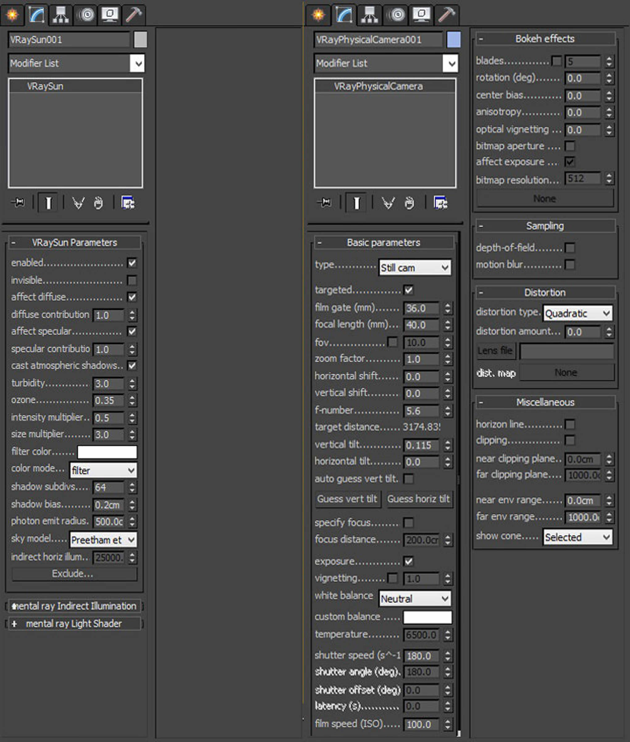
Exterior VRaySun/Sky and camera settings

Interior VRaySun/Sky and camera settings
Materials
One of most important things while working on this project was getting the wooden shaders right as they were one of the key features of the whole project both in interiors and exteriors.
There were two main wood materials (lacquered and weathered boards) both with variations from scene to scene. Similar setup was used both for flooring and vertical cladding and we will go over creation for one of these wood materials.
The base material is consisted of diffuse, reflection and bump maps attached to Multi Texture plug-in (as mentioned above, floors were mostly done with Floor generator).
Here is a setup and preview of base material

Blur value is lowered to 0.5 for diffuse and 0.8 for reflection for slightly sharper result. Maps in bump slot are also used for reflection with slight color altercation. We used Color correct instead of max color correction as it gives more freedom with adjustments. One last thing for the base material is adding VRayDirt to diffuse map in unoccluded slot. Settings are left as they are with only slight adjustment to occluded color from black to dark brown to match wood color.
The base material looks solid already but needs some imperfections, variation, bumps, scratches, etc. to make it more realistic. Next up was copying our base and using it as a coat material inside a V-Ray blend material. Glossiness and Fresnel are increased on our coat material in order to give that glossy effect. But without any adjustment to glossiness and reflection level our coat will look too uniform and unrealistic.

So the next step is to get some scratch or dirt maps in order to fix this.
First map is added in r. glossiness to make subtle changes in the parquet lacquer. This should usually be black and white map with little color variations to avoid drastic transitions. If your map has too much contrast you can tone it down using color output like we did in this example. Color correct can also be used to achieve this.
Next up is the bump slot where you can use whatever scratches map works best for your scene and gives nice contrast to wood bump.
With the glossiness and bump in place we now need to adjust reflection in order to get some more diversity to our floor and achieve that final look of floor that is little worn out by time and slightly damaged from constant use, moving furniture or what not. In this particular case we mixed two maps to get what we wanted.
This is a process of trial and error so you will probably have to do couple of tests before getting desired result.

Also, don’t forget to assign map channel to your masks so you could properly map them using UVW modifier.


And this is the end setup and final result of our wooden material.


Now that we got the interior flooring material setup covered let’s go over exterior painted wood.
Textures from CGTextures were used for the exterior cladding. Same boards were used for all three channels (diffuse, reflection and bump) with different desaturation settings in multi texture. Diffuse slot is also attached to color correct to brighten boards and get some more contrast. Once we have our diffuse slot desaturated properly it’s time to connect it to an RGB multiplayer so we could change boards to desired color.
Here is base material setup and render.

The siding looks OK but a bit plane, flat and uniform. It needs more bump to bring out wooden rings and cracks and reflection needs more work. So let’s again copy our base material and create a V-Ray blend material to add more depth and realism to our material.
The procedure is similar to floor material we created just now for an outside material. Focus should be on recreating how weather conditions are impacting wooden boards. But in a manner that won’t affect cladding too much considering client is supposed to sell them as new cabins.
Like before, VRayDirt is added to get some more depth on edges with no adj. to its settings. Our copied material (coat material) had increased reflection and in reflection and glossiness map there are two mixed maps combined together. For glossiness, same map is used only rotated for 90 degrees and then mixed with the original to avoid glossiness repetition. Reflection has two different maps slightly brightened in color correction and then mixed together. Bump value is pretty low as on higher values becomes too obvious.

This is how material looks after adjustments.

And here is comparison between start and final result for exterior wood material.

Other materials had fairly simple setup with diffuse, reflection and bump maps applied so let’s not drag along too much with materials and move to next stage.
Render Setup
Here you will find commonly used settings with Adaptive DMC image sampler and Area filter for exterior shots. For interiors we often switch between Catmul-Romm, Lanczos and Sinc filter as each of them gives sharper results than Area. This is just a personal preference, you may find Area filter most suitable for softer raw image which has its benefits later in post.
For color mapping type we use Reinhard and burn value ranging from 0.3 to 0.6 depending on lighting.
In GI, Irradiance map is used for primary bounces and Light cache for secondary as this two will get you clean and nice result while keeping render times within a reasonable time-frame. This project was done with 2.4 V-Ray. In new 3.2 V-Ray you may try and play around with Brute force as it is improved greatly but for fast production Irr+LC still proves as winning combination for us.
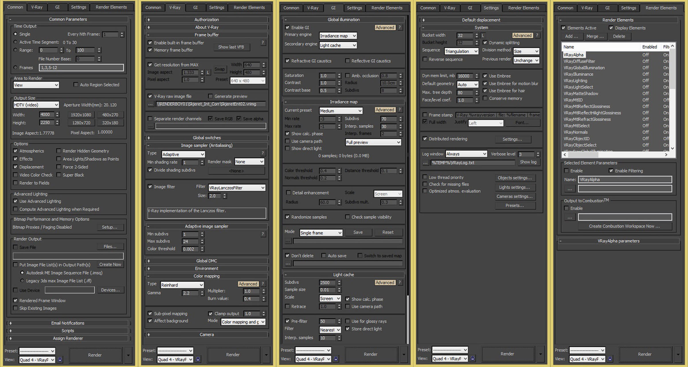
Exterior render setup is pretty much the same apart from image filter (Area).
Post Production
In our opinion you can swing one of two ways when comes to ArchVIZ. Get the most from the raw render and polish it later in Photoshop or just let your creativity run free in post with minimum effort getting the base image.
As great fans of CG realism we like to spend more time in max and try to get most work done there.
Here is an interior raw render saved as 16 bit tiff image. As you can see nice, solid result with no over bright areas.

First thing we like to correct (if needed) are levels, curves and colors. Nothing major, just to bring up colors, adjust contrast, etc. You can see how the image looks after basic adjustments.

Next up are passes.
Even though we don’t rely on post production as much we still like to render out all passes just in case we might need any of them.
Besides the standard passes we render out additional ambient occlusion pass with quick passes script and this is the first pass we use to accentuate contact shadows.
In order to keep this short I will just mention what other passes we like to use (Raw Lighting for more depth, Light select to emphasize bright areas, Reflection and Refraction for reflective surfaces and glass).

With passes done, next up is Color Efex plug-in which we highly recommend.
Sometimes it can be a real life saver when you are up against some ridiculous deadline and don’t have enough time to dedicate to your image. Here it’s used to get a bit more contrast, bring some of details back, add a bit of soft glow and some vignette to round it up.

Finally, chromatic aberration is added bring back that color bleed from old cameras we all love so much. It’s always tricky to get the right amount so try a couple of times to get it as you want or you might end up overdoing it which can take focus from all hard work you’ve done thus far.

And last step is to get crisp sharp render using high pass filter in overlay mode with opacity lowered to about 50%.

With that image is complete and here is final result

Conclusion
And to slowly wrap up, thanks to anyone who took their time to read this article, I hope it was helpful in any way. Also I would like to thank A+ studio for helping us out on this project!
For the very end here are a couple more renders…


Best,
Dusan
So, that`s it.
I hope you enjoyed it. If there is any question regarding any subject I would be pleased to answer it.

Architectural ID is a Serbian visualization studio founded in 2011. Team began experimenting with CG early on their architectural studies and are now specialized in architectural visualization.


Excellent work guys! Lovely mood in those renders…
Ivcabre Thanks! Happy to hear you like it!
Great work, as always!!! Inspiring scenes… Keep it going! Cheers…
djcomy Hvala Mare!
Nice! Hvala, Stevicu!
I
was reading your post and no doubt it was really informative.!! <a href=https://my3dhouse.com/>Architectural 3D Services</a>
I
was reading your post and no doubt it was really informative..!! <a href=https://my3dhouse.com/>Architectural 3D Services</a>
chouba1986 Nema na cemu Djole;)
Looks awesome. It will be great if you can explain how to do “One last thing for the base material is adding VRayDirt to diffuse map
in unoccluded slot.” Also you mention Color correct, is it a script or plugin? I can only see Color Correction. Thanks heaps.
moifa Thanks for commenting. You need to connect MultiTexture to VrayDirt and adjust radius and occluded color. As you see on attached preview we used dark brown as occluded color to add color variation along the edges and lowered radius value.
As for Color Correct, it’s a great free plug-in which you can download here https://www.cuneytozdas.com/software/3dsmax/#ColorCorrect
Cheers!
Awesome lighting Sir, but could you please give a brief explanation about how you approached this lighting, what was the idea behind this lighting since I have already tried to reproduce this lighting but with no satisfying results.
Awaiting for your reply!!!
Also I have uploaded my work, would be really awesome if you could give any reviews on the same!!
PrajilKumar Hi Kumar, your lighting seems very much on point to me! You have nice distribution throughout the whole room. What looks a bit off is lighting coming from the right. It seems too strong as the sun is not hitting exactly from that direction. Try to remove some accent from that spot and try to control burn out on the ceiling you have there. Play around with sun size and multiplayer to get softer shadows and reduce mentioned over bright area.
ArchitecturalID PrajilKumar And the door (and other objetcs) looks too saturated, for being there close to the light source
Any chance you u can make a breakdown on the snow cabin and share the snow material? 🙂
Does anyone know the price for an amazing work like this one?
Hi. I became a huge fan of your work. Amazing, amazing renders, mood, details, lighting and…. just everything in this project 🙂 This making-of was really helpful for me and you really clean some thing for me that always was a headache in my work – mostly because of the wrong combination between them. But there’s a one more that i always wonder and i’m not sure i do it right – THE GLASS ! If i you can answer to a few question for that part of the work it would be really, really helpful for me and will solved a general problem in my work 🙂
1. Do you use plane object or box for the glass – i mean to say did the glass objects have thick or they a just single plane?
2. Do you use the same glass material for the exterior and interior scenes?
3. Can you please post a shot of the material or materials settings if they are different?
Hope you would be able to give me a clue or solution ;p for this one. Will be appreciated.
Well that’s from me – continue with this amazing job and i wish many successes to your Studio.
p.s. Sorry for my english, i hope it’s not too confusing and incomprehensible 😛