


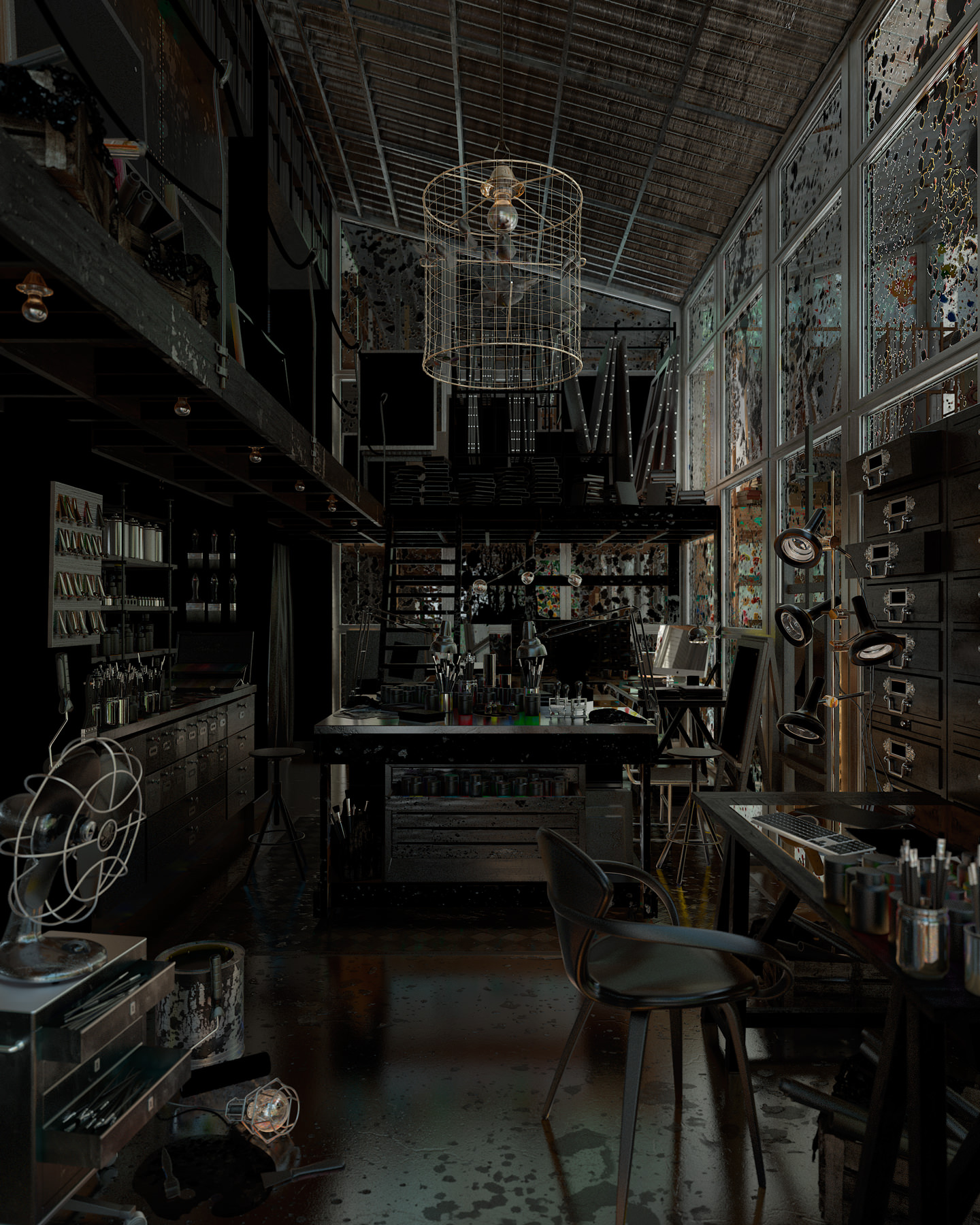
Making of Arts & Crafts
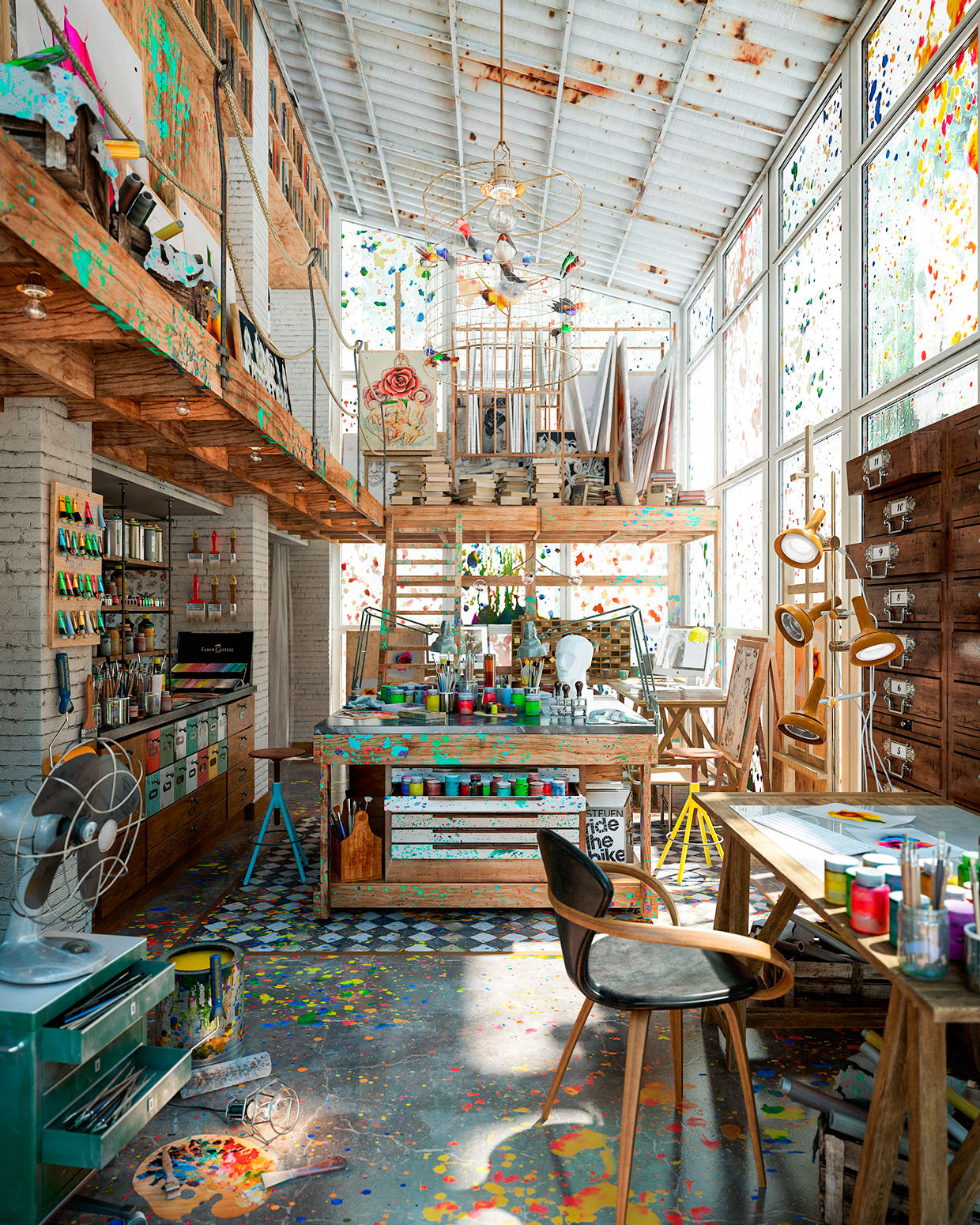
Diego Querol shared his beautiful Arts&Crafts images back in March on the forums. Since then he shared two more sets related to this great personal project, the upper area of the studio and a Tattoo Salon, as well as winning the 3dawards with the image behind. Today he takes us for a ride into his great looking mess of things, breaking it down to bits from initial concept to final post-production. Enjoy!
Introduction
First of all I would like to thank Ronen Bekerman for giving me the opportunity to share with you a new article about the making-of my Arts&Crafts project which was posted on the forums and recently won the 2015 3dawards in Image – non commissioned category.
It took me about three months to complete this project, working on my free time and I have experienced that sometimes is nice to have time to stop a project for a while and then start it over with new ideas.
For many days this was looking like a complete nightmare, and probably for some people that is still happening, but in the end there is a nice harmony between composition colours and materials.


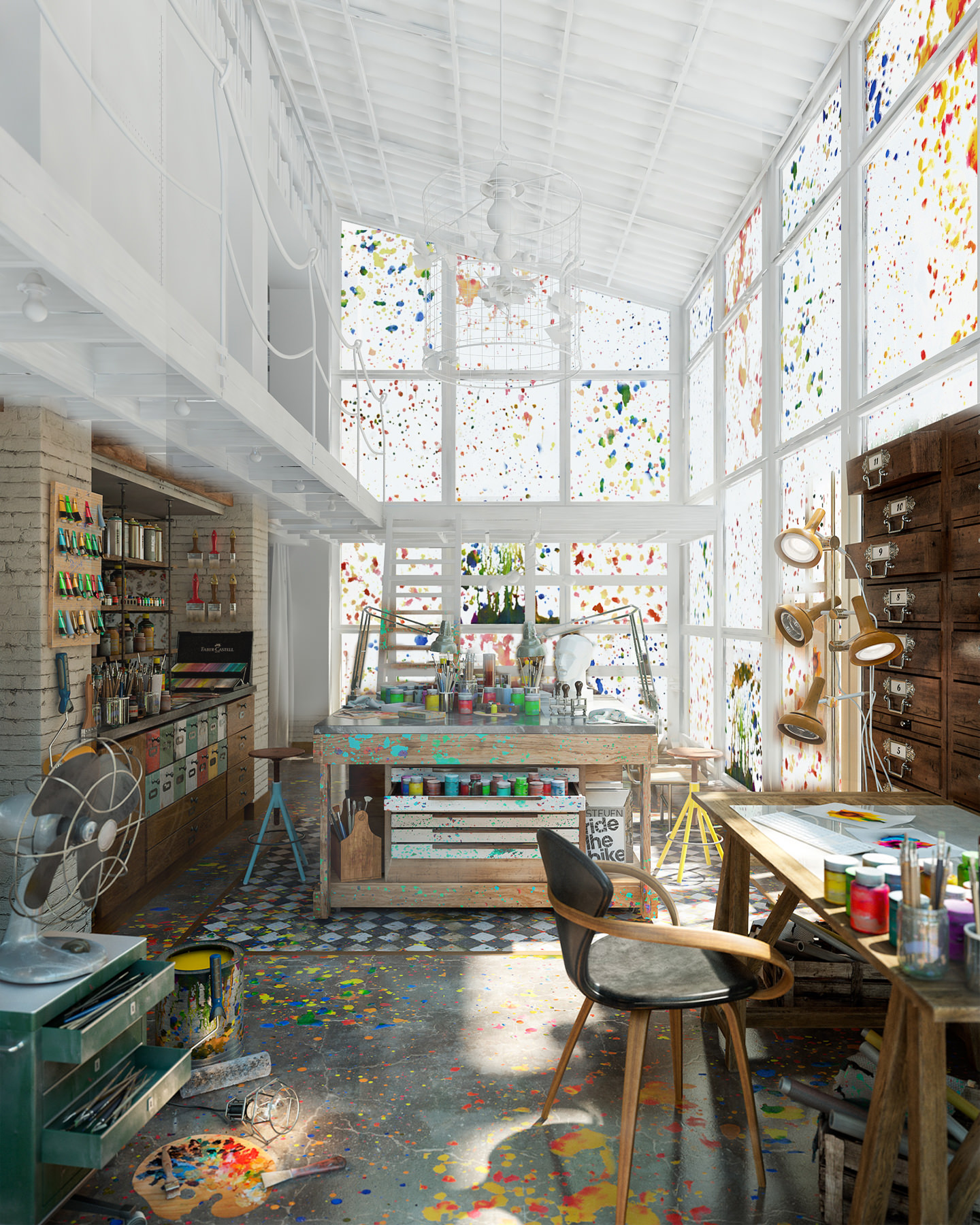
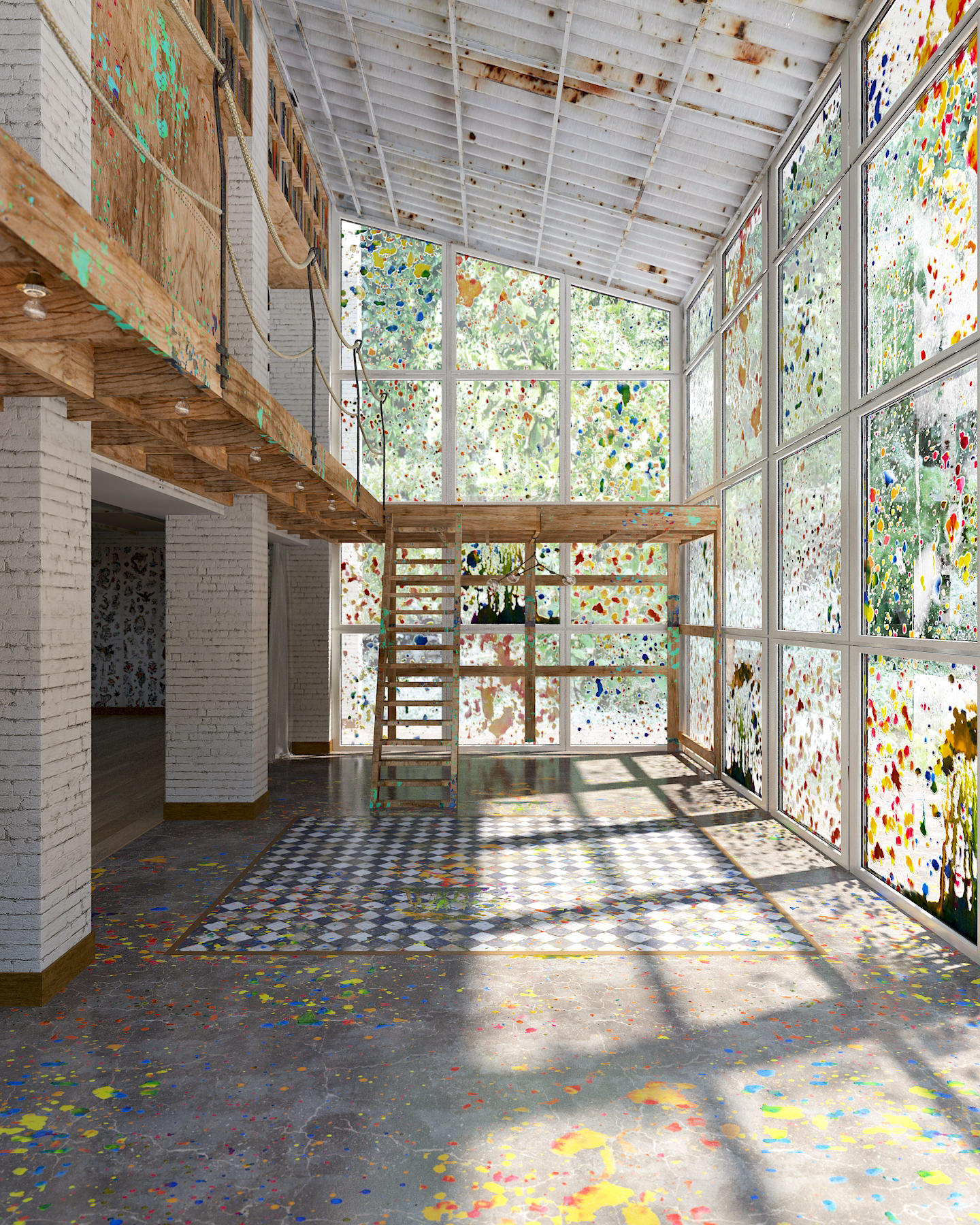
This is the first part of three different scenes I have designed and it is inspired by an art studio space.
There is something going on upstairs and a Tattoo salon on the other side.
Let’s start the behind the scenes.
The Initial Idea
If we have a look at some of the inspiration imagery I found on pinterest, we cans already see nice compositions and small stories between all the elements.


Everything looks messy but at the same time it is organized.
This was the big challenge of this project. How to get the right balance between a nice mess and a complete nightmare?
If you have a look to some of my old work, you can see I always like to use powerful colors to accent the spaces and I wanted to keep the same idea for this area.
I referred to imagery of the holi color festival and some artist that work splashing of nice primary colors.
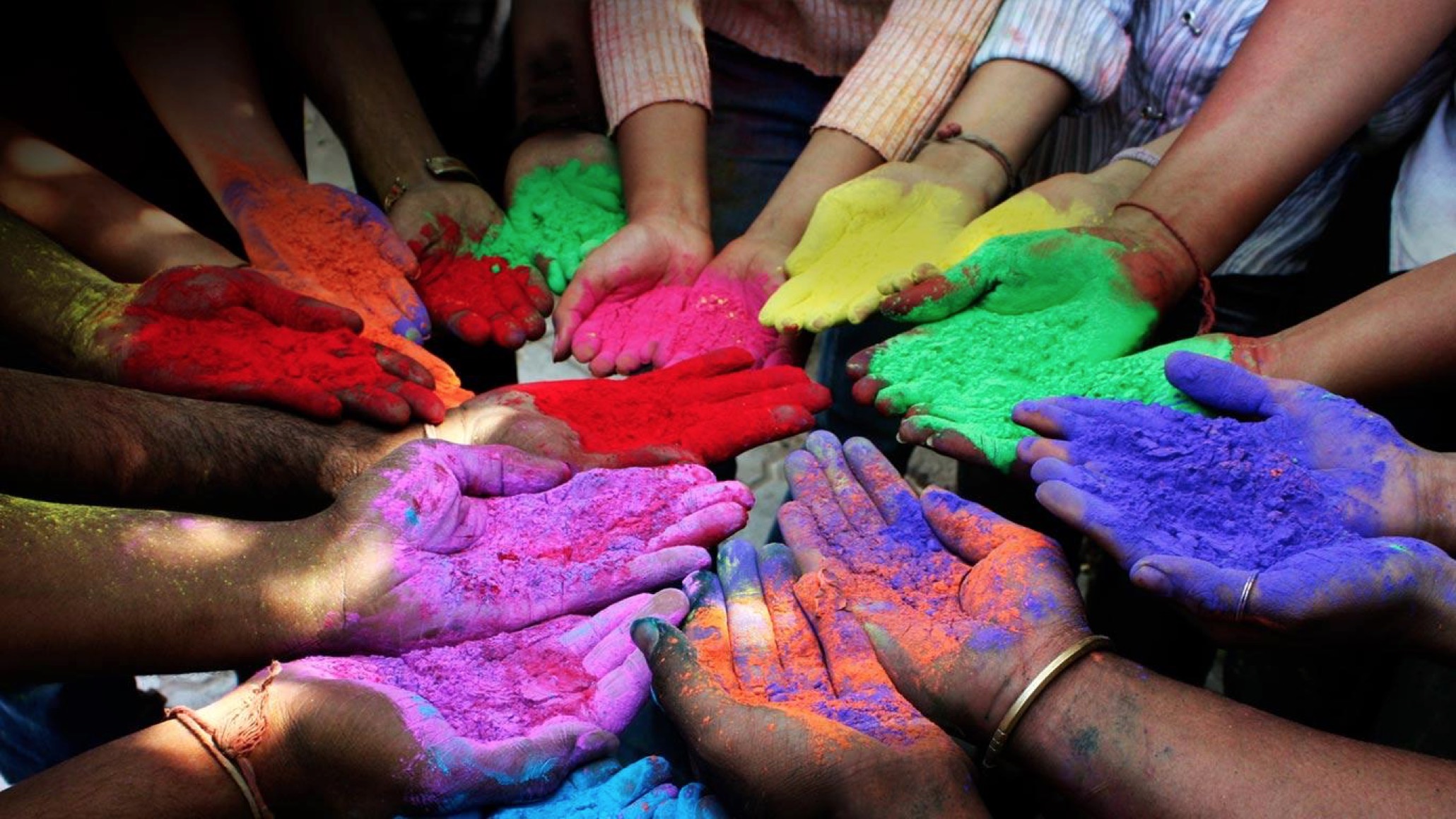
Why not? Let’s have these colors all around the space.
With all this inspiration I started to develop the idea in 3d.
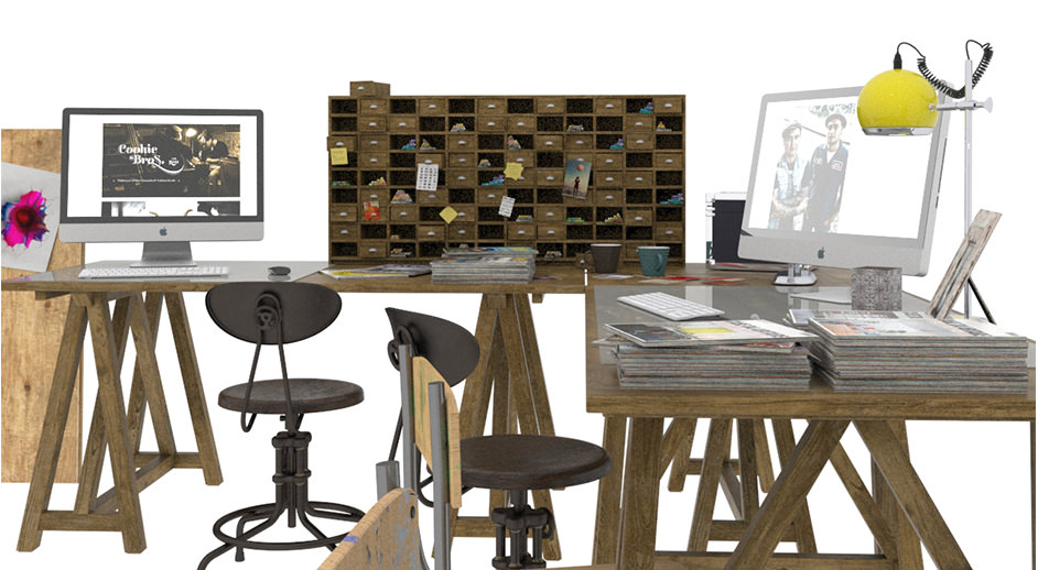
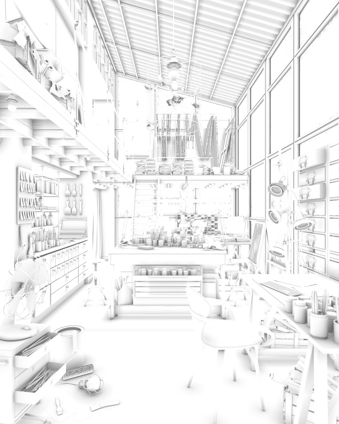
Modelling and Composition
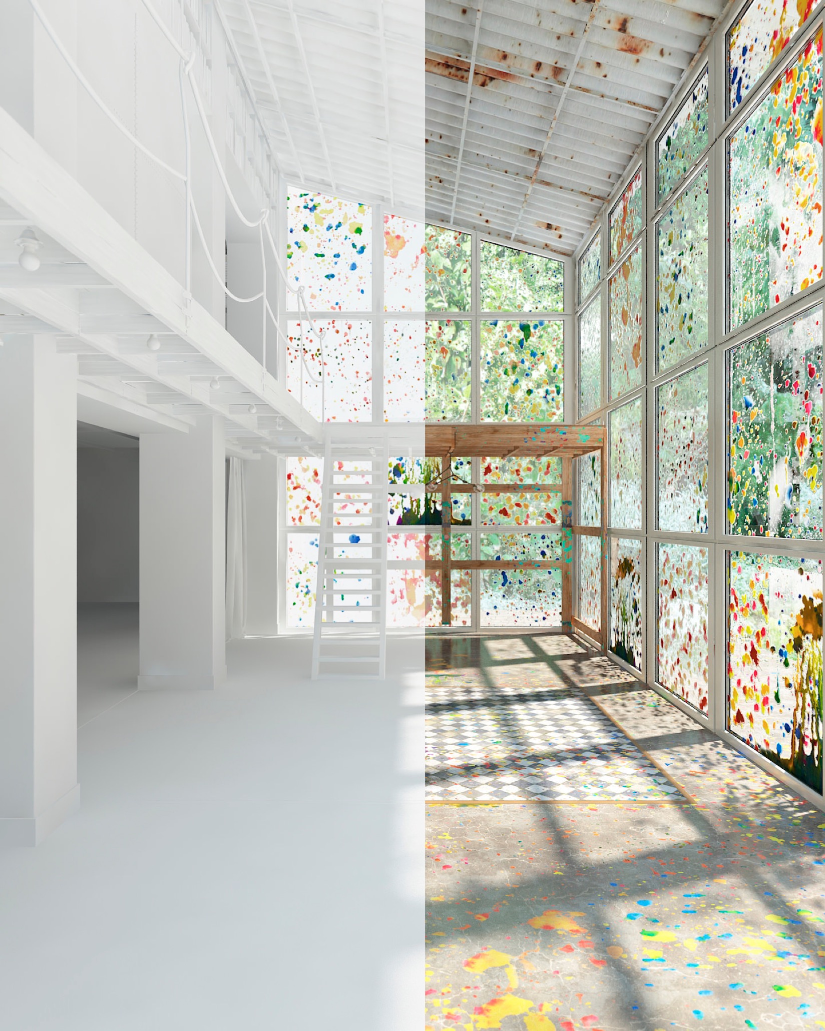
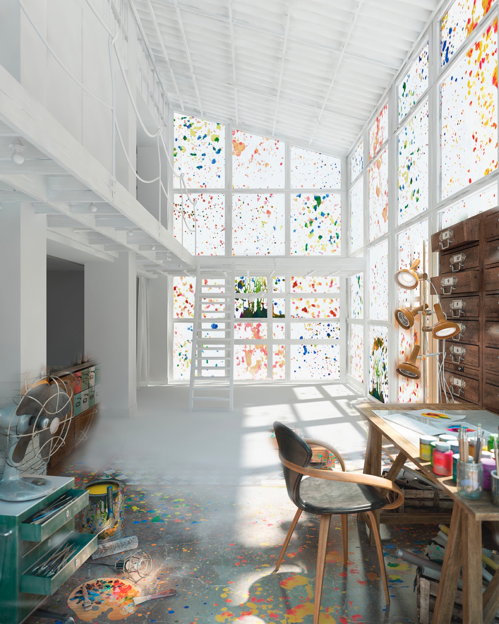
I wanted to have light coming through windows, and lots of it, so I started by setting up big frames – 5 meters high.
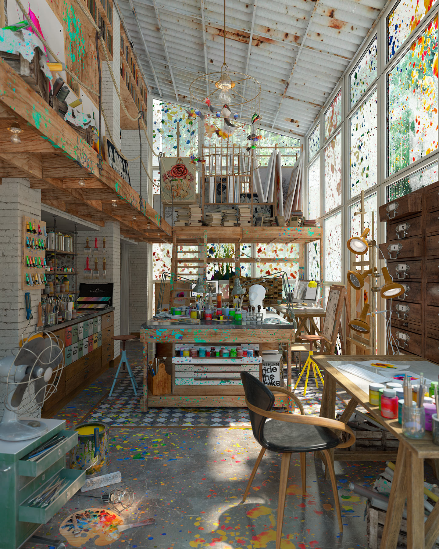
A lot of things were going in the scene, so I broke it down to layers to make this easier. Each of these layers is telling a small story in terms of composition and colors and it is important to go through each of them separately and complete one by one before you go to the next layer of elements in order to keep an organized workflow
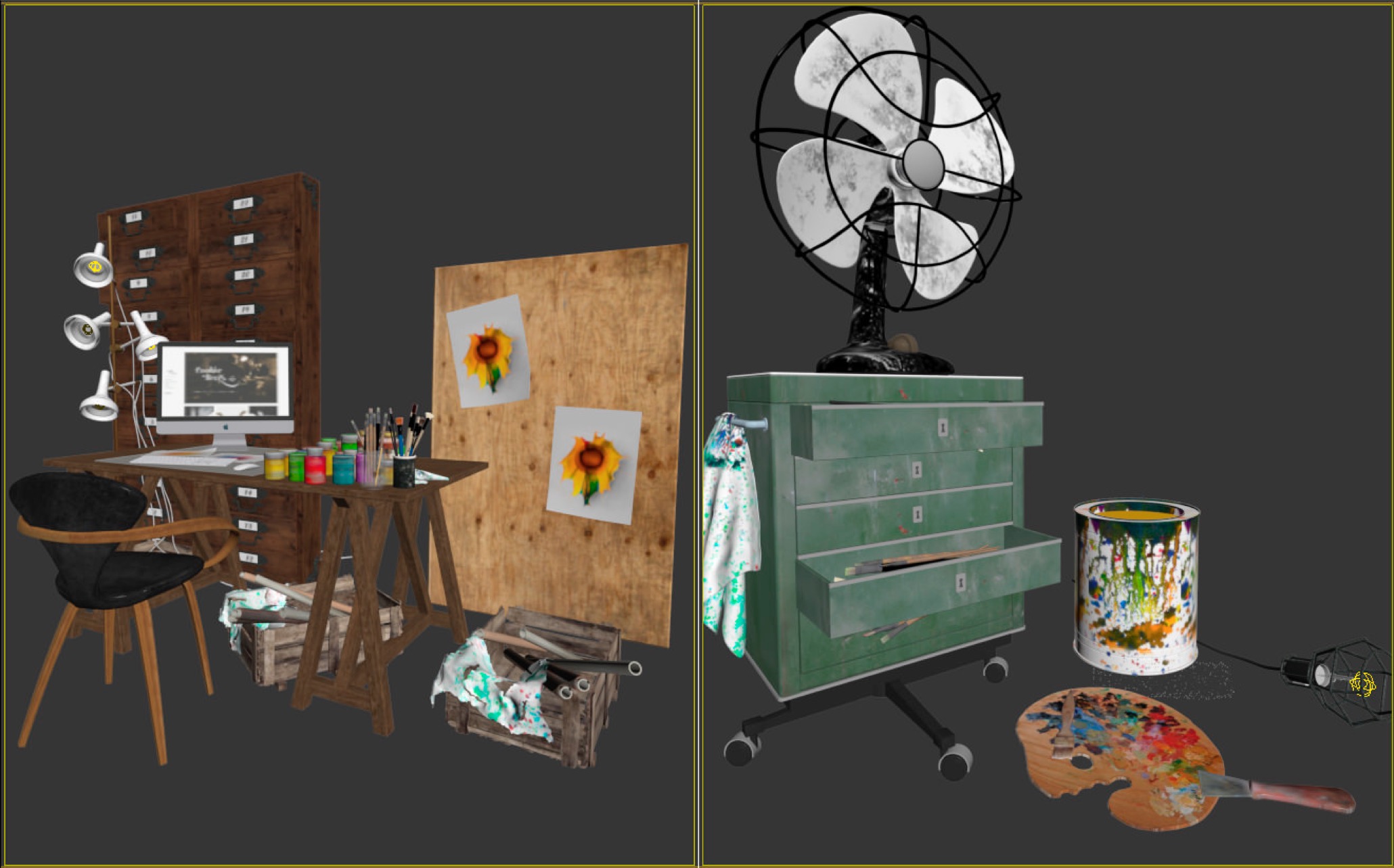
Layer 1 – Foreground
I always like to have something in the foreground left and right and then I can start setting the background. This can be done on the opposite way depending on your inspiration.
As you see I did these two compositions for the foreground. Some of the models had been downloaded from 3dsky.org and then customized by me. Some others like the floor standing lamp were model by myself.
This is a vintage lamp I took from elrecibidor.com
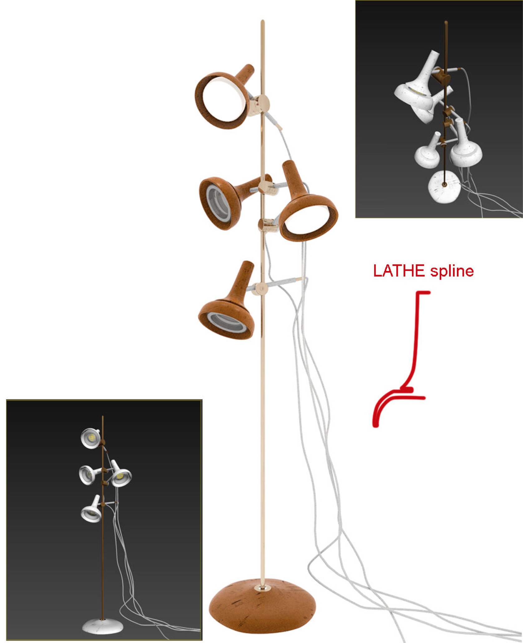
There are some interesting English vintage single pieces there I suggest you to have a look at the website for reference.
The modeling is pretty simple. You can use a Lathe Modifier for the base of the Lamp and splines for simulating the hanging cables. Then, a mixture of cylinders for the structure and be sure you chamfer all the edges. There is nothing in the real world with perfect edges. This is a very important point at the time of making objects look realistic.
Layer 2 – Working Table and Drawer
The second layer is the working table and the accessory drawer.
The working table was modeled based on the reference I have on the inspiration imagery. The drawer shelf was built from scratch combining a metal structure with old painted timber.
Then, I filled up the shelves with all kinds of paint and painting tools. These are the elements I used to give some color on this second composition layer.
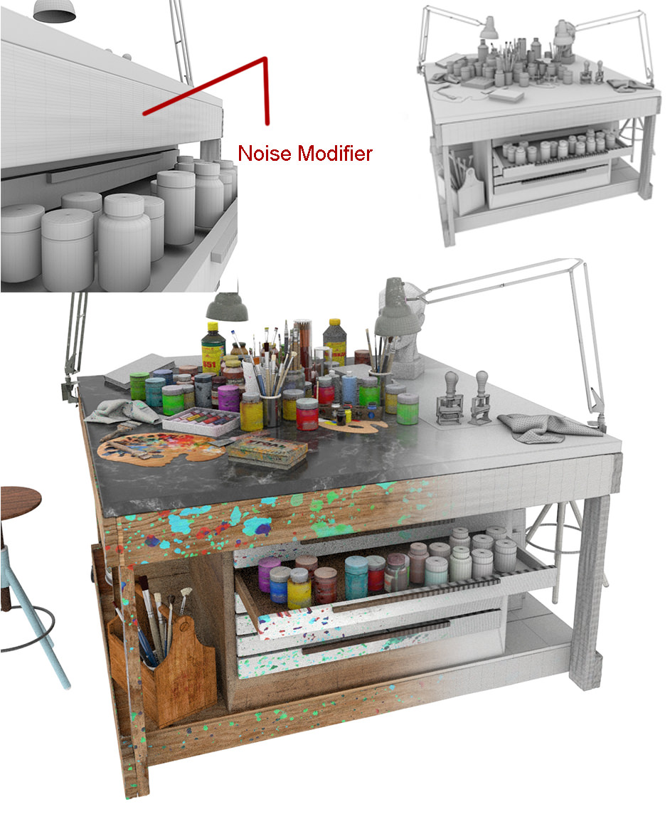
One simple tip for modeling the wood slates was to tessellate the faces and then add a small noise on the vertex so we can get a nice random surface that gives some realistic look of old wood.
As I mentioned, one of the things that bother me working in 3D is that everything looks too perfect and clean. I spend a lot of time working on making elements look used and old. Of course, the texturing process is very important at this point and helps a lot to get the realistic look and feel.
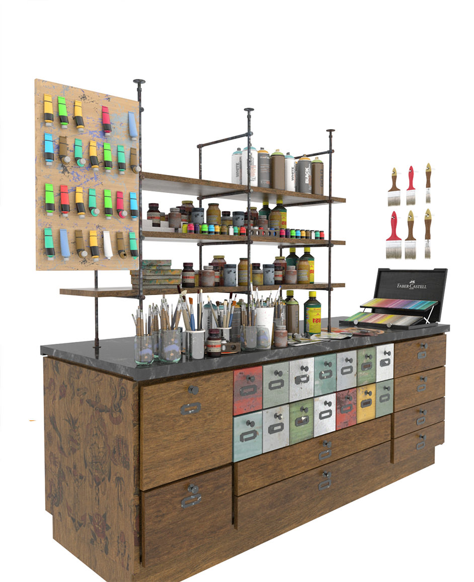
Drawer composition is pretty much the same. You need the patience to set up all the elements and then just try to keep the harmony between colors.
Layer 3 – Background Working Tables
Next layer is the background individual working table in which I have used a different composition. Industrial stools with two iMac 27’’ and in this case, the element adding color is the wood drawer with some Faber Castell pencils on it following up the inspiration reference images.
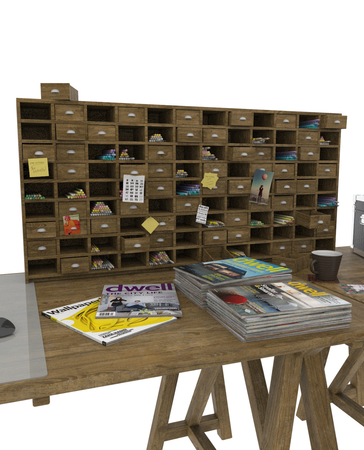
This is the last composition before we go into the texturing process.
The second floor filled up with painting frames and some illustration done by my brother David Querol. Also some old books collections I thing worked very well for the concept.
Once we have modeling and composition. I would like to explain the texturing process so I will proceed show some of the most significant materials and textures I have used for this project.
Texturing
This part of the process is very interesting and also very important for the final look. Spending some time creating your own customized textures makes the difference on the final quality.
It is most artistic and personal part where an initial idea can bring your mind to something completely different in the end but you need the time to test and play with colors and textures. I think inspiration only comes when you are working hard to find it.
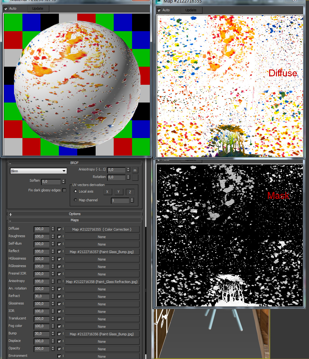
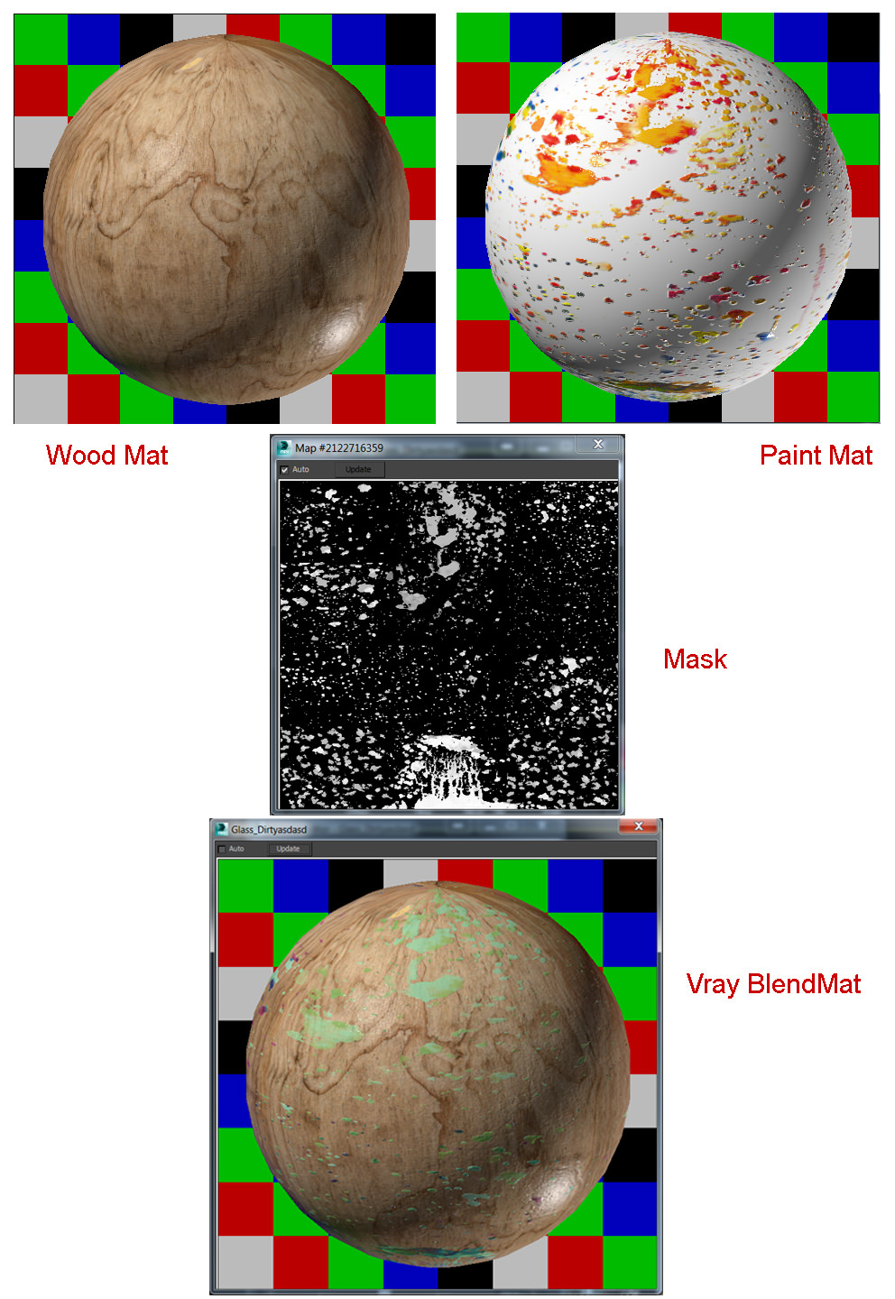
The first texture I have made was the Paint which is all over the place.
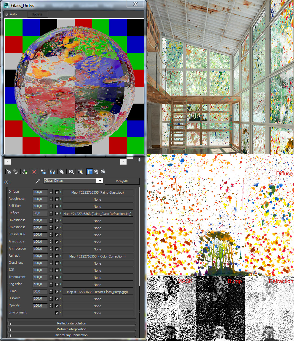
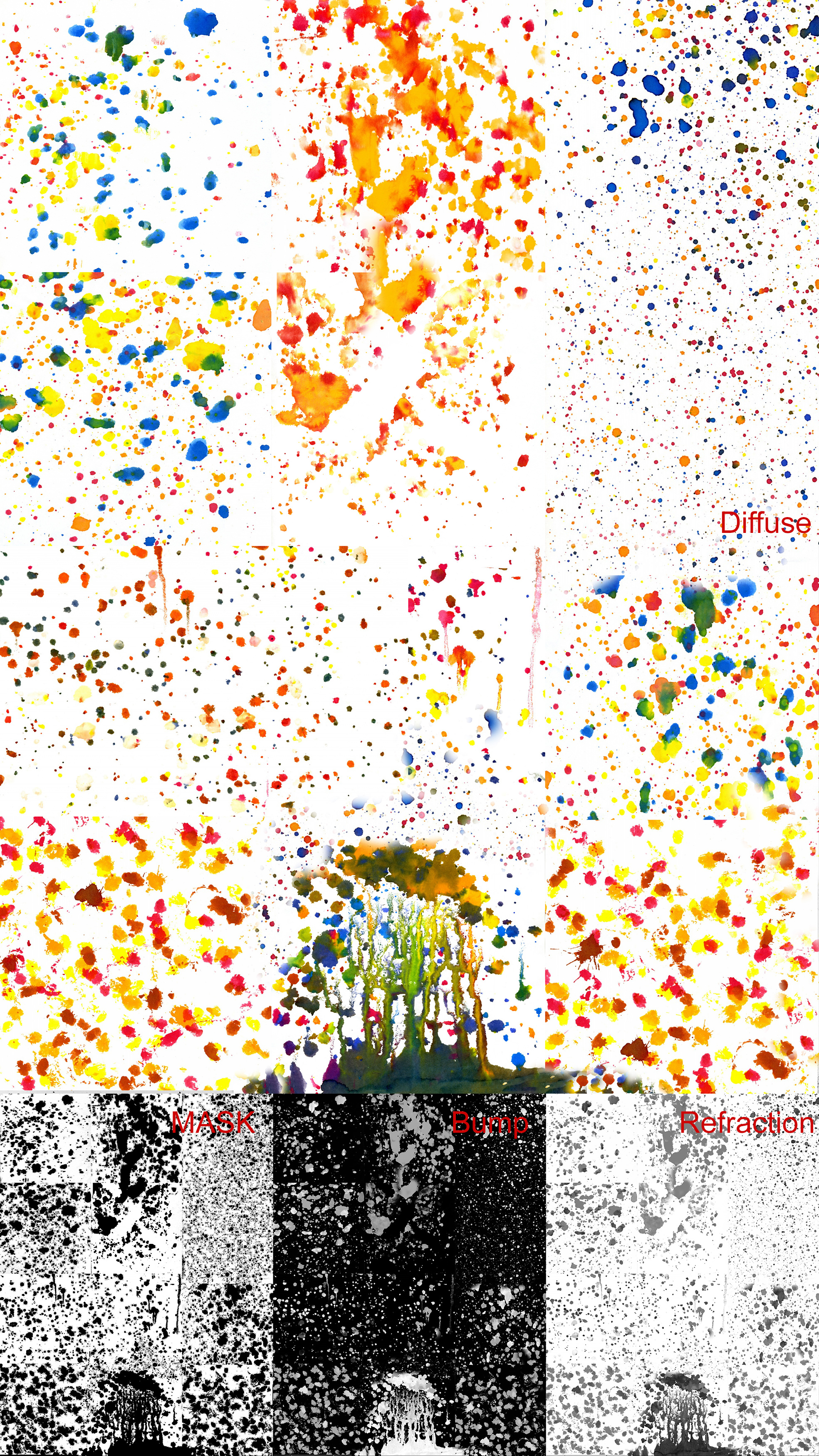
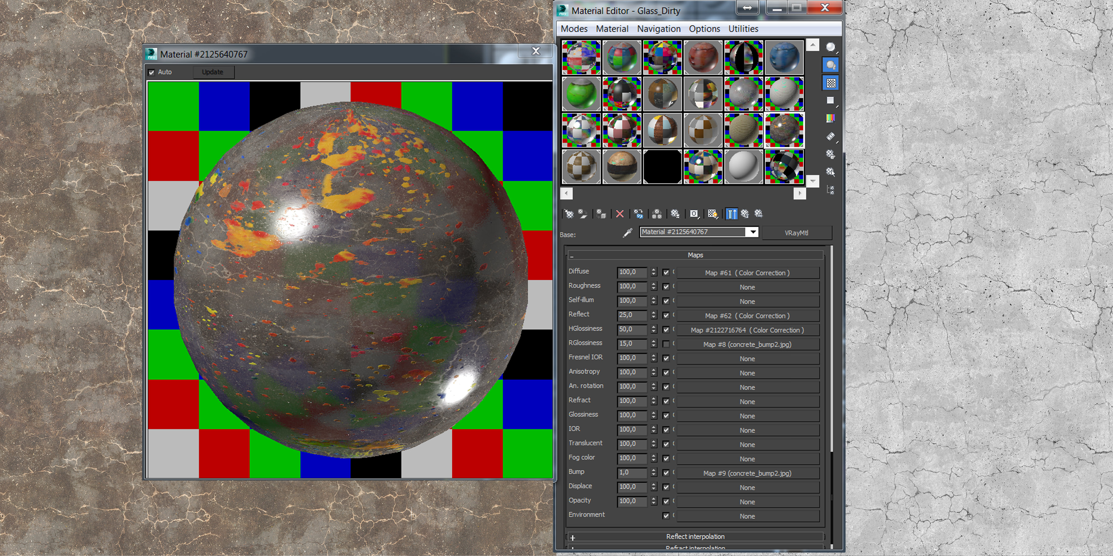
I have ColorCorrect’ed the Refraction Map in order to get the proper balance between transparency and refraction glossiness on the Glass.
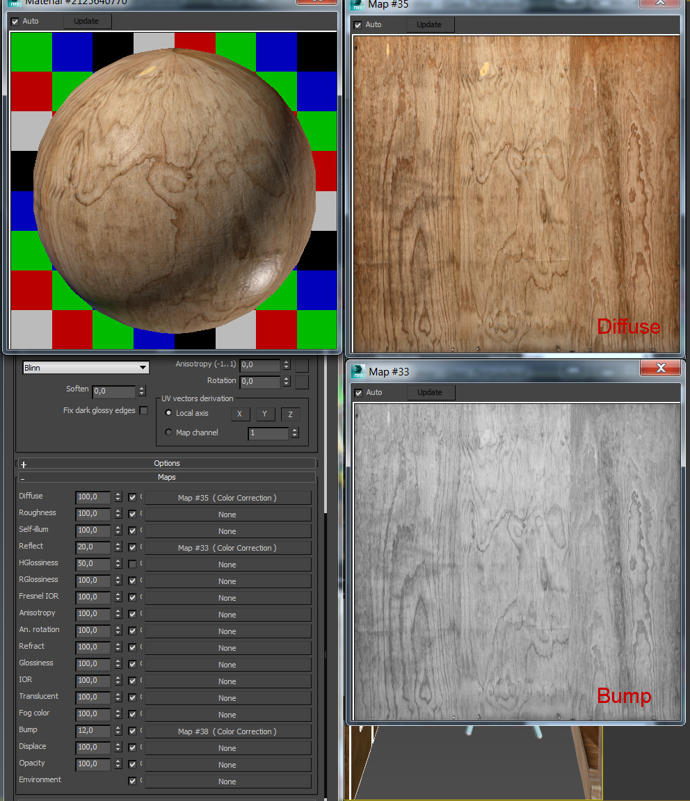
According to this painted glass material I have developed the idea to splash the paint on the floor and also in the wood. So I have created a plywood texture modified from one of the HD samples on CGTextures.com.
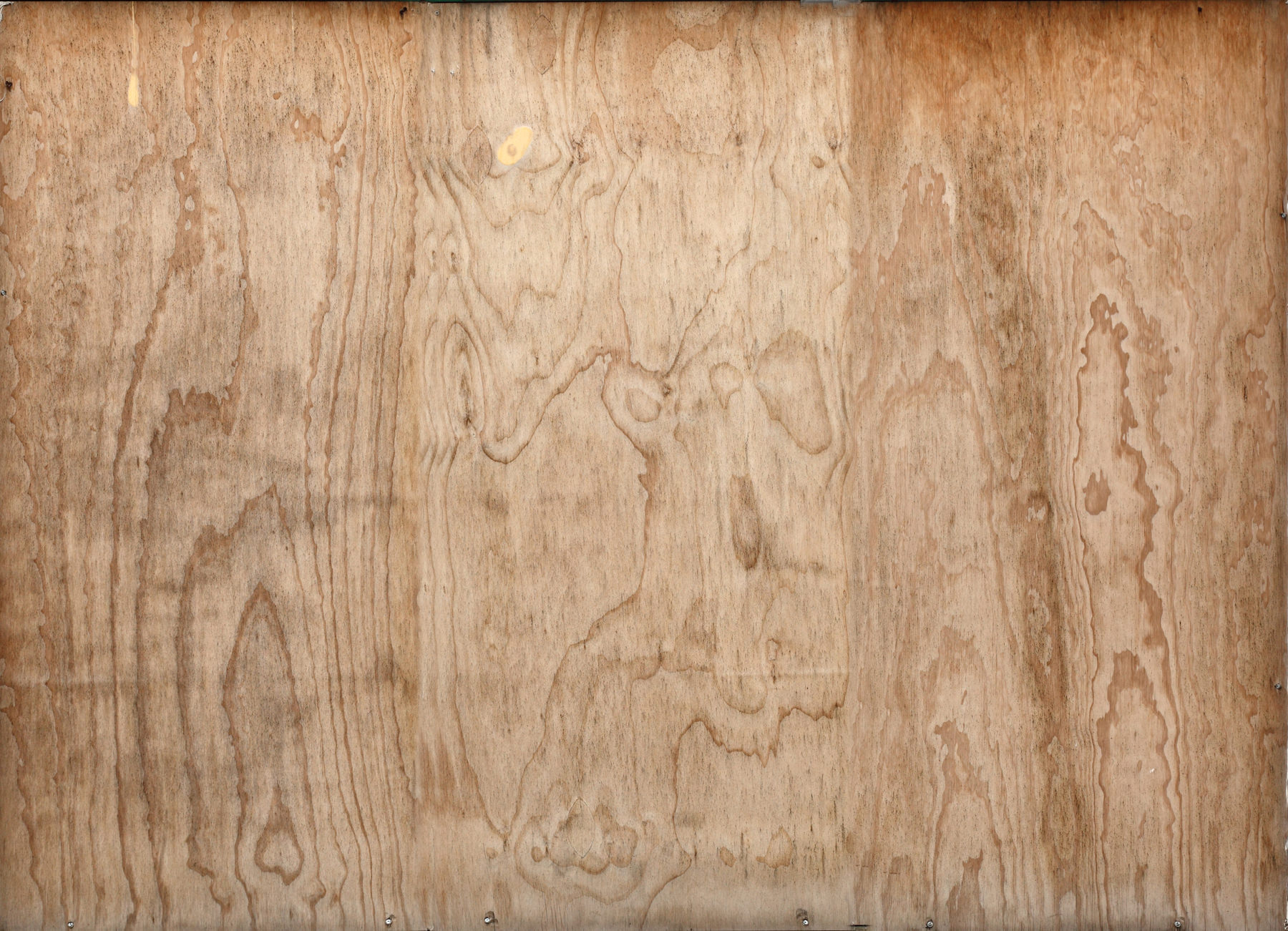
Then I have blended it with the paint splash material I have created on the glass. But in this case I use the mask to overlay the paint on the wood.
Wood Configuration
Paint Configuration
For the concrete floor I have used a texture I did a long time ago for another personal project called Creative Coffee. This is a huge concrete texture with a very nice quality.
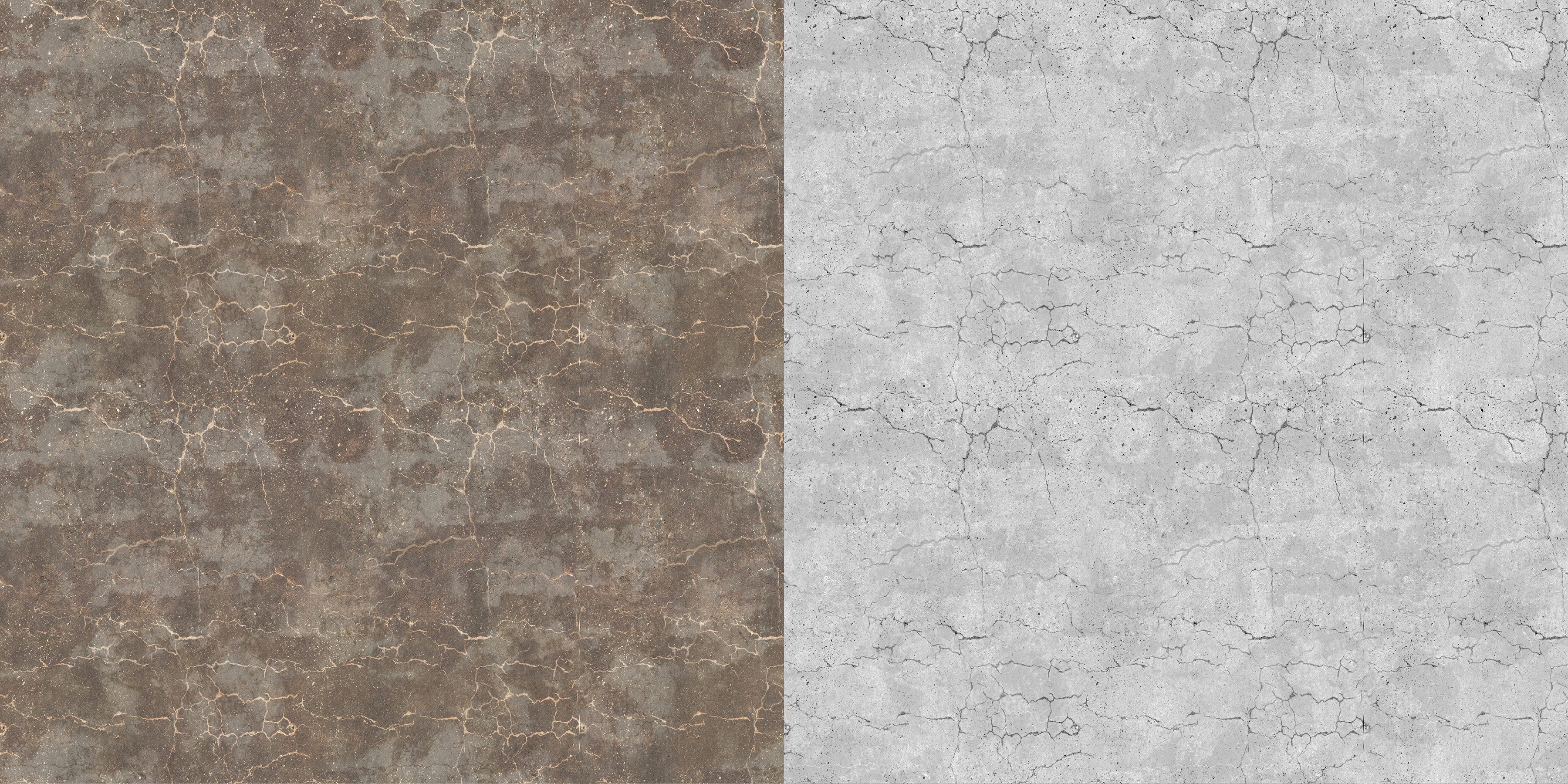
For this texture I have blended different textures in PS playing with opacities and screen/soft light modes to get a nice old and dirty aspect.
As you see, the texture is not perfectly tiled but I do not really need it to be because the original map was 10K and the UVW Mapping is big enough to avoid this problem. In order to blend it with the paint material I have used the same method as in the wood material.
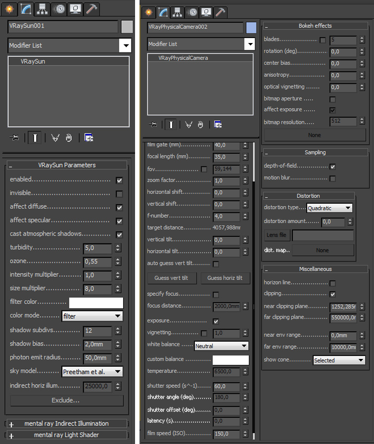
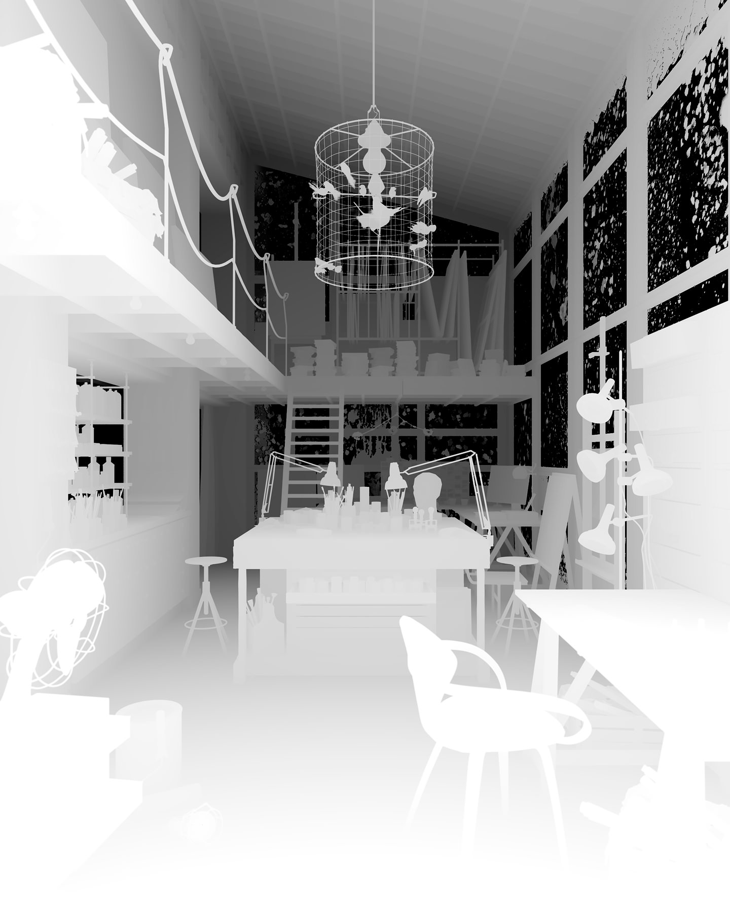
Lighting and Camera Settings
Lighting the scene was simple because effects on the floor glass and wood paint splashes provide me a dramatic feeling so I thought best thing would be a simple V-Ray Sun with V-Ray Sky casting some shadows and generating nice white reflections on the concrete trying to reproduce the kind of lighting I have seen on the reference images.
You can see below the setting for the V-Ray Sun and Camera Parameters.
Post Production
I think this is a very personal part and everyone has a different eye for contrast and color temperatures. That is something that I try to improve every day. White Balance on the renderings and also the contrast is something I find very important when you are looking photorealism.
Of course some images need some more post production than others depending on how much time you have to work on the raw rendering. In this case, the raw rendering came pretty good and I adjusted contrast, temperature and added some depth and environment to the rendering.
I start with the Raw Rendering
Then I adjust contrast and Temperature with levels, curves and color balance.
As you see I have already a nice temperature with saturated primary colors then I start to play with rendering passes to improve the final look.
VRayReflection Pass, using it in Screen/Softlight mode to add Highlights/Contrast.
VraySpecular Pass, in screen mode to add Sun highlights.
VrayExtraTexAO, by multiplying this we add small shadows in the contact points.
VrayZDepth Pass, Inverting this map and setting it in screen mode we can generate some environment fog to add Depth to the image. Depth of field in this case was rendered with the V-Ray Camera but this map is very useful also to use it as a mask to blend with other render passes.
Once I was happy with the composition and apply again final levels, tone/saturation, color correction and some vignette effect. And this is the final result I like.
Of course there are many workflows for post production and I hope you find this one interesting. As you see I keep everything very simple and I work hard to have a nice raw rendering to avoid destroying the image in PS.
Well, I want to thank Ronen Bekerman for the invite to write this behind the scenes and I hope you guys found it interesting. Find some of my latest work in Ronen Bekerman Forum and also visit diego3dq.com
See you in the forum 😉

Diego Querol is a 3D artist based in Spain heading studio diego3dq, for Interior Design and Architecture through 3D modeling tools and lighting simulation.


WoOOoooo 😀
this is absolutely stunning and beautiful
that cool
thank you so much :3
inspiring room yahoooo! `3`
how
How you make the texture,shader for the celling and how you apply it? plz thanks Very nice tuto and awesome image wow!!!
u r crazy man……….
its cool arts thanks for sharing
how i can download project file?
I cried watching this! This is the most perfect art studio I always wanted!!!!! PERFECTION!!