

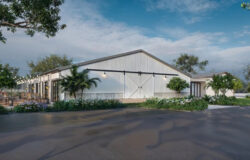
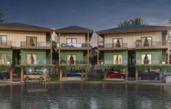


Making of Quinta da Comporta
I’m always fascinated with recreations of built projects, but even more so with proper integration of 2d people cut-outs into renders. I’m not good at it as I want to be and I’m sure many of you seek more information about how to do this better. I’ve invited Jaime Moreno to share his insight about this topic, seeing his journey with it on the blog’s Facebook Group. Enjoy this Making of Quinta da Comporta.
My name is Jaime Moreno. I am a former soccer player who had to reinvent himself after retiring from the sport. I finished my degree in Technical Architecture and started in the world of 3D visualization in 2015.
I currently work at www.bsidevisuals.com, a 3D visualization studio in Barcelona. I also have my own personal firm www.kirarq.com in which I do some commercial projects and personal projects to improve my techniques to make images more realistic and learn new techniques and programs.
INTRODUCTION
First of all, I would like to thank you, Ronen, for giving me the opportunity to write about the Making of Quinta da Comporta. I have always had great admiration for this blog. It has been a significant help in my learning process, and it is an honor to be a part of it.
In my personal projects, I try to learn new techniques/programs and improve my scenes, searching for photorealism.
I have always wanted to insert 2d people in my renderings. Still, I could never achieve a good result, so I recently decided to start looking for information and improving my technique. This article will show you the process that I follow when I face a project, focusing mainly on inserting 2d people.
Let’s start the Making of Quinta da Comporta!
REFERENCES AND INSPIRATION
Whenever I do a personal project, I try to find a reference image that meets specific requirements:
- It has to be done in a short amount of time so that it is not left forgotten on my pc. These are scenes that I do in my free time after work, so I don’t usually have much time or energy.
- It has to make me learn something new.
- It has to be visually appealing.
With these criteria in mind, I look for references on social networks and different websites.
This is how I came across a series of images of a small hotel in Portugal, QUINTA DA COMPORTA.


I think using reference images to try and reproduce is the best way to practice and achieve photorealism. Our goal is to study their saturation, contrast, lighting, and other aspects to imitate it within the virtual 3d world.
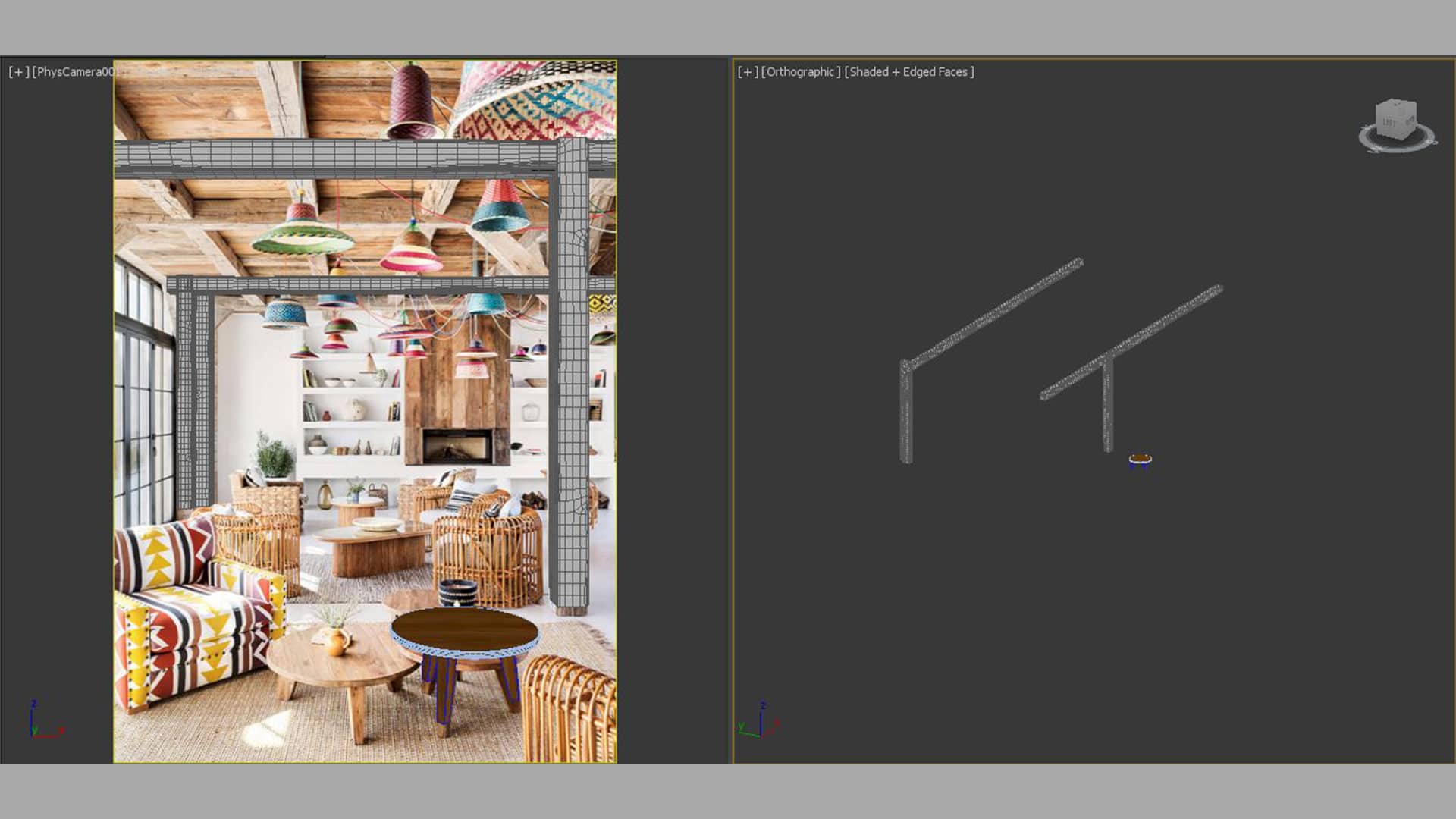
3D MODELING
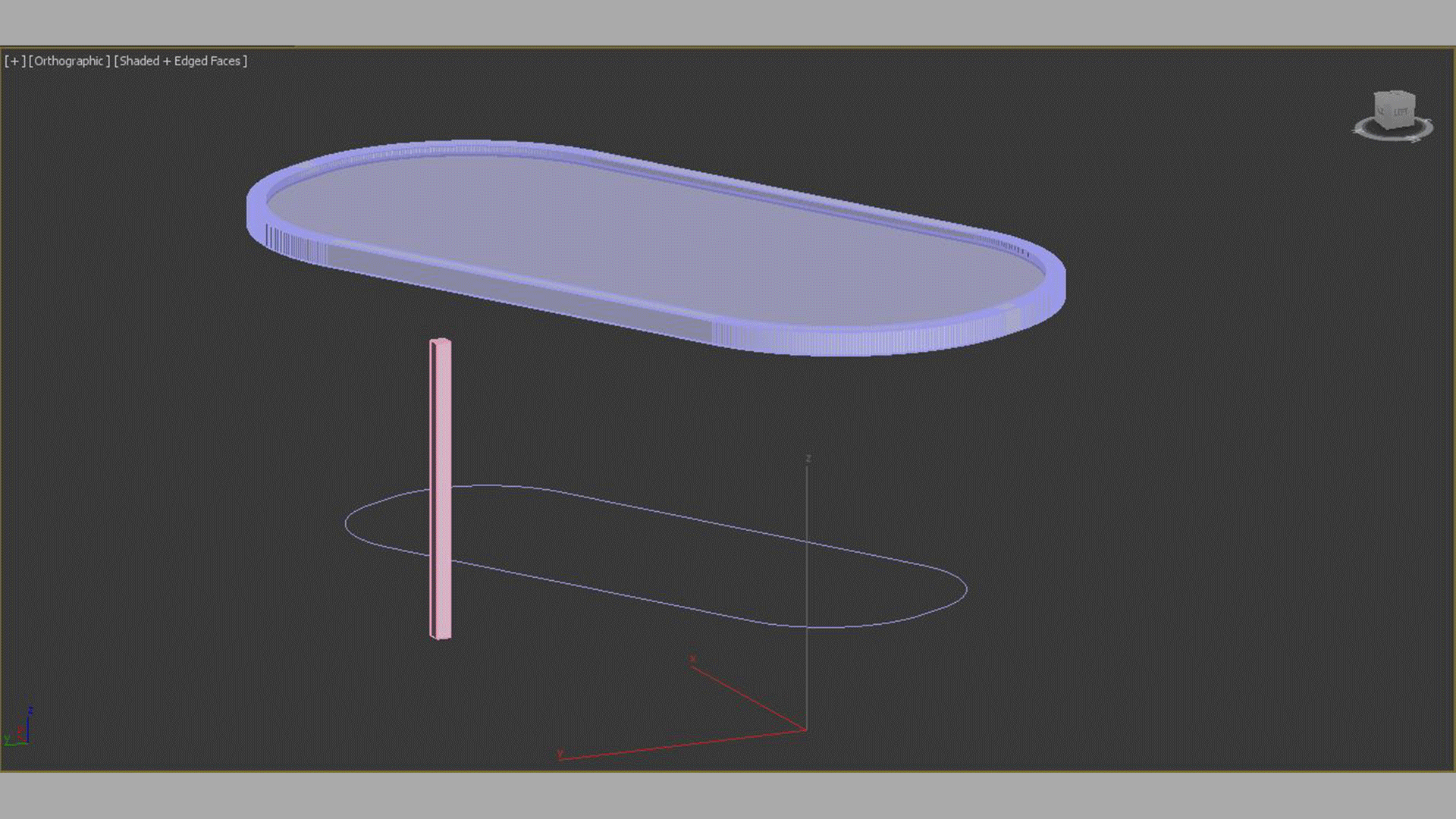
In this scene, the modeling is elementary. I used the real reference image as the background of the viewport to position the camera and adjust the different props (many of them were downloaded for free from 3dsky).
Modeling was not the purpose of this practice, so anything I found similar saved me time.
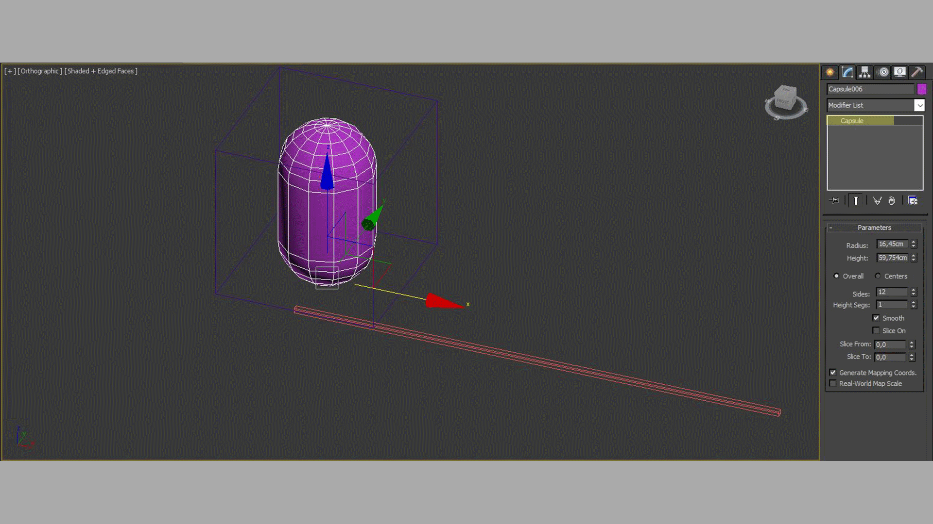
Several modifiers were applied to give the wood some complexity/randomness (chamfer, subdivide, and finally, a noise modifier). One of the most essential parts of the scene was the colorful lamps, so I had to model them, although the process is straightforward. They were created with hemispheres and capsules and finished with a lower braid.
For the distribution of the table’s wooden slats, I used RailClone, and for the distribution of the armchair clasps, I used the spacing/tool.

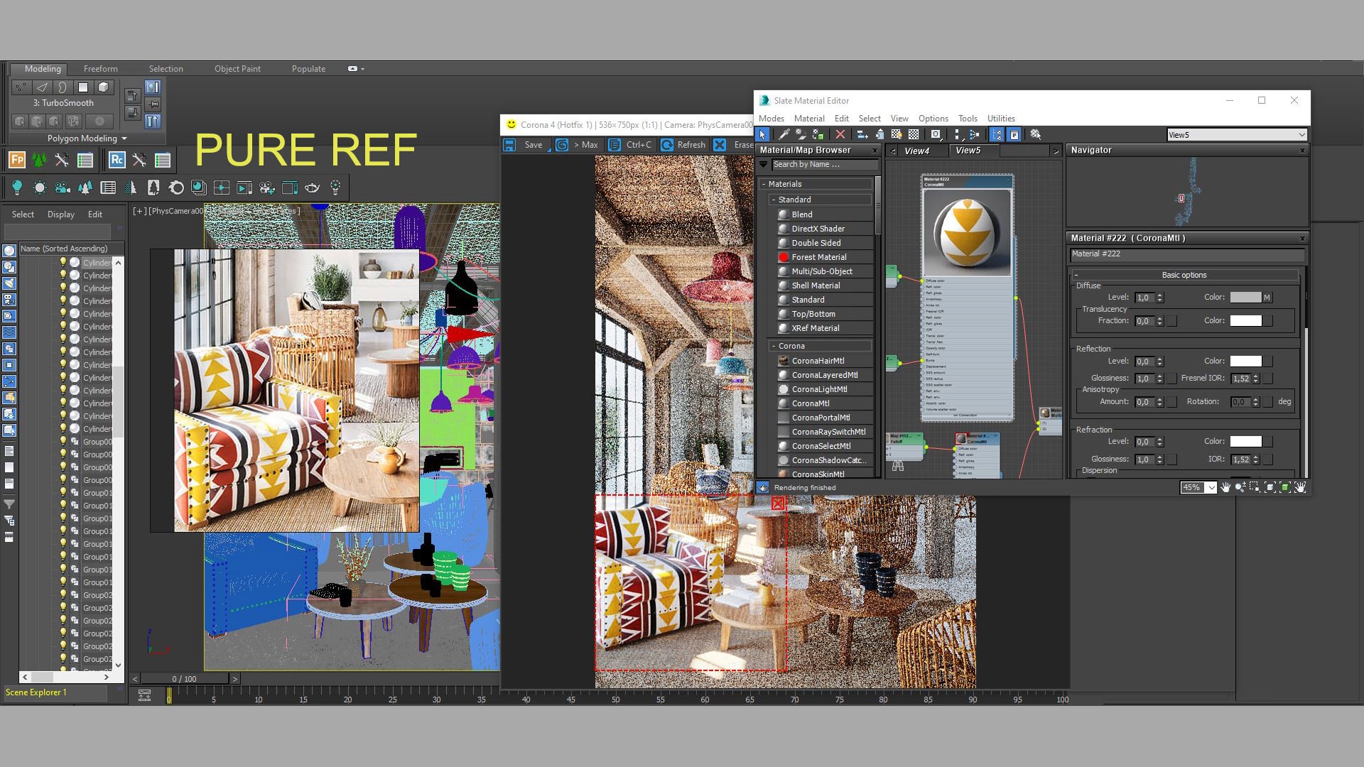
TEXTURES AND MATERIALS
I spent more time on the lamps’ materials than I planned, as I had to generate all the masks and color palette. In the armchair’s case, I drew the Photoshop patterns so that they were as similar as possible to the reference.


As for the other materials, I added dust in the diffuse through a Corona Renderer AO. For the slats, I used Corona Renderer multimap and UVW randomizer. These tricks helped achieve realism by generating randomness.
To adjust the materials, I always use two tools:
- PureRef (a program that allows you to have the reference image always visible).
- Corona Renderer Interactive (an incredible tool that allows you to adjust a material in real-time).
LIGHTING
The lighting of the scene is straightforward. I used Corona Renderer Sun & Sky. As I wanted to reproduce the real image as much as possible, I needed to have full control over the sun, so it was easier to use the Corona Renderer Sun rather than an HDRI. I always try to mimic the shadows’ burnout, hardness, and darkness to frame the lighting. Because the shadows are just as important as the light.
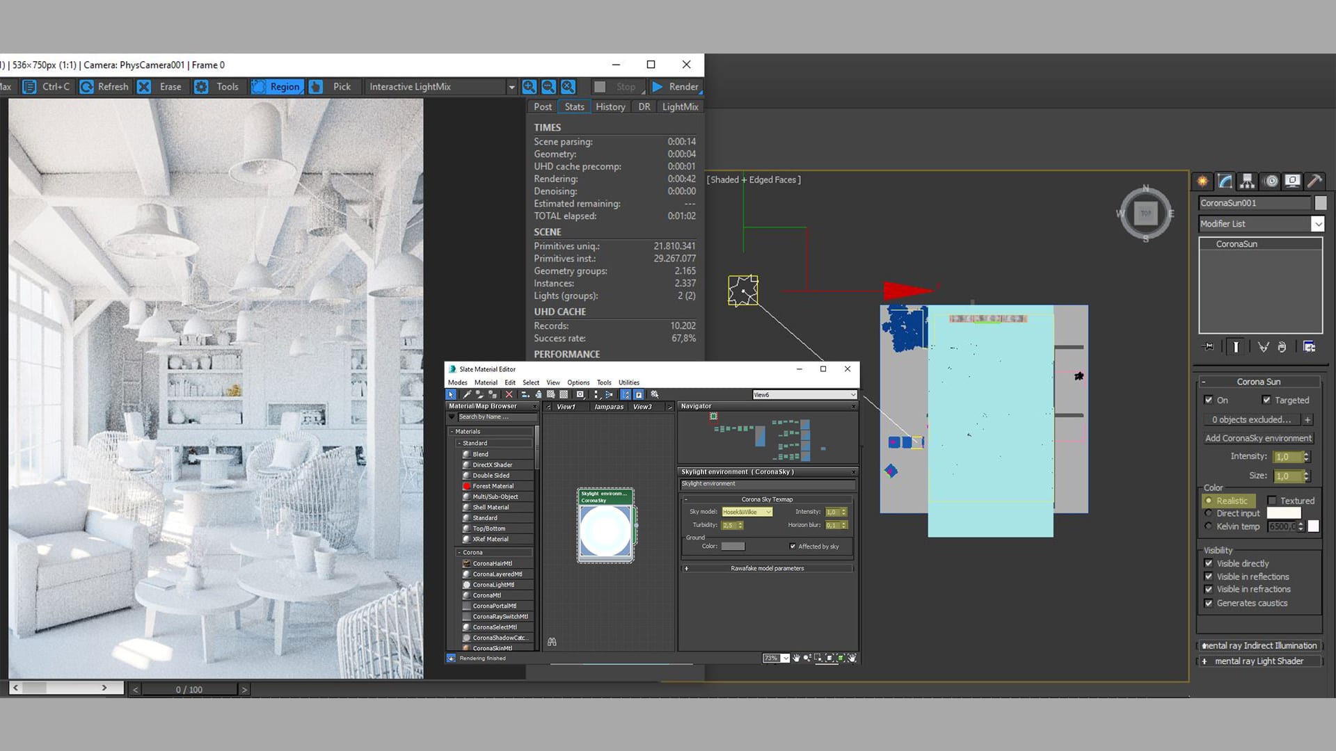
For me, lighting is the key to a good scene, as it sets the image’s mood. Poor lighting will flatten the scene and will take you away from photorealism. We need to use light to give the objects volume.
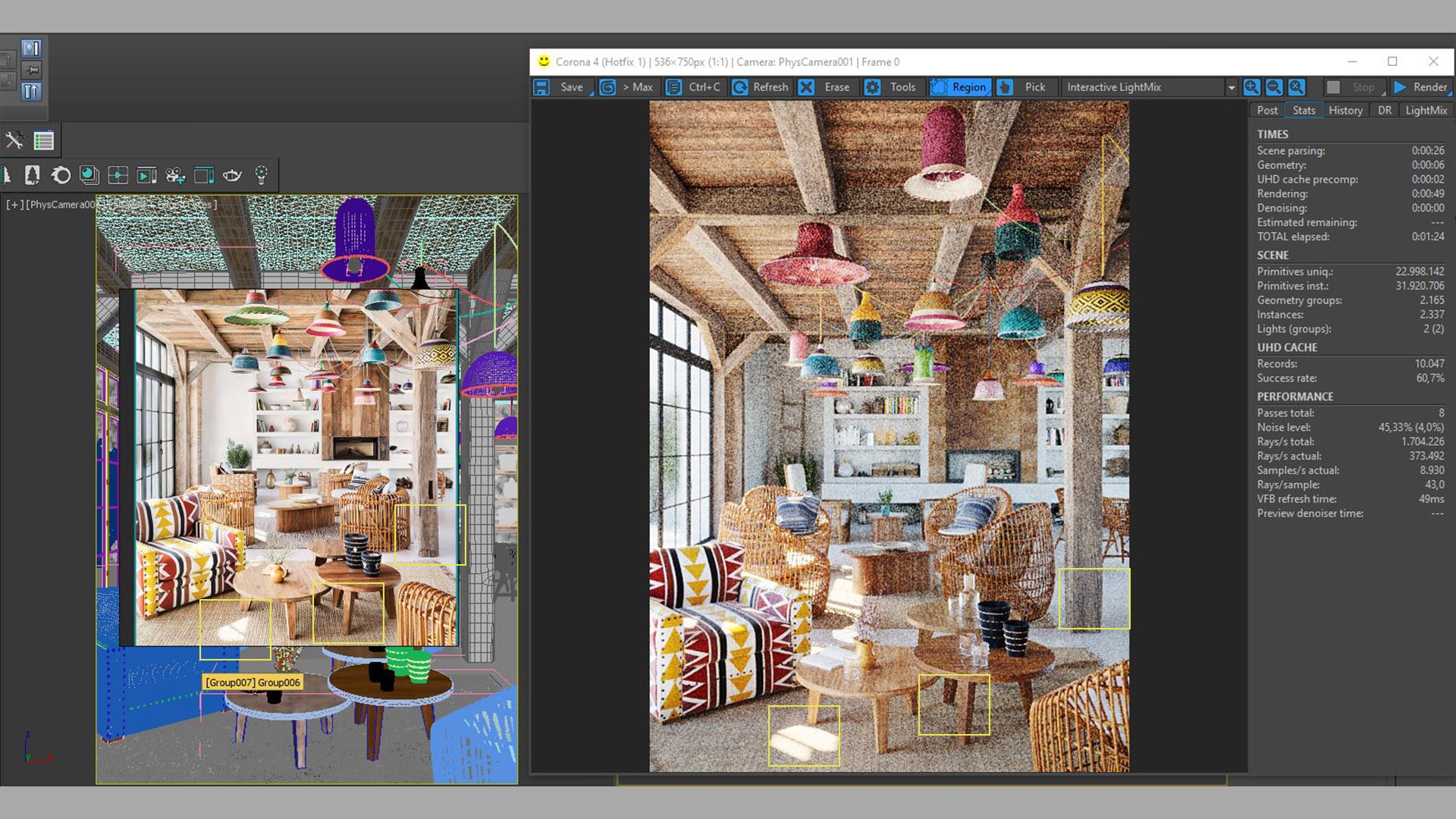
RENDERING SETTINGS
In this section, there are no secrets.
Corona Renderer defaults.
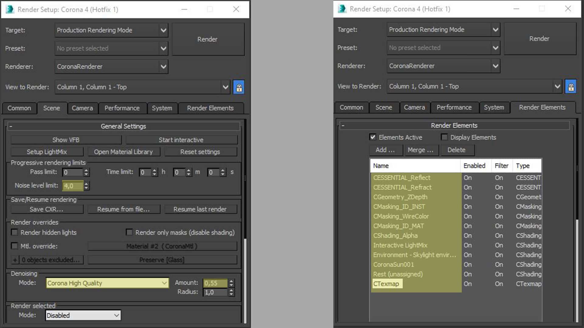
I just focus on the value of noise in the render and the maximum render time I want to allow for it to run.
POST-PRODUCTION
This is a section that I am increasingly enjoying more and more. Although with the Corona Renderer frame buffer, you can have enough control for good post-production, I always finish adjusting things in Photoshop.
Recently, one of the things I enjoy the most is inserting 2d people, which will be the second part of this post.
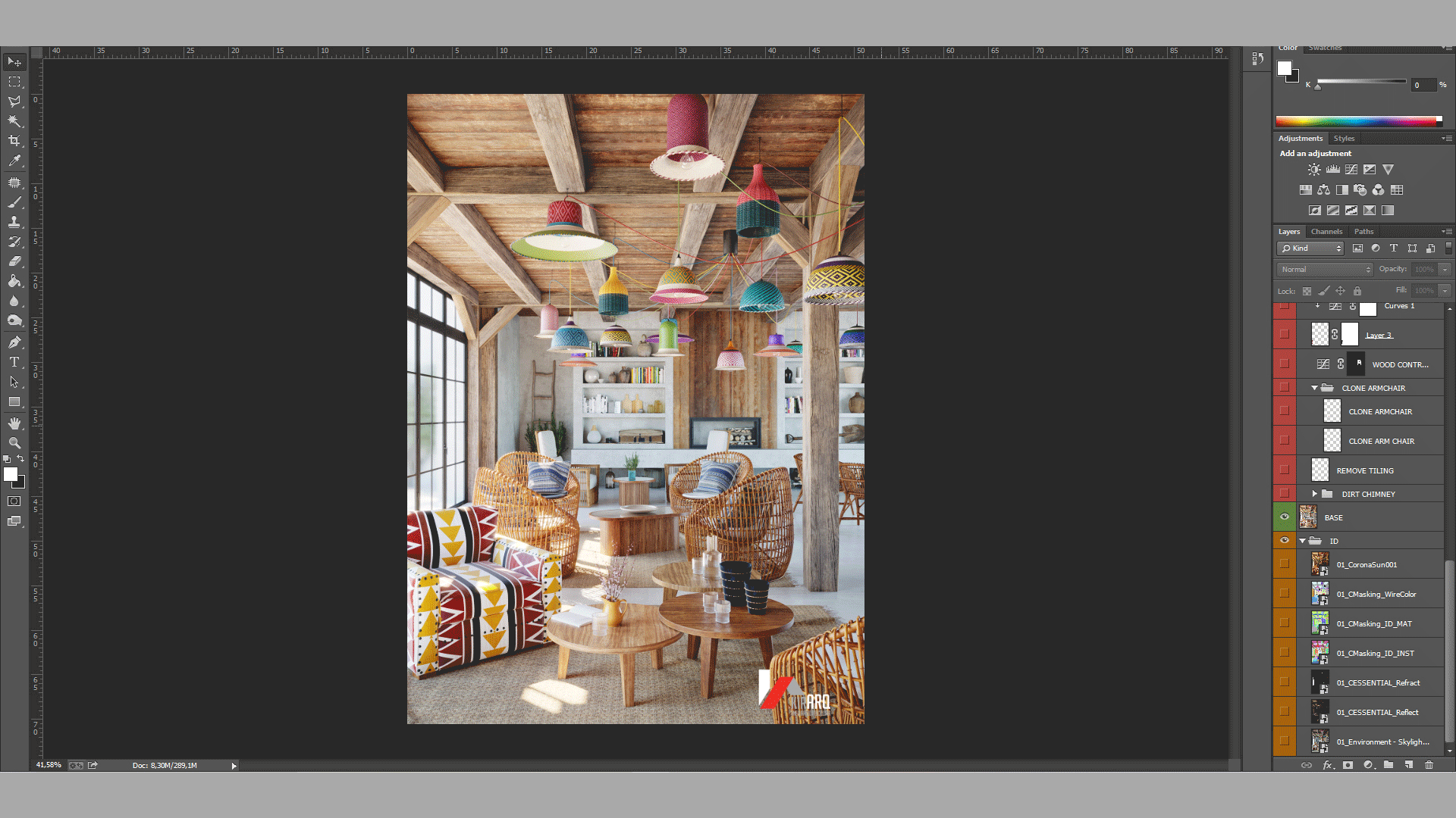
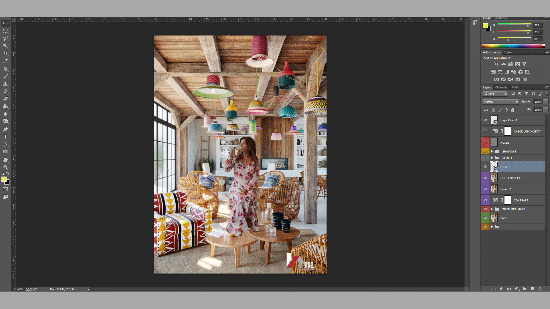
INSERTING 2D PEOPLE
Inserting 2d people PROPERLY into a render increases photorealism. You can tell a story… it adds tremendous value to the image.
Not doing it correctly completely ruins any image!
It is not always necessary to insert people. In fact, there are plenty of beautiful images without them—different strokes for different folks.
I have always admired 3d images with people. I had tried to integrate them before but had never managed to get it right (now I’m starting, I have yet to improve), and I recently decided to get serious about this topic. One of my mistakes is wanting to learn a lot of things simultaneously, which I don’t practice, and in the end, it is forgotten, and I haven’t learned anything. This time I have only focused on inserting people in my renderings.
Let’s give it a go!
I looked for a video/tutorial where they explained the complete process. Still, I really couldn’t find one that covered the whole process, so I started looking at different aspects separately (how to generate shadows, how to match tones, saturation, contrast, lighting, etc.)
The process that I now follow to inserting 2d people is the following:
- I look for a person that already has a similar lighting condition to the one in the render. Finding something fast that fits perfectly is very difficult, so you have to invest time in the process. Getting a good result is almost impossible when trying to change a person’s lighting in a photo. There are payment sites with excellent libraries, but you can also search for, download, and crop your own free images from google or free download sites.
- I adjust the position of people in the scene by using the perspective warp tool.
- Within the scene, we can generate boxes, which serve as a guide for scale. Especially if you are starting, likely, your eye is not tuned enough to know if it is in the right proportion (I sometimes skip this advice, for pure laziness, but it is not the correct thing to do, because then they are not proportionate hehe). Another option that you have is to compare objects in the photo and 3d, to be able to adjust the size, as you can see in breakdown 2.
- I always try to insert people in places that help the composition, that help tell a story. Overlaying them slightly with objects in the scene helps improve the feeling of integration.
- I also try to match these aspects:
- Degree of definition: sometimes, we will need to add blur and focus our cut out.
- Light: desaturating the entire scene will allow us to compare the levels of whites, medium tones, and blacks of the cut-out and the 3d scene and to match them.
- Tone: we will generally have to correct the tones of lights, mediums, and shadows. Finding a photo that perfectly fits the scene is really complicated, although you may have a lucky day, hehe. You can also take a picture reproducing the conditions of light and perspective of your scene. This would be ideal.
- Saturation: we will generally have to adjust the saturation of the skin tone. We can change this option by modifying the red channel of the cut-out.
- Dodge and Burn: we can finish by emphasizing the lights and shadows using the dodge and burn technique. There are numerous tutorials with different ways to do it.
- I will finally recheck that the noise level is similar in both the scene and the 3d.
FINAL COMMENTS
Doing personal projects not only allows you to learn, but it also lets you enjoy 3d without restrictions, client comments, and deadlines.
I hope this post is as useful for 3d peers as all the other posts on this blog have been for me.
Thank you very much. Let’s continue our search for photorealism!


Join the discussion at talk.ronenbekerman.com