


Making of Koncept
I’ve been wanting to get this one published for a long time now. This project by Pikcells, Won the Best of Week 10/2015 as well as Best of March that year. Follow Richard, Andy & Martins, as they describe the process of working on what they call “a dream job”. Enjoy!
Project Overview
This project is as close to a dream job as you could get. Kronospan has long been a great client of ours and always give us a large amount of free reign over the design elements, which is generally when we create our best work.
On this occasion, they were launching a new line of exterior cladding products and wanted some images of contemporary looking architecture which would incorporate each product. Voila, CG at its most useful!
As you will see in this making of, the majority of our time [Approx 80%] is invested in design and detailing, the rest of on lighting, rendering and post-production.
Check out the final images at the Best of Week 10/2015 page.
The Project Brief
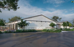
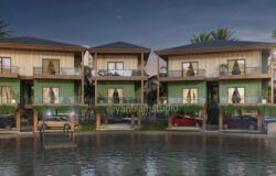
There would be 3 building types; A public building, a residential building and a commercial building [Offices]. Each required 1 main image and 2 closeups showing the details.
The products were to be marketed to architects and specifiers so needed to be very eye catching and in line with current architectural trends to make them stand out and be memorable.
Each building, therefore, had to be designed from scratch and feel real, meaning tons of details and a solid design scheme. To communicate a sense of the products hardiness, the images should also be shown in various weather conditions, including rain… yay!
1. The Design Process
Where design work is required we use an iterative process gradually refining and adding detail as and when each stage is ready to be developed further. We generally start to design in 3D after a very quick sketch on paper.
We will begin adding in camera views to see how the building looks from certain aspects, from this point the image composition also begins. A luxury we have in 3D is to only design the bits you see and we had to get the client’s approval at each stage too to ensure we didn’t veer away from the style they wanted.
There are many factors affecting a good image, and we have come to understand that a really important one is having a holistic and unified design scheme. In our experience, many well lit and detailed images remain average because of the quality of the design choices within it. We always aim for :
- Harmonious color and texture combinations.
- Excellent camera and object composition.
- Natural looking lighting setup.
- Correct architectural details and volumes.
Look development
The very first thing we sent to the client was some look development for each space. Here is our look dev board which was used to flesh out the direction each image would go in. We specified examples of the types of atmosphere, lighting, and architecture we thought would suit each space best.
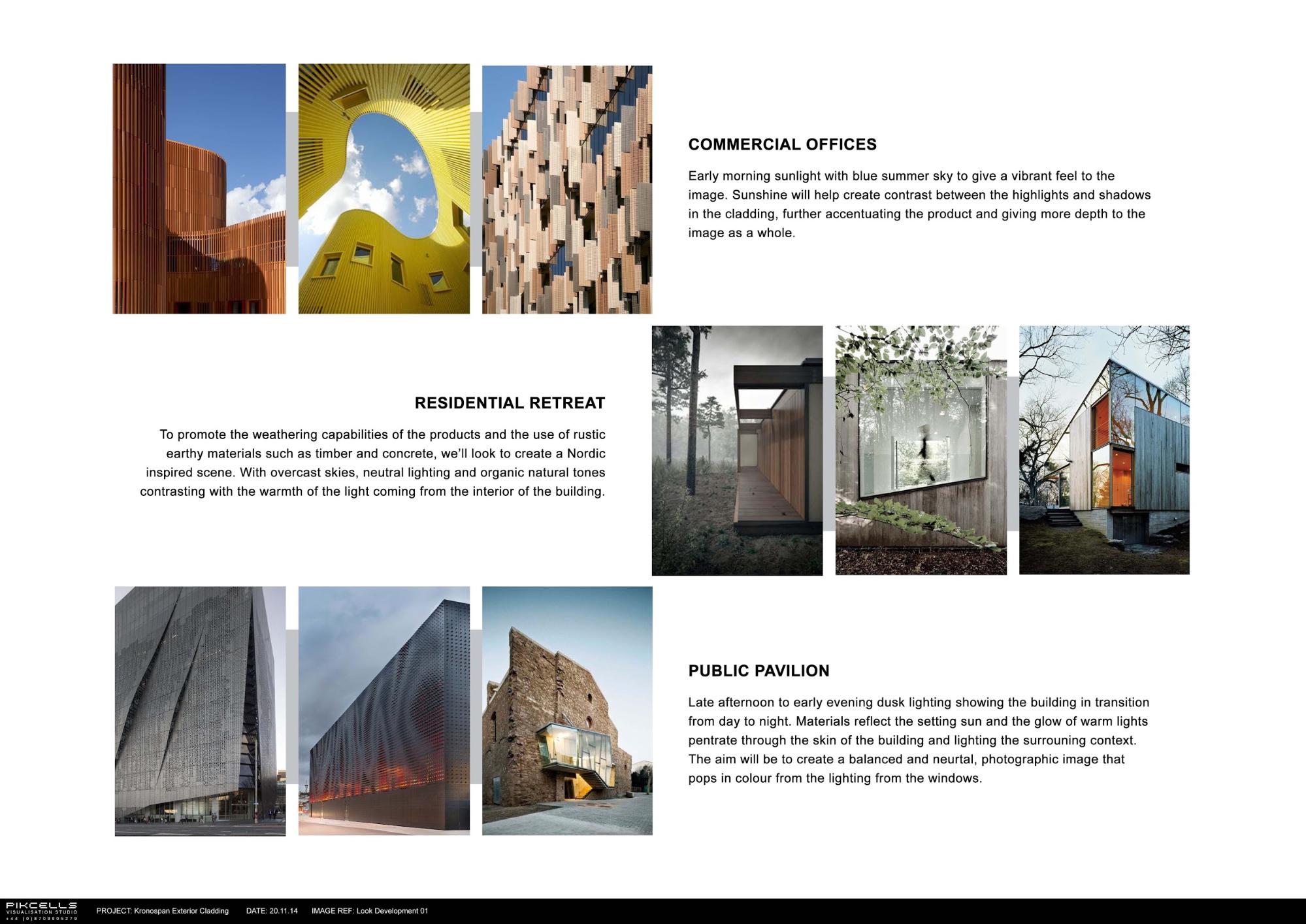
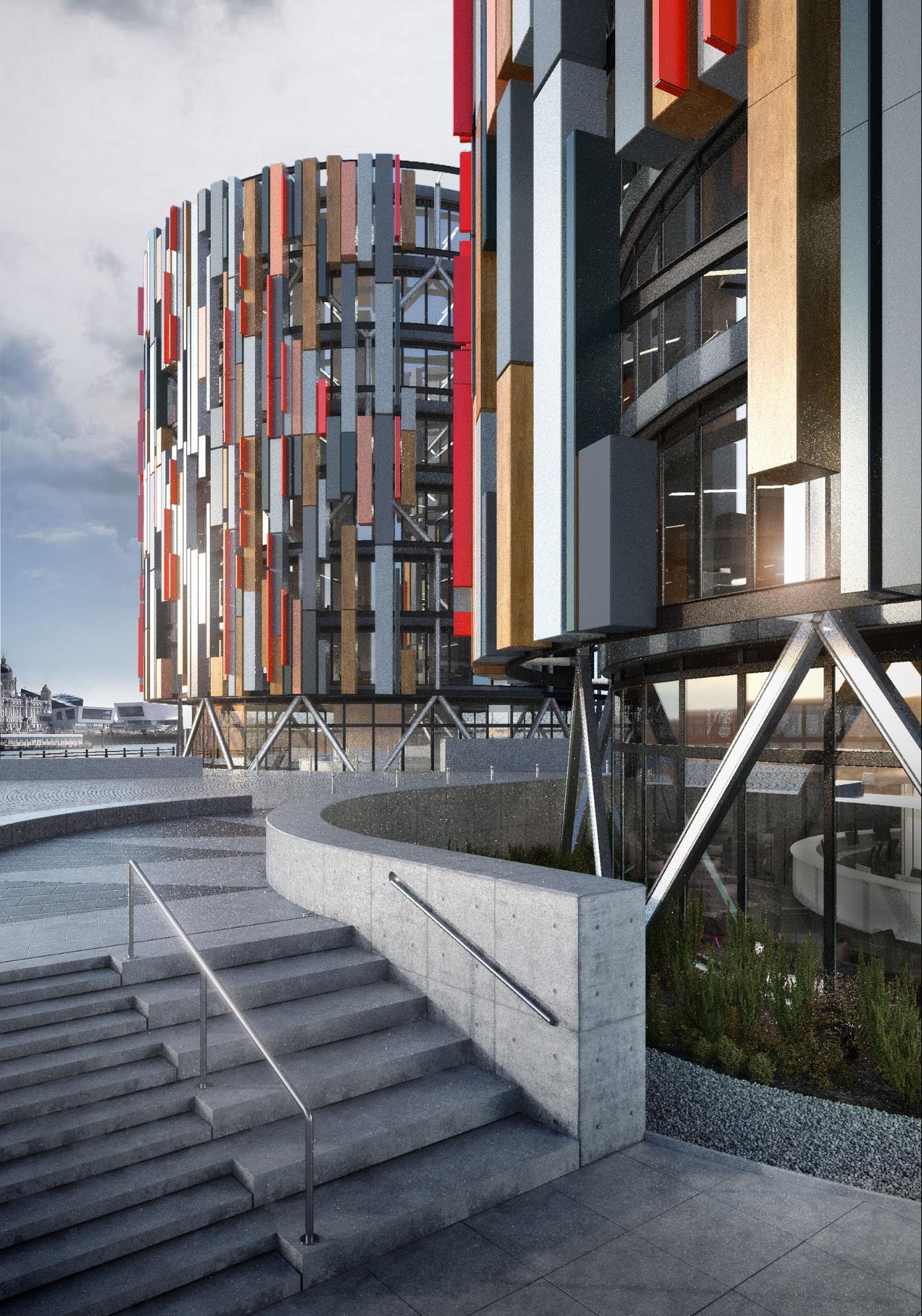
The office design
It’s common in tutorials to show all your best bits and forget about when things nearly went completely wrong. We thought it would be a good idea to show the development of the office building as this nearly ended up being a total disaster.
You learn the most from these incidents.
This is our initial design board for the offices. We needed something with lots of space for cladding to feature, so the slatted “fins” stood out as a good option.
We then developed this further, keeping the models extremely rough so we can quickly flesh out the details, bringing the rough model into photoshop to see if there was any mileage in the design.
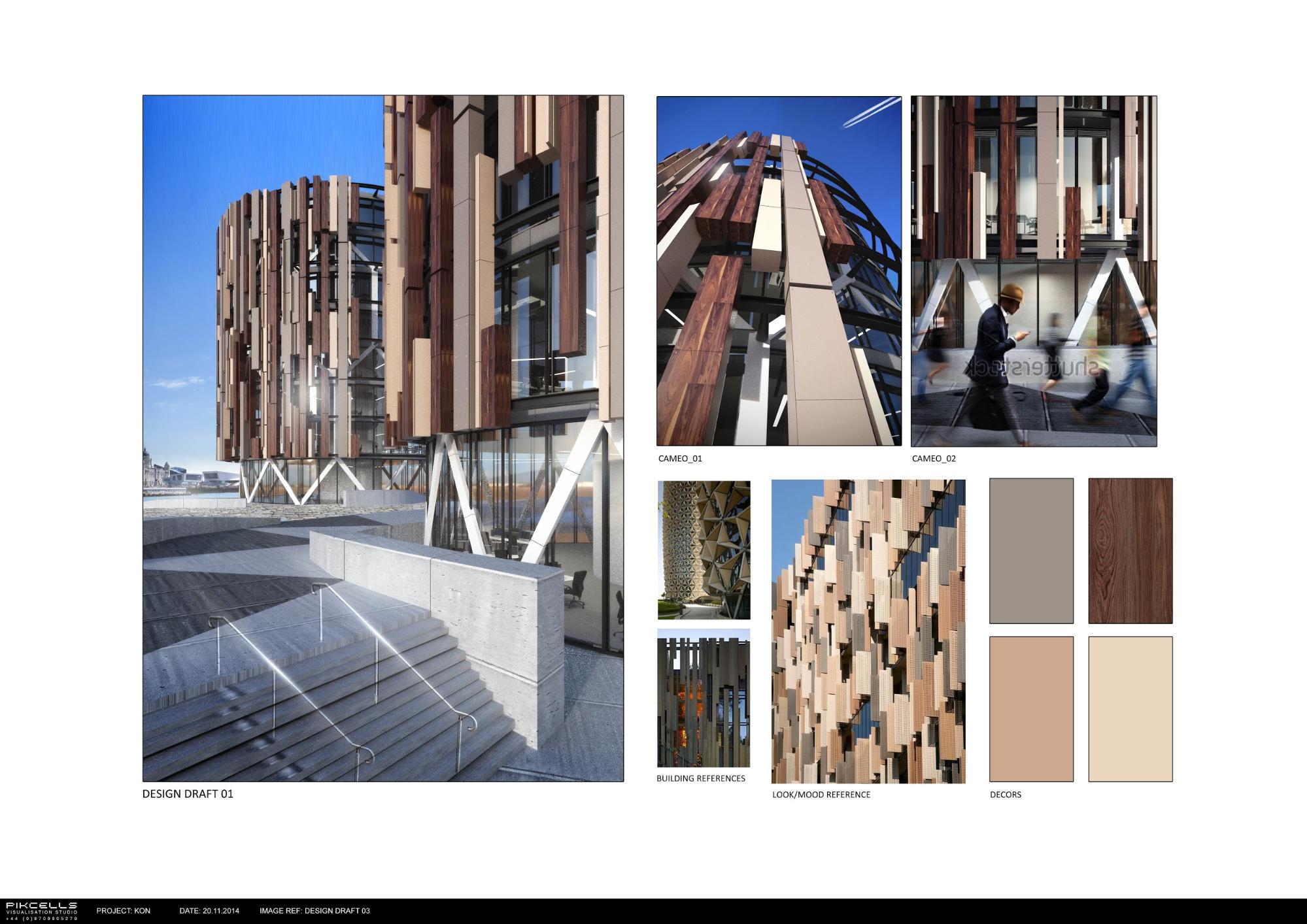
We floated around a few ideas and eventually came up with the design below, which very nearly made it to the production stage. In the heat of battle when deadlines are looming it’s important to step back and be objective.


Objectivity
Because people are innately biased in some way to look for the easiest route and to get too close to images, we think it’s really important to keep asking objective questions when designing and developing images. We seem to be more honest and objective when reviewing other people’s work than our own.
We kept asking ourselves “if this image was someone else’s, what would you think of it?” Then you can be more honest and say, “yeh that looks not very good”. We took a step back and came to the conclusion that this indeed did not look very good, so we changed just about everything apart from the only thing we liked which was the composition.
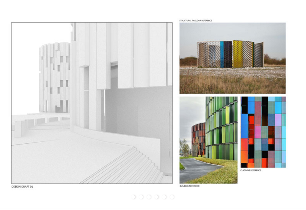
We revisited our original reference material and had another go at the cladding and details. We wanted to create a double skinned facade where the cladding would sit as a decorative element over the glass as shown below.
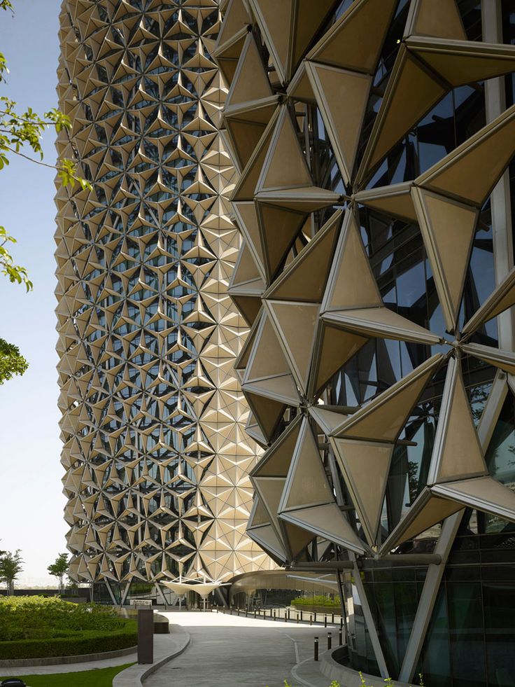
These 2 buildings inspired the massing of the cladding panels and the color variation.


Below shows the first stab at a new cladding layout.
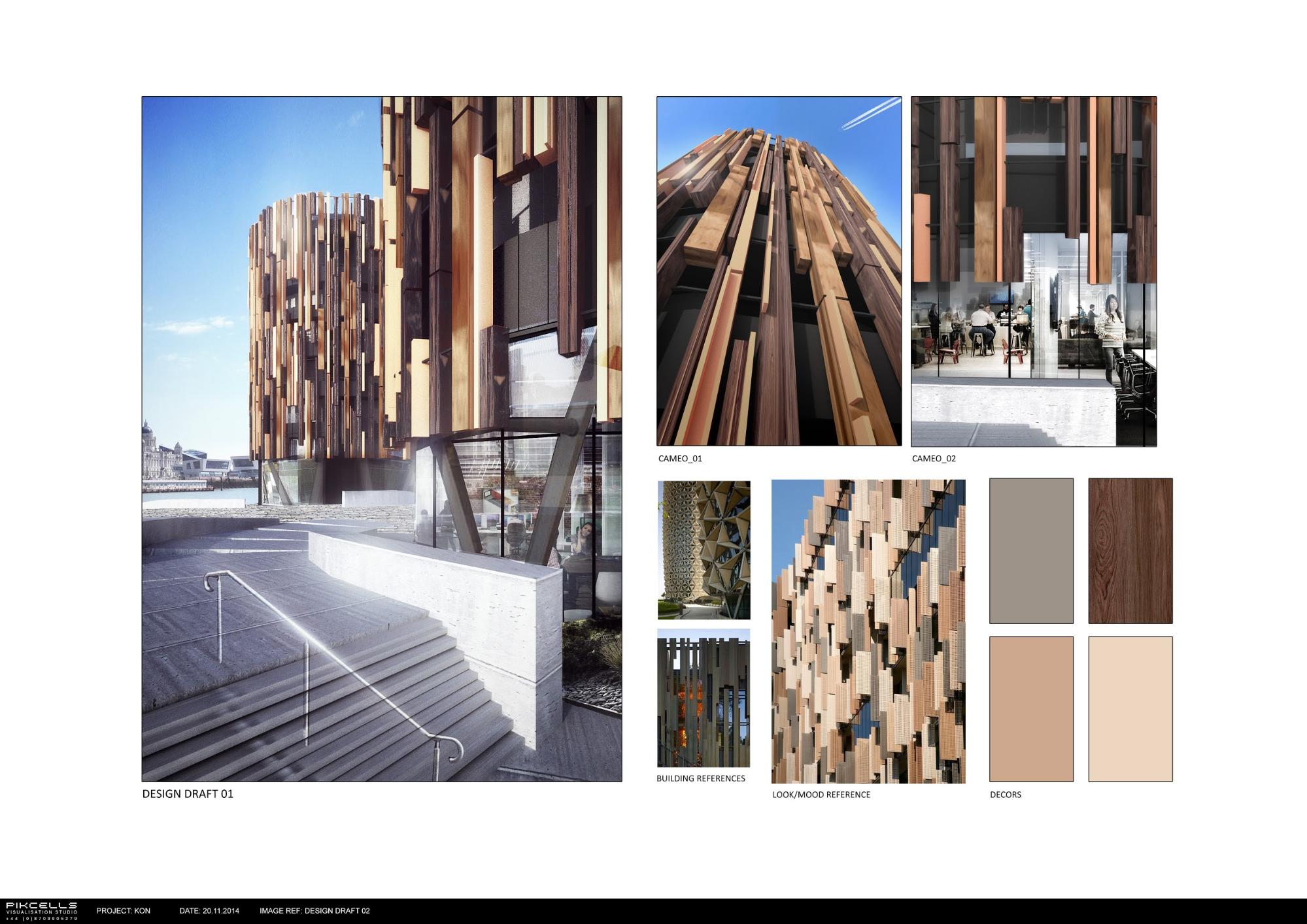
The cladding looked quite dense so we thinned it out and created another draft. This time we could start to think about potential lighting options and deliberately opened up the glass area facing the camera.
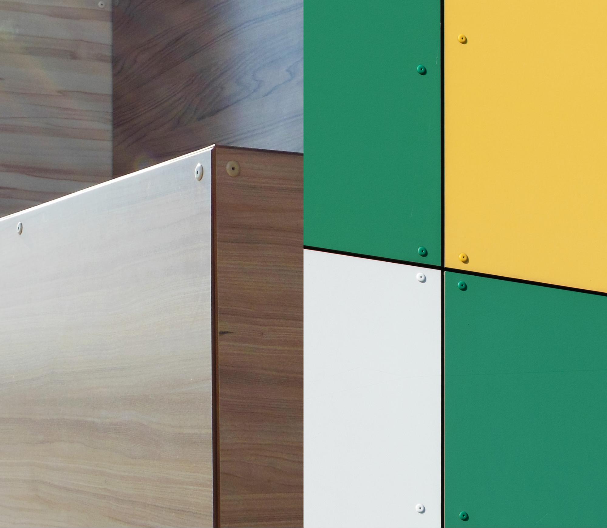
Now the details were starting to come together there was still one final problem, there wasn’t enough color variance to show off the numerous colors and finishes the cladding was available in. We needed a better color scheme and eventually came across this on trend reference image from the Trend Bible website.
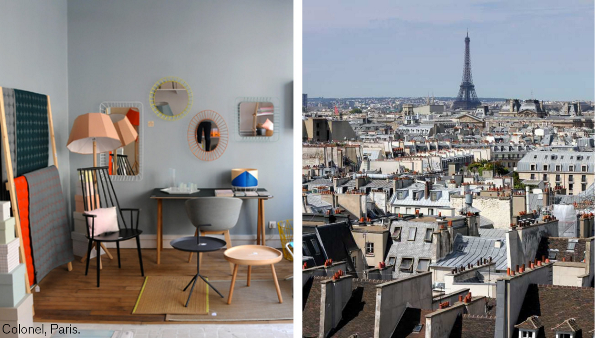
This image showed a good looking pallette of solid colors that sat well with timber.

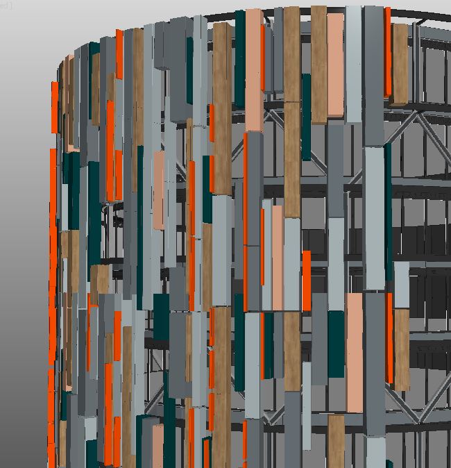
Once we had updated the colors we turned our attention back to the other design details. The cladding was split into random sizes, with thinner red panels dotted around.
2. Modeling, Textures & Materials
Residential landscape and cladding details
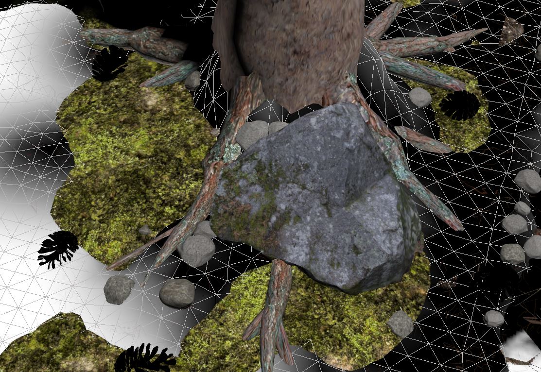
The modeling and texturing components had a very tight deadline so to get the environment for residential scene done in two days we had to buy a few models here and there like pine cones, larger rocks near the pine tree and leaves etc.
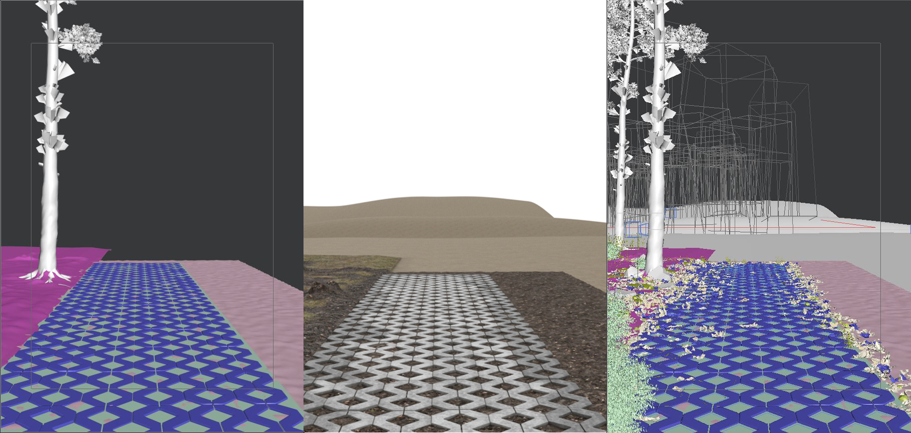
The landscape was split up into two pieces : one being under the building and pathway and other the forest landscape itself. The pathway was relatively easy as we modeled a piece of turf stone, positioned them accordingly, added slight chaos to its rotation and position so they aren’t perfect and assigned a concrete material, which also added color variation to each piece.
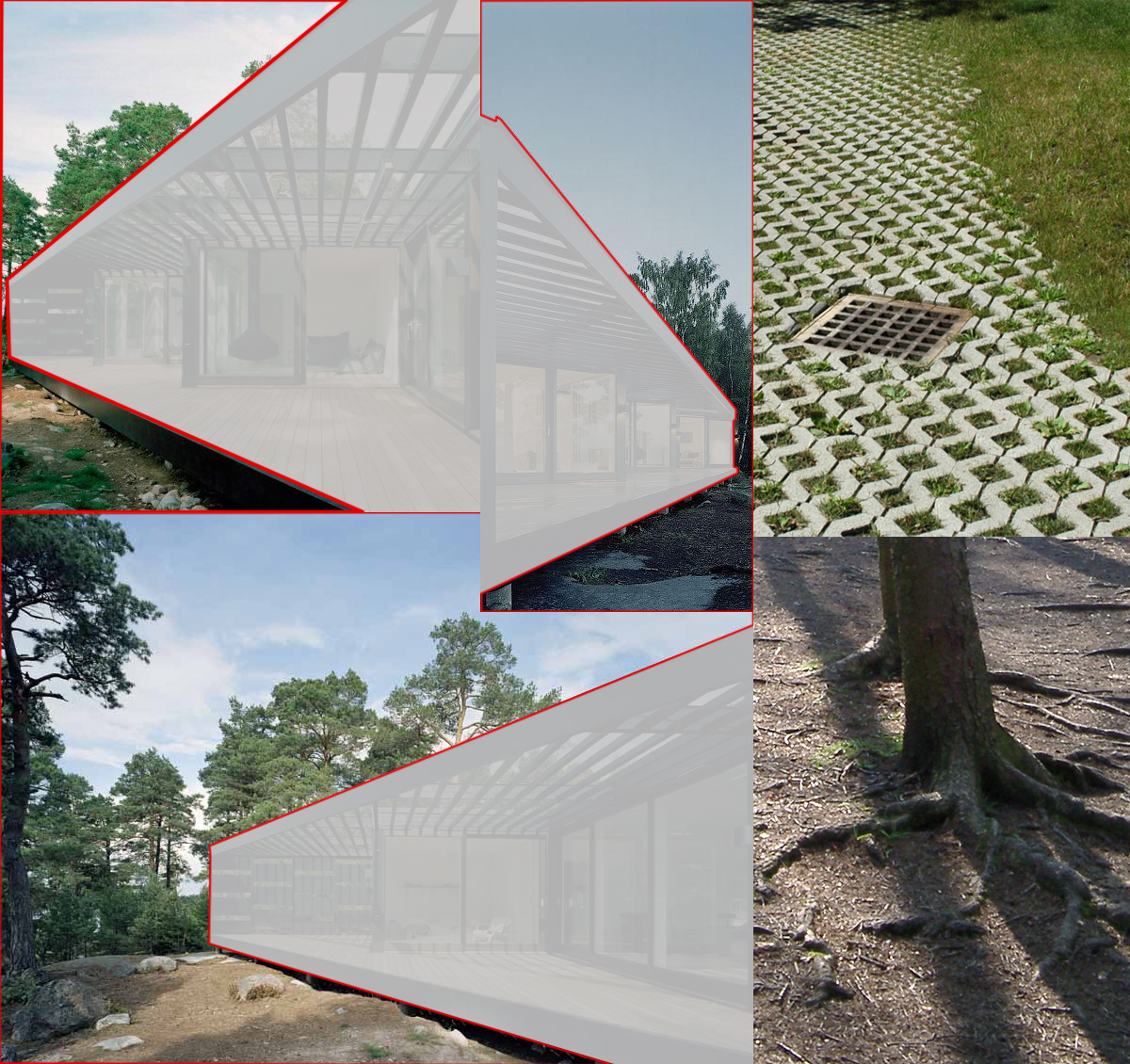
One of the hardest parts of this space was creating a convincing pine forest with the ground and its organic layer of soil, moss, branches, leaves etc. So we looked at a lot of reference images specifically of pine forests, buildings built on concrete posts, turf stone driveways etc.
The ground was modeled using freeform tools that come with max to have support for the pine trees, natural dips, and crevices here and there.
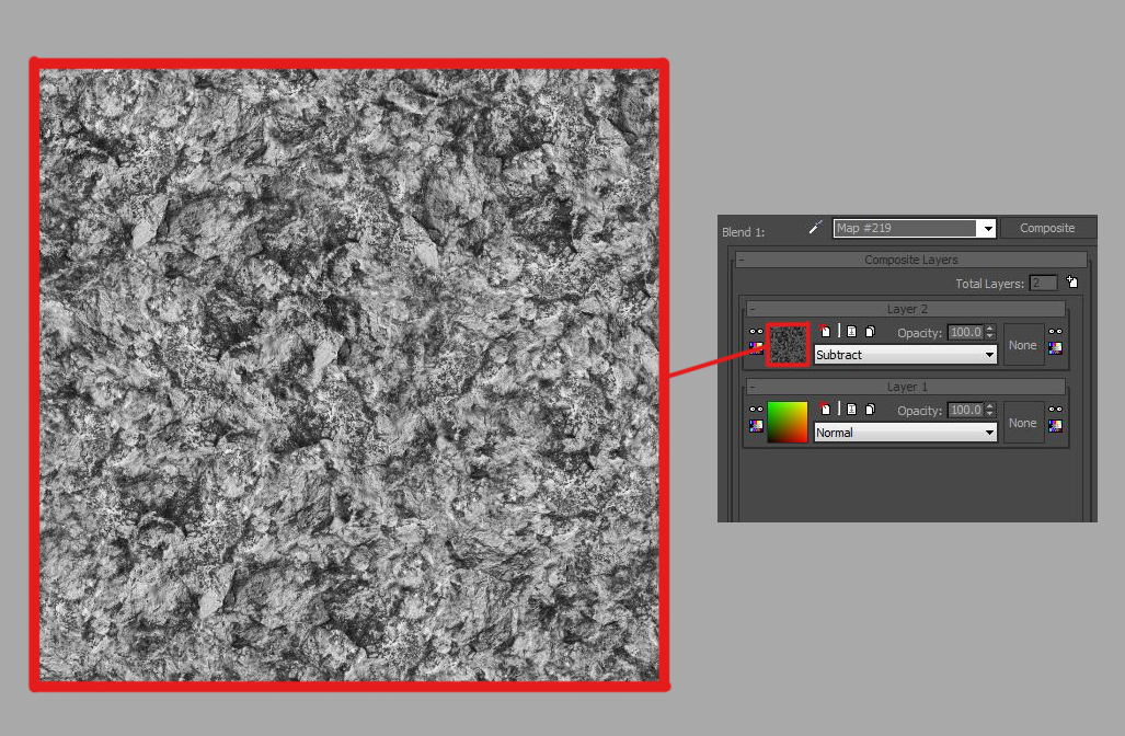
After that, we created a soil material which essentially had two materials being blended together.
One was a dark forest soil and the other was more mossy greener material. They were both mixed using vertex painting. Because vertex painting will have a relatively smooth transition between black and white we used a composite node to add organic variation. To do that we added a fairly harsh B&W texture that would be used in transition areas of vertex paint. We added small variation into the turf stones and ground underneath them using the same technique.
To add more variation and softness to the ground we created a simple mesh to act as a patch of moss that also had moss material with a fairly strong displacement on it. This meant we could position these patches sunk into the ground and it would organically blend with soil because of displacement.
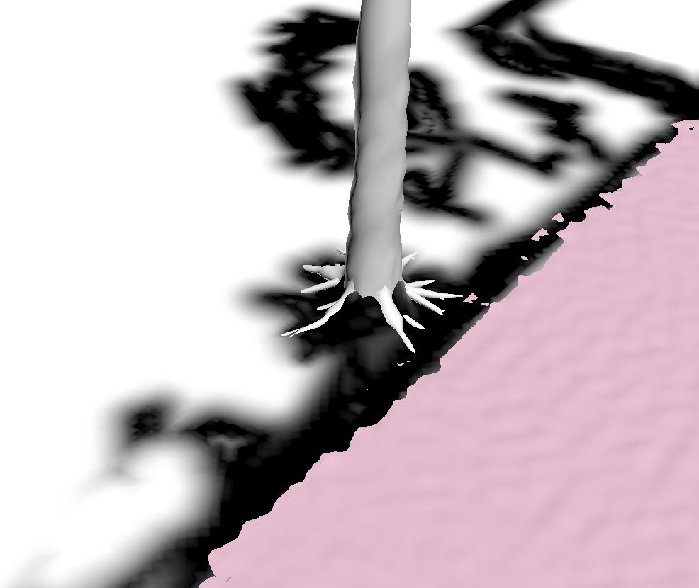
When pine trees were placed in the foreground and their positions were locked we started populating areas around them with these patches of moss, larger rocks, leaves, pine cones, pine needles and smaller pebbles. All of these closeup objects were placed manually with object painter tools that also come with max, though we had to be careful not to have objects intersecting and sinking into the ground too much.
All pine trees were done in SpeedTree just to speed up the process and still maintain the look and quality we needed. SpeedTree also allowed us to get a natural variation in the trees using its built-in export settings where you can export specific amount of trees each slightly different with no extra work. The closest trees and the ones contributing to composition were positioned by hand but all the rest in the background were placed using MultiScatter.
90% of the vegetation was placed using MultiScatter and controlled via spline masks. The grass was split up into thin small, mid, long and very long and each had different MultiScatter settings and masks.
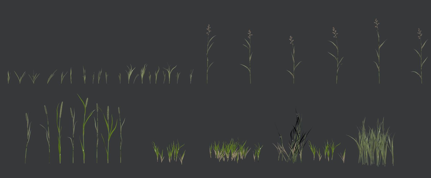
The grass between the turf stones also had a variation texture for growth so that it wouldn’t be perfect and so some of these turf stones had almost no grass in them.
Bushes were placed manually as they were only seen in closeups and didn’t need scattering in the background.
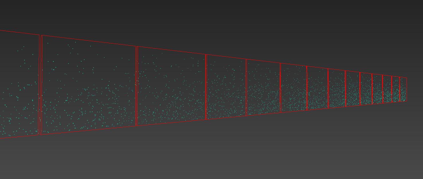
The cladding components for the building were modeled using lots of reference images like these:
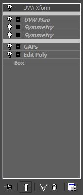
Note the chamfered edges that also have a different material on them. We started out by creating a master cladding board and then copying it around as reference and then adding symmetry modifiers to get the needed size. On top of that, we added a UVW Map modifier that would correctly map the texture and to add some variation we added UVW Xform modifier with randomized values.
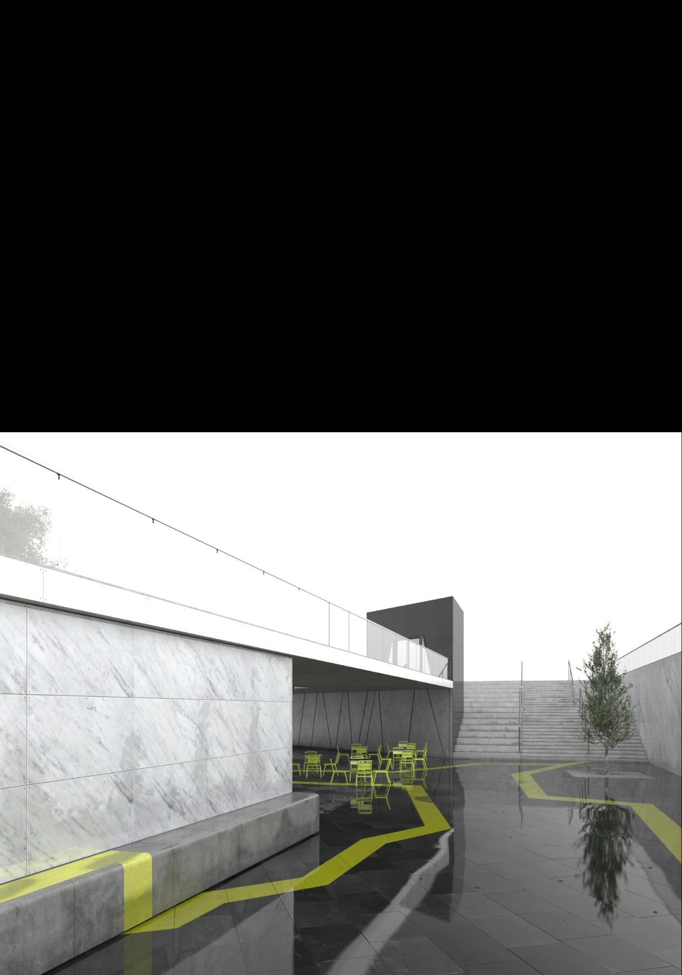
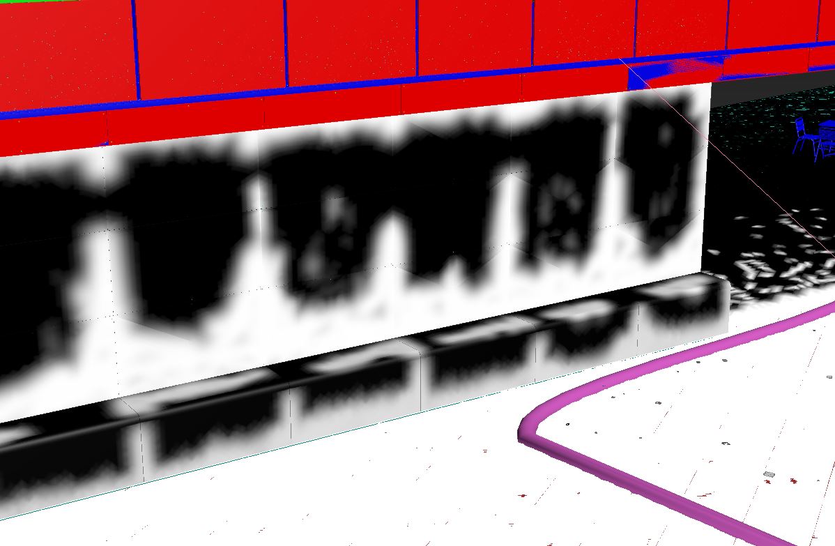
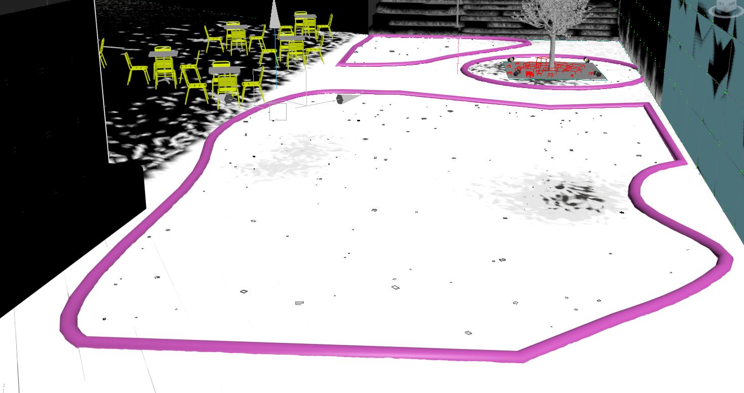
Public rain… public rain…
We changed the design of the environment fairly late in the production and also decided that it has to be “the wet set” so we began by working on the hard landscaping first. To achieve the level of realism we were striving for we gathered dozens of references to similar settings and weather conditions. We were blown away by these CG images from Tamas Medve (you can read all about in Making of Grihallen) and wanted to create a very similar wet paving look.
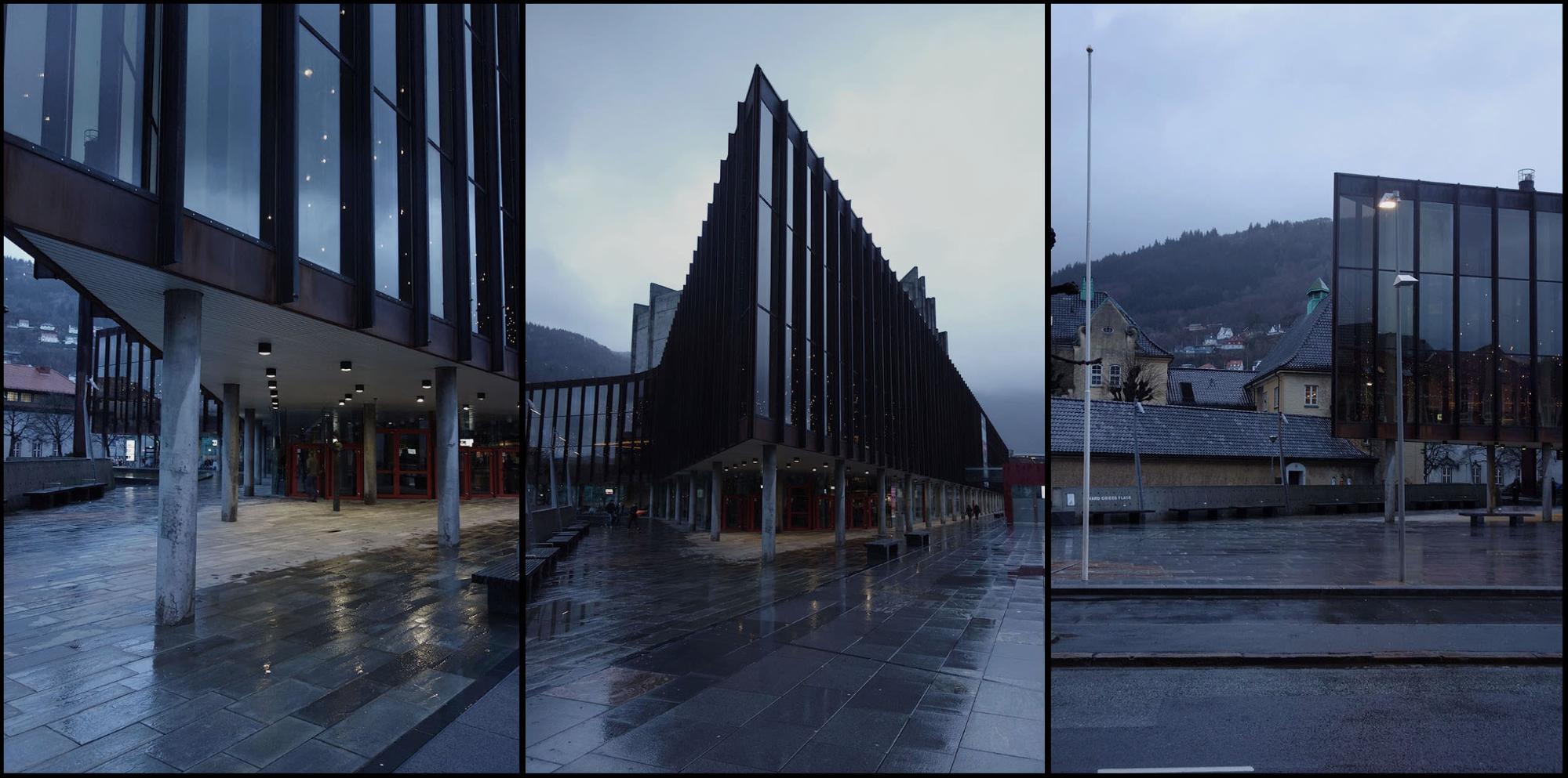
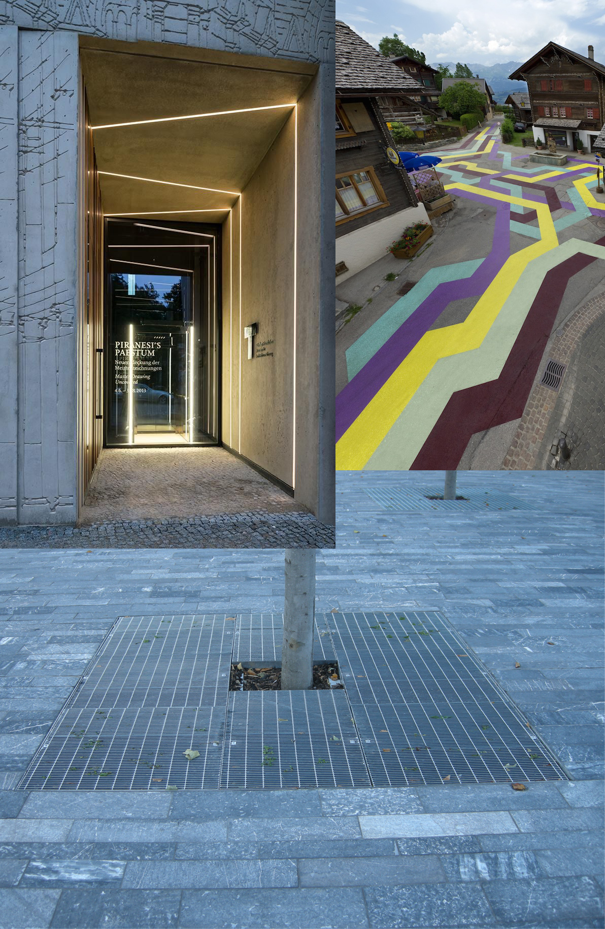
We also wanted to add some color to the public walkways via a colored stripe running through the space.
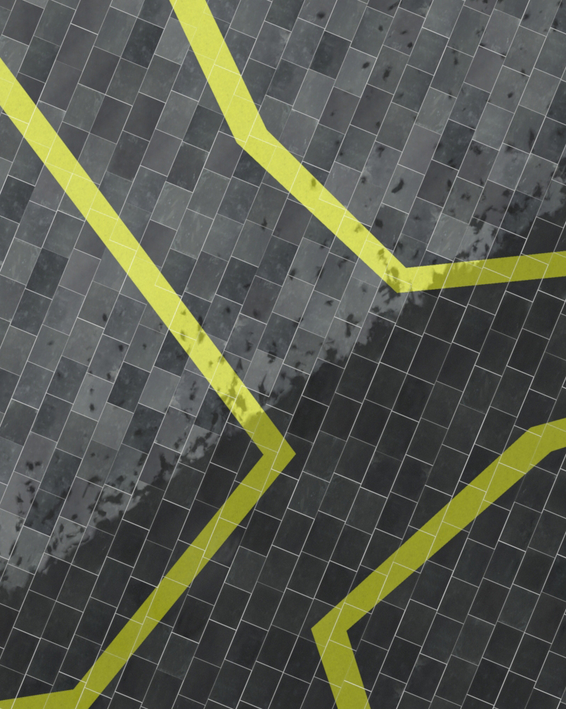
Large tiles were generated using the floor generator script which gave us UV’s and random ID’s automatically.
After that, we set up a material which again had two materials blending – wet and dry.
Dry material was to be used under the roofed part of the pathway and the wet on the uncovered part.
To mix them we used vertex painting where we assigned a vertex color of black to the wet portion of tiles and white to the dry parts. Again, we used the composite node to break up this mask. We also added “footsteps” by painting small patches here and there leading into the roofed area.
To simulate the wet tiles we made the diffuse darker and made it much more reflective and glossy.
On top of that, we added several textures into reflective and gloss slots to simulate the drying around the edges of the tiles.
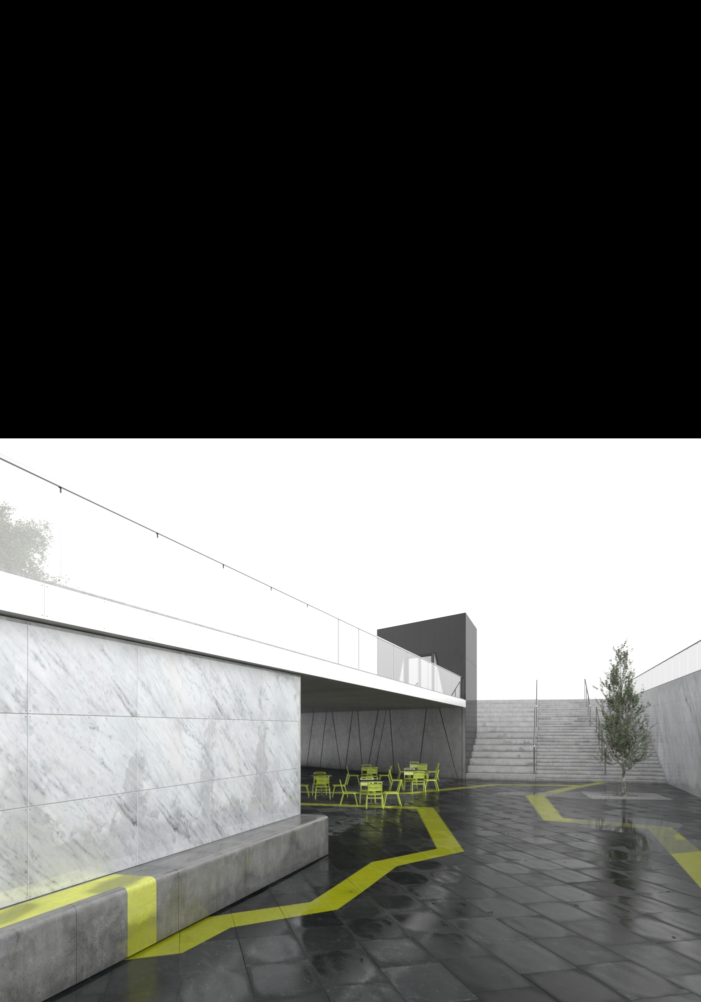
And on top of these things, we also mixed in a huge texture that acted as a mask for the green lines that go across these tiles. We created it by making a spline with sweep modifier (with box profile) so we could easily adjust it and once we were happy how it looked we baked it into a texture where the spline had white color and ground black. This allowed us to have a floor with different textures, and still have the control over the color of the painted lines, floor tile textures and their respective values and have all these textures at fairly high resolution.
As all tiles were one object and had fairly high polygon density we used freeform modeling tools to create puddles of water exactly where we wanted. For example, we wanted to have a puddle where the tree would reflect so it would add a nice detail and break up the scene. Puddles themselves were just a plane with a water material that had a stretched noise node in the bump slot to simulate wind blowing over water.
Most of the environment surfaces had a material with wet and dry parts which were mixed using vertex painting. This allowed us to control how wet and dry a surface were by just quickly painting on its surface.
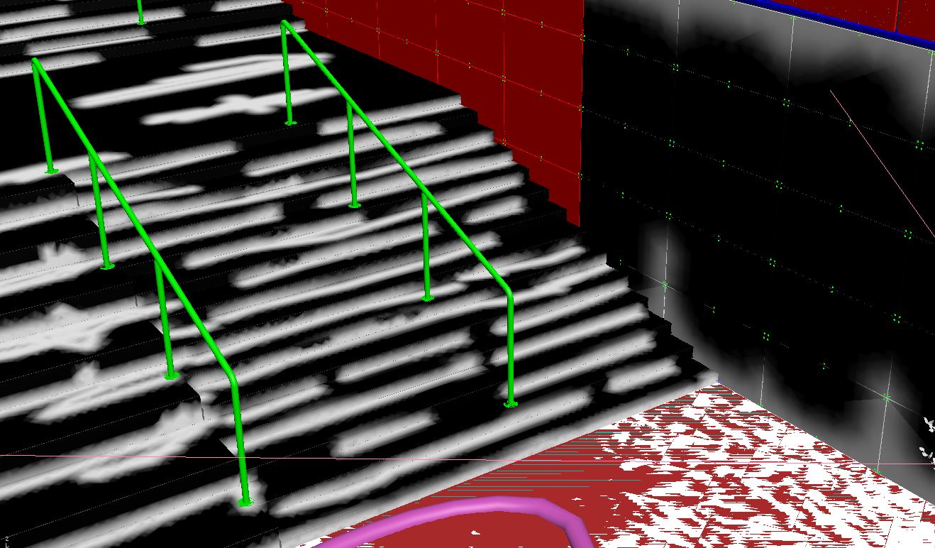
We did this on all major parts of the environment, including corners and crevices of stairs, walls on the left and right and obviously the tiles.
For added realism we created several water droplets and using particle flow we position them on all glass balustrades. Using gradient masks we made sure that there are more droplets closer to the bottom of balustrade than the top as they would slowly travel down after the rain had stopped.
To add small detail on the ground we spread out leaves using MultiScatter and again we wanted to control where they would go so we used splines that could be visible in the viewport and easily adjustable from the camera.
Trees again were done in SpeedTree and underneath them, we added a metal grate with some grass peeking through.
3. Lighting
Planning
Our initial lighting plan here was to create an atmospheric daytime shot as outlined in the look development board. Here was our first attempt using a daylight HDR.
After we rendered this out at full res, it became apparent that this wasn’t the best look for this shot and it would work a lot better with the internal lights turned on, this also meant the sky would be better a bit darker. After confirmation this change was ok with the client we started to create a more moody and overcast late afternoon setup.
Moody setup
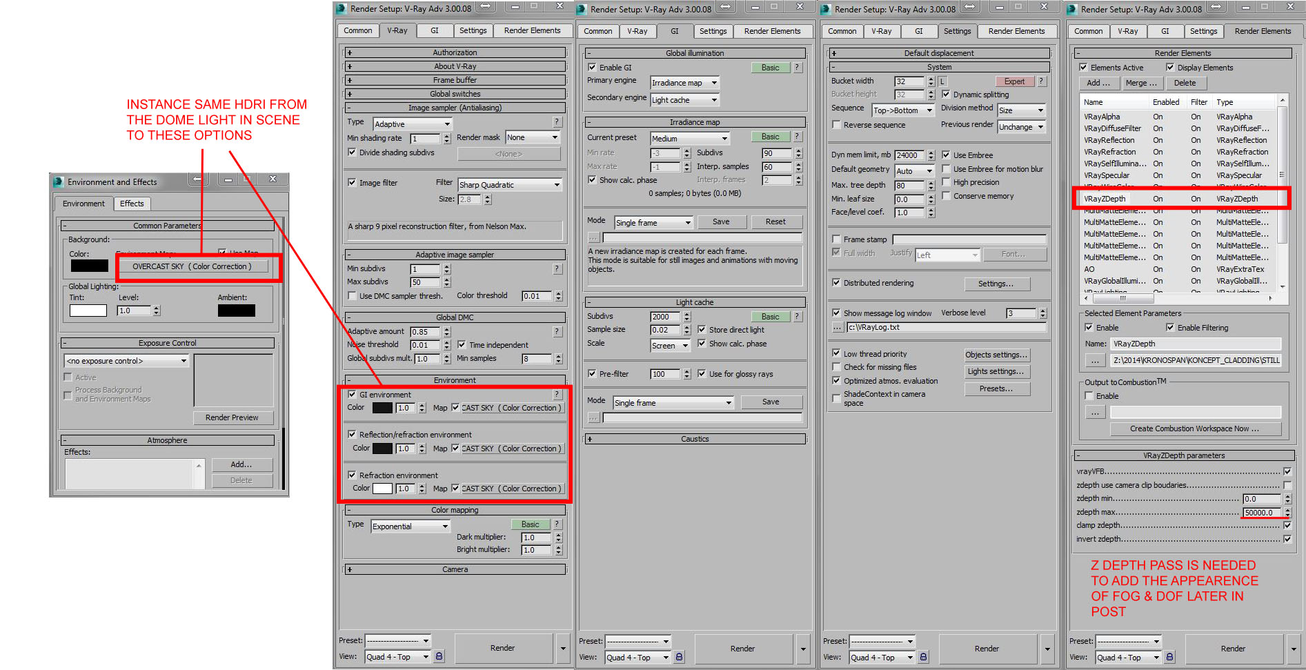
For the new office lighting, we started off with the environment lighting. We used a V-Ray Dome Light and set-up an HDR with a slight color correction to adjust the hue and saturation to our liking, then instanced it into the Dome Light. If you keep the strength of the light to 1.0 and the HDR outputs to 1.0 and let the camera settings do all the work, you’ll have fewer variables to contend with and will be closer to real life, like a photographer who has to adjust the exposure on his camera.
Once we were happy with both the environment lighting and the camera settings, we then added the interior lights and some exterior lights to the site to add a little more interest to the foreground. These lights were a mix of V-Ray Light Planes all instanced for the office interiors and V-Ray Light Spheres for the up-lights. We could’ve used plane lights for those, however, we preferred the look the spheres were giving so we went with those.
We also added warmth to interior lights for a cool contrast with the exterior environmental light. Changing the color temperature in the lights is a great way to achieving this. For interiors, we generally work around the 3500-4500K mark.
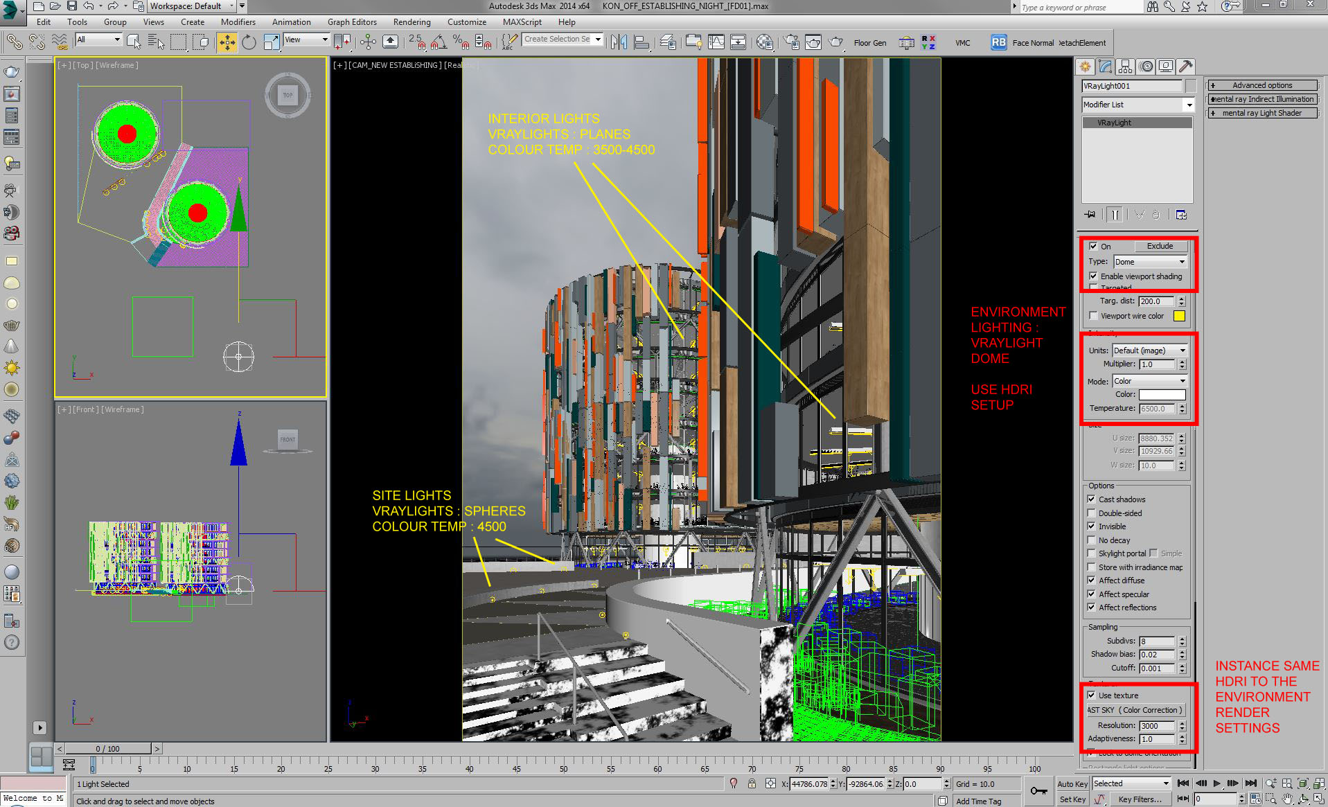
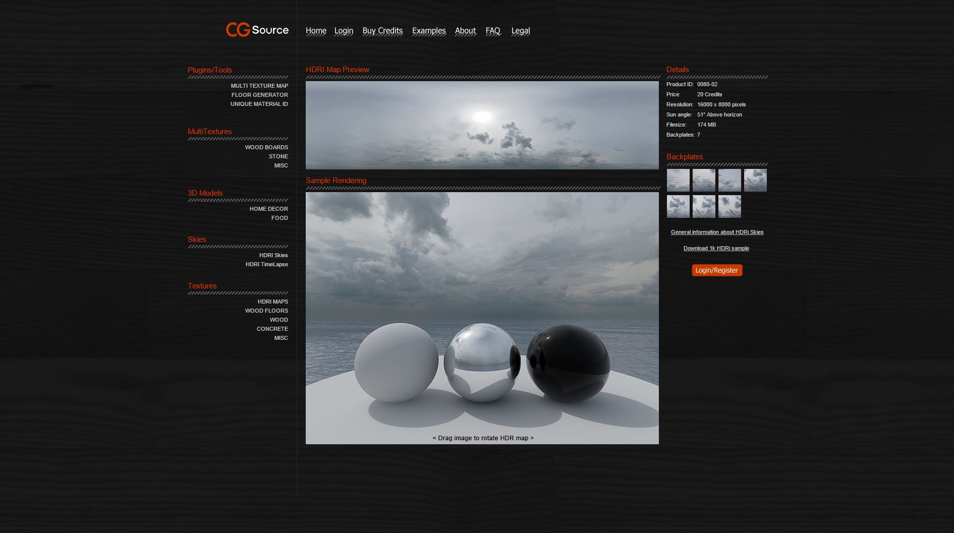
As we wanted to create an overcast, moody looking image, we chose an overcast HDRI, but one which would give off some sunlight and shadow so the building, given its design, wouldn’t look completely flat. CG Source had a great selection and this is the asset we went with.
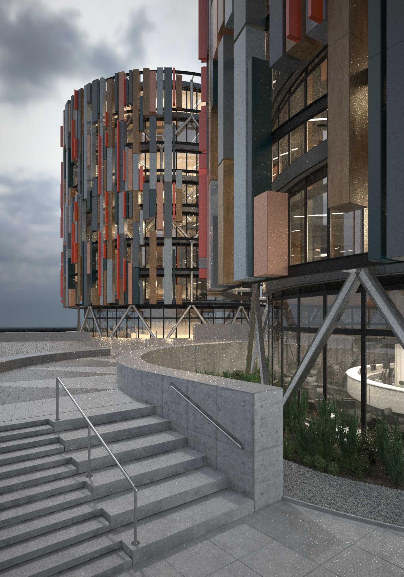
Below is an initial test render. The composition was working beautifully with the lights coming from the inside facing windows of the offices.
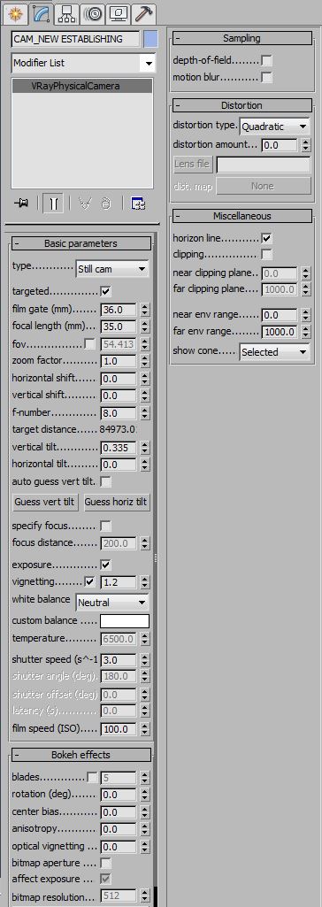
Camera
Here are the settings for the camera. Pretty basic.
Render Settings
We’re fortunate at Pikcells to have quite a meaty render-farm in-house so we’re able to load our universal preset which is quite high, send and forget, knowing that the renders will come back quickly, nice and clean – even at 5K.
Here are the resulting renders for the moody version. We actually ended up using both the daylight and moody light setups in compositing.
Post-production

Like all our projects, for this one we aimed to create the best possible base renders we could – nice details in the model, solid materials, simple lighting approach, good render settings, all the basics done really well.
The important thing to note at this stage in the process is that all the hard work is done and we are just titillating the final render. We have added contrast and framing through our lighting and composition, details via the model and realism from materials and textures. Our mantra is that if we have to do too much in post then we need to revisit the production stages.
Photoshop
All our interior images are composited using a complex layering of elements in After Effects. For exterior images, we generally use Photoshop as our main compositing application due to the additional photographic components like sky and trees.
From there, we were able to bring each base render into Photoshop and gradually add adjustments to each element in the scene and slowly build up the look of each image – constantly referring back to our reference photography and referring back to the brief and our style boards to ensure we weren’t drifting away from our initial vision. It’s so important to start with good references and to refer back to them, even when you think the final render is looking great. There’ll always be a nice detail you’ve missed and could add in post.
Here are some of the steps we took in post on the office main image.
Office step 1
The image below shows the “Moody” RGB render element with the chosen sky behind. As mentioned, most of the hard work is done at this stage and the base looks pretty good with no adjustments, we could add more contrast and enhance the interior lighting.
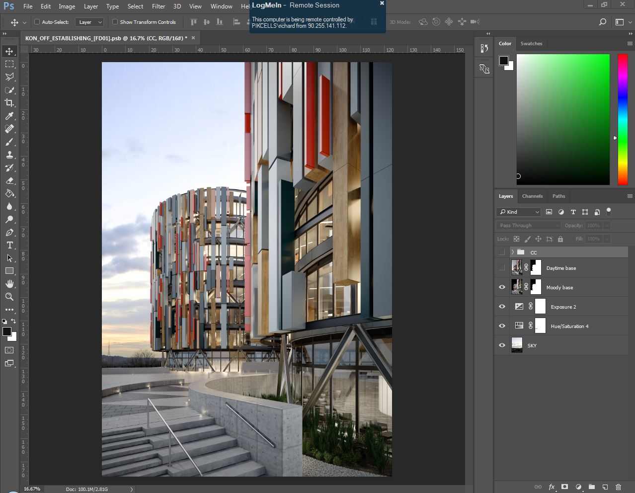
Office step 2
The next image shows the effect of adding the “Daylight” RGB element over the top with a “lighten” blend mode. This additional lighting setup isn’t something we would usually have so it was nice to take advantage of this situation. This added some nice specularity and highlights.
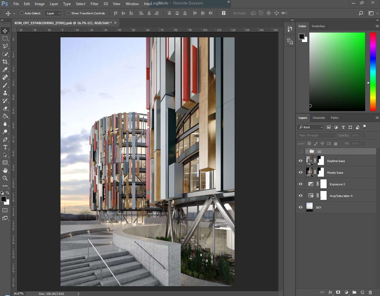
Office step 3
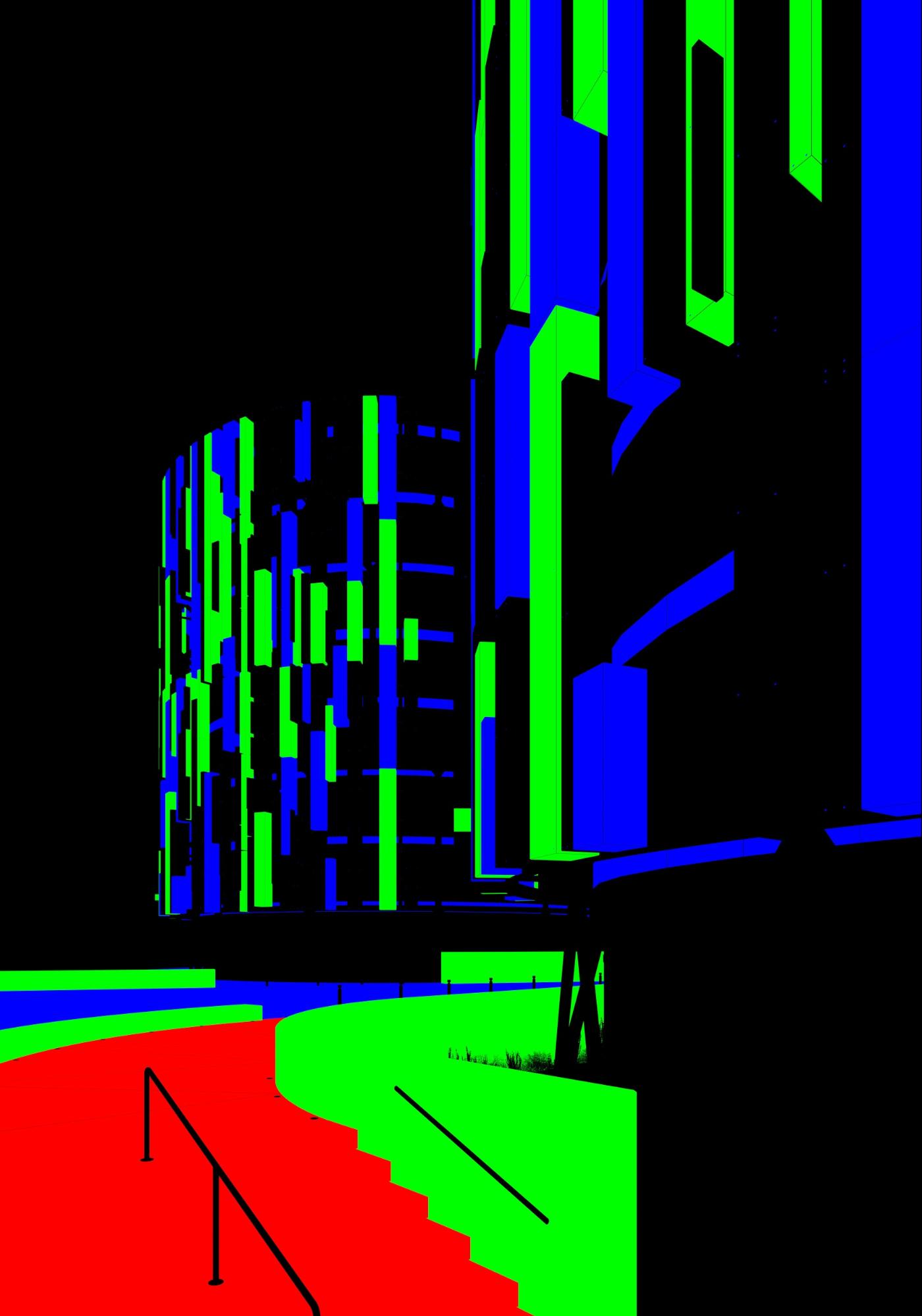
Here we have gone round each part of the image using our Material ID passes or painting into masks to enhance certain parts of the image. Note especially how the internal parts of the glass are more obvious after we overlaid the refraction element over the top.
Having a full selection of render element passes and channels means you can quickly make either general adjustments to the whole image or adjust a single object using a simple curve with an alpha mask.
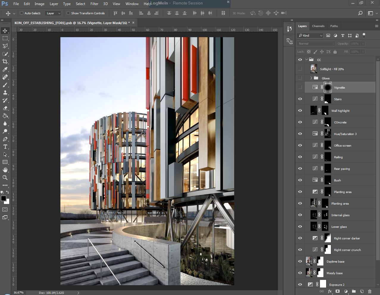
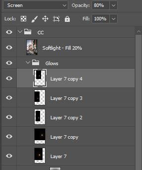
Office step 4
Final touches include a hand drawn vignette, some glows then a duplicated flattened layer, blurred slightly and set to softlight. These help to really bring out the atmospheric feel and focus the eye on certain areas.
The glows were done by painting onto parts of the image with a soft brush on a separate layer.
There you go, not much to it on a project like this. Here is a video breakdown of the post production for some of the images.
Visit us at Pikcells


Great to see this finally up on the site!
It was a pleasure working on these and also trying to push myself to get this done on time.
Ah cool, this was a great project – real collaborative team effort, everyone was pushing and bringing their best work which was really enjoyable and great to be a part of, made me push myself too. Miss these projects! Again, great work everyone and cheers Ronen for hosting our work.
Congratulations, great making of! One of the best I’ve ever read.
Making of Koncept