


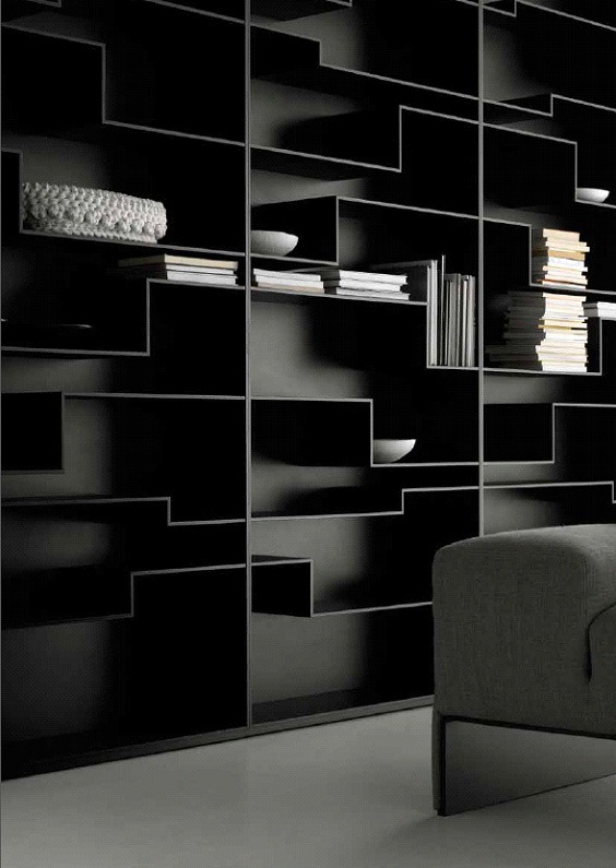
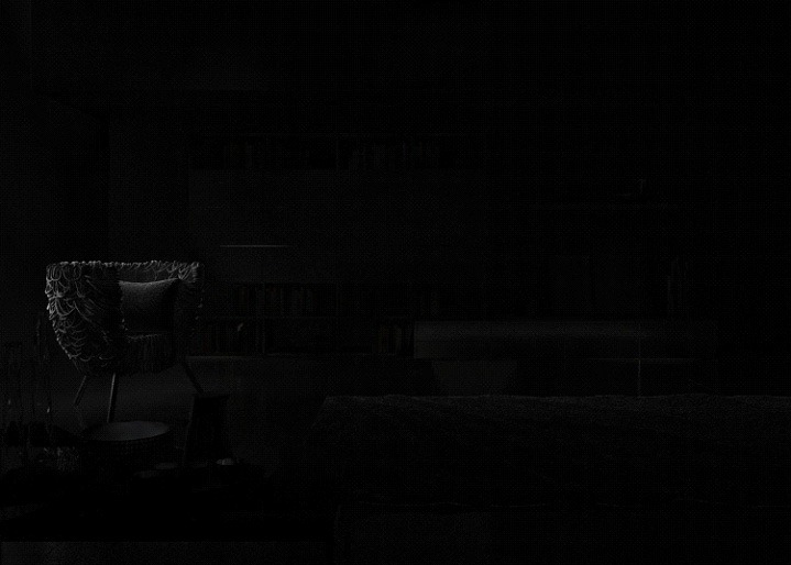
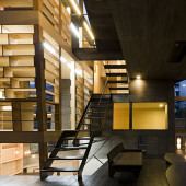
Making of Black Living
Blackhaus’s Black Living scene was featured on the blog exactly one month ago, and today I’m happy to bring you the making of that scene. Working with a dominantly dark scene is a challenging task, one that might be a bit easier after you follow Fernando Gasperin’s description of his process in making the Black Living scene. Enjoy!

Author: Fernando GasperinFernando Gasperin, CEO of blackhaus studio – A creative studio, that involves, 3d art, photography, project and design.
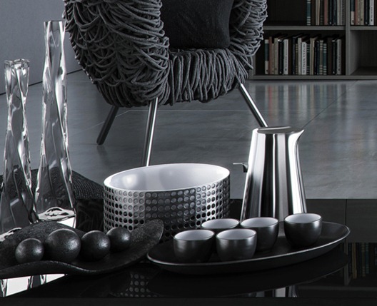
References and ideas
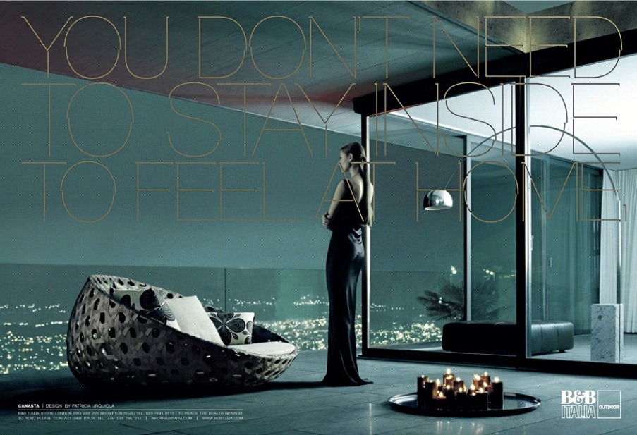
Our main goal with making Black Living was to try to work with a dark palette, which is not an easy thing to do, while managing to give to the images a sophisticated look… a look we have seen in catalogs of Poliform and B&B that we like so much.
The first thing we did, in order to get what we expected, was to gather several reference images that expressed the look we were after. We wanted to have good-looking images in low light situation… mainly a scene that could be built as a photography studio of sorts.
Here are some of the references…
Modeling
I did not use any kind of fancy modeling techniques, just the good old simple poly modeling. I will not focus on that to much, as there are many other very detailed articles about this topic. I would like just to show some of the arrangements I’ve been modeling for the scene. These two I’ll show represent the common techniques I’ve been working with.
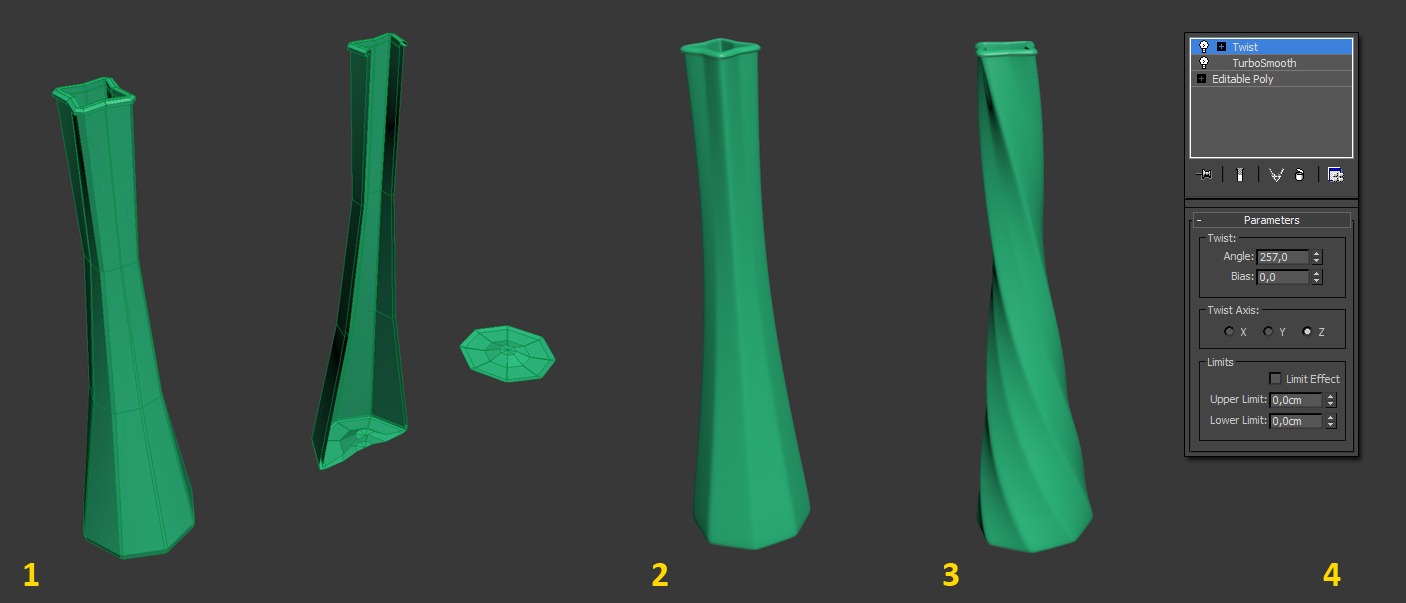
Glass Vase
- I started with a cylinder of 8 sides and added deformations to the mesh, after a minute I had the base mesh (low poly).
- I applied a turbo smooth modifier to smooth out my low poly vase mesh.
- At this stage I had my glass vase almost done. To give it the exact look I had in mind I used the twist modifier
- As seen here done!
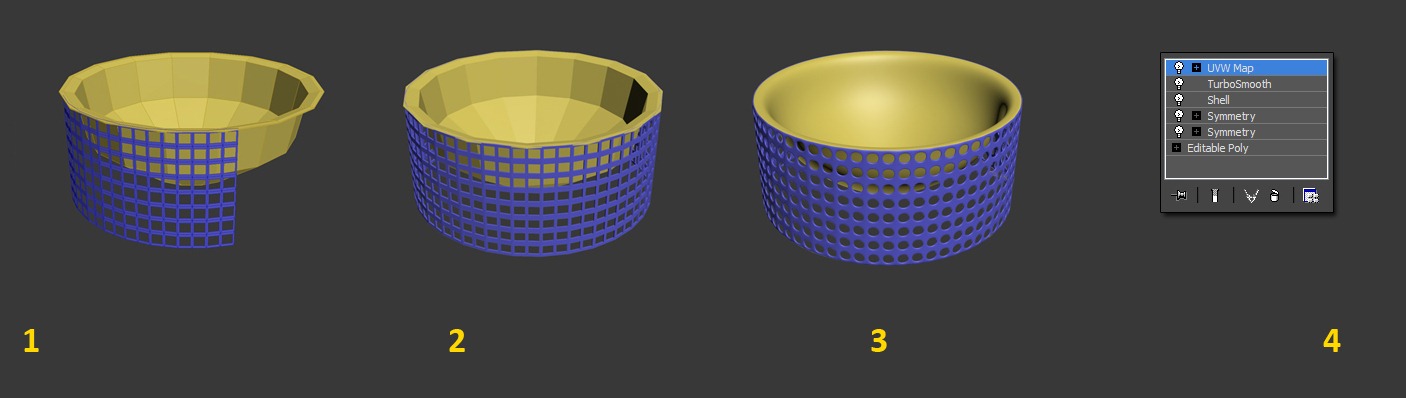
Grid Metal Vase
- I started with a cylinder of 16 sides for the inner part. For the outer part I got I made a plane and divided it into squares that after applying a turbo smooth to them turn into round holes!
- To complete the perimeter with the external grid I used the symmetry modifier and the shell modifier for the added thickness.
- After I had my base mesh for the inner part of this metal vase, I turbo smooth it too for a a nice soft shape.
Texture and Materials
In this part of the process I collect as many references as I possibly can. I’ll try to explain All the settings of the main materials in the scene. If you get confused along the way, just add a comment below and Ill pick it up from there with further detail.
The Concrete Floor
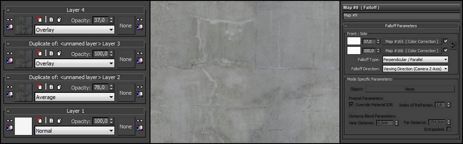
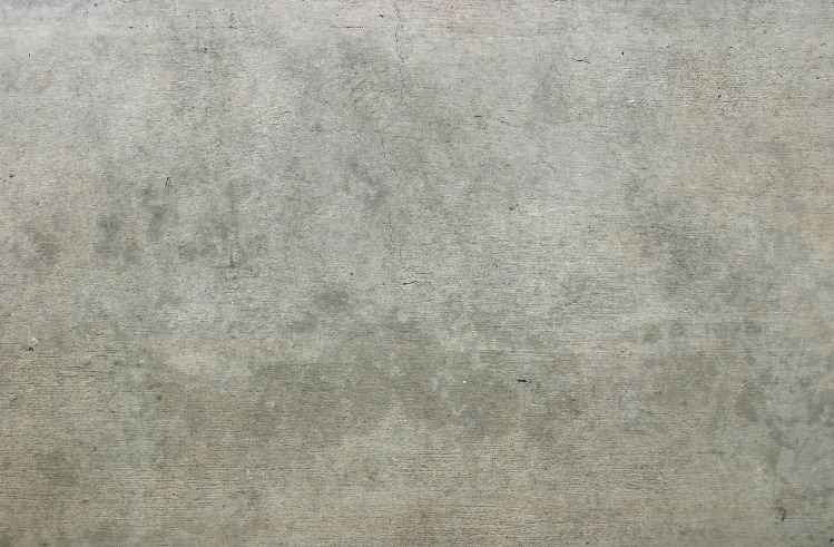
At the heart of it, Im controlling the look of concrete in the diffuse channel, using a composite map, where I have my base concrete texture with several layers on top of it.
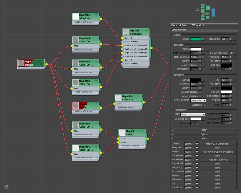
In the reflection slot I put the same texture, but with a higher output level, to bring more reflections to the concrete surface. To control the reflection glossiness I’m using a falloff map with the same base texture used in the diffuse channel.
You can see I don’t have anything in the bump channel. This is because I modeled the imperfections of the concrete on the floor surface, instead of handling it inside the texture. I have set up the concrete tiles manually, and applied a turbosmooth modifier to it. After all this, I added a noise modifier with a small number in the z-axis just to get them small, real life, imperfections.
The Dark Wall Painting
For the dark wall painting, I did not use any particular map inside the diffuse channel, I used only the reflection channel with a mixed map of concrete textures to give the imperfection I wanted to the wall surface. I’ve also used a slight amount of bump on this one.
This map was used just as a reflection map
The Dark Rug Material
This was the most difficult one to execute while having a good look to it. To give an impression of some “life mess” in the image, we decided to give the rug some folds and visible imperfections maybe a bit overdoing it, rather than doing it in the most common way.
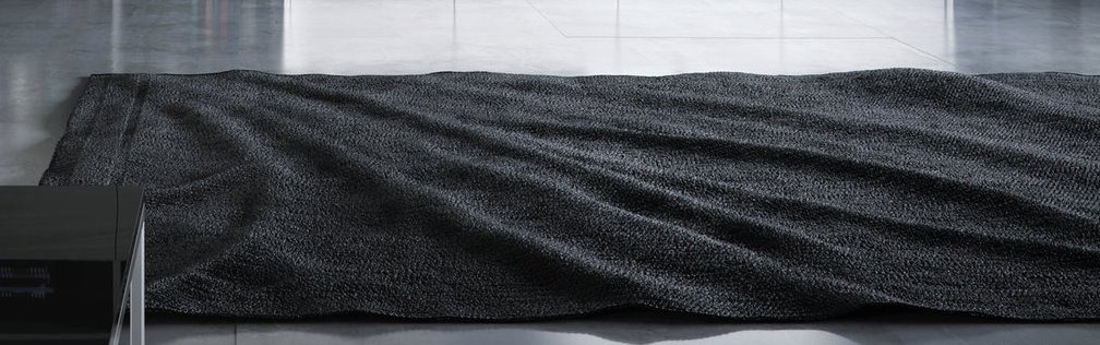
I used fall-off’s, where each one was mapped with a mix map and plugged eventually into the diffuse channel.
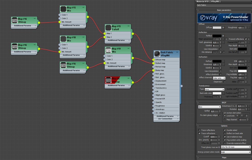
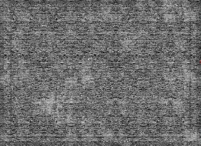
To get the best possible look for the rug, I unwraped the mesh and painted the map inside Photoshop. This technique allowed me to deal with some tiling problems I had with the high-resolution settings of the image.
I also added a reflection map to the rug material, but not for reflecting actually as much as giving the fuzzy looks the ends of the rug strands tend to have in real life. Because of that I turned off the trace reflections options as I did not need those, It won’t reflect but It’ll make the effect I was looking for pretty well, while preserving some valuable rendering time.
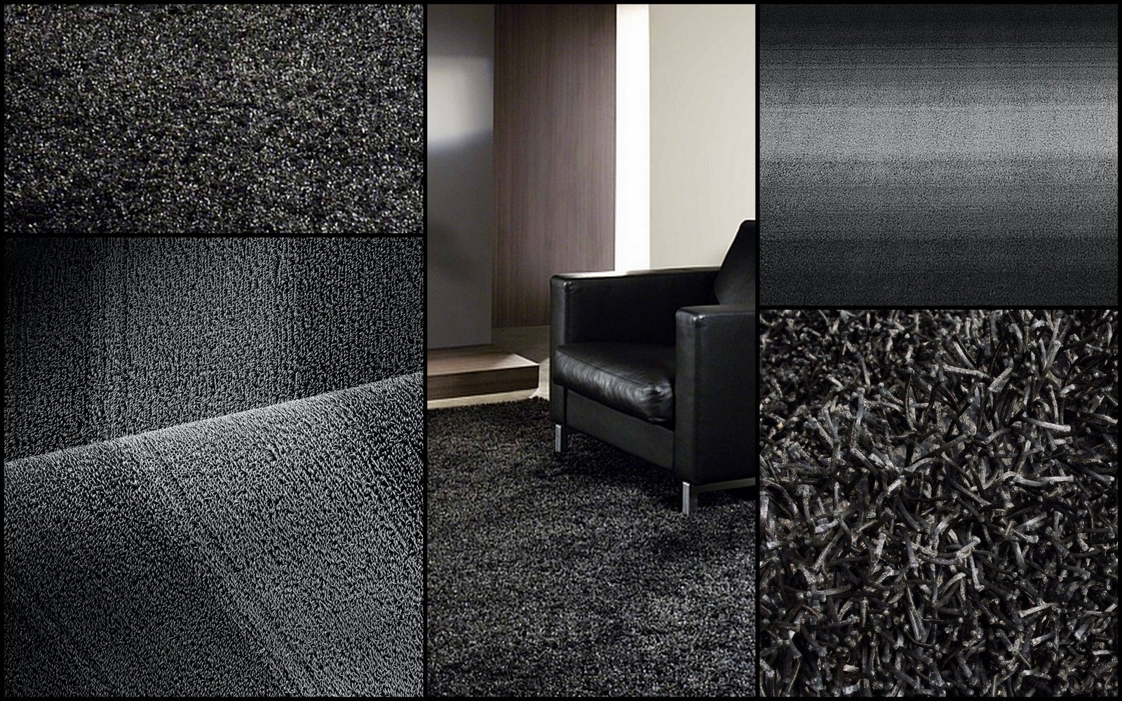
Here are some examples of how black rugs look for real with that white sparkle thing.
To get the look of the rug I wanted I had to use VRay Displacement instead of bump. The displace actually deformed the base mesh, while with bump I could only get light and shadow tricks on the flat surface.
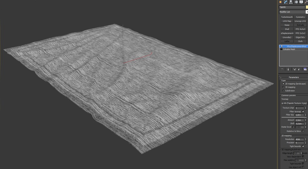
Displacement tip: As I had my mesh opened with unwrap I just added a VRay displacement Modifier with the 2d mapping option selected. For a less time-consuming displacement, I subdivide the mesh a lot, with 4 levels of tusbosmooth.
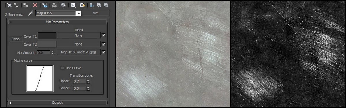
The Black Cup of Tea
Here is the overview of the Tea Cup Material
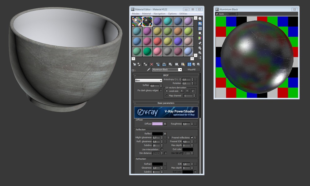
The diffuse channel has a mixed map inside of it, controlled by a texture.
For the reflection channel I used the same mix map, but I just changed the colors, brightening it up almost all the way near white.
The bump got a similar treatment, taking the same texture of the diffuse and balancing out the blacks and whites to fit.
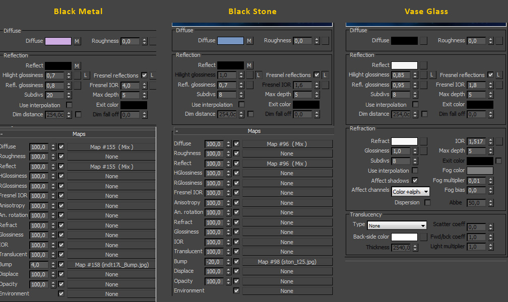
Other Materials Settings
Here are screen captures of the settings other materials in the scene have
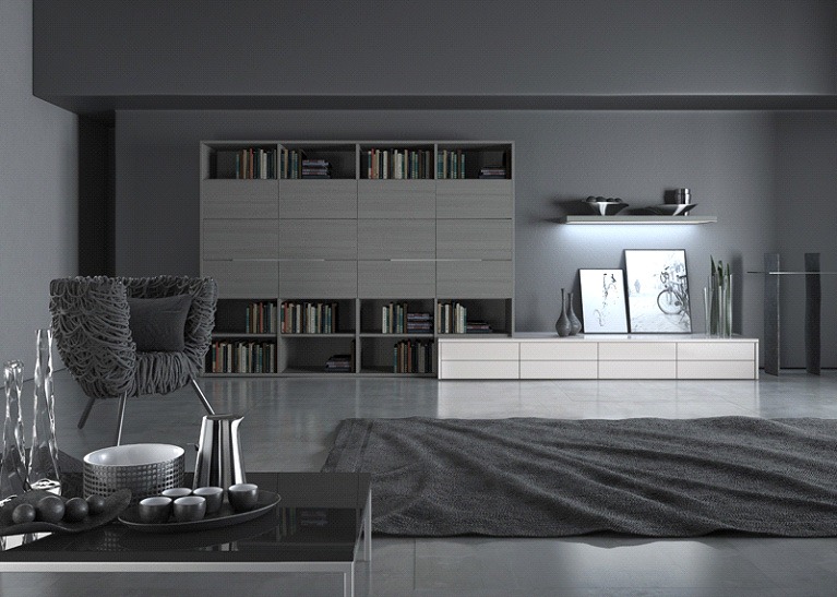
Lighting and Rendering
In this stage of the process, Im used to spend hours looking for the best way to shape every element in the scene. You can see how it all looks in the clay render below, with all lights active. I will break this down for you, so you can understand how I went about lighting it from the start.

At the beginning of the article I mentioned that we were trying to simulate an artificial light as in a studio photography set. Well the first thing to be mindful about is where your main lights will be positioned. What is called KET LIGHT. This will be the strongest light in the scene, one that will determine the main shadows. All the other lights will have less power and will serve as accents for specific areas.
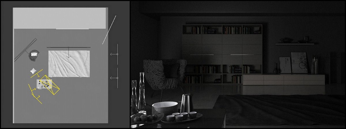
The image below shows where I placed my key light
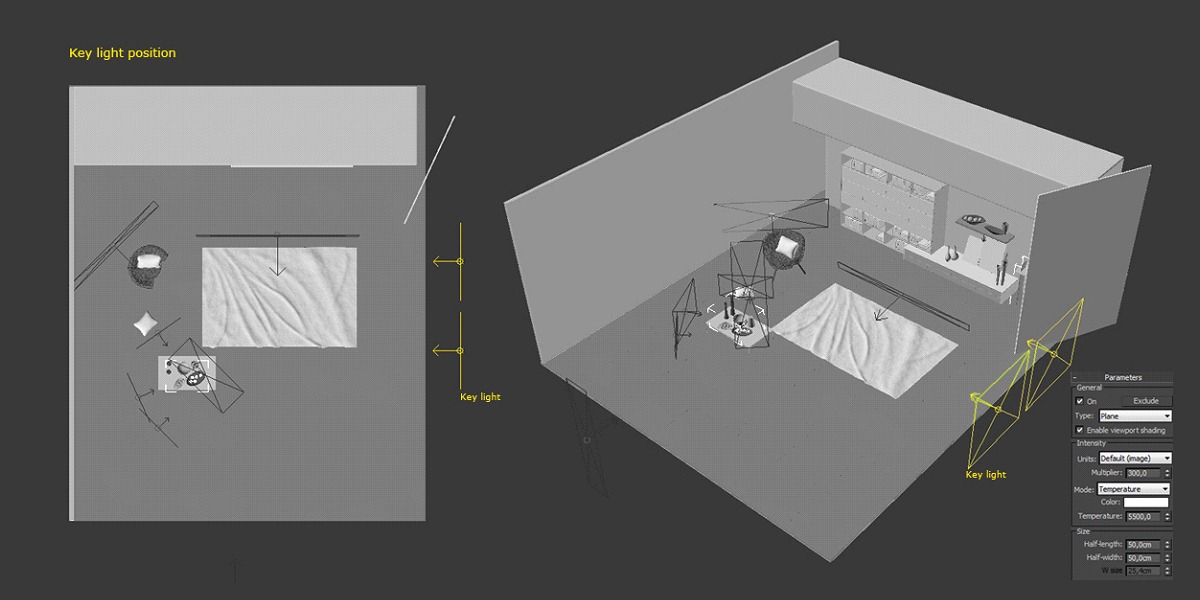
Here you can see the image with only the key light active…
I added a box near the wall on the right side, to add some shadows and underexpose that part of the scene.
Next thing was working on some of the fill lights. GI can only take you to a certain point and then you must boost the light in some areas, other then the obvious placement of some real life light fixtures here and there. Photographers usually deal with that using reflectors and extra lights added to the set lights that would normally would not have been there.
The foreground table is not looking too good as it is with just the key light active. Theres no detail on the glass, chrome and other metal accessories. This is where I needed to work with some extra lights, such that would help me with the table area.
Below you can see where I placed the lights, and how the image looks with just them active. This added the highlights, nice reflection details and subtle shadows to all the elements on the table.
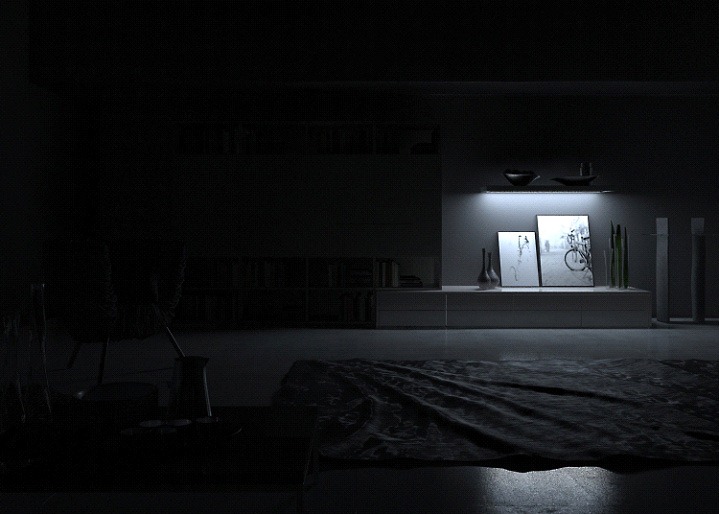
Next stop was the lower shelf at the back wall. This area had a the potential of generating great reflection and specular highlights on the floor and rug, as well as adding some shadow detail to emphasize elements and add some badly needed contrast to that region. As we work with a dark scene we must get the light back in key points to balance it all back. I switched a light on under the shelf, and made sure it will not over expose that area thats it.
At this stage the lighting was nearly done. I just added one more light to boost that great DesignConnected Vermelha Rope chair by Fernando Campana This added the nice highlights on the rope mashup and made the details pop out.
That light was actually set to work only on the chair!
A small tip that you may find handy, is to set the light to work only on the element you like to enhance. You can exclude all the elements of the scene and just include the objects to be lit.
At this stage of the work I had all my lights and materials setup in the right way. Next stop is going into the post production part, where I’ll give the mood, and enhance some of the parts that I think are easier to make in the post production stage.
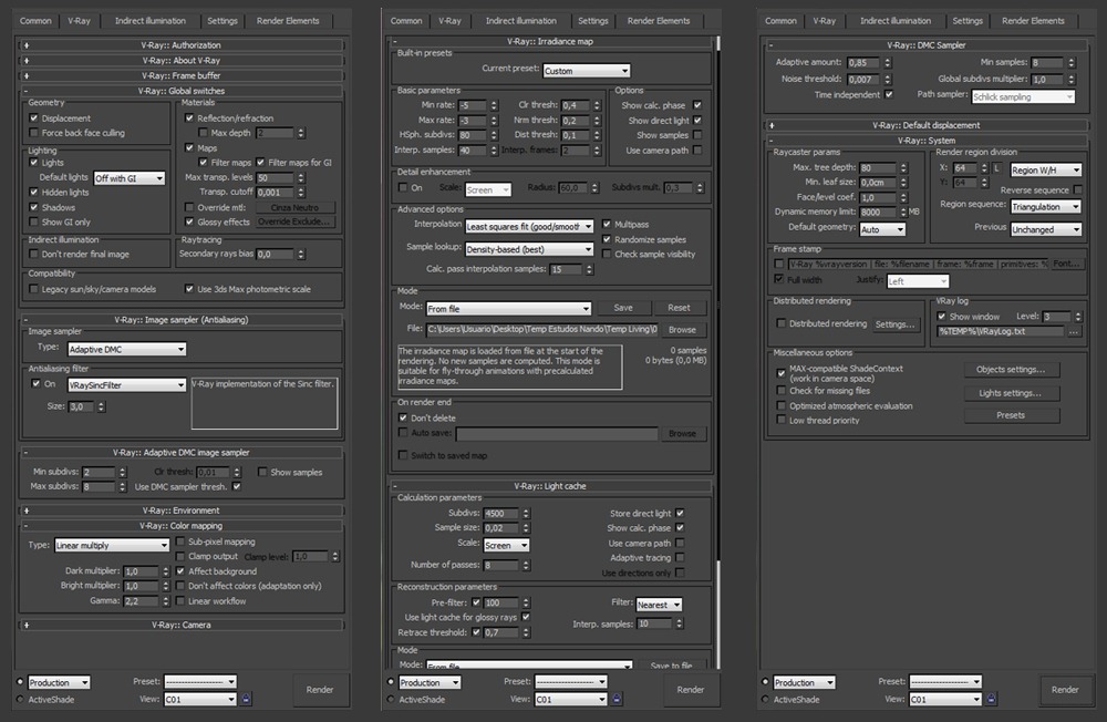
Below is the RAW rendering without any kind of post production and the V-Ray settings.
Post Production
I decided to output the RAW render without any clipping, so that in the post production stage I could enhance and balance the image in order to get a more contrasted look without lose of any information in the original rendering.
I used Photoshop for the post production, but the concept I think is the same for whatever software you’ll choose.
First Step
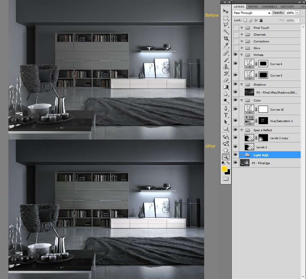
Doing light adjustments on the image.
I brought back some contrast into the image, working with various adjustment layers targeting specific areas. Below you can see the scheme of my post production in detail.
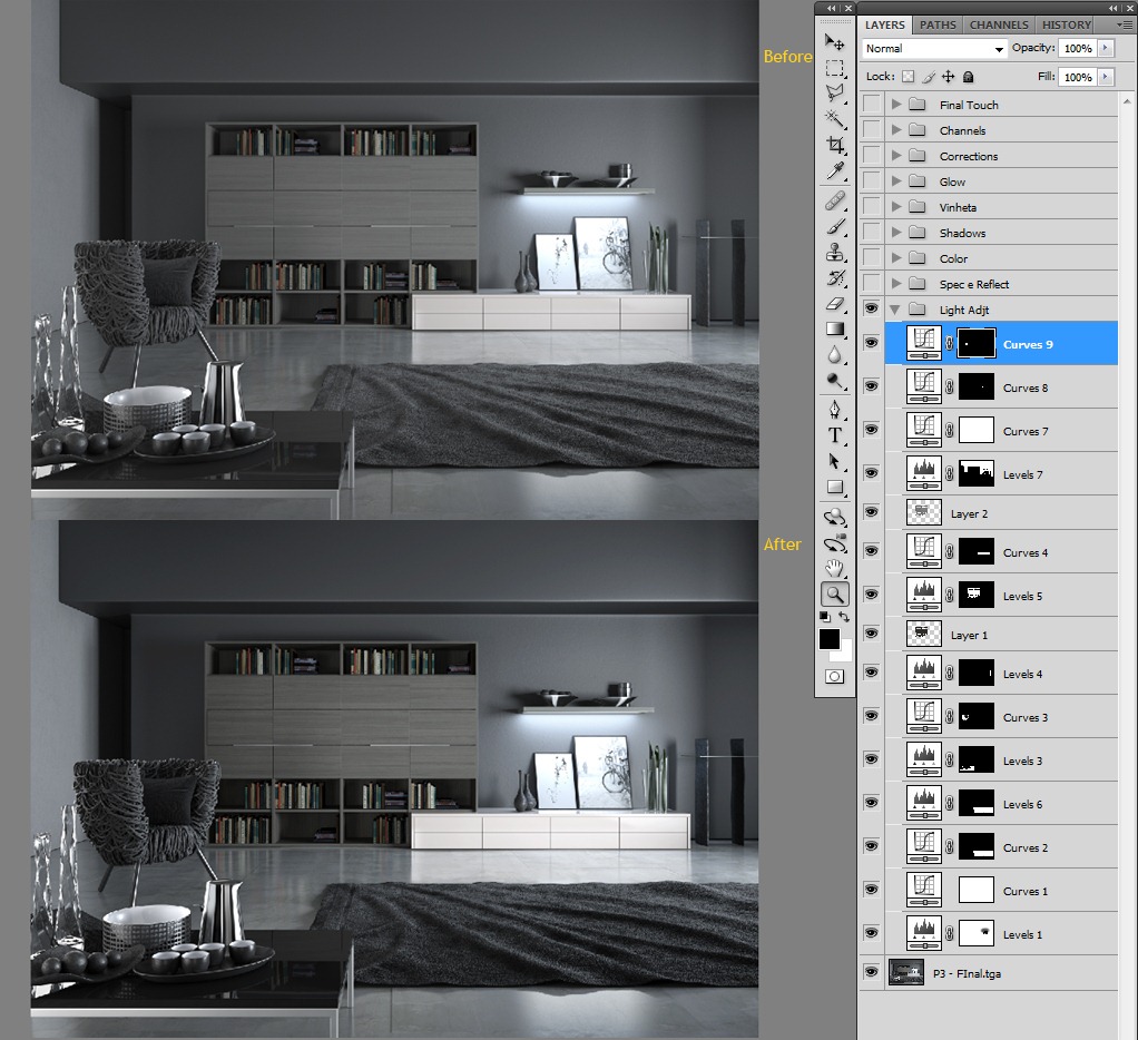
As we can see, I improved the overall look and feel of the image and its lighting with only a few adjustments layers in Photoshop. I brought the contrast back a little further and I worked separately on objects such as the rug, table and chair.
Second Step
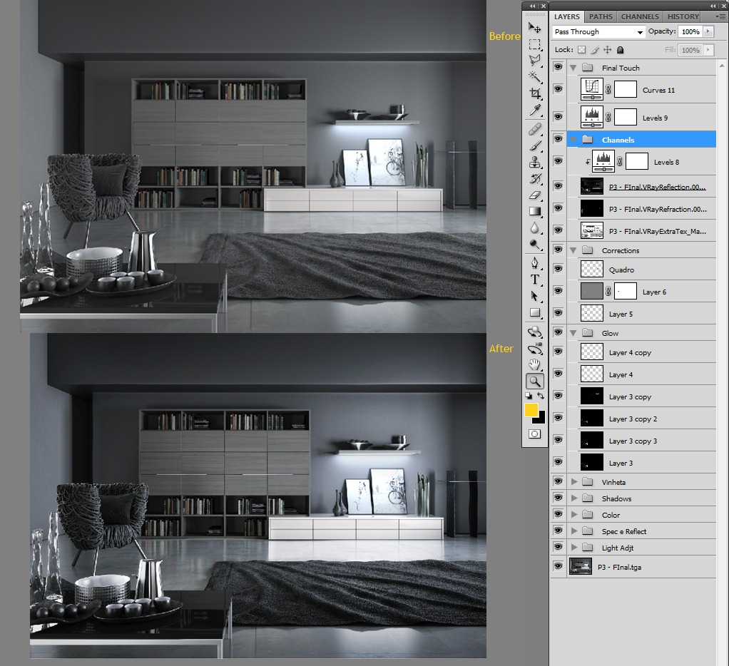
Using some V-Ray rendering elements to help enhance the image.
I corrected the color with the curves and gave some corrections to the books on the back shelves, they were looking so saturated in relation to the general scene and what I was hoping to get out of them.
The specular and reflection groups are just the V-Ray elements with the blending mode set to screen, I also erased some parts I did not want to have an affect on the image. The vignette was done with curves. I had 2 curves with 2 different fall-off’s, one shorter and one lighter but with a higher falloff.
At this point, the image is really getting into shape.
Third & Final Step
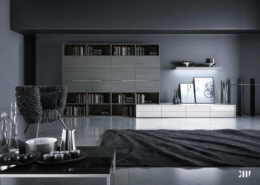
In this final step I added some glows to the image. To make the glow, I converted the current image into black & white, made a curve adjustment with high contrast so only the whitest areas will remain, applied a Gaussian Blur to soft it up and overlaid it on top of the original image.
The group corrections were used to bring back things that are so contrasted. I just copied parts of the original RAW image and blended them together. The channels group were only V-Ray elements. I just switched the blend mode to screen and above the reflection layer I put a levels layer to bring the black down. The final touch group were just a bit more of contrast and corrections to suit my printed version, and that’s all folks,
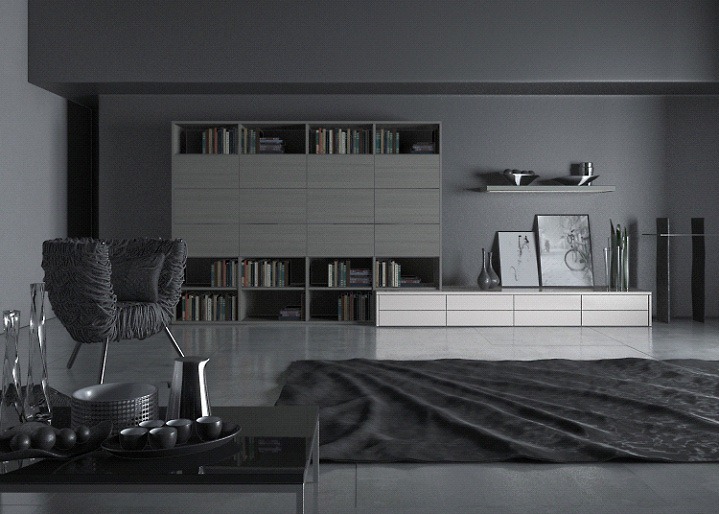
Below You can see the final result
I’d like to thank Ronen Bekerman for providing me the space to bring to you some of my knowledge that I developed during my career. Some of the techniques and perceptions are just my way How I’m used to work, and I know there are many other ways to do the same things that I showcased in this article.
There are no strict rules, just the best way that suits your needs and your own workflow I hope that Ive been of help to you by showing how I go about my work.
If I could recommend you some further resources I would highly recommend you to see
Gnomon Schools Master Classes 2011 Efficient Cinematic Lighting with Jeremy Vickery & High End Industry Photoshop Retouching Techniques. These were a great source of learning while I’ve made my personal work.
Thanks ALL!
Fernando 😉
@ronenbekerman great link, thanks! I did love Black Living, I hadn’t seen any of Blackhaus’s work since last months blog post
@DanCole3D ohhh… but Fernando was pretty busy bee lately 😉 Doing lots of great stuff!
Great making-of! I found here many useful informations! Thanks Fernando. You made fantastic work! Thx Ronen for sharing!
Astonishing detail. I honestly thought it was a photo. I’m a massive fan of BB Italia furniture as well, just a shame it’s so expensive.
Very nice making-of, thanks for writing it! I especially like the lighting breakdown and your explanation of why you put each light where you did, it gave me some good insight into your thought process.
How you made the chair? 🙂
@Dollmaker He didn’t 😉 It is a DesignConnected Chair – Very nice one in real life and as a 3d model – http://www.ronenbekerman.com/go/DC-Vermelha-Chair/
@ronenbekerman Thanks.. the chair is lovely… and hay thanks for the tutorial.. very nice work Fernando Gasperin 🙂
A very interesting lesson, like the carpet, unless you can put slzhno displacement map in high resolution.
Thank you.
Incredible thanks for sharing the techniques and procedures. Awesome work.
Well done! Very interesting lighting breakdown.
Thanks for sharing.
Hey guys, Very good to see that the making of was useful for everybody!!! i tried to explain in details what I was looking for, sorry If forget something!!! either way, thanks for take your time to see the making of by blackhaus. the best for everybody, Fernando.
If I would like to model somethings like that chair, is it worth to do it with only splines or there is a faster way to do it?
@AndreaSpadoni I would suggest checking the Rope Ball tutorial by Francesco Legrenzi – The author of The VRay Complete Guide.
https://vimeo.com/3896030
http://www.francescolegrenzi.com/forum/viewtopic.php?f=11&t=191
http://www.francescolegrenzi.com/forum/viewtopic.php?f=29&t=189
Very nice breakdown… I really like the color pallet and the composition. It makes you want to be there. Well done.
A very interesting lesson!
Thank you.
hi ronrn
@arkinesref great tutorial, but I wouldnt like to sit on the chair!
@acjwalker yeah wouldnt be that comfortable but look cool!..I’ve just gone throught that tutorial thoroughly..great lighting techniques
ronenbekerman DanCole3D please”””” i want scene to Study please please