

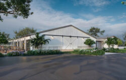


The National Museum of Afghanistan
Ive been fascinated by the work of Spanish Estudio AGraph since Ive seen it for the first time. The visualizations they create, and they would say so themselves, resembles more to architectural drawing than 3d rendered visuals. It is not the first time Im covering this style of visualization, and yet they have something unique about how they approach and perform a visualization project which seemed important enough for me to explore it and ask them to share more about it.
The thing I find fascinating the most is how you can break out of the 3D mold, consider an architectural visualization image as being an abstract piece not necessarily an exact 3d special representation of the future building, but an exact expression of the architects intent!
While this surly not fly well with the real-estate developer looking to sell his latest NYC loft, it can with almost all competition style, early development, conceptual projects. You never really get a solid plan or model to work with in any case, right? an architect is never finished not in a competition hes not.
For this to work, you need to strike good working relationship with the architect and get into his mind. Estudio AGraph mention this and this is a good time to hand you over to Patricia & Daniel
Enjoy!
We are interested in ideas regardless of the scale, in this manner we are facing projects that go from architecture and graphic representation (mainly focused on architecture contests) to graphic, corporative, editorial and web design. Our relationship with the client is a priority for us. Therefore, from the beginning we establish a direct and close contact, vital to achieve a powerful result.
Our studio conceives the visualization of architecture as a discipline comparable to architectural drawing. We prefer architectural expression than literal representation.

We give much more importance to capturing the essence of each project rather than detailing every single aspect of the building, and even more in this case as it was a contest of initial ideas (focusing on the main aspects and avoiding or simplifying superfluous elements that could well distract the receptor from the main ideas the architects were wanting to put across).
Therefore, our first task as we work on each project is to, alongside with the designing studio, analyze which is going to be that essence that we want to transmit, which will be the detailed elements, and what will be the level of definition we will want to obtain in each of those elements (scenery, materials, lighting ).

Initially we discuss ideas, not plans, sections, or constructive details. This is the most important part for us there is always a key word that defines the essence of the project and that guides us through the aesthetic approach of our work.
Our relationship with the designing studio is usually quite close as it is not just about nicely redrawing some plans. We usually keep close contact with them and talk things through, so that the images express the intentions we are looking for. The choice of a good station point is vital. In this case the exterior images were pretty clear from the start.


One of the images would reflect the entrance practically in a facade view, another image in a mouse view so that the protection wall of the building would acquire certain prominence, and an aerial view is characterized by a sunset scenery that would explain the roof lights and the relationship with the environment.

The views of the exterior images were chosen from the 3D cameras, but the views of the interior images were chosen from the original sketches drawn by Emilio Tuñón. Sketches that were loaded with intention and werent just talking about a specific spot in the building, but of the geometry present in any part of the building.

Our job was to find a meeting point between the freehand sketches, and an abstraction of the building and the 3D camera that resulted from the drawing up of plans. The final outcome was a pleasing midpoint between both things, satisfying both us and them. Correcting vanishing points and reconstructing the interior spacing to try and put across the general idea of the building. Our aim was to condense in one image all the possible interior locations, the essence of the project.

In those interior views we are able to notice quite clearly the simplification of elements, and our will to capture the importance of the light, the bricks, the sculptures, and the spatial continuity, the other elements disappear or are simply reduced to the minimum expression.
Once we had decided these issues we began the process of generating the images. Considering everything we have talked about perhaps we have a way of working that is a bit peculiar, where the rendering has little importance in comparison to the post production work, which takes up most of the time we put in to generating the images.

We use the render as a base to work on, but of which we can appreciate very little in the final result (or sometimes nothing at all). We like to control each material, each surface, each spot or ray of light that comes in to the image, in an almost manual technique.


Initially the building materiality was going to be something more abstract, an earthy surface, bricks but with less defined rows. We created the material but as we put it in place we realized that the strong geometry of the building was asking for a more directional approach that would emphasize de direction of each plane. In the end we generated the bricks using photographs of the Herat Citadel, a recently restored building and that served as source of inspiration to the designing studio. Two types of materials were created, one for the images where the building is seen from afar, and the other for the interior views. In the aerial view we used a mixture of both.


Maybe what took us the most was to find the level of abstraction/reality that we were looking for in the graphic display of the walls and the roof lights. We did several tests until we found that expressiveness we were looking for (neither old nor new). More than the definition of the specific material, what was most important was to be able to put across that that material is part of that place, that culture. That the project is fully settled in.


In the lighting the process is quite similar. We used very basic lighting in the 3D model to be able to have a base image to work on, but most of it is done in the post production process (both in the building and on the landscape). After having tried out many ways, this is the process that we find out to be the simplest and the most controllable (more drawing, less rendering).
Here is the same process on another view


Tell us what you think of the visualization approach & workflow showcased here in the comments section down below 😉

Comments are closed.