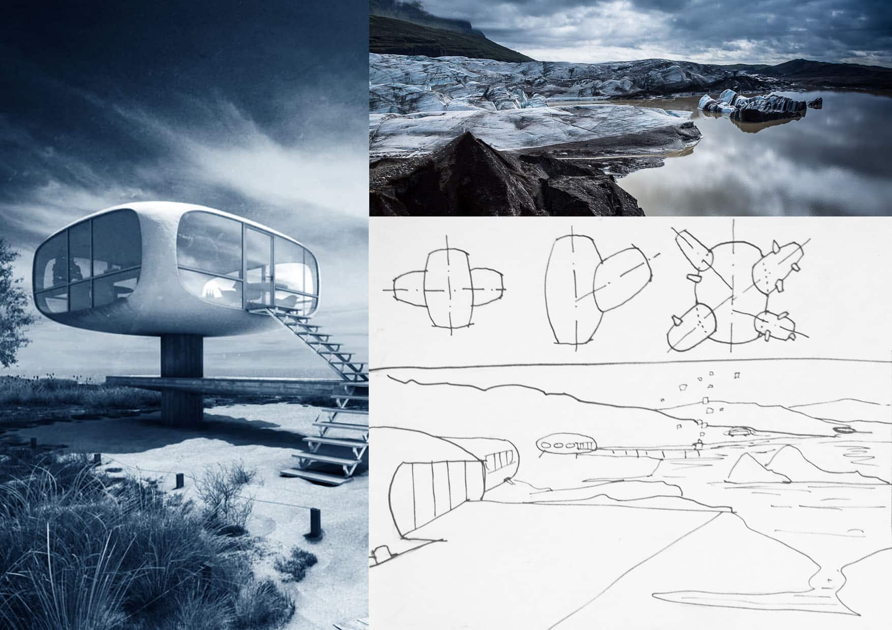
Beside the potatoe choice, I’ve got a lack of rock and environment modelisation, texturing and rendering training. That’s why I chose this Icelandic picture. I also love “drama lighted” surroundings, and can rarely use it in my business work… Blue environment fits so nice with hot orange/warm colors brought by interior lighting or sunset/sunrise.
By the way, I’m still not an expert in picture composing, and I’m looking for making lots of tests so I can grow some experience on your kind feedbacks.
3
replies
Leave a Reply
Want to join the discussion?Feel free to contribute!
Leave a Reply Cancel reply
You must be logged in to post a comment.









Hello!
Lasse Rode is in the House! … ah… in the CABIN 😉 Good luck!
I agree with you regarding the choice of color contrasts that you have in mind for this project. This is going to look very nice!
😀