


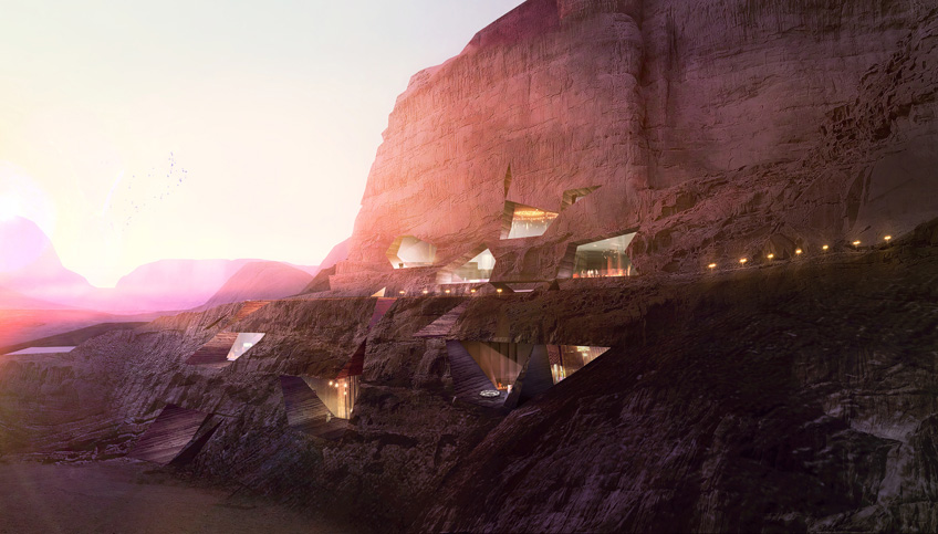
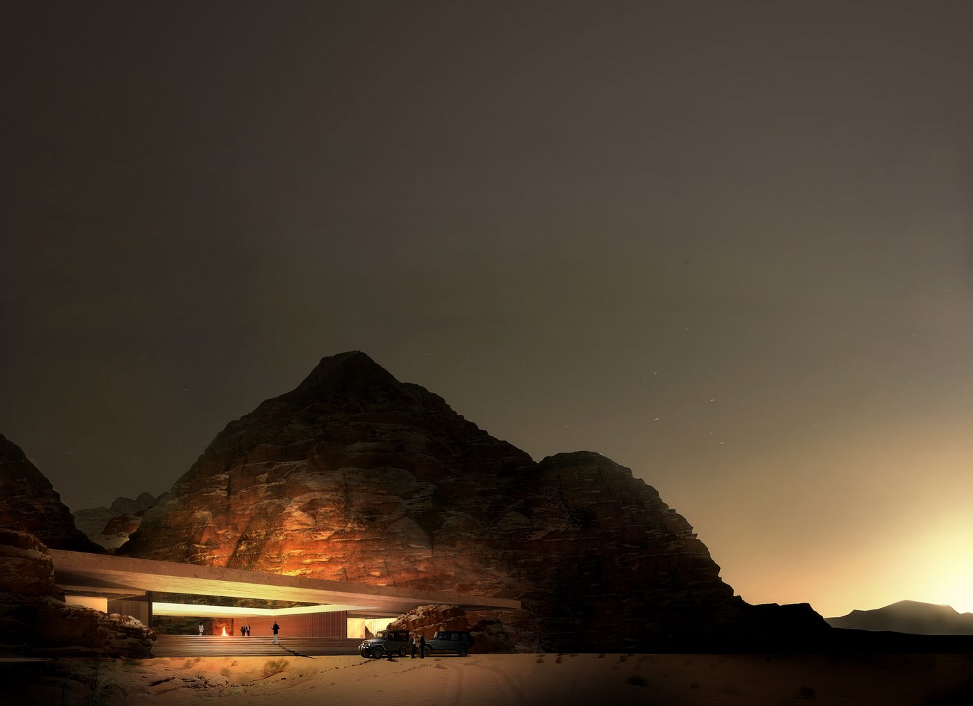
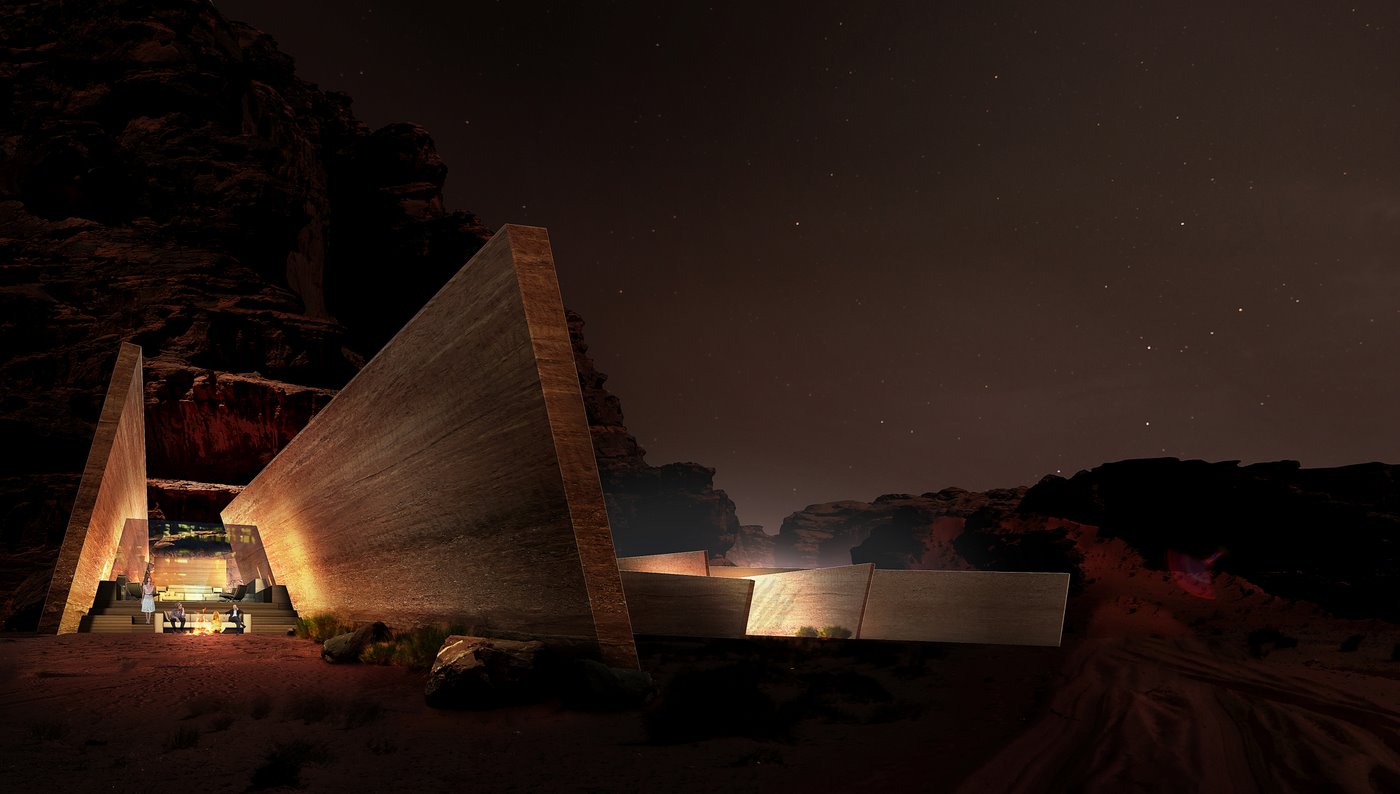
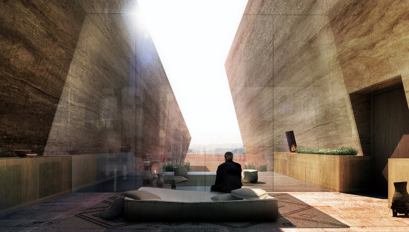
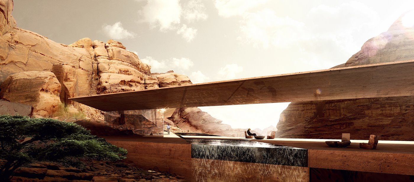
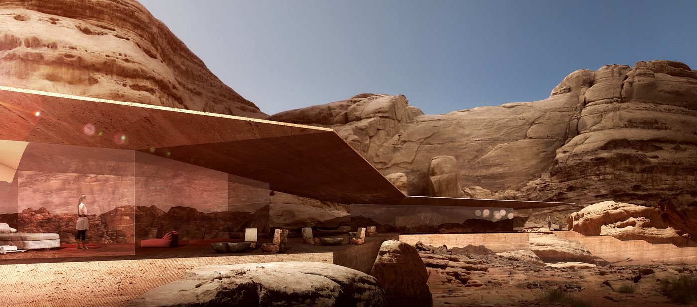
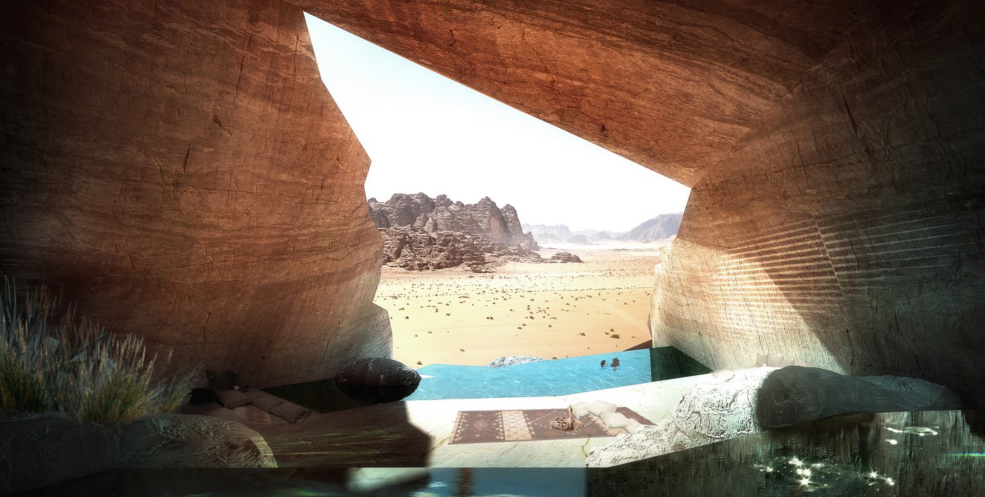
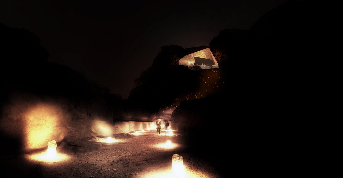
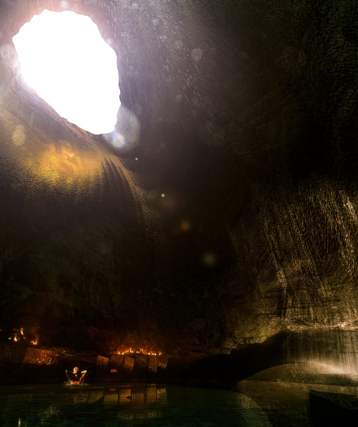
Wadi Rum Desert Lodges Visuals by LUXIGON
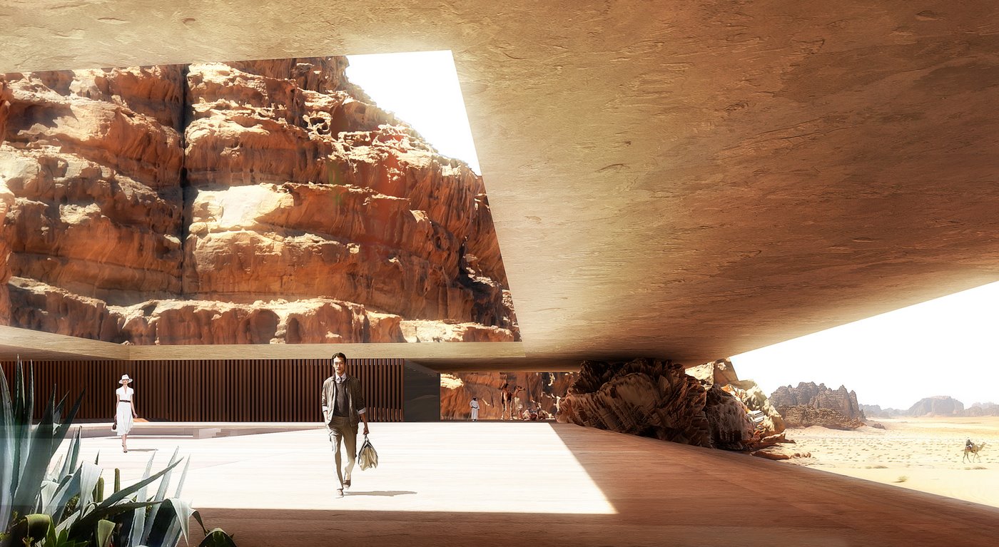
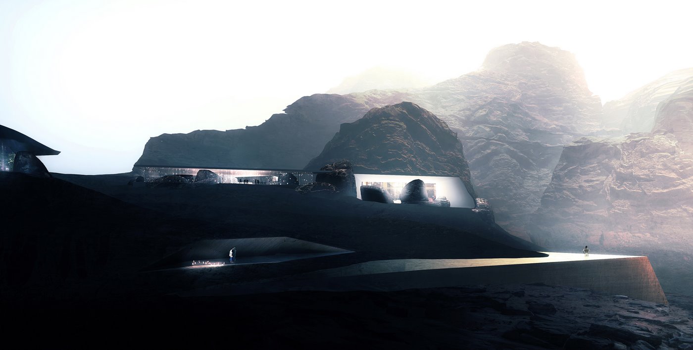
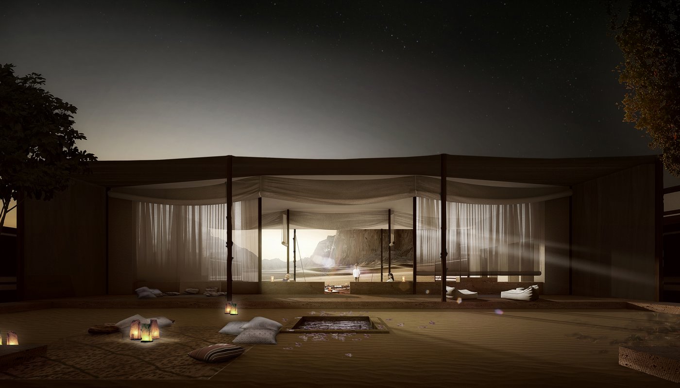
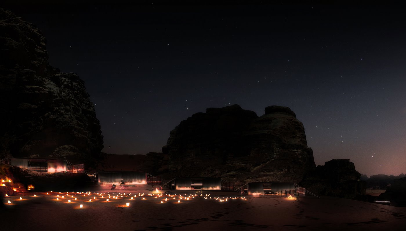
Seeing new work by LUXIGON is always interesting, and their latest work for architect Chad Oppenheim truly amazed me. They produced a series of architectural visuals for the Wadi Rum Desert Lodges Resort in Jordan, an hour and a half outside of Petra. LUXIGON managed to inject a massive amount of emotive qualities into these images, aided greatly by the unique and isolated desert context. I’ve attached a PDF with information about the project and a set of images provided by LUXIGON.
I started an interesting fast challenge on the forums following the discussion that we have here. Do check it out and feel free to participate any time. The guidelines are to take the basic set of information provided and get a result within 2-3 days time max (you need to state your starting time and end time for the results you show)
Go ahead and show us what you can do…
In the files box below you will find a PDF with a brief about the project and a high resolution version of the preview image you see above… It’s very interesting to see the full near 5000 pixels wide image.

that’s beautiful! trully artistic. At first glimpse they look so simple, but… captivating. The representation of architecture is so intense, that You could almost feel what it would be to sit or walk around there… and this is the aim of all the artfull rendition – a lot of renders we see online really miss this, miss all the emotions.
My favourite one is ‘Wadi Rum Lodge 4’. Hovering portion of the house attracts attention like a beautiful women walking down the road on a sunny morning =) (thought the tree would work way better without saturation, just a plain siluet in the shadow – that’s just my personal oppinion)
Nice to see some stuff from giants! would love to get some more =)
I’d like to see some more full res crops or higher resolution images because I am not convinced by these and the one high res image provided has big issues. There appears to be quite a few aliasing issues, bad masks / selections in photoshop, low res textures and texture mapping issues.
Don’t get me wrong, they have a great look to them as conceptual images but I think the quality just isn’t up there with their usual imagery.
Who cares about “issues” ? The point is on the composition and the feeling… There is less focus on technical side, it doesnt want to be perfect technically, technique is only tool not the goal. Thats why i dismiss cgarchitect and other sites preferring realism. Realism -as style- is undistinguished and limited, and the good architectural graphic absolutely rejects these things. Good architectural graphic only cares about transmitting the essence of the conception, with its own specific way.
thx again for that proposal…
I fail to see the qualities, my eyes get stuck on bad textures and overly simplistic emotional elements (Wadi Rum Lodge 3). Maybe I’m just more of 75% render – 25% photoshop type of guy, but these images lack the slowly emerging details and qualities of say Betrand Benoit’s.
Very nice ! Composition is each time spot on.
@Jason why focus on a technical aspect ? Plus, I don’t see any aliasing problem, and low textues have their charms 😉
I agree with you! Art is art, totally subjective and we all get to have our opinions right?
..but let’s be honest, there is a line between what these days is a fantastic architectural rendering and what makes a beautiful matte painted concept rendering. This lies somewhere in the middle, in my opinion…
The bad aliasing and chop shop work is in the full resolution image, around almost every opening to interior spaces. The jagged white line….eh?
20 images = 6 days. Low res textures were our lowest concern at that moment. Just sayin’.
I guess that puts things in another perspective!
Impressionnant !
Although perfect, all-3d renderings a great, we DO work in an industry with hard deadlines. I`m trying to develop a workflow like this…
I’m not ragging on the images by any means, just saying that there are issues with them, technically speaking and not everything by a firm or studio that has a name is worth praise. We all do work that is just ‘ok’ from time to time…
I work in house at an architecture firm and your 20 images in 6 days comments does nothing to impress me or give room for a reason that something is sloppy. Hey, I drop quality left and right and cut corners to finish jobs every day. It’s just the reality of our industry these days, short deadlines with a lot of images expected. Just sayin’
6 days?! Sir, you are champions!
Amazing story telling- spectacular visuals,
you have captured the soul of Petra as one of the wonders of the world, these images are the pride of architectural visualization. Good find Ronen!
Technical issues and details are not what makes the quality of an image imo, i think it’s more design quality, emotional and artistic sense . This images are there to illustrate an architectural idea and concept, not to showcase technical abilities or architectural details. my 2 cents 🙂
Seeing images in full high resolution by many artists will show many problematic issues of modeling, texturing and other things too… the thing is no one ever really sees them as such, and this is mostly intended for print were a 5000 pixels image gets to be an A3 at 300DPI and so many of the things you see in 100% on screen is much smaller on page.
One must consider the way the images are being presented and after Eric mentioning they did 20 such images in a 6 days stretch… I dare anyone to even consider getting into doing just one Bertrand type image at 5000 pixels in 6 days (Bertrand excluded.
I got to see LUXIGON images at original resolution first time during the interview I made with them and I was surprised to see how things look at high-res and yet be so remarkable and really “kick” you inside.
Being technical and precise is not the most important thing, the overall impression, conveying the core ideas and making it within the set time-frames is key.
Now I am more of a 75% render – 25% post type of artists. I tend to try and do most things in 3d and in pure rendering but time and time again this pre-position of mine is being challenged, not only by my own thoughts and feelings, when seeing such work by LUXIGON, but also by comments made by friends, architects and clients I work with.
If i try to think about it in more depth – seeing an image made by Bertrand, Benjamin or Peter is much more appreciated and the amazing factor is greater if the viewer is a 3d artist such as ourselves. Others might not appreciate it more then being a great photo or actually just a normal photo… they are used to see photos all the time – so nothing special here.
Even funnier is the fact architect clients push towards less photo-realistic visuals to hide or enhance aspects of their design… so no point in being so photo-real or super detailed.
The latest set of images by LUXIGON do not look like photographs… they are much more then that.
completely agree with You!
And guys, don’t mention gods names without a reason… Just jokin’! (we all know they are ubnormal =) in the best possible way.
Well put Ronen.
But, to be fair, Betrand’s work is also much more than just photographs, it’s just that he’s more subtle, more refined than this I believe. I get so much emotion when looking at his renders -emotion that is, not drama.
I still love these BTW. I believe one has to be able to produce both kinds of viz.
So, work on your Photoshop kids!
Ok, I agree with almost everything that you said, but if a company like Apple was to say “forget the quality on this round of ipods because we have to push out 2 million in three days!” what happens next? Just food for thought.
I think you took my initial comment out of context. I even made it a point to say that the images were great, just lacking attention to detail that could have been there with a few minor tweaks.
No reason for anyone to take offense here.
None taken, I actually appreciate your comment and think you are correct about what you are saying… it’s just that even so, knowing about these technical issues, the image really inspire me and have a ‘Wow’ effect that many super great, pure 3d, all in render, technical images can’t even reach.
It’s make me think about were I put my efforts in relation to the outcome taking time and budget constraints into consideration in our daily work.
truly inspirational, fantastic work!
great concept art!
I like the quality of the background plates; it adds to the style and feel of the images. It’s a hybrid between a photomontage and a full CG rendered image. To create that amount of work in that short space of time and still inject the images with emotive qualities is a job well done.
Very nice work.
I think these images are absolutely fantastic. However I have noticed that some architectural visualisers prefer the really clinical look with high resolution textures, razor sharp edges and most of the stuff done in the render itself with relatively little in post production. To each their own…
Personally I’m not a fan of that style so much, because I feel it leaves little for the client to get ‘excited about’. I prefer to communicate a ‘feeling’ of a space and leave the more detailed images to a later in the project.
It takes a real artistic sensitivity to create images like LUXIGON do, and sometimes I find those artists that are more technically based get rubbed the wrong way when images like these pop up because there are ‘bad masks, aliasing problems, low-res textures’ etc. Sure, they may have those, but I would take that for an image that makes me say ‘wow’ than for images that are technically perfect but dull anyday.
75% Photoshop and 25% rendering FTW I say!
In my opinion great visualization is a mix of both art and craftsmanship. The second element seems to be missing here.
The question is, what is visualization for? Is it for showing ideas or is it for evoking emotions?
Sometimes details can be blurry, sometimes even they should be…
I think the visuals presented are absolutely breathtaking. I think Luxigon has done well in capturing ‘the spirit’ of the building.
Beautiful images! I think arch. viz is more about evoking the mood and feeling of a space rather than mimicking a perfect photograph, although each has its place, and they`re not mutually exclusive. What I love about these kinds of techniques is that there can be so much detail that would take ages to model and light correctly. Collage and painting in Photoshop doesn’t rely on any kind of rendering ‘feature’ to work.
I am wondering what would one do to have fun in desert.. in a day time its way to hot so no way you going out….. at night its way too cold and u cant go out cause of snakes and stuff 😉 strange place to open lodge..
I like it!!!
Wouldn’t you just love to get hold of one of the PSD’s and devour it!
yes Id definitely would love to get that kind of insight.
Whatever works.
We will probably work cleaner starting now. I can’t promise… but we’ll try.
Just have to figure out where we put those huge tif textures. I’m done with low rez jpg.
IMO at a competition stage it’s better to go a little rough. Better to not shoot your own foot by saying/showing too much. I kind of like the collage feeling. We’re demonstrating a concept here not an actual building.
“Whatever Works” That just about sums it up! 😉
(great movie, btw)
All this remember me museums, where a lot of people (like me) goes at 30cm from the painting trying to understand every single stroke, as if the real magic was there…
Great job indeed for 20 img in 6 days.
This discussion here turned to be very interesting and about core issues of our work.
The time constraints Eric mentioned, the number of images they been asked to deliver and the Whatever Works phrase got me thinking about trying to explore this more.
Any takers on doing a “Fast and Awesome” mini challenge during this weekend? I have a nice dual tower model we can use as the subject matter for such a session, and it can run on the forums.
What say you?
that could be a great experience 🙂
Well, the experience is live on the forums. I call this the miniMAX session – The Black & White Towers.
Have a go and I invite all to join too 😉
http://ronenbkr.mn/iZgUhM
I would love to share some ideas/methods on specifically these style of images. I also beleive there is still much to be explored in this workflow.
Take a look at Vyonyx, for some more examples of how its done. They even have a timelapse on their website of them painting an entire scene using 5% render 95% Photoshop, its called Quicksilver I think.
I just wanted to ask LUXIGON guys, did this job turn out good?? I suppose the answer is YES!
Well, that’s always behind every single commercial work. The artist eye is one thing and you can setup your scene and props and lights, but the one of the crucial element is knowing and recognizing client vision/style and implement that in your daily cg workflow.
Sometimes one is supposed to give all the creativity to flow into renders, but there are moments, you have to deliver final composition on time even if it looks like a draft.
If you can see satisfied customer/architect when you deliver your work, this is great feeling. Than your sketch looks like unique style, even if it’s “draft like”..
Considering those 20 images = 6 days, i think that’s great work and seeing all other work from LUXIGON, i must say i love it!!
Thanks LUXIGON and keep up with the good work!!
Thanks Ivo.
Yes it turns out very well in the end- ultimately, they won the competition (which just can’t be bad)
That said
I’m very seldomly satisfied with the job we’re doing. I too can see the jagged lines and low rez textures. It’s defintely not perfect by any means and I do understand the criticisms because I agree with most of them. Loving what we’re doing is not mandatory. We did it this way because it seemed to be the best options at this moment.
Boys don’t cry.
I started a session on the forums related to the discussion that we have here. It is basically about doing the maximum you can in a minimum time… Whatever Works, right!
Do join in at – http://ronenbkr.mn/iZgUhM
I like the mood of those images very much, its very hard to create this, especially the dark ones, impressive work!
I agree with most people here that renderings don’t have to be too techically acurate in order to convey architectural concept, especially those images that show unusual designs. By the way, if you look closely at Leonardo Davinci’s famous artwork, you will see a ton of imperfections, so my opinion is that if you overall image impresses the people, then imperfections that exist in that image will not make it less impressive.
Absolutely outrageous look. I really do not care about what is the percentage of a render or post. Much more important that the master show his new fresh view on visualization. And falling in love with this type of new architecture, fully integrated in the Mother Nature. Dead clean photo-realistic renders and old 60-s glass&concrete are boring and lost in time. Voting for 80% imagination, 20% talent, 100% love and passion for beauty
Really gorgeous!, I’m trying to learn and it’s a lot of time I’m studying for it but when I found this post I think I have to begin all over again. After having red I think I have to change my philosophic approach to the work i’m doing and using resources in a different way to be more fast in having results!
Thanks for your post Regards
Marco
the cutted mountain looks kinda vveird
It was you! I always thought they were amazingly beautiful poetic images. Although quite doubtful of it’s architectural design.
This has turned out to be one of the most interesting discussions i’ve read lately. I actually am in the middle of quick work so I’ll have to keep reading some day else, maybe never, cause I might fall in to another job like that soon. It makes a very good example of the day to day issues of our labor.