


Render vs. Photo / The Trojan House
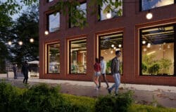
I’ve posted about the Trojan House by Jackson Clements Burrows Architects almost a year ago and seeing Behrendt’s rendered versions based on it on the forums sparked the Render vs. Photo theme I play with all over again. As you can see in the image above, even though he didn’t actually went for total resemblance, the match is really good!
Behrendt made two more renders with similar viewpoint to original photos taken for this house by photographer Emma Cross. Again, not aiming to look-alike completely, but very interesting to see that interpretation.
Here is the first…


And second…


I like these attempts and studies based on real photography, since you learn a lot from trying to mimic the photographer and his camera, so I’m making a dedicated category for it on the blog and invite you all to share your works with us on the forums and i’ll make sure to plug it in here too.
An additional great case study can be seen at the post about the Dolomites House by JM Architecture with the rendered versions of it by Bertrand and hcpiter. I hope to be able to post more of these on a regular basis so if you see something you like, let me know.
You are welcome to comment on this article and ask questions using the comment box below!

Interesting post, and lovely images all!
A former colleague of mine, Peter Guthrie, once did the same comparison between his renderings and my photos of a landscaping project by 7N Architects:
http://www.peterguthrie.net/blog/2010/08/the-phoenix-flowers/
Interesting comparison – the night time visualisation in particular is perhaps more successful than the photo.
PS. Dave Morris – we prefer ‘public realm’, rather than ‘landscaping’ 😉 but yes, Pete’s visuals are fantastic compared to the actual construction
aww comon… that’s just a bad photo. The photo wasn’t even taken at mid day as the rendering was rendered out in the very first image set and the rest are just bad photographs.
Bad photo or not… there is a photo-matching process here that we can learn and comment on – as you did.
As for matching the camera position to the original photo, I think it is very good – though, not that hard as it is a single point perspective.
As for other aspects, such as material & lighting, it is clear that pure simulation was not the main aim here. Even so, this is a great showcase and starting point to what I hope will be a valuable spot on the blog – Simulation of photography and what we can learn from this process and incorporate later in daily work without any prior photos to look upon.
And that’s the point. As soon as you see great photos you want to recreate them and use as a template to reapply in your work. However this is when we come to the point when we must talk about not simply recreating a photo but go further in materials, composition and everything that could bring out more and more. That’s what Behrendt try to achieve but we could far saying whats better and whats not.
Personally I think the dusk photo works better perhaps because of the more intense terrace lighting (I wouldn’t go that far though) and the atmosphere due to it’s colors and intensity. Also the perspective is a bit more dramatic which helps to exaggerate the shapes of this building, however really good try. The interior shot is definitely better rendered I would only soften the IES on the floor but that’s all, it looks much better.
Definitely waiting for more projects
I just found his recent work today. I thinks he’s pretty good with the kitchen scene but take a look at it
http://www.ronenbekerman.com/forums/finished-work/719-tribeca-loft.html
Stay tuned for more about this project 🙂