


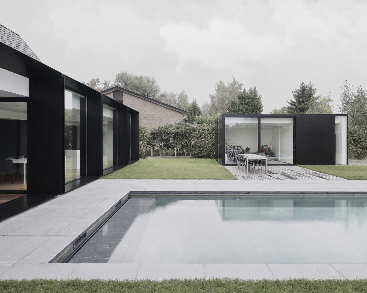
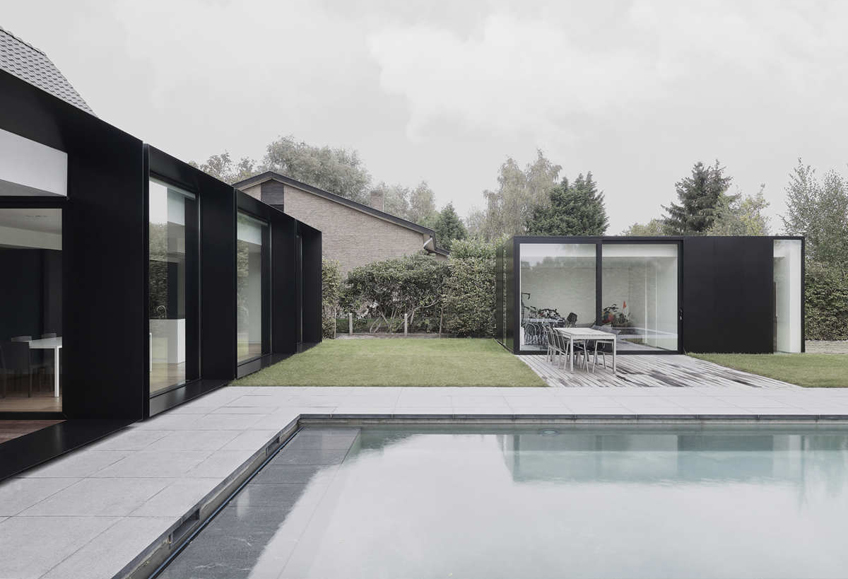
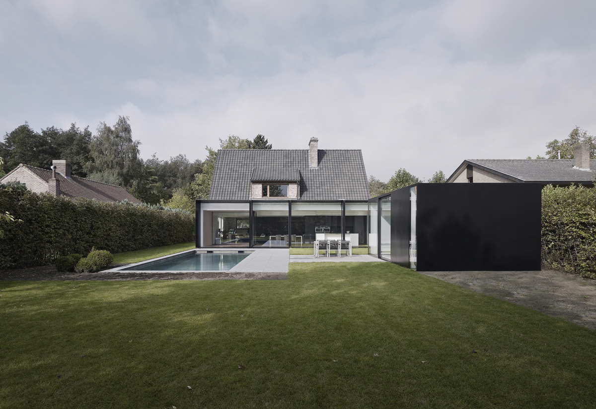
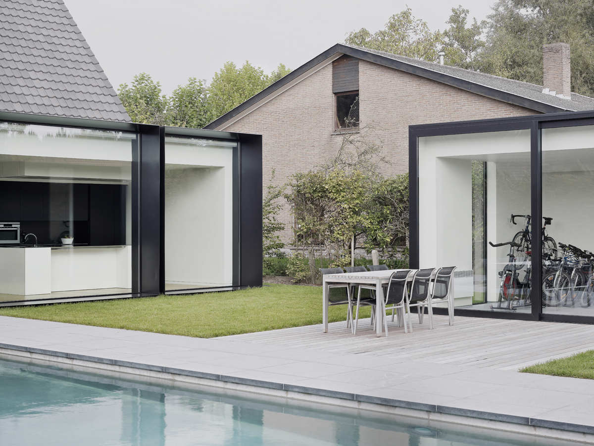
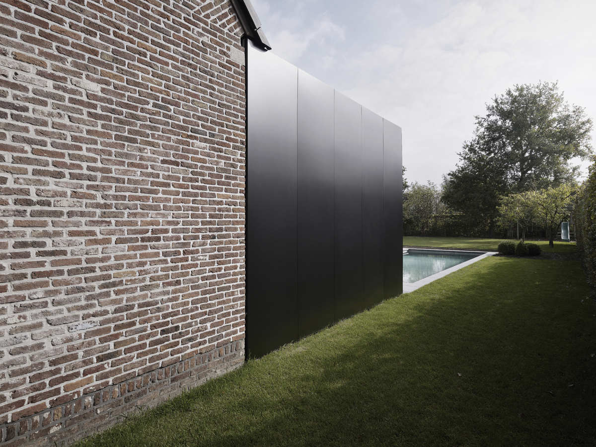
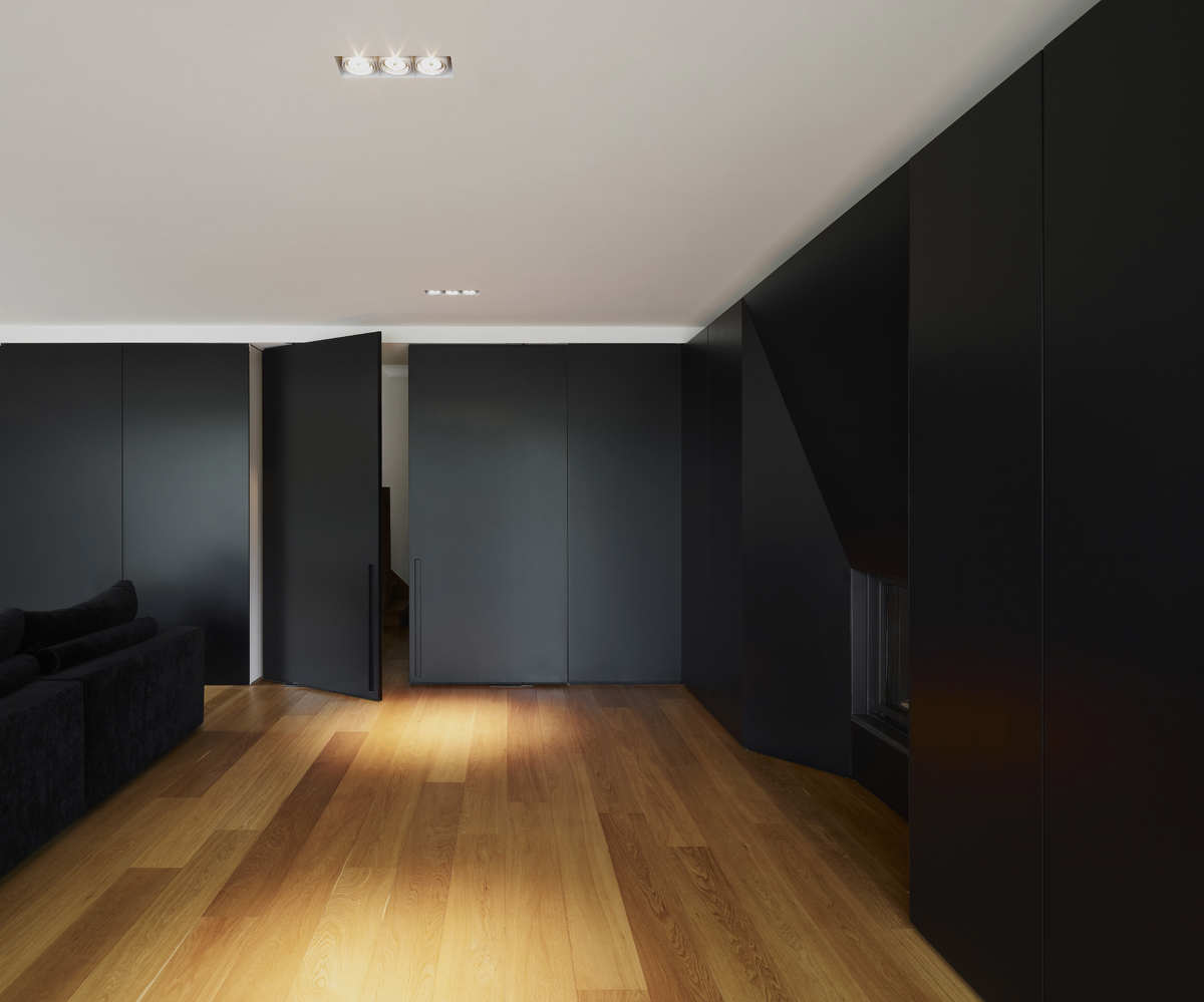
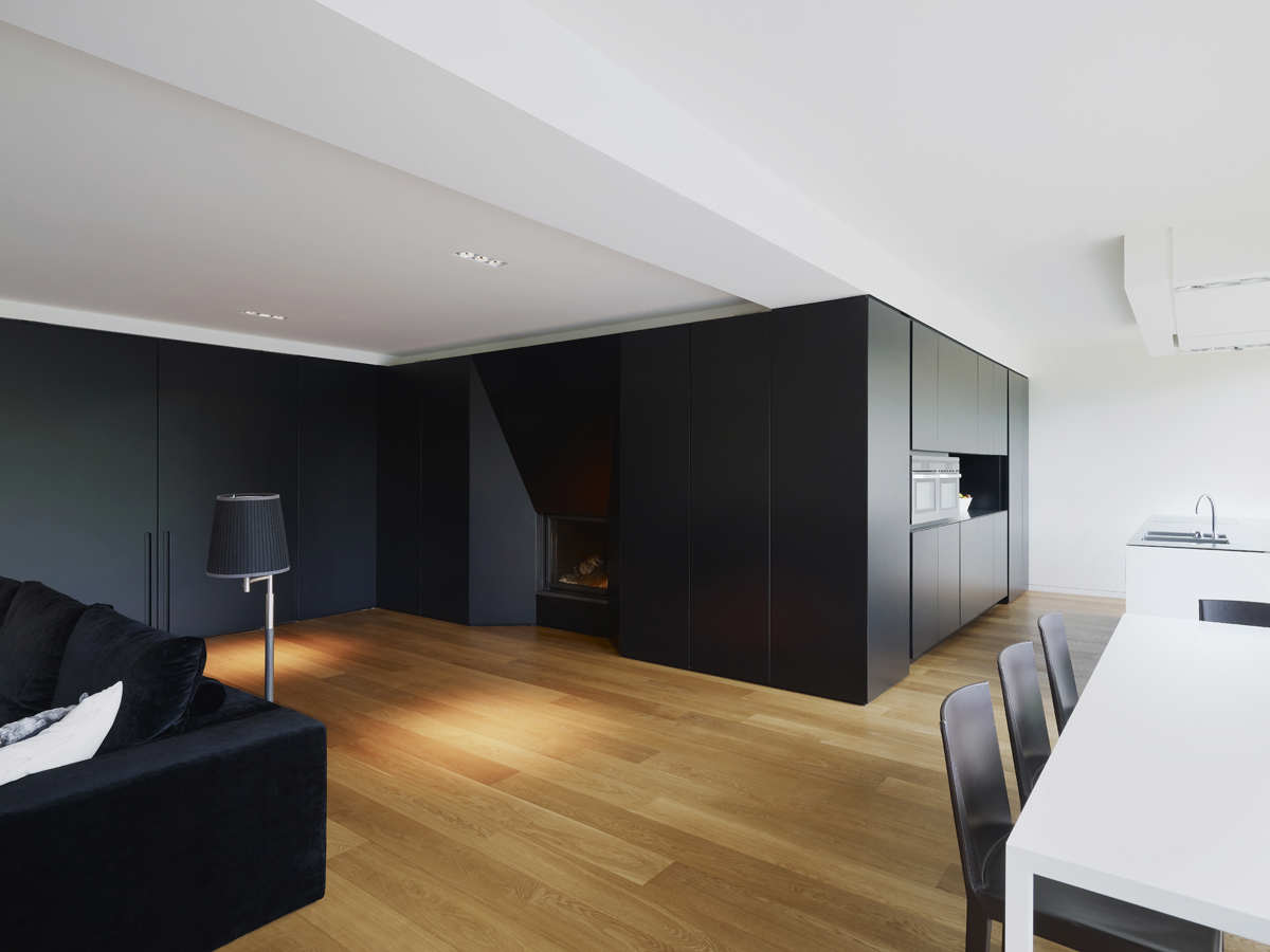
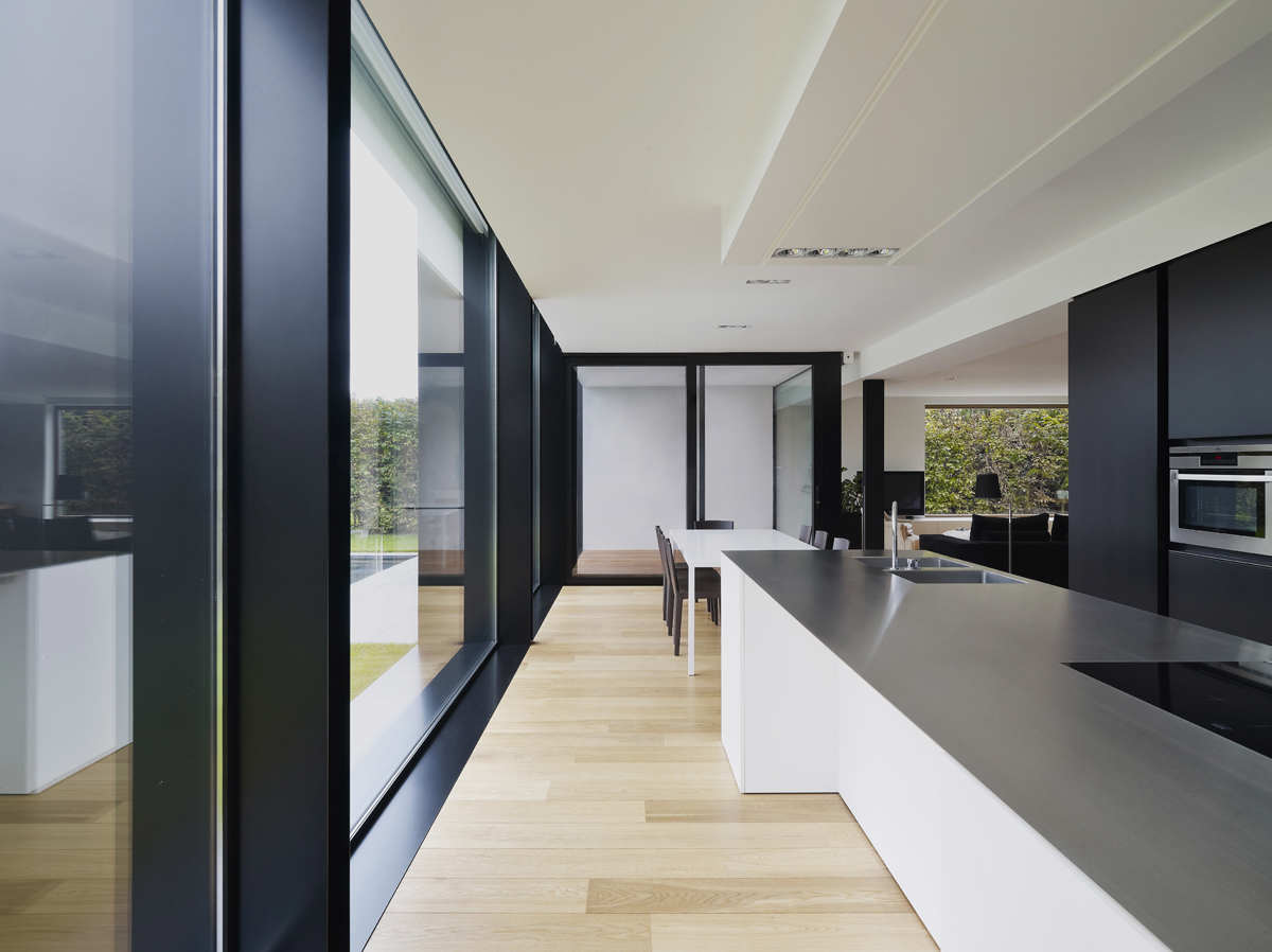
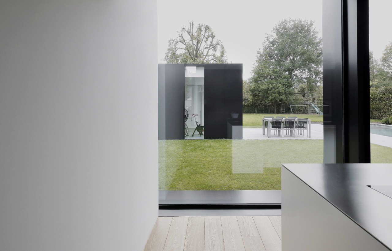
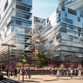
House DS / GRAUX & BAEYENS architecten
Jump starting this week with an inspriation piece from GRAUX & BAEYENS architecten. The photo set taken for their DS House by photographer Julien Lanoo have a very familiar look & feel to them… can you guess what I’m thinking about? Some of them look more like renders then photos, but I like it. The toned down colors, framing and the great reference these are for materials such as grass, glass, metal & wood.
Photography by Julien Lanoo
original post House DS / GRAUX & BAEYENS architecten at archdaily
@ronenbekerman beautiful extention! Seen it a while ago in #Architizer =) Thought i’d prefere rusty look instead of black finish =p
@tomglimps That black gloss look super cool to me 😉
It’s hard to look at these and not to think of Peter Guthrie’s images.
@BBB3 My thoughts exactly! 😉
@ronenbekerman@BBB3 lol, thats what i thought when i saw the pic on the home page :)…i though…oh not again :))) another day in envy :)……but really….i thing those photos are photoshoped a lot in some places…you can tell on the bushes and on the sharpness of some elements when you compare the background with the foreground ones…………………and then again…i would not bet if those werent renders 🙂
The first two images are a bit too washed out for my taste… Inspirational none the less!
@Vpower This washed out look is kind of refreshing for me. it makes for a photo in “limbo” not fully real looking / almost like render at times – Could be interesting approach in rendering as well.
I also like the washed out look. But then again: on graux-baeyens website the images look far more saturated…and therefore more photo like. Am I wrong?
@micarstens They do look much more saturated… maybe a bit too much. I wonder why archdaily showcases them as they do and the architects otherwise? I do feel the washout set is more “presentation” like, no?
I agree. Anyhow, thanks for the link, Ronen, they have some very nice projects on their website!
You really have to write if it is a photo or a render. With the quality of some artists, it’s hard to tell!
@kainfury Dude! I did 😉
@ronenbekerman
Haha, yes I see it now. 🙂
I actually think if someone were to create this in 3d it would actually look better than the photo! could be a good challange? 😛
@ArkinAdamEsref
I agree, I would see this as a night render, with nice light reflections in the water.
@ArkinAdamEsref Any view in particular from the set or more then one 😉 ??? Could be a nice challenge!
@ronenbekerman@ArkinAdamEsref Any view would be nice – Maybe the challange could be to create an overcast / de-saturated image similar to these? Just a thought 😛
I must say this really reminds me of Peter Guthrie’s work. When I first saw it, I was like “Awesome Renders”, so realistic, only after reading and looking closer I saw it was photographic. Good to see photography try and go the other way round. Refreshing
What a great set of photos…I really like the architecture, its forms, finishes and the way the photographer has controled the saturation, specially on the exteriors. The style of the photos matched the design, the bricks and cool black gloossy finish perfectly!
hey guys,
thanks a lot for the interest in our work,
much appreciated
koen & basile
Graux & Baeyens architects
Lovely architecture. Though I think the old house, in particular the roof, could use a little refresh to blend more in with the minimalistic new.
hey! i was wondering what material was used for the black walls?is it some kind of metal plating?it looks very modern
I love