


Composition.
The need of compositing the image did not come up until I had enough envirornment elements in the scene. There was actually a primitive stage of composition during the concept: choosing the point of view and what the image has to offer itself, what it wants to transmit. Now it’s the time to make the right decisions and contribute to the early idea of the concept.
This stage came up while I was modeling the background and the terrain that I had from the sketch. Since the outline has a landscape ratio, I started taking a preview with a horizontal image aspect. I used the photography standard: 3:2.
The first decisión to take was if I would use a wide-angle lens or a telephoto setting.
The ideas I had in mind for the image when I did the sketch were to transmit serenity, armony and romanticism of a simplier era. I wanted the building to appear massive and heavily lying in it’s foundations. I wanted to create different layers of scale and also different depth planes to locate the building in the middle of them.
I made two previews. One with a wide angle and the other one with a telephoto.
Wide angle is really cool. I really love the vanishing lines it offers. It gives the building a monumental look. Everything is dynamic and fun. Also things are easier: The camera is so close to the building that you don’t need to model and shade a vast extension on your scene. As much as I love it, it wasn’t what I was looking for.
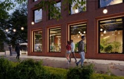
The telephoto offered me the stability I needed. The pine forest draws a perfectly horizontal line in the sky and the trees show up from behind the building. If I close my eyes a little I can start seing perfect lines and basic shapes. Mondrian-like. That would definately work on strengthening the message.
Now that the first big decision is made. The second one shows up inmediately: the image ratio.
I like to use the ratios that photographers use in the real world. I think this choice is very important as it helps a lot on transmiting what you have in mind for the image.
Once more, I took a set of previews with different ratios and formats. I did include a versión of the image with a wide-angle just to see what would happen.
Vertical format could have worked. It balances the predominant horizontal lines with it’s ratio. After a lot of thinking I chose the 1:1 ratio. Square format. No direction. Completely static. Reinforcing the message.
Now I could continue working on the enviornment. Last stage of compositing (and this stage lasts until the very end of the process) is positioning the diferent assets in the image. I will talk about colour, saturation, depth and levels in the postproduction updates.
I was really missing a strong vertical line to compensate all the horizontal lines in the frame (If I had chosen the vertical format, I wouldn’t have had this problem). I had the trees in the background but they where not enough. That is why I decided to place two more trees in front of the building, left side of the image so it balances the museum big shape and redirects the eye of the observer to it. I will use the intersection of this strong vertical line with the horizontal line of the terrain to set a point of interest. I want to make at least three of these. It really helps making the observator eyes travell through the image.
I am posting the second modeling update now as it was a parallel process.
I want to take advantage of the weekend, so if there are no surprises I will post the shading and lighting updates in the next days.
Thanks for reading! Cheer up guys!!!


