


Tomorrow Challenge entry by User-17821908
Thank you Tomorrow team, Ronen and all the participants for this opportunity. It has been great to participate on this contest.
Good luck to everyone and keep the good and hard work!
Access the Best Articles about Architectural Visualization. Learn about all aspects of crafting images that tell stories.
Making Of's Case Studies WorkflowsShare your work and get immediate appreciation through discussion, feedback, and a possible nomination for the…
![]()
A weekly experiment, exploring the creative minds in Architectural Visualization and more. Find out what makes us all tick and push the limits.
Listen Now! Subscribe on iTunesOut with the old and in with the new! In Converted, I’m asking you to take an in-depth look at existing architecture near you or one you love worldwide and introduce something new.
See Entries & Join! About ConvertedThank you Tomorrow team, Ronen and all the participants for this opportunity. It has been great to participate on this contest.
Good luck to everyone and keep the good and hard work!
A really cool thing about archviz is that you can take a photograph of impossible things.
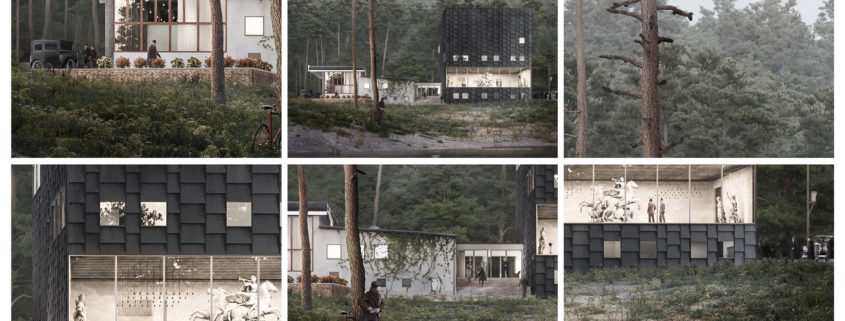
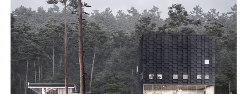
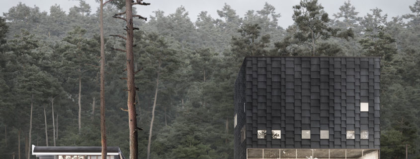
Something I like very much is to look at old photos of places and buildings I come across daily and realize how a different context can have such an impact on the same object. I want to do a little trick here and it is to translate the building not only to a different place, but to a different era. And of course, as much is I love it, this era could not be other than the 1930’s. As if the restaurant and museum were built at the same time.
Postproduction is my favourite part of the process. I guess I am not alone in this 😉 Everything is so flexible and inmediate in comparision to 3dsmax that it really mean a big breath of fresh air to the process.
The first step when working in photoshop is to use one of my actions to create the project folders. Needless to say that, if the organization in 3dsmax is important, in photoshop is essential. A correct folder structure is a must. Also using pre-programmed actions saves a lot of time for mechanical processes like switching masks to channels (img.1)
I set up masks for everything in my image. I do not want to waste time making selections and if I have time I will retouch all the elements that appear on the scene.
Another essential part of my workflow with photoshop is the use of “helpers”. These “helpers” are filters that isolate value, saturation and tone. They are really really usefull when giving unity to all the different elements in the images. They also become necessary to integrate the assets properly. (img.2)
One more thing that is also really important: Getting the zdepth element in 32bit. This allows to have different “versions” of the zdepth allowing you to a better control of the space between the camera and the objects. Zdepth works great for depth of field, but it has many other interesting uses. You can simulate the “atmosfere” with different zdepths and give profundity to the image. And is also great as a mask for let’s say saturation, value or whatever. (img.3)
Introductions appart, it’s time to get messy. I start working in the EXR 32bit file. I create different exposures versions from the original and mask them. Then I start “painting” light and darkness as if I were manually building a high dynamic range image. I usually get free license here and star being more artistic and less square-head. (Whole process can be seen in img.4).
Next is using the render elements globally. Reflection, Total light, global ilumination, speculars… They will almost always enhance the image in no time.
Next is adjusting the items one by one. I like to use levels and the burn and doge tool to sculpt some more light.
In this last step I also adjust the global value of the image with the help of the value “helper”
Next is adjusting the saturation of the items so they appear homogeneous in the imgage. Saturation helper used here.
Now it’s time for the tone. I choose my color palette and match it with the tone helper. As I said, these guys are very usefull.
When I have a catchy image and I’m happy with the mood it’s time to insert the assets:
As I did with the ilumination stage, I do a sketch of the assets that I want in the scene and their importance (img.5). It is about to tell a story so there must be a protagonist. Mine is going to be a newspaper boy who has already finished his work and decides to relax in front of the new museum building. Everyone in the city is talking about this weird cube that hosts a renaissance sculpture exposition. The kid is just there leaning on a tree smoking his pipe when something calls his attention.
Once the story is set up (I’m sorry to disapoint, no gangster firing this time :D), it is time to get the assets themselves.
As I said in the concept stage, my image is based in the 1930’s… so to get people cutouts I am basically using some scenes from my beloved movies. I just have to look for the perfect positions, camera angle and lighting conditions of my assets and export the frame where they are (img.6).
I merge them in the image using my old friends “the helpers” to integrate them.
Lastly I add some extra effects as depth of field, LUTS and final retouch in Camera Raw and voilá! C’est fini.
Rush!!
Lighting
So far the scene has been illuminated with a fairly flat ambient light. Once modeling and shading are over, it is time to try different light conditions.
I do not like to do lighting tests with clay models. The materials have a fundamental impact on the lighting of the scene when bouncing and absorbing light. That is why, even if it translates into slowing the process, I prefer (when there is time) to do these tests with the shaders shown.
Before I get to illuminate the scene I take a preview of my image and draw the lights (img.1). The goal of lighting is to get the sensation of volume in the objects. Achieve the “chiaroscuro”.
The method I usually follow to illuminate is the following: I establish a hierarchy in the lights that illuminate the scene according to its function.
The primary light is that which establishes the direction of light and the most important in intensity. Secondary light balances this primary light in direction (not necessarily opposed) and intensity. It is not a matter of fighting between them, but of complementing each other.
Then there are tertiary fill lights that illuminate those parts where the other lights do not reach.
Finally there are accent lights. They do not contribute practically to the scene illumination but they paint flashes in parts of the image.
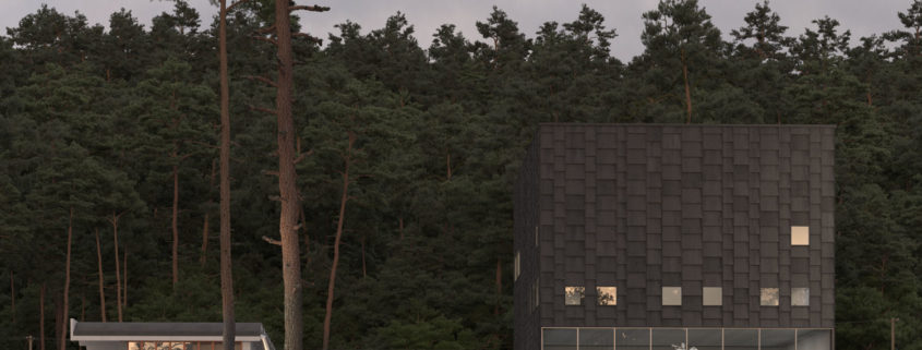
In this image, however, I have changed the rules a bit. I do not look for strong light with marked shadows in the environment, so I’ve tried several HDRI’s until I found the one I was looking for. (Img.2) (Marked in blue in the sketch)
I do not have a sun on the scene.
Once the environment is lit, I drew my attention to the small windows that do not constitute an interesting interior space in the image and I have treated them as if they were accents. (Marked in yellow in the sketch)
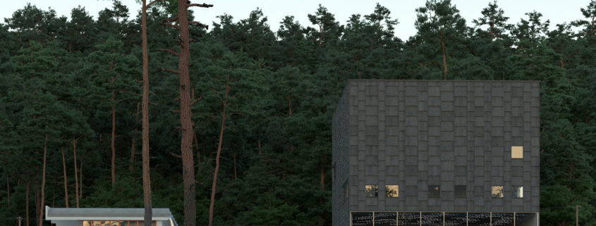
Once happy, I have illuminated the exhibition space following the rules described above. Primary light from the ceiling, secondary lights in statues, tertiary light in beams and accents in the luminaires. (Marked in white in the sketch)
Finally, I sculpted with light the key objects of the image: trees in the foreground, path, car, steps and facade of the museum. (Marked in red in the sketch)
For this process I use Vray light lister. Essential to efficiently manage all the lights in the scene. (Img3)
At this point it is likely that some of the materials need to be adjusted because of the change of lighting conditions. Nothing that can not be done in postproduction.
I’m going to rush the postproduction tonight! The end is near D:
When the shading stage arrives I always think about what are the most important materials of the image so I can focus my efforts on them.
In this case, in order of importance, the wooden planks of the museum facade would be first. Closely followed by the soil and the foreground vegetation. In the last position we have the white plaster and the concrete that dress the restaurant.
To create these materials I used substance designer (all of them but the terrain shader that was done when modeling the environment). I wish I had known the existence of substance before. Incredible! It greatly shortens the process of creating materials by its real-time viewer and also makes very enjoyable and fast creating materials with it.
For the facade I had some textures that were almost perfect. The only problem were the wood knobs. I got rid of them via photoshop in no time and everything was ready to jump to substance. There I created the specular, glossy and normal maps from the diffuse. Once I had the node tree I replaced the original bitmap with the 11 different difuses and suddenly I had 11 full maps ready to load to multitexture to avoid repetition. (images 1 & 2)
For the vegetation I have used forest color. Also very powerful. I have used its function of taking values from a texture and “tinting” the elements (leaves) of these random values. That is, a good randomness in a single click. Magnificent.
To help set the mood of the image I have resorted to several free 3d models that I have textured very simply as they appear in third plane.
The summary of the shading phase would be: Substance designer, forest color and references, lots of them 🙂
Modeling 2 – The place.
I did not want to neglect the environment because I think it is on the same level of importance as architecture. These elements are what really set up the mood of the image and helps me tell a story.
I wanted to take the opportunity to learn (although in a very rudimentary way) two softwares that I want to master as earlier as posible: substance designer and zbrush.
In substance designer I created the material of my floor (one of them). I have not used it because I wasn’t happy with the result, but I have realized the potential of this software: You can create a material with a billion nodes but, in the end, you’ll end up exporting only four maps that contain all the info to 3dsmax. This way you save max to calculate all the nodes and saves great time! You can also export parametric materials to 3dsmax which is very interesting.
I have created the geometry of my terrain in zbrush, and the truth is that I felt like a child sculpting in clay. I think I’m going to implement it in my workflow just for the fun :D. The result is very simple, but it has provided unevenness to the ground.
For the shading of the base terrain I have used three different materials in a blend material to avoid tiling. Although the textures have 8k, it is of little use when using a telephoto lens and there is a lot extension of ground to cover. Fortunately, grunge masks get the work done.
Of course, I have used Itoo’s forest pack to spread vegetation and other elements such as stones, branches or lamps inside the buildings. I have also used railclone though in a modest way creating the railing and gutter (which are presets that I modified a little bit). Would have been great creating the façade with railclone but I have no level for it yet.
I have created more than 10 different forests to give enough diversity to the terrain.
The process images are there to see and are more efficient than my words in this update;)
Keep on going! 😉