Tomorrow Challenge 2018 entry by User-35204214

Since the start I have thought about developing a concept to help me describe a specific moment in time. When I think about my experience as an architecture student, I always remember the moment of presenting a project and how this was the biggest moment of tension. Through this image I want to have as characters, architecture teachers and students. Usually the teacher-student relationship is a complex one, even if teaching has changed a lot through time there is still tension between the two of them. The teacher represents a duality, a person that guides you through your learning process, but it is also someone with more experience that corrects you when you are wrong. In an institution there is a hierarchy and the students look up to their teachers. In addition I thought about these characters and how they are opposites in many occasions. The student is a character that is in need of guidance and that feels judged (Even if he is not) when showing his work or projects.
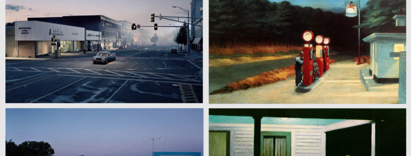
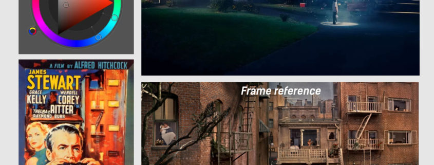
As I said before, I want the picture to represent a cinematic moment in this specific setting with the characters that I have in mind. I want the moment to capture the tension, duality and opposites of architecture students and teachers, to capture the moment and for being able to represent this, I will use the composition as a tool. The palette that I use will show these two sides of the story by using opposite colors. I chose a split complementary palette because the reddish color of the context and the building was very strong, so I wanted a color variety that would represent my concept. I want the warm colors to represent the students by using the building, and the exterior represents the teachers with the opposite and complementary colors, green and blue.
The frame was chosen because it is worked to a vanishing point that reinforces the scenic moment just like in theater, where the perspective gets lost and the characters can be shown interacting in two axis of the stage (Horizontally and vertically); this allows telling the story with characters, which is generally related to the cinematographic context (in the context of narrative photography) where this resource is used a lot and for this I have thought about the movie Rear window by Alfred Hitchcock. Also, I used a wide frame because it permits to have the feeling of being in a cinematographic format. I wanted to show the characters in specific places to form the scene, the mood is captured through the twilight and how the artificial lights interact with this moment. The lightning is a big part of the mood that I want to accomplish, the artificial lights help to add contrast that allow to understand the interior and outside the building.
My concept for the story is: The students are nervous about what is happening before their eyes and they wonder about what they are talking about.

Tomorrow Challenge 2018 entry by User-35204214

From the start I thought about making the material in a non-procedural way, so that I could capture the main characteristics of the building. I separated every piece of the geometry of the corten exterior, I divided them in a similar way taking into account the picture references. It was a challenge remodeling some parts of the building according to the plans so that it could be closer to reality, this included remodeling the structure distribution, the window frames, the glass for the windows and some inner walls that will be seen in the final frame. The next thing I did was to organize the pieces so that they wouldn’t look perfectly straight and lined up, for doing this inside 3DMAX I applied a noise modifier to each one of the pieces that I already had separated, that created the discrepancy between the pieces. I also applied a chamfer modifier with a small size in the piece so that the edges acquired some reflection.

Using the photographic references and the painting in photoshop, I painted, adjusted the color and the value of each one of the 40 panels approximately. When solving each one of the layers of the material, the diffuse layer, the reflectance base that is one of the most important and that showed values in the areas with more reflection of 0,2 in an approximate reflection index of the steel in outdoor conditions just like in the pictures. In its areas with less reflection and that are rusted the values were of 0,036 in a linear space. After solving the exact point of how much glossiness the material had, the values were of 0,4. Then, I painted many of the blended textures to create relief (BUMP). It was a big challenge painting all of this by using photoshop.

One of the main reasons I invested a lot of time in the material is because if you understand the material, you understand that under different light conditions it changes, its color changes and its reflections. Understanding the material gives you the possibility to illuminate without having to fake. Having a comprehension of the steel and reproduce it was a big challenge. Technically, the corten is a mixture of two materials. First, it is a steel that is a conductive, so its base reflectance is higher than a dielectric. In a second place, the rust that is a superficial layer in the material that protects it from the inner corrosion. Components like copper, chromium and nickel are the reason for its reddish color, which it can change its tonality according to how strong or weak is the rusting.

When finishing the material, I did some testing in different light conditions to verify that it would accomplish its initial purpose of being able to recreate a physically correct material that looked natural.

Tomorrow Challenge 2018 entry by User-35204214

MODEL DETAILS AND COLLECTING PROPS

I’ve added some models of Evermotion to decorate the building, for example, you can observe inside the windows some objects like the lamps on the desks, the kevi chairs, some pots, purses, books, etc.

So that the model would look more similar to the reality, I added details on the stairs, I adjusted details on the entrance door, the tiles on the roofs, the sewer covers, I also modelled the floor outside with a floorgenerator. The lamp posts outside the building that can be seen in the reflections.

Inside the building, I added somethings that are important like the ceiling and the ceiling lamps, the wooden walls and some windows inside. Besides, I also modelled the blackouts.

Tomorrow Challenge 2018 entry by User-35204214

THE STATE OF THE ART: THE REFERENCES AND ENRICHING THE CONCEPT THROUGH THE TECHNIQUES

In order to solve my question about going beyond the composition, I started to think about the significance of the references and how they could help me build a complex image supported by the concept that I want to accomplish. I know that my references need to be of great importance, artists whose work have a great amount of detail that are thoughtfully and elaborately construct. It is important to think and analyze recognized artists because they already have a previous knowledge and they have researched the state of the art for creating their own pieces.
THE REFERENCES
Gregory Crewdson is a recognized American photographer known for his “surreal formula, resulting in decidedly cinematic images reminiscent of the films of Steven Spielberg. These photographs have become increasingly spectacular and complex to produce, requiring dozens of assistants, Hollywood-style lighting, and specially crafted stage sets.”-(Guggenheim.org). I chose him as my main reference (Especially his work in Twilight: Photographs by Gregory Crewdson and Beneath the roses) because of his use of lightning that is not only creative, but it makes the particular subjects within the frame to stand out. He has total control over his composition being the light one of his main tools. Besides, even if the themes in his work are surrealistic, he manages to use the lightning in a natural and realistic way.
In addition, he uses photography as tableaux vivants to narrate. His pictures tell a story through a cinematic look in a single frame and his characters are well defined. He is an artist where every object, character, lightning and the composition has a reason to express an idea, an idea that is meaningful to him and that it creates meaning to the observers.
Another reference that I took into account is Edward Hopper (One of Crewdson’s references). “His vision of reality was a selective one, reflecting his own temperament in the empty cityscapes, landscapes, and isolated figures he chose to paint. His work demonstrates that realism is not merely a literal or photographic copying of what we see, but an interpretive rendering.” -(edwardhopper.net) I chose him because of his complex character development and story in a specific moment in place and time.
My references have in common that they use their own vision to show a moment that allows the observer to get involve with the image and interpret it. They all go beyond the composition and their images speak for themselves. They use refined techniques to convey meaning and sense. As Edward Hopper said: “Great art is the outward expression of an inner life of the artist, and this innerlife will result in his personal vision of the world.”

Tomorrow Challenge 2018 entry by User-35204214

First, I reflected on how the image had to look natural and realistic (Thinking about the mood). Second, I thought about the importance of the concept as a tool to narrate a story in the context of the image. Besides, I thought about the idea of incorporating characters that would help me to make clear my concept and story. Third, I also considered the techniques that I had to incorporate to make the concept strong (Lights, composition, colors, the frame, etc.). After considering all of this and in need of developing and building a concept, I asked myself about how could I go beyond the composition and add a sense of what is experienced by a person while being in this space surrounded by the historic buildings and specially the school of architecture?

MATCHING THE ENVIRONMENT: THE KINDNESS OF THE MATERIAL

Taking into account that the main material of the building is an aesthetic element of great importance in the final image, I’ve made the decision to replicate the Corten steel just like in the photographs. In this way, I used an environment very similar to the reference photo and I started to copy the photographic exposure values and the frame. For this, I used the HDRI as the environment and a Sun (Fstorm) to reproduce the approximate same position of the reference. After having done this, I copied the values of the tones in the colors of the material. Additionally, I positioned the building on the map, so that I could have an idea of the coordinates and in that way I could position the sun. Working on this allowed me to emphasize the peculiarities and the kindness of the material and how it matches perfectly with the surroundings.