


Tomorrow Challenge entry by User-18180931
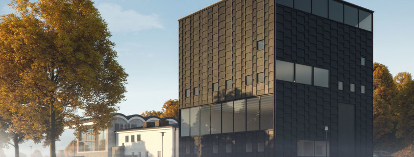
This is an extraordinary extension of a building. It is absolutely beautiful and those photographs by Åke E:son Lindman makes any visualisations completely redundant really. But it is a competition and here’s my try.
I started out with creating a bunch of sketches to get a “feel” for this beautiful building. I tried framing it differently, tried to decide what orientation to use.
I initially thought portrait orientation would suit the large dark structure best but I really liked how this is an extension of an older building and I think the architects managed to marry the two together beautifully. I didn’t want to lose that. I also fell for the arched roof of the older building and thought for a while that that should be the focal point. However, I ended up trying to elongate the structure with angle and focal length instead. I wanted to make it spread out through that park setting I had envisioned it being placed in.
I wanted the final image to have that misty morning feel to it and I wanted to place it in an autumn park setting. Fallen leaves. Dew. First ray of lights finding their way through the trees.
I used the available drawings, googled some additional images for reference. I called Kalmar kommun to see if there was more facade drawings available but I couldn’t get ahold of the right people there. I even thought about calling Tham & Videgård but I ended up eyeballing what wasn’t clear in the drawings.
I did a simple mass model from the drawings which I matched to my latest sketch from a composition standpoint. After that I started with the facade, creating those scale-like elements.
The next step was creating the ground and choosing and placing the right trees for my scene. I used basic Vray sun/sky initially and actually that’s what I ended up using. I was happy with how it “felt” for this morning light tone. I tried a few hdri’s too but I didn’t think it gave it anything extra.
After that I added detail to the model where needed, threw in a car behind the building, moved some stuff around, added a hedge which ended up barely visible in the final image, placed grass and leaves and started with the texturing. Tried different DOF-settings and did a bunch of test-renders before I hit the final render button.
Took the final render after I added some bloom to it to Photoshop where I did a few passes adding irregularities for different sections, created a hint of rays of light at the left side of the image, adding noise, CA, vignetting, compositing gradient and clouds in the sky, adjusted levels and stuff for different regions of the image, bumping saturation for some, desaturating others, did overall toning and color correction. Exported to jpg and tried some different toning and levels of saturation and contrast the that before I decided which one to use as the final image.
What would I have done differently? Well, I guess I could have been smarter with the facade-elements. I first had an idea that creating them in chopped up horizontal chunks would be a smart choice for texturing later on. I did that for one side of the building but swapped to keeping a few elements that I scaled instead for the other side. I should have done that from the beginning. That would have saved me an hour or so and left me with a more clean and better structured file. Beside that I guess I could have spent a little more time with the simple mass model and using test renders of that for compositing in PS. It would have helped me think about choosing image size, composition and framing a few more times before rendering. Yeah, and another thing, I should’ve chosen to include some more space in my final render to have some margin for cropping in post.
Thanks for the opportunity to participate in this contest. It was an honor portraying this magnificent building.