


The ARM Work in process – May 6th
Hi guys,
It has been a while since the last update for this proposal. I hope you are all doing great and be safe the whole time!
From the last post, I simplified the design for the ARM concept. Founding it would be much stronger in terms of illustrating the linking characteristic yet also less interruptive with the surrounding design languages.
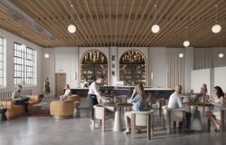
Going through multiple experiments and camera angle tests, I ended up with this one for the first in three final images. Looking down from the top of 30 Hudson Yards tower, vividly highlighting the ARM spanning from one to another building along with exposing user activities within, which I am working out until the final. Besides, There are various building structures and context details I have to add in the weeks to come.
At the moment, I am trying to use different colour schemes for this frame. Attached with the update you will see two of them, I am still very much on the fence so far so please let me know which one would you prefer?
It would be much welcome to hear your opinion about anything!
Thank you for reading and catch you guys soon with another update.
Best Regards,
Duy Phan


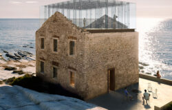
Hi Duy Phan, nice to see your work in progress. You did a good job! ). I think you could do a couple of things in order to make the comprehension of the image more immediate.
Sincerely it took me a while to understand the camera angle and maybe that is not a good thing (but I just woke up and I’m not so much reactive…
https://images.app.goo.gl/pRUpQW2vKBCXqcUVA
This is only my two cent
F
Hi, Duy Phan,
I like the angle, it looks cinematic. I would try to add more dynamic to this picture. You could add more moisture and falling rain from top to bottom, I think it would be cool!)
As well as some traffic on the road at the bottom. I also think it’s interesting to show more colors and make them gradient as an example.
I like the first option in the light. It’s a good angle and a great job! I’m excited about the next iterations, I think it’d be cool.
Big thank you for your thoughtful advice @idesigne4 Roman!
Believe it or not, I was surfing through the google images looking for the raindrop one-point perspective (exactly alike with the one you share here!)
Totally agree, colours gradient will be a good way to try to improve this frame! The image you share is inspiring as well!
Also very glad you liked the camera angle! Just trying to explore new taste here!
Let see if I can manage to achieve all this for the final then!
With Much Appreciation!
Cheers,
Duy Phan
Hi Duy-phan, I really like the color grading in the image you did.
It would be great to see how you can add a bit of life and activate the view.
This would make it hell lot more interesting. Looking forward to seeing it further.
Great Job !
Thanks a lot @shubhamsharmarchviz very glad you liked the colourful frame!
I will try to populate the scene more in the next update!
Best Regards,
Duy Phan