


Lost Books
Here I present my final submission
Access the Best Articles about Architectural Visualization. Learn about all aspects of crafting images that tell stories.
Making Of's Case Studies WorkflowsShare your work and get immediate appreciation through discussion, feedback, and a possible nomination for the…
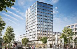
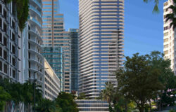
![]()
A weekly experiment, exploring the creative minds in Architectural Visualization and more. Find out what makes us all tick and push the limits.
Listen Now! Subscribe on iTunesOut with the old and in with the new! In Converted, I’m asking you to take an in-depth look at existing architecture near you or one you love worldwide and introduce something new.
See Entries & Join! About ConvertedHere I present my final submission
I decided to join Tomorrow Challenge for the first time.
It’s been 6 years since I started CG production. It was a good opportunity to ascertain how much I am making CG and studying regularly.
What you usually care about in CG production is to be Photorealistic, to make people’s eyes attract attention, to feel a sense of air, to make buildings look better.
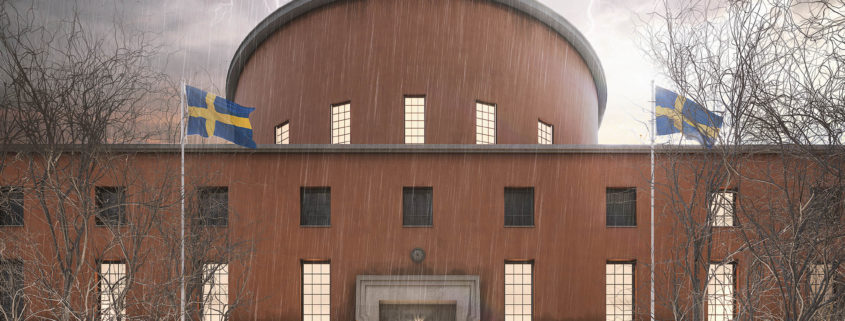
Each of the three CGI devised Stockholm ‘s climate, air feeling, color taste, and determined the composition using the nature and topography of the adjacent park.
The entrance image depicts the composition by golden ratio and expresses the winter climate of Stockholm.
Snow on the ground uses displacement, and we produced masks of people walking in Photoshop.It was a fun work because I do not usually make snow scenes.
It was a fun work because I do not usually make snow scenes.
I would like to see the details such as the snow on the window sash.
The interior image explored the light to be inserted through the window and the dynamic angle looking up the stairs.
In the space where there was only one person before the opening, light was inserted, and the dust was visualized to express the dry feeling of winter air.
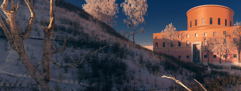
The exterior image expresses the nature of the adjacent park as naturally as possible and uses the branch on the front and the ridgeline of the hill for guiding the line of sight.
Even this image made a snow scene, but it was difficult to make snow material real.
My goal is to produce CGI which is not so far.
Although past targets could not clear that goal, I would like to try to continue making high quality CGI from now on.
I am glad that I participated in this Challenge.
Unfortunately – as I expected – I was not able to finish all the deliverables but I wanted to share the work I have done with you anyway.
Try new software:
My goal to try some new software.
I worked with the quixel mixer for the first time and was impressed how easy it was to use. I did the texture for the steps with the mixer. A stone floor with wetness added and some decal on it to break up the tidiness.
The second thing I wanted to try was the speedtree software. The very particular shape of the trees was perfect for that task because I had nothing comparable in my library. I didn`t get it quite right but keeping in mind that it was the first time working with that software the result was close enough for me. I am quite happy my generated trees.
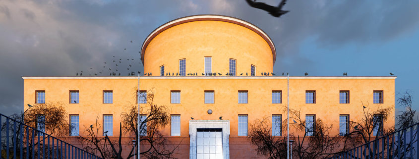
Composition:
I wanted to reflect the regular shape of the building in my image so I went for a square format. The main ledge of the library is dividing the image in two equal halves. The shadow ends at the lower third of the image – following the rule of thirds but breaking them a bit.
I put a flying crow on the top right third to catch the eye and lead them towards the building. Also the man is situated on one of the thirds walking to the building.
Light:
I wanted to create an autumn morning mood right after a storm. The bottom third of the image is still in the shadow to set the focus on the main character – the building with most of its parts already lit by the morning sun.
The reflection of the sun in the glass of the main entrance is slightly out of the center and its bright reflection hitting the wet surface of the stairs again leads the eye of the viewer to the main focus of the image.
Materials:
Two materials were very important for me. Firstly, the color and texture of the facade with its significant stains. I think I nailed that part. And secondly the worn and wet texture of the walls next to the steps leading to the library.
I used a distance map to get the stains under the letters and AO maps to get the wet stains on top and bottom of the wall. Maybe the contrast here is a bit too strong.
After all I am happy with the result and I hope you guys like it too.