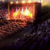


Making of ‘Viking Pavilion’ NPR Dusk Exterior
Here’s the continuation to Scott Baumberger‘s Non-Photorealistic Rendering (NPR) Approach to Architectural Visualization workflow article. This time he dives in, with great detail, into the process of making the ‘Viking Pavilion’ Exterior Dusk Image. Enjoy, and stay tuned for the next part!


Author : Scott Baumberger
Scott Baumberger has been offering high-quality illustration services to architects, designers and developers for fifteen years. He uses a digital process to produce imagery that ranges in technique from photo-realistic to simulated watercolor effects.
Scott’s illustrations have been featured in many publications including Architectural Record, Urban Land, Building Design & Construction, 2004 & 2008 NYSR Portfolios, Best of 3D Graphics, Architecture in Perspective (AIP) catalogues 15-25, as well as monographs for KPF, FXFowle, and Callison.
In 2001, 2002, 2005, and the years 2007-2010 his work received an Award of Excellence in the AIP Competition, held annually by the American Society of Architectural Illustrators (ASAI).
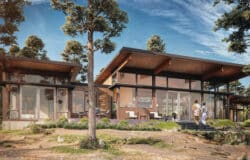
This is the first of a series of renderings completed for the Viking Pavilion project on the campus of Portland State University in Oregon. The Client is ZGF Architects, also of Portland. The project is a proposed modernization / expansion of an existing student athletic center and the addition of a new 5,000 seat arena to be used for academic, athletic and community events. For this view there was already an existing rendering in place, but the building design had changed somewhat. Since we were going to do several interior and exterior renderings, it was important that all artwork felt consistent or made by the same hand.

Non-Photorealistic Rendering (NPR) Approach to Architectural Visualization
This article is an in-depth process breakdown of the ‘Viking Pavilion’ Exterior Dusk image following Scott’s intro to the subject of NPR – Non-Photorealistic Rendering.Make sure you read that introduction to understand what this style is all about and how Scott implements it in his daily work.
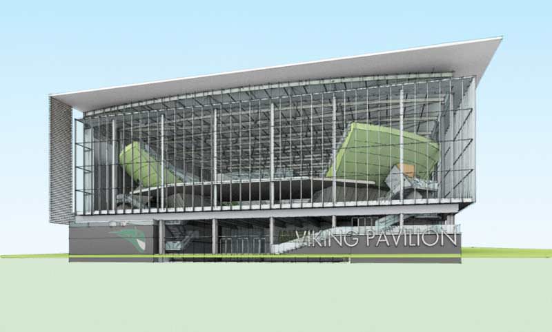
Here is our starting point, the older version of the rendering.

My task was to soften up the overall technique, and make the project as inviting as possible while at the same time preserving the monumentality of the arena bowl. Here is a collage of some of the provided collegiate imagery to get a feel for the site and mood for the renderings.

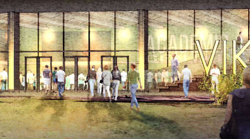
As with any sports imagery, people are a big part of bringing the scene to life. We decided to keep the dusk lighting, and emphasize the game day approach to the building. I recommended keeping the two-point perspective but dropping the camera to a more natural eye-level position. For the composition I wanted to maintain a clear line of sight to the front doors and use foreground shadows to lead the eye towards the entrance.
The toughest part of the rendering process would end up being the transparency of the large glass surfaces. With a dusk or blue hour lighting setup you have more license to dial-up or down the interior lighting levels as needed. During the day, it would be much too dark inside and in a pure night lighting we would lose a lot of the exterior context.
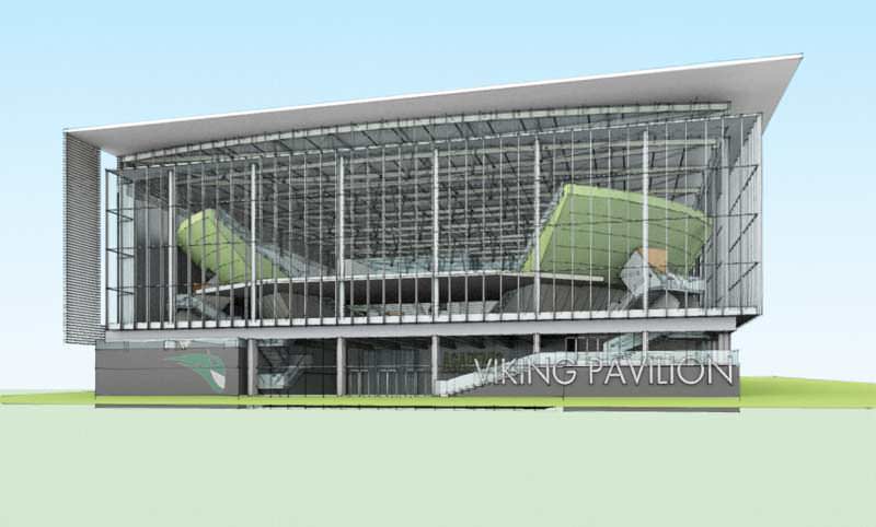
Here is a screen shot of the SketchUP model provided by the client with a general idea of the viewpoint.

As I mentioned, the first step is to investigate alternate camera options and get the final viewpoint nailed down as quickly as possible. Here are a few early options, experimenting with camera position and lens focal lengths.
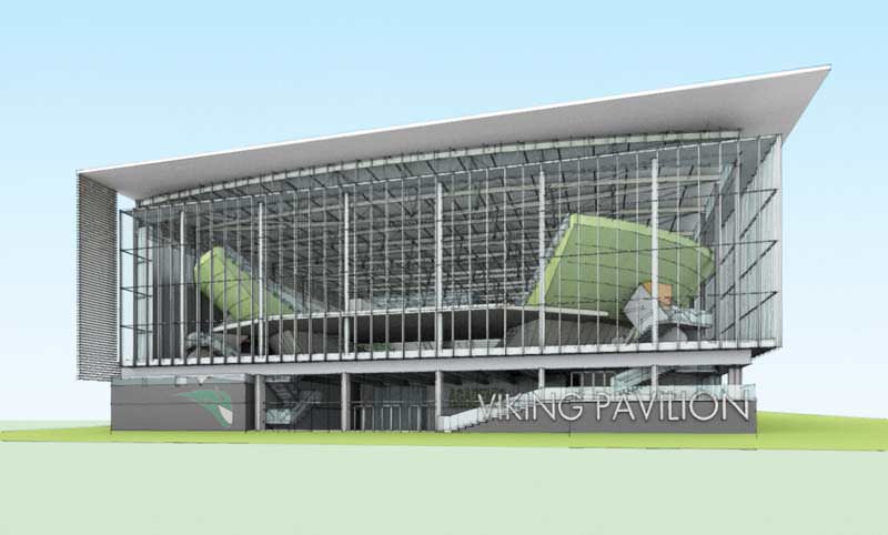
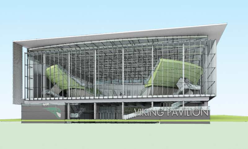
The differences are subtle, but it is critical to get the viewpoint right at this stage as all Photoshop work will be based on this perspective. Good communication is essential at the outset to ensure that all stakeholders in the rendering have a chance to weigh in before the camera position gets locked down for good. We proceed with the third option above.
The Render Passes
Once the viewpoint is approved, I export high-res render passes of the SketchUP model, usually at 4000 pixels wide. With glass I sometimes need to export one version with the glass surfaces fully opaque and another with them fully transparent (or just turned off) in order to create good selection sets and masks in Photoshop. It usually takes 5-6 separate passes to be able to easily isolate everything later.
Here are a few of them for this rendering…
I used this one as a pseudo-alpha channel to isolate the sky but it also gave me sharp line work to select the individual glass panels.

Here is a color-only export used for isolating most of the interior elements.

Ambient occlusion-only pass. I cut out the sky including a small portion visible through the back wall of the arena. All glass is isolated in the model and turned off.

Line work-only pass using a custom style in SketchUP, darkened a little bit here for clarity. There is some jagginess to the lines, which is great for simulating hand-drawn line work but bad for creating clean selections. I use a combination of the first two passes above for setting up selection sets and masks.

For this project, I used the Shaderlight render plugin directly within SketchUP. I gave the metal surfaces a slight Satin sheen but left pretty much everything else alone as default materials. I setup a couple point / omni type lights inside the bowl but hidden by the floor in this perspective. Another light is added in the middle of the lobby just out of view. Glass is still turned off.

At this point, its not bad… but still needs a lot of work. First thing is to composite all of the passes and set up a few of the big selections. Heres a look at it composited and a twilight sky dropped into the background.

Next, I make gentle adjustments to some of the materials and also paint in highlights on the undersides of the interior roof trusses.

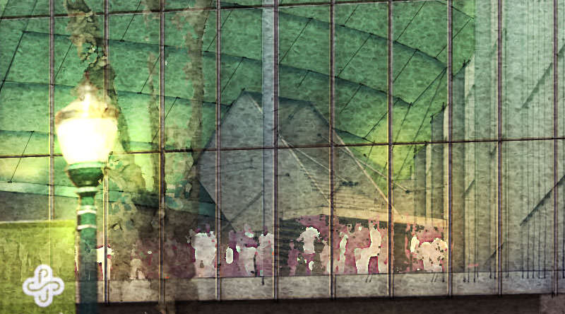
More development of the exterior surfaces, adding lights & glows. I also get a request to punch up the red tone of the interior trusses. To be consistent, I add more saturation to the purple sky visible through the back wall.

Now for the rest of the exterior…
First, I paint in the foreground leaving the grass pretty green at this stage. The walkway at the lower right is a stitch of several photos distorted to match the perspective. Im not especially careful with it as I expect this area will be much darker in the final version.

To get the perspective correct for the neighboring buildings, I set up a quick set of guidelines for distorting the photos.

Here it is with buildings left and right along with some more plantings in the foreground.

Glass facade and the Interior
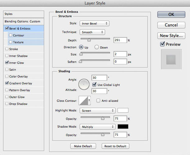
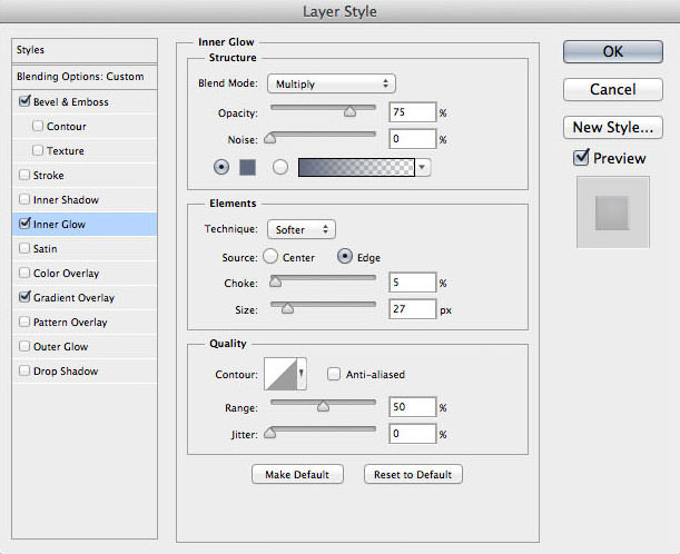
First, I set up a new layer group for the glass and apply a mask. On a new layer within the group I fill the selection with a flat color at about 40% opacity with several layer style effects for the main glass wall (even though the layer group is masked, it is important to fill in just the glass selection and not the whole canvas… many of the layer style effects occur only at the edge of the fill area and would not be visible if the entire canvas was filled). There is no one size fits all for this particular layer style, but the effects I used this time are Bevel & Emboss, Inner Glow, and Gradient Overlay.
The Bevel & Emboss effect are very subtle (Size = 2), but it simulates the thickness of the glass panels, catching highlights and cast shadows at the edges. Inner Glow (set to Multiply) creates a light ambient occlusion type of effect and Gradient Overlay simulates an overall light-to-dark wash, keeping the surface from getting too flat.
In this case, the upper portion of the glass would be receiving more indirect light from the inside of the bowl and than the bottom. Using layer styles is a good example of a non-destructive workflow. I can easily change (or remove) any of the layer style settings later on without any loss of work. Heres a look at the wash and then screenshots for the layer style settings.
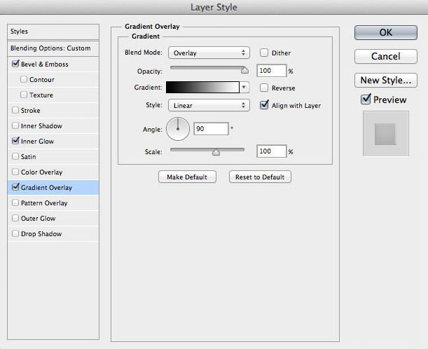
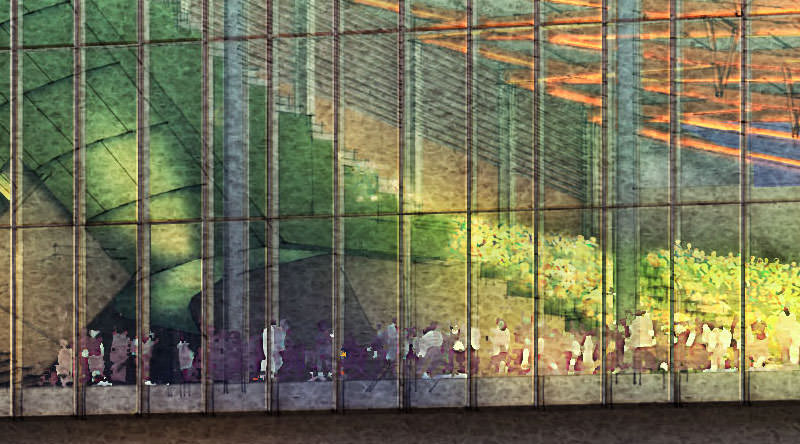
People Inside the Arena
For this I work back to front, building up overlapping things in perspective emphasizing scale as I go along. First, and very loosely, I paint in the large crowd already inside the bowl using a warm color scheme but also introducing a lot of green color to match the PSU colors. Then, another group is added on the floor up against the glass… this time cooled off a bit. The glass color also keeps the lower portions cool.

More people are added to the lobby and mezzanine, also in a cool color scheme.

On a new layer set to Color Dodge Blending Mode, I painted in overall glows using a very large soft brush at a low opacity going over the surface several times to build up the right look. I want to leave some areas relatively dark against the bright interior bowl.

At this point, I get a request to emphasize the horizontal bands on the backside of the green bowl and add a running bond joint pattern to the bands. The client also wants to see more green color in the crowd inside. To get that effect, I add a new layer just on top of the bowl crowd layer and below the perimeter crowd layer. It is set to Color Blending Mode and I paint in the green color sampled from the outside of the bowl using a small soft brush at 30% opacity.

Here is a blowup to see the effect…

The interior is now feeling good, and so I go back to the…
Exterior Foreground
There is usually a lot of jumping back and forth between the two areas… A change to one part of the image will often trigger a change somewhere else to maintain a good balance. The first step for the exterior is to cool off the foreground and paint in glows coming from the entrance. I drop in the foreground-to-transparent gradient on a new layer set to Color Blending Mode to give the bottom a blue cast. I then paint in the glows in a similar fashion to the interior on a new layer set to Color Dodge Blending Mode. Mixing blue/purples with yellow/oranges creates a nice vitality, in keeping with lively sports theme.

Next, I turned on the Viking Pavilion sign with a custom layer style. A combination of Bevel & Emboss, Gradient Overlay and Stroke create a back-lit effect. The layer is set to Normal Blending Mode, but at 70% opacity to help blend in. I also erase a few areas of the sign where the plants are in front, destructively in this case. I was reasonably confident there wont be a change and the consequence of recreating the text is relatively low. If I expected a change to this area, I could have masked it out instead. Either way is fine, just make the best judgement you can and keep moving!

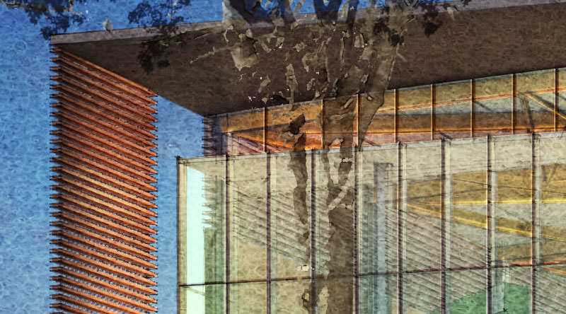
Existing lamp posts are added with the Portland State University logo. I took some license with their placement so they do not cover up any important features. I also change the color of the banners as they are around campus but alter the palette somewhat so they are in harmony with the rest of the scene. So the banner at the left picks up the red of the wood screen just to the left, and the banner at right is a medium blue color sampled from the building at the right edge.
Take great care with the coloration of photographic elements to make them feel like they are part of the scene. In this case I reduced the saturation of the green pole to almost zero and then brought back just the colors that I wanted so the green of the pole wouldn’t clash with the green in the interior. These two colors are adjacent in the perspective so their hues almost exactly match in the rendering.

Here is the original photograph of one of the existing lamp posts…

Next, I add in people and trees, experimenting quite a bit with the opacity levels to avoid overpowering the arena interior. The large right tree is placed exactly on top of the A in Pavilion so that the sign would still read as well as possible. Knowing that the rendering will be presented to a large audience, the legibility of this sign is especially important.

More cast shadows on the ground from the people are added, along with glows at the lamp posts and a foreground shrub to cover up the seam in the sidewalk at the right edge.

Im almost done with the image, so I add paper textures and washes to frame the subject. The wash at the lower right is especially heavy to help sell the image as a nighttime / dusk shot. Without it, the scene could almost be daytime.

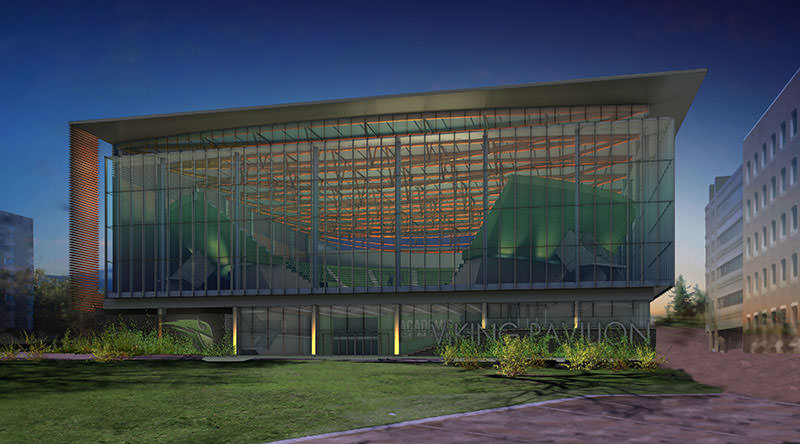
Were all done…
except for a late request to get more glows on the roof trusses. Heres the final version…

And a few blow-ups at 100% to give you a feel for the technique.
Thanks for taking the time to read the article, I hope you will find it helpful to your work. Soon, I hope to cover one or two of the interior renderings for this project as well in a separate article.
Scott.