


Making of DAZZLING
I’m very happy to share with you today, one more making of by iddqd Studio. They previously wrote about Making of Winterhill and this one is about their recent in-house attempt at matte painting, which also awarded “DAZZLING” as Best of Week 31/2017. Enjoy it!
Hi, all.
My name is Sergei Pogorelov. I run iddqd Studio, and I’m very pleased to share the “behind the scenes” process of our most recent work “Dazzling”.
I hope this small article can energize you, bringing an extra dose of inspiration to your work as well.
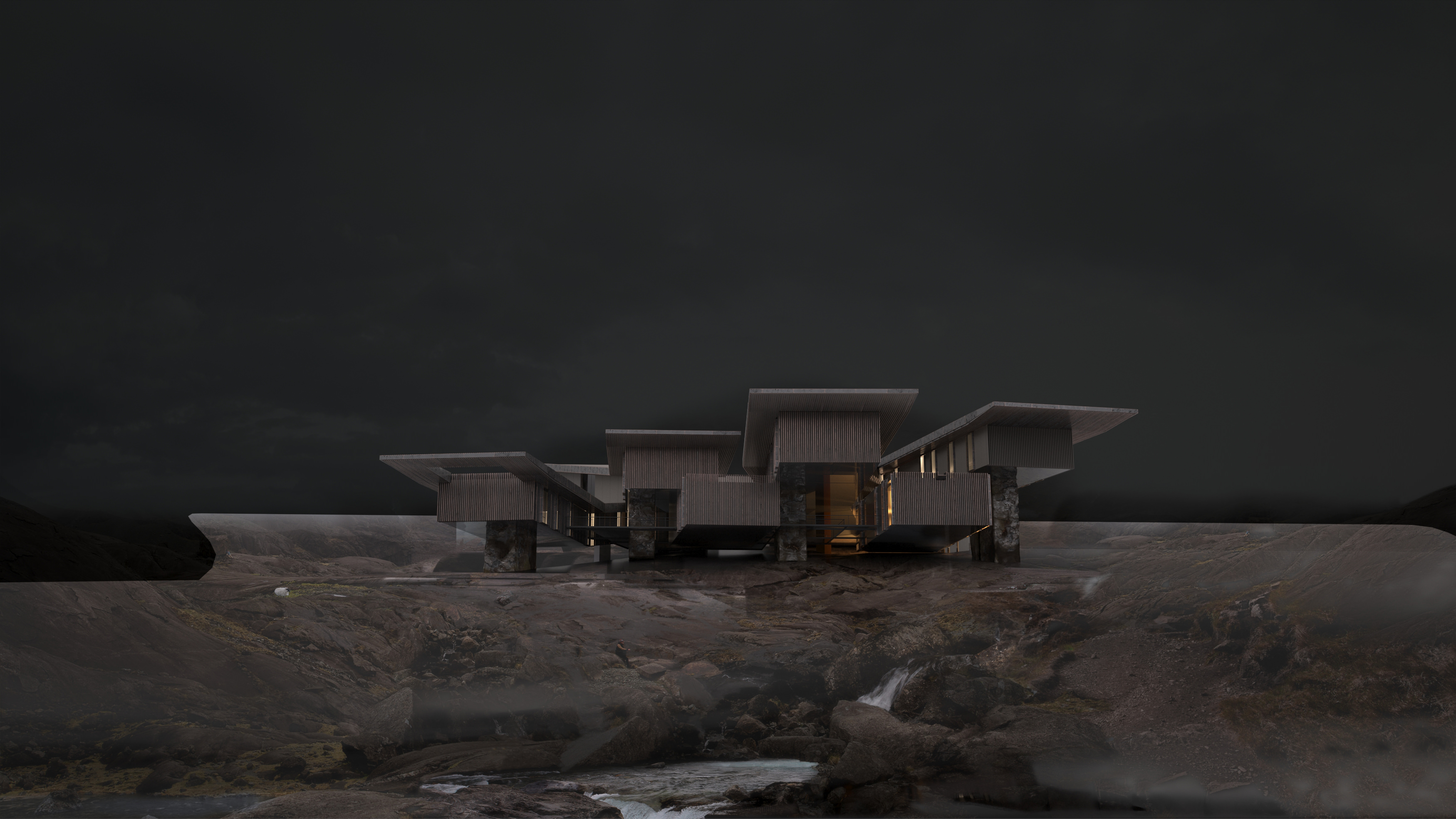
First, I have to admit that Dazzling illustration is unique for us since it was created mainly to develop our matte painting skills.
In our practice, we typically have a full 3d production pipeline since it helps to be flexible and agile when meeting requests for adjustments even at late stages of a project. However, the matte painting technique is very powerful and allows to create highly detailed, realistic images that we have constantly gazed upon.
Finally, the time has come.
The very first step is the inspirational reference of course. We used the below image as an initial guidance for the atmospheric look and feel.
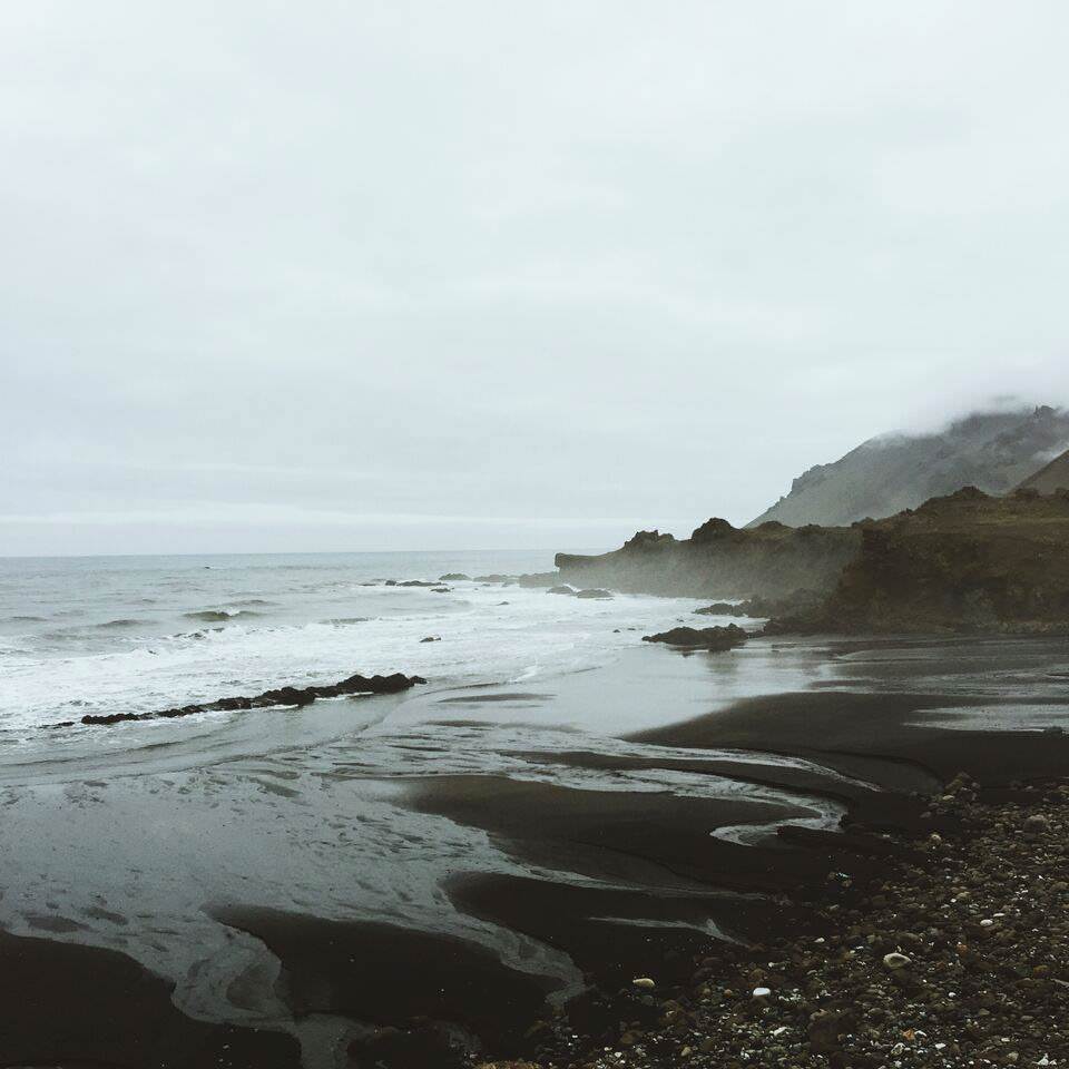
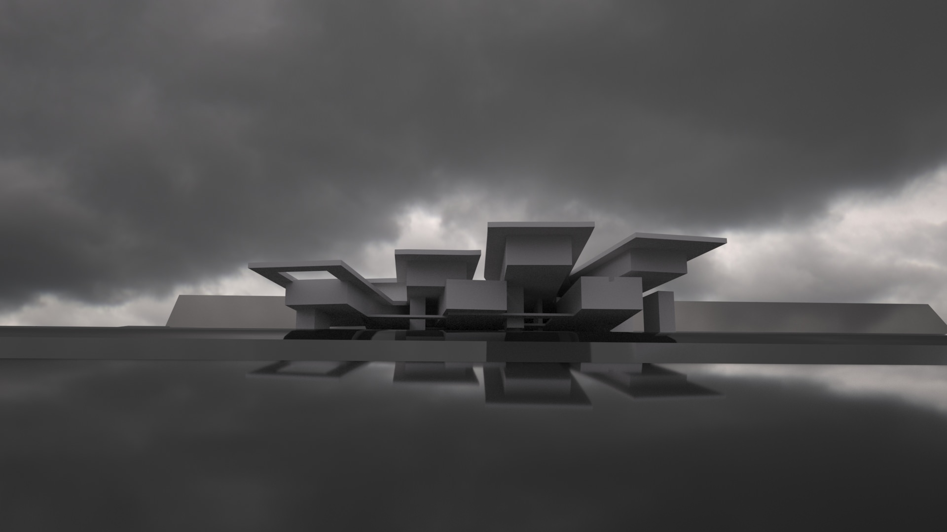
We distinguished the vast area of the reflective wet surface to be the most compelling aspect of the photo.
That’s why we also used the reflective surface while searching for the most promising camera position.


Finding the right angle is one of the key points in the perception of architecture. That’s why we spend a lot of time with the whole team discussing which camera position reflects the design in a way we want.
This particular case was no exception.
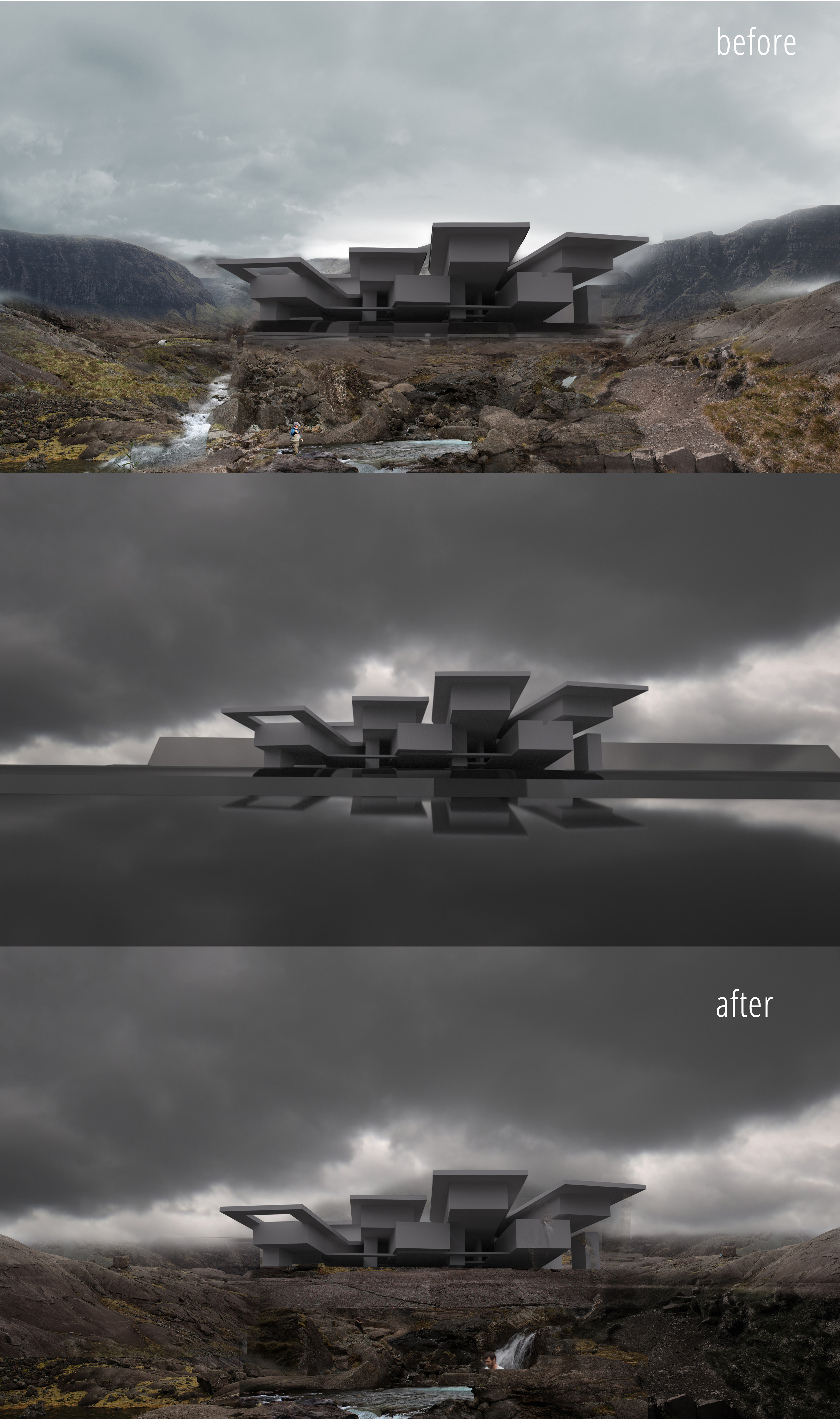
Next, we moved to Photoshop and composed the surrounding landscape draft out of a few different photos, which took us some time of course. Here comes a tricky moment when you can insensibly lose the initial sparkle during the development.
This both works for the architectural design and visualization process as well. You always have to be aware of preserving the sharpness of the initial idea.
For instance, you can see how the added surrounding dramatically changed after we compared with the first rendering.
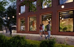
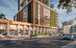
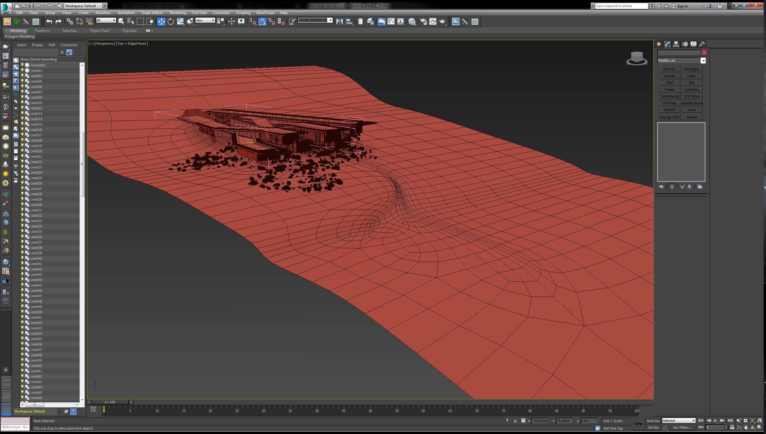
The set of following images depicts the development of the illustration. To seamlessly merge the 3d rendered building with the matte painted landscape we were adjusting them while moving back and forth between 3d modeling and PS work.


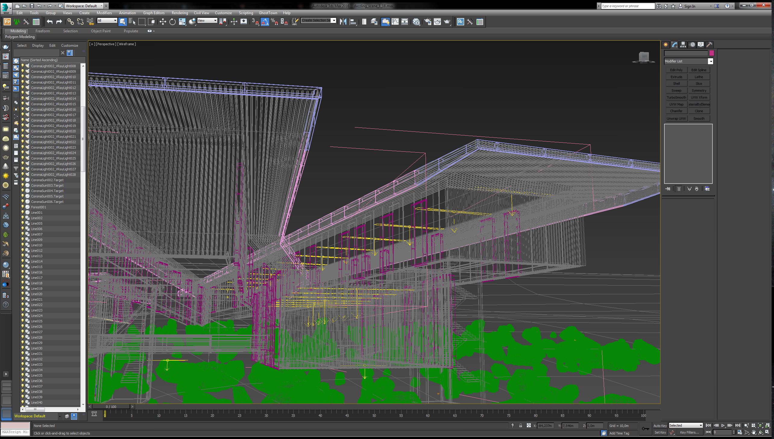
Below you can see the screenshots of how the 3ds max scene was arranged.
3D Model
Obviously, the overall 3d model is quite simple.
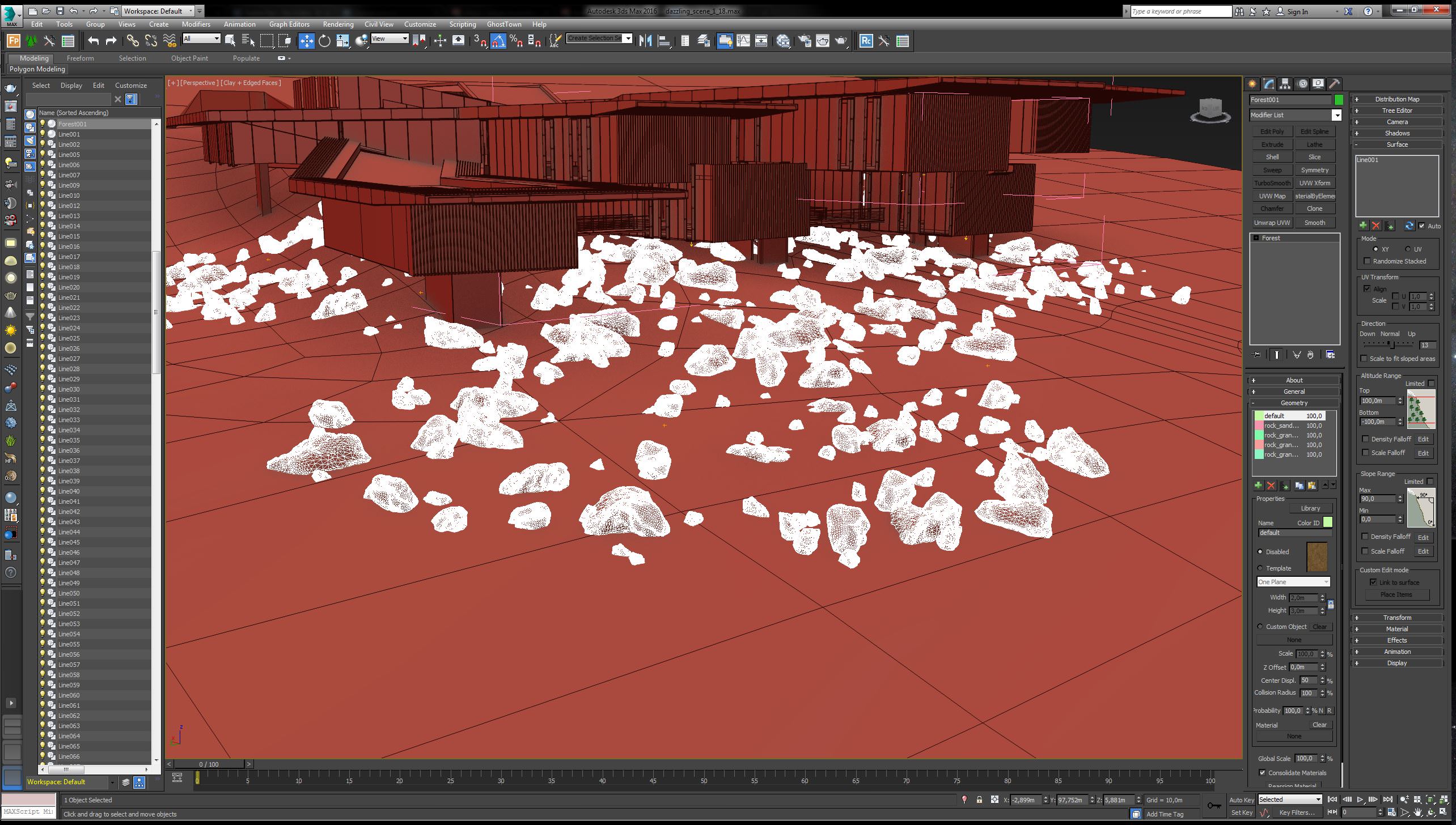
We used stones from Megascans and scattered them around with ForestPack.
For the distribution of repeating elements such as panels and window frames, we used RailClone plugin for 3ds max.


Lighting
We used an HDRI image for the exterior lighting and a series of V-Ray lights for the interior.
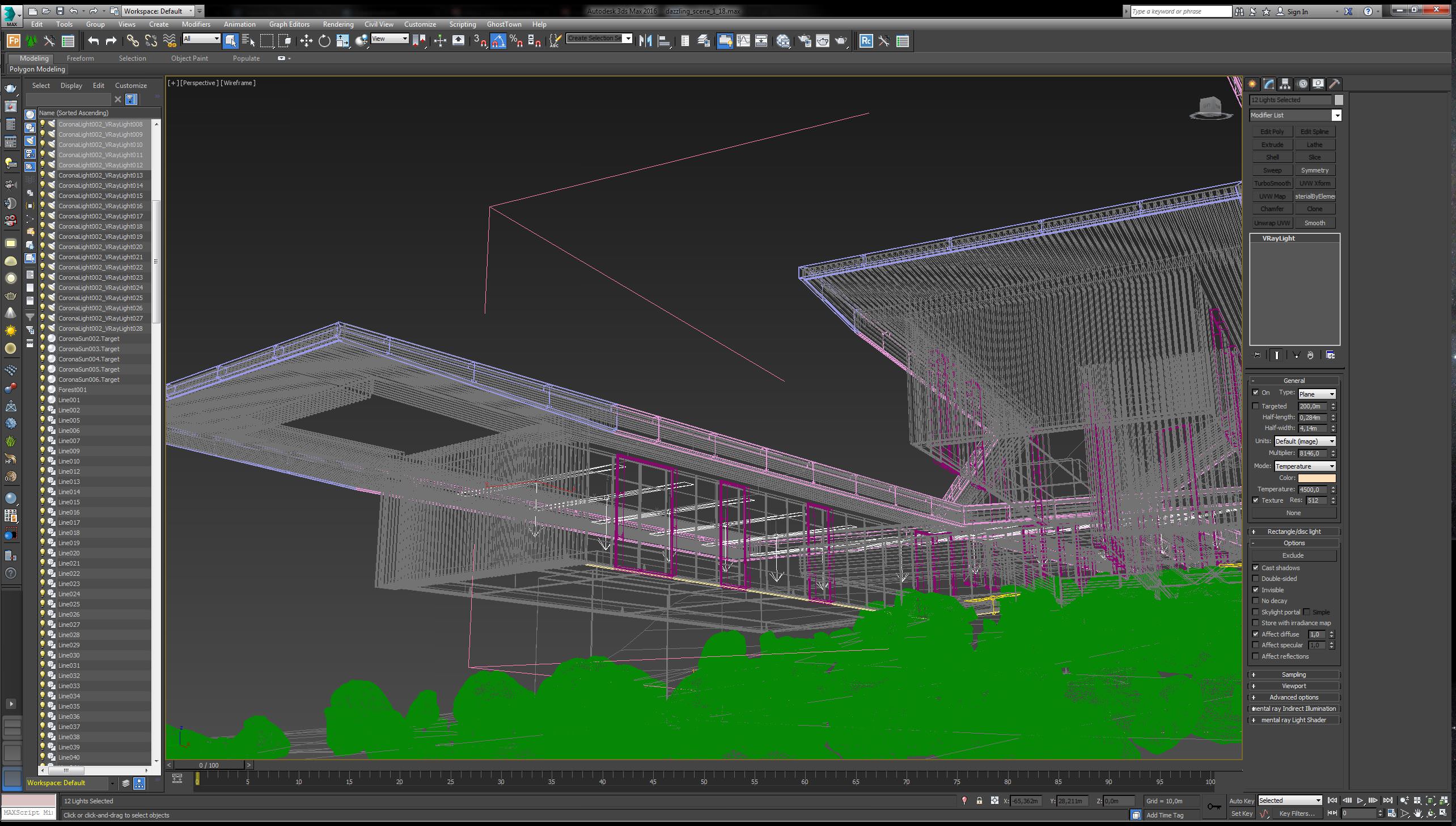
It is necessary to use different interior lights instead of putting one or two large ones since it helps to achieve a realistic look.
Materials
As you remember, from the very beginning we decided that the wet reflective surface should be of the greatest importance for the overall look and feel.
For this purpose, we have used a slope plane underneath
the building with the reflect-catching material applied to it.
We put the background image prepared in PS into the diffuse slot of the 3d plane material.
Next, it was converted to the height map and put into the bump slot. The tip is to apply both these maps in a screen mode.
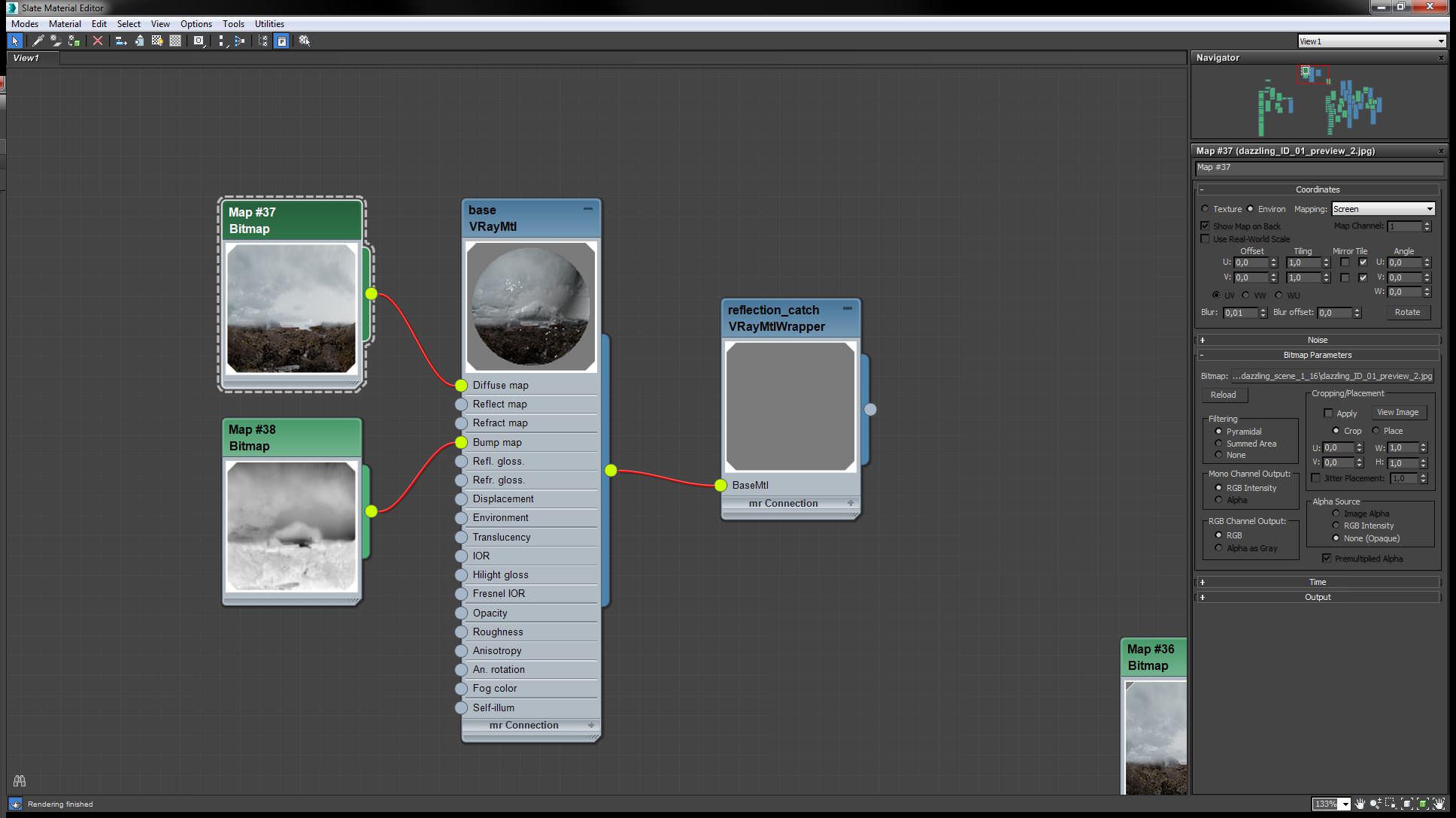
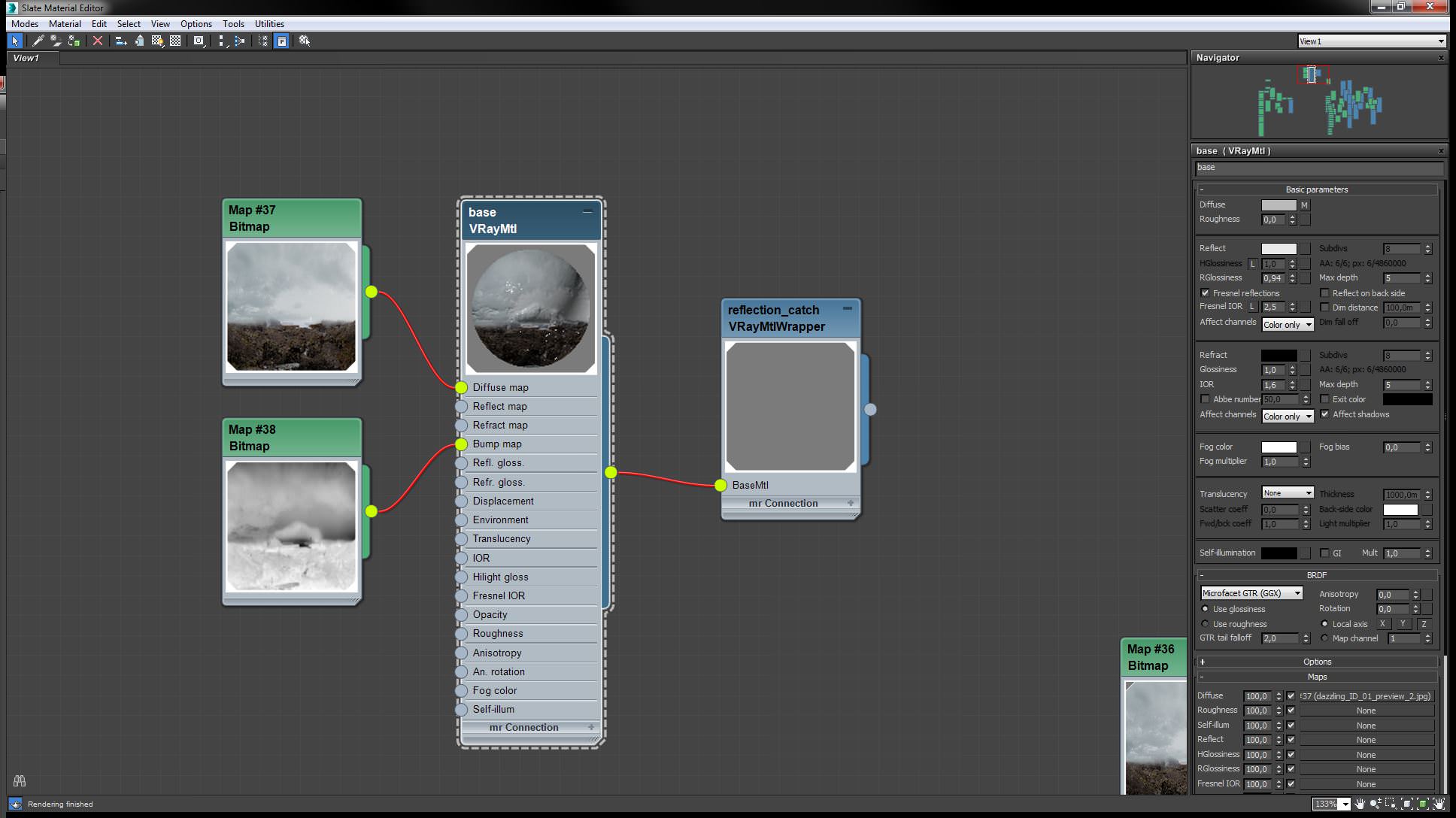
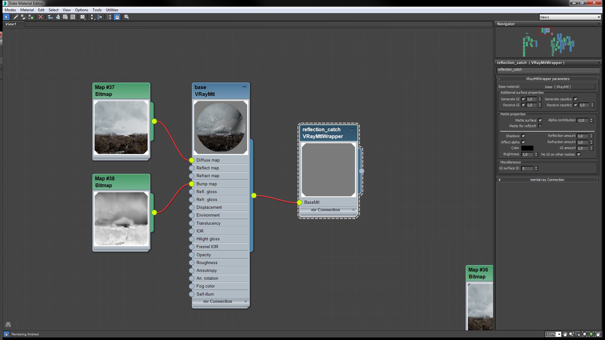
As a result, the reflection of the building became bumpier and less homogeneous.
Below you can check the façade material setup.


Finally, on this short movie, the composition and arrangement of the final PS file are revealed.
Hope you found something interesting or helpful, or even both.
Thank you.


fantastica !